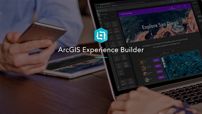
Responsive web design is the practice of making websites adjust to fit the dimensions of any device or window. ArcGIS Experience Builder, Esri’s web app builder, use automatic responsive design and offers tools for manually adjusting layouts for different screen sizes.
You can practice using those tools in this new 30 minute tutorial, Optimize an app layout for mobile.
The goal is to adjust the home page of a park information app for Great Smokey Mountains National Park to fit on a mobile screen.
You’ll use all of the following features:
- Device editing modes
- Size and position settings
- The pending list
For more tutorials, visit the ArcGIS Experience Builder resources page.


Article Discussion: