In Collect geological data in the field using ArcGIS Field Maps, you collected data on minerals you found during a field lab activity. Now that you have collected all your data, you will return to your computer and use Map Viewer to visualize the amount and type of minerals that were collected.
View your collection points
First, start by opening Map Viewer to view all the collected mineral points on a single map.
1.In Field Maps Designer, click Open and select Map Viewer. The map will open in Map viewer in a popup window.
2. Click Content.
The web map opens centered on your collection area.
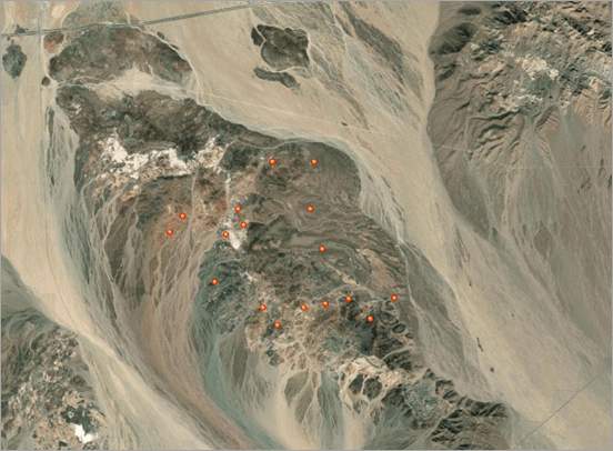
Each mineral point collected in the field is displayed as a red circle on the map.
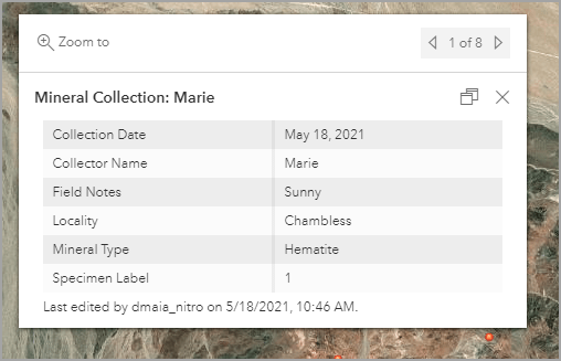
3. Click a mineral point.
The mineral’s pop-up opens containing the responses for the Field Notes, Locality, Mineral Type, and Specimen Label fields, as well as any Pictures you took in the field.
Visualize your data
Next, we will visualize the collected data by changing the symbology of each mineral point, configuring the pop-up, and creating a chart that shows how many minerals were collected based on their mineral type.
Change the symbology of points
First, we’ll change the symbology of our mineral points. Each mineral type is currently represented by a red dot on the map. We’ll symbolize the layer so that each mineral type has a unique symbol. This will make each mineral type easily identifiable and distinguishable as points on the map.
1.In the side panel, click Layers and click the Mineral Collection layer.

2. Click Styles in the side panel and select Add Field.
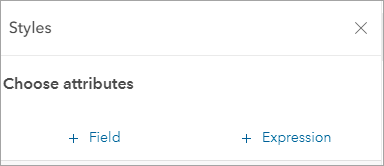
3. Select Mineral Type from the drop-down menu and click Add.
4. Next, scroll down and click Style options.
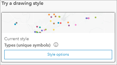
5. Click the colored circle next to Hematite.

6. Under Symbols, select Basic shapes from the drop-down menu.
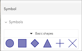
7. Select the circle shape and use the custom color tab to make the symbol red (Hex# E61919).
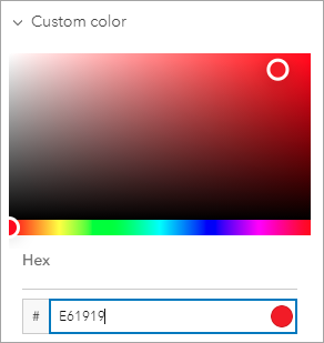
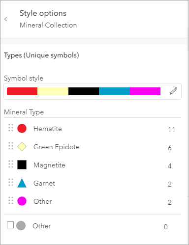
8. Repeat steps 5–7 and change the color and shape of the other mineral types. Use these shape and color combinations as an example:
- Magnetite—Square shape and black color (Hex# 000000)
- Green Epidote—Diamond shape and yellow color (Hex# FFFFAF)
- Garnet—Triangle shape and blue color (Hex# 149ECE)
- Other—Circle shape and purple color (Hex# EE00F7)
This is what the finished symbols look like:
9. Click Done when finished.
Configure the pop-up
Next, let’s configure the pop-up for the mineral points. We will reorder the fields in the pop-up so the data is displayed in a preferred order.
1.In the side panel, select Configure pop-ups.
2. Click the Edit button next to Title and change the title to Mineral Collection. Click OK.

3. Next, click Fields list and in the Title box type Collection Information.
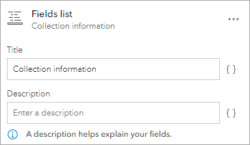
4. Reorder the list as follows:
- Mineral Type
- Specimen Label
- Collector Name
- Collection Date
- Locality
- Field Notes
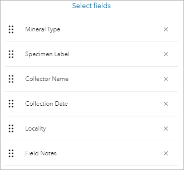
Once you are done reordering the fields, close the pop-up window.
5. Click a mineral point on the map.
The pop-up now reflects the reordered changes.
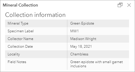
6. Save the map.
Create and configure a chart
Next, we’ll add a chart to the map that will show the number of minerals you collected in the field.
1.In the side panel, click Configure Charts and click Add Chart in the menu that pops up.
2.Select Bar chart and click the Data
3.In the Category box, select Mineral Type.
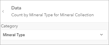
Once we collect data in the field, the chart will show the number of minerals collected based on their mineral type. Later, we will also configure the look of our chart.
4.Click Save.
Now that we have collected mineral features, the chart shows the count of each mineral collected in the field.
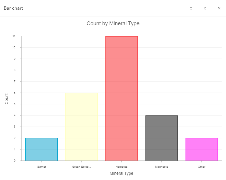
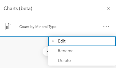
5. In the Charts panel, click the More options button next to Count by Mineral Type and select Edit.
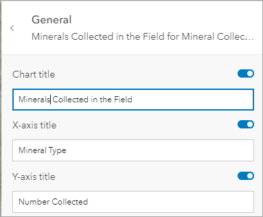
6. Click General and change the Chart title text to Minerals Collected in the field, the X-axis title to Mineral Type, and the Y-axis title to Number Collected.
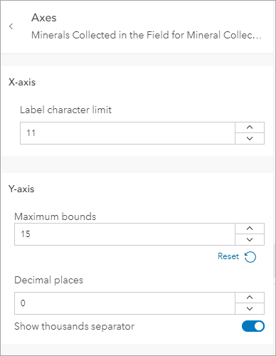
7. Click the back arrow and then click Axes.
8. In the Decimal places box, change the number to 0, and under Y-axis, change Maximum bounds to 15 (or whatever the total number of collected minerals was).
9. Click the back arrow and select Format.
We’ll format the font, axes titles, and chart background color.
10. Click Chart Title and designate Font as Arial and Font Size as size 18.
If you want, you can also change the color of your font.
11. Next, click X-Axis Title and designate Font as Arial and Font Size as size 14. Apply the same changes to the Y-Axis Title.
12. Click the X next to Text Style to close the text formatting window.
Finally, we’ll format the color of the chart background.
13. Scroll down to Symbol elements and click Background.
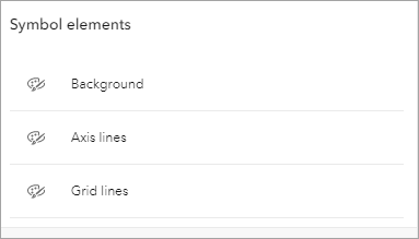
For this chart, I chose a light gray color (Hex# F7F7F7) that best complements the colors of the mineral type bars. Choose the background color that you think best complements the colors in your chart.
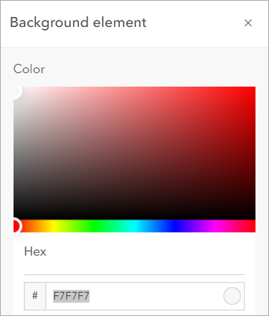
14. Close the Background Element window.
This is what your final chart looks like:
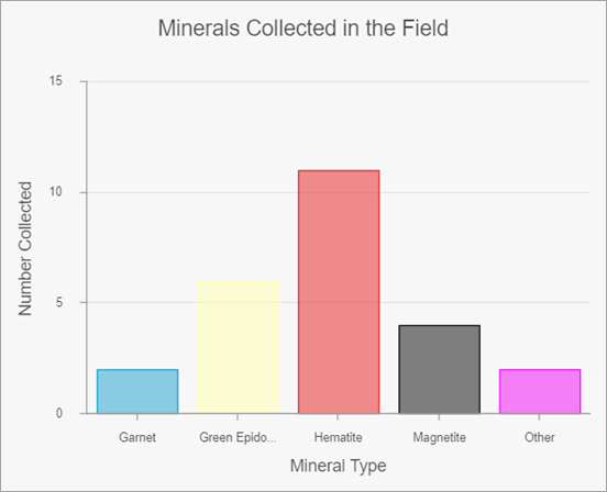
Next, we need to save our changes.
15. In the side panel, click Save and save your map.
Add labels
As an extra step and to add a bit more visual information, let’s add labels to the mineral points on the map.
1.Select Labels from the side panel and click the Enable labels button to turn labels on.
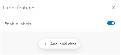
2. Click Add label class.
3. Click the box under Label field and select Mineral Type.
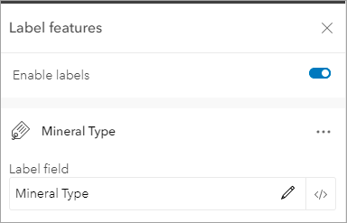
4. Select Replace.
5. Click Edit Label Style to change Font to Arial Regular, font Size to 13, Font Color to black (Hex# #2b2b2b), Halo Color to white (Hex# #ffffff) and Placement to Above center.
6. Click the Close button next to Label style to close the window. This is what your map labels look like:
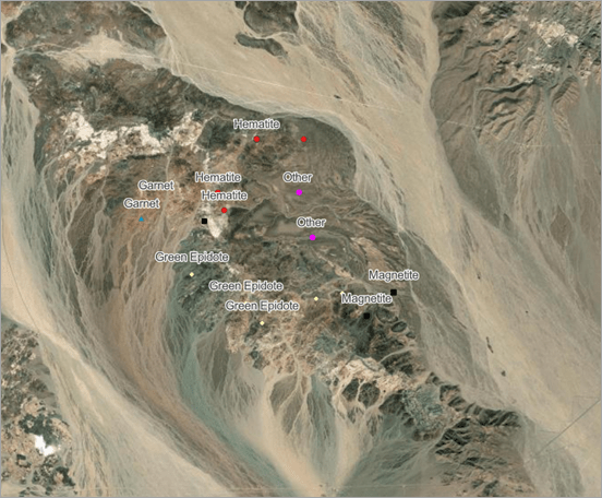
7. Click Save in the side panel and save the map.
Now that the map is finished, students can discuss any patterns and trends they see related to the minerals they collected. Here are some potential questions to ask your students about the field data:
- Which mineral type was collected the most? The least?
- What trends do you notice (if any) in how mineral types are distributed?
- Are there any clusters of minerals in certain parts of the collection area?
- Are there any minerals that stick out in terms of where they are located?
Next Steps
This blog post is the final part of the Collect Geological Data with Field Maps tutorial series.
To learn how to make and configure the map used in this video, check out the Create a map for geological data collection in the field blog post and the Configure a mineral collection map using Field Maps video.

Article Discussion: