This is Part 2 of a two-part blog exploring the scope of epidemiology, how GIS provides an important analytical component, and what ArcGIS Insights can do to support epidemiological analysis. Part 1 of the blog should be read before you dive into this second part.
Just to recap, epidemiology sits at an intersection of a number of different disciplines and uses knowledge and methods from, for example, the fields of health, medicine and, statistics. There are numerous disciplines even within the broad framework of epidemiology that focus on infectious disease, genetics, chronic disease, and environmental and spatial epidemiology. For consistency, during this overview I’ll demonstrate epidemiology using examples of COVID-19 from April 2020. I’ll also demonstrate how ArcGIS Insights provides a powerful, yet accessible solution for some of the analytical needs of the epidemiologist, how it can be used in unison with other epidemiological approaches widely used, and how it can help convey information to the general public and decision makers.
Part 1 of the blog identified the first five of ten main areas of epidemiological study. Here, we round it up to ten with a further five areas of study and application.
Creating composite indicators
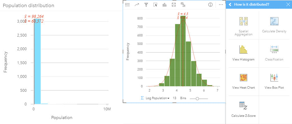
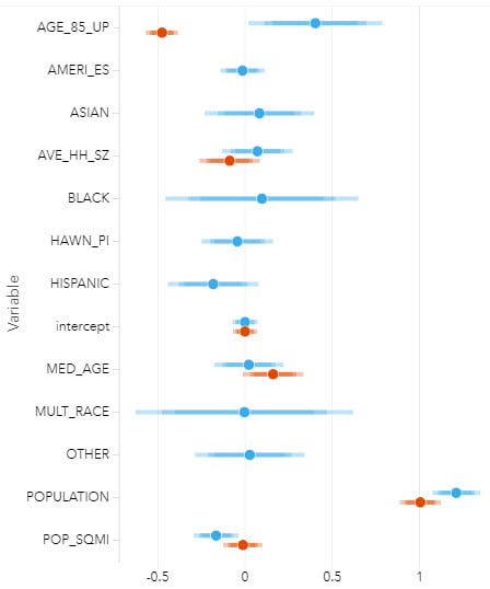
Deprivation indices are widely used in epidemiological research and for local and national government applications. Composite measures can be created for specific purposes or existing indicator variables can be combined to create a situation specific index. These indices are designed to capture a variety of socio-economic characteristics and ensure that multiple population characteristics, which may impact the outcome to the health event, are being analyzed.
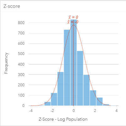
To combine data that represents different factors uses different measures, such as unemployment rate and percentage of mobile home ownership, requires that data be standardized and possibly transformed. Data can be standardized using Z-scores so that all variables have a mean of zero and a standard deviation of 1 and are, therefore, equally weighted when combined. In some cases, input variables will have skewed distributions. These variables can be transformed to (near) normal distributions (for example, by taking the log transformation), again to ensure they can be combined with other variables to avoid skewing the final index.
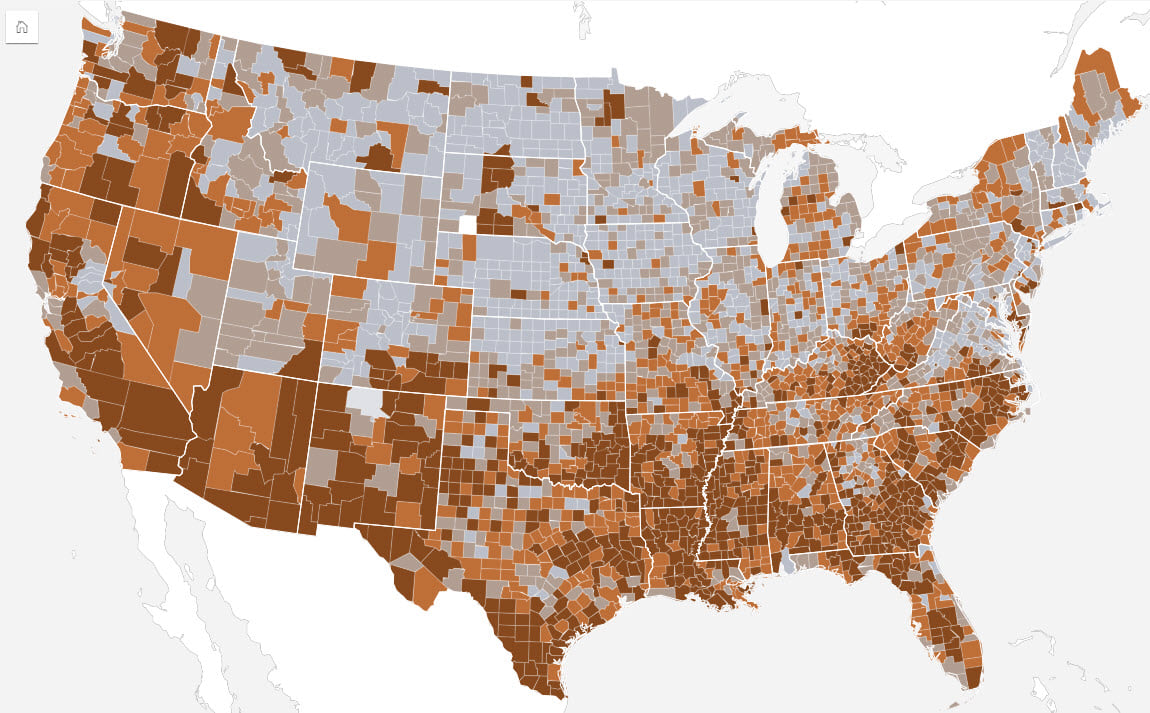
Indices are an excellent way to assess relative circumstances but the scale at which they are calculated can sometimes be problematic. For instance, an index calculated at a national scale can mask local conditions. In some cases, regional analysis can therefore benefit from indices that use variables and/or values more tailored to the local communities, such as local house prices or income rather than using national values.
Graph networks for health analysis
Network analysis and graph theory are well placed for both understanding the spread of contagions and influences of social interaction on population health. Furthermore, they can be used to analyze the impacts of intervention strategies since social network dynamics can influence disease spread.
Using graph theory, a network is seen as a set of interconnected links and nodes from which relationships can be identified. Typically, a node or vertex represents an entity, object, person or, place. Links represent the relationships or connections between nodes. Usually, nodes represent individuals, but they can also be groups or even geographic locations. Centrality metrics can subsequently be calculated and used to determine the important nodes in the graph, and different measures can be determined from the analysis, such as finding the most connected individuals or, key ‘bridges’ in a network.
Assessing network structure, which is defined by transmission pathways, can be valuable to reduce the spread of infection. (for example, for contact tracing to identify connections and potential transmissions to contacts after exposure to an infected person). At scale, contact tracing requires managing sensitive data at large-scale. Successful control of outbreaks through contact tracing is often related to a number of factors, such as number of initial cases, the onset period and the basic reproduction number (R0). Contact tracing can also be used to understand disease etiology, such as infectiousness, and can play an important role in analyzing a novel virus.
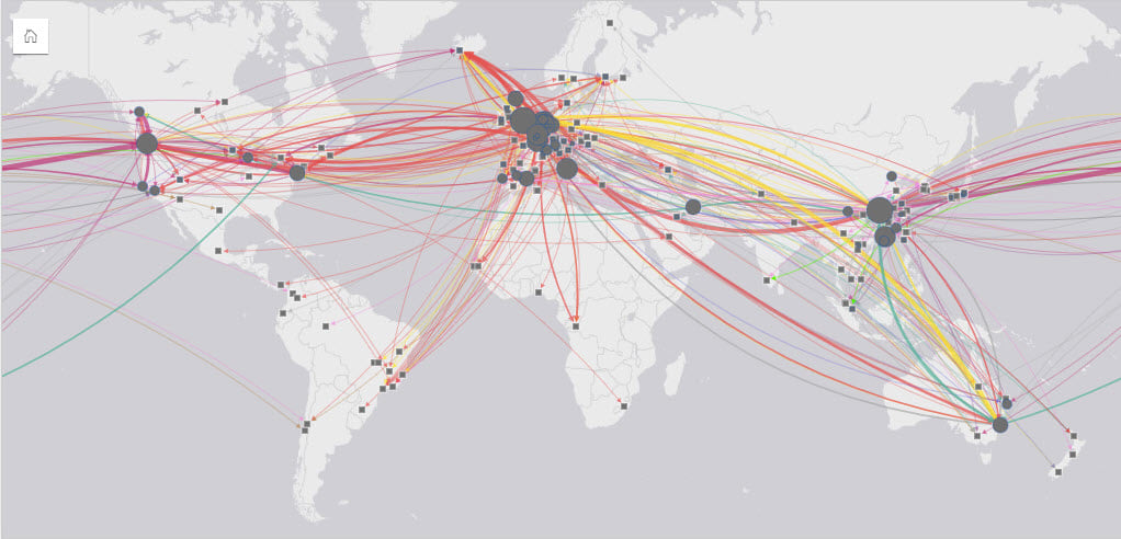
A graph database is traditionally used to store data with a structure of nodes, edges and, properties. Technological advances now mean that linkages in a data set can be automatically created and visualized from data stored in flat files or relational databases, and which can then be used in conjunction with other analytical approaches.
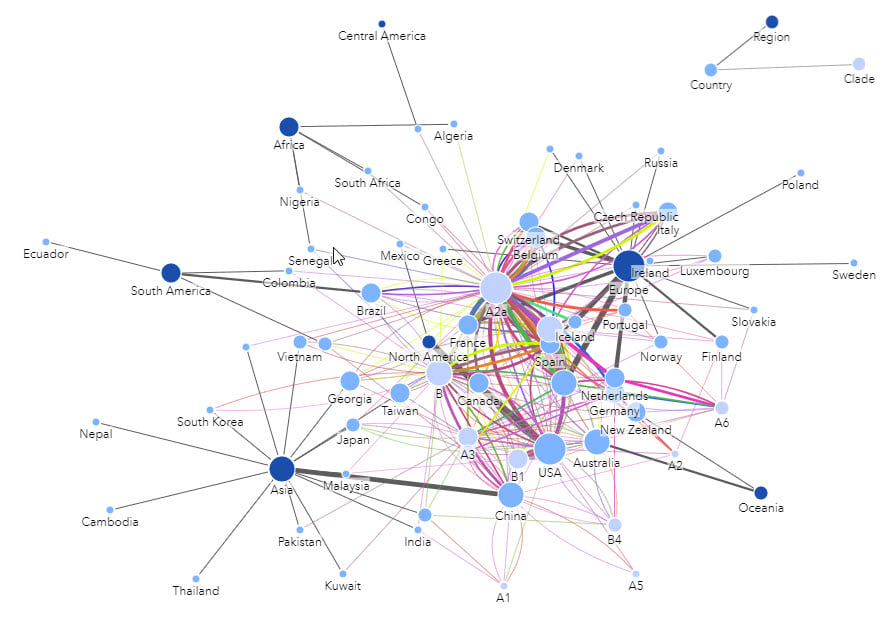
Epidemiological analysis needs to go beyond simply combining numerous variables by area and rather focus on understanding the population and interactions within those areas.
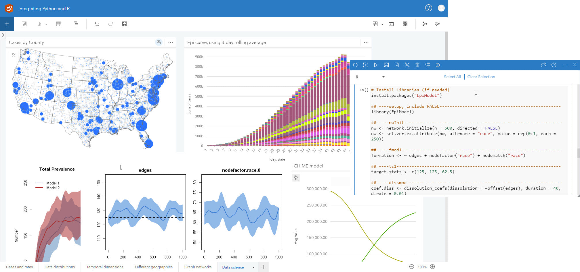
Integrate with custom models and open data science
Although many different approaches and technologies are used in epidemiology, there are also some very specific discipline techniques used for data collection, interpretation and analysis. A variety of statistical methods and advanced statistical packages are used. In many cases, standard epidemiological models are used, and in some cases, custom models are developed.
Numerous epidemiology models have been developed over time, many of which are freely available in R and to a lesser extent in Python. R is both a programming language and software that enables simple to complex analysis. The ability to explore and describe data both visually and quantitatively in addition to the active development and maintenance of code, in many cases by subject matter experts, makes it an invaluable tool for epidemiologists.
Epidemiology, like many other disciplines and specializations, often uses accepted tools and software that have a long history of use for analysis in those areas. Equally, GIS offers a number of methods and tools that are invaluable. It is important that these functions are easily accessible to those who may not be able to work solely in GIS, but rather can be used to compliment and strengthen other analysis.
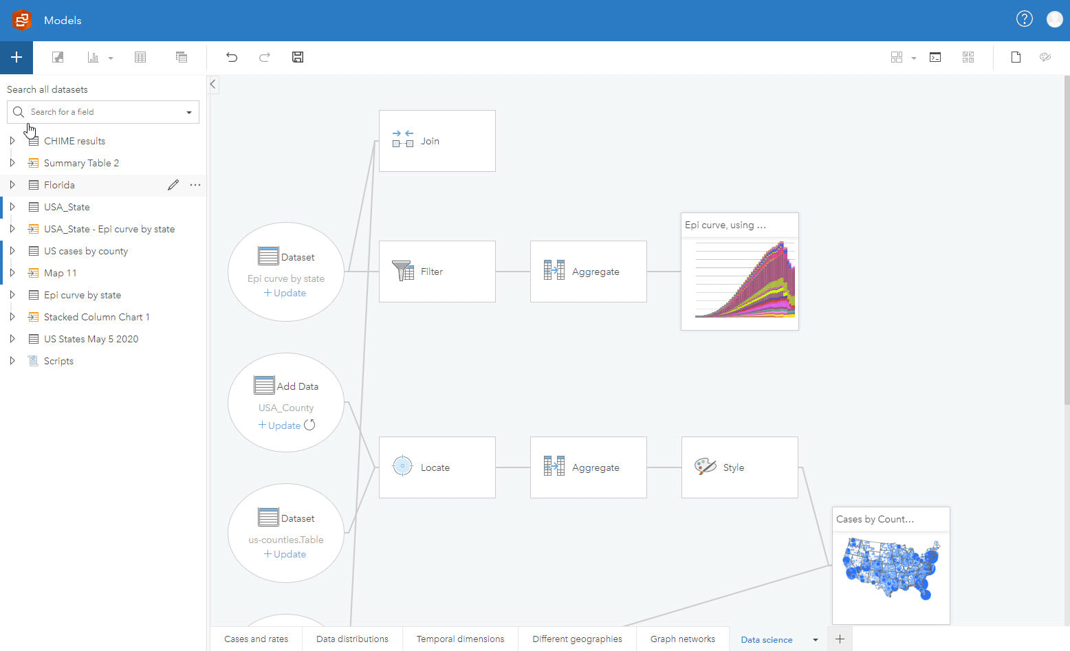
Document and re-run workflows
Any analysis should ensure methods are transparent, and the more involved the modelling undertaken, the more important this becomes. Distilling complex pathways through data inevitably requires some form of decision making, aggregation/generalizations or even using proxy variables. Ensuring the reader can interpret the findings with some knowledge of the steps taken means that informed choices can be made. Going one stage further, spatial analysts are likely poorly positioned to properly understand and run epidemiological analysis. Collaboration is often the key to high quality spatial epidemiology.
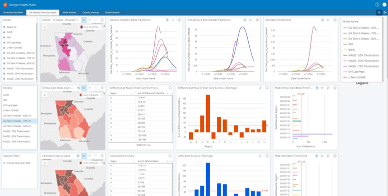
Epidemiological analysis is rarely run once. For example, during disease outbreaks, analyses will have to be re-run as data changes and, in some cases, as understanding grows. In some situations, there may be a need to evaluate outcomes based on intervention approaches. Models that can easily be re-run are, therefore, highly desirable, although this is complicated by the fact that, in many cases, multiple tools with data from various, often unrelated sources, are used.
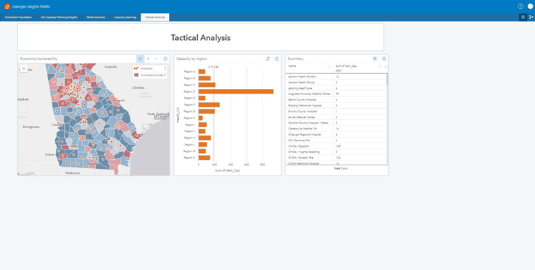
Effectively communicate results
It takes skill to bring together results from numerous sources- ̶ many of which are the output of involved modeling ̶ and use data that cannot be shared until anonymized in some way. Unfortunately, this work is often undertaken in a compressed timeframe to suppport the immediate need to disseminate findings and provide information for policy, and for the public. Furthermore, those who carry-out the analysis are heavily embedded in the work and, intimately know the data, analysis shortcomings and overall findings. Most readers will not have the background knowledge the analysts have developed, yet may be under pressure to make rapid decisions that have consequences for response and resourcing.
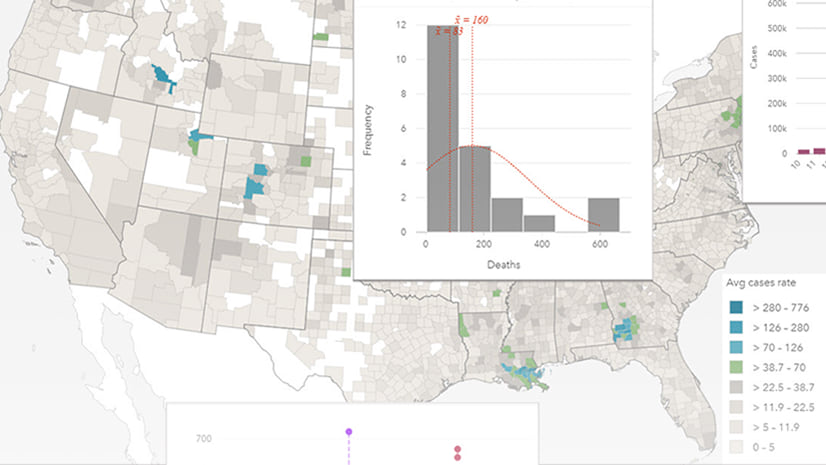
Often, the first consideration when communicating results is the need to maintain confidentiality. A number of techniques exist, from aggregating results to suppressing small numbers (which could lead to identification), and the details of each differ by communication type and format. In most cases, results will be accompanied with confidence intervals, which are an integral part of the findings and should be considered an important aspect of decisions making. It is this detail that will drive effective response and planning, and also communicate an element of uncertainty in reported results to alleviate the risk of people seeing the analysis findings as incontrovertible fact.
Epidemiological studies are rarely definitive but are based on careful and complex analysis that advances with ever increasing understanding. The desire (and need) for categorical answers is not easily fulfilled by epidemiological analysis that is often looking for ‘a needle in a haystack,’ and levels of uncertainty are important to also describe.
Summary
In this, two-part blog, I have outlined ten topics in relation to epidemiology GIS, and demonstrated the value of combining the two using ArcGIS Insights, with examples using COVID-19 data.
Now, more than ever we have the opportunity to embrace many of the challenges that epidemiological analysis presents. Sourcing data is no longer the problem it once was and, better yet for many of us, it is routinely geocoded. Technology gives us the ability to analyze the data. Advanced functions are readily accessible. Effective communication is made possible through numerous visualization techniques.
It is still a challenging area of analysis, combining skills from many disciplines, requiring thoughtful and careful analysis. It is this though, in a large part, that can make epidemiological analysis so rewarding, and which can reap real benefits for individuals and society more general.

Commenting is not enabled for this article.