I’ve spent most of my professional career working in spatial analysis and epidemiology. These were terms that were often met with blank stares when I was asked what I did. But now, after years of having to explain what they mean, and furthermore, how GIS is related, during the COVID-19 pandemic previously specialist terms like ‘epidemic curve’ have entered the everyday language. It therefore seems a perfect time for a quick blog on this topic.
Epidemiology sits at an intersection of a number of different disciplines and uses knowledge and methods from, for example, the fields of health, medicine and, statistics. There are numerous disciplines even within the broad framework of epidemiology that focus on infectious disease, genetics, chronic disease, and environmental and spatial epidemiology. While I could passionately write about environmental and spatial epidemiology in particular, I have tried to keep this blog a little more generic but thought I should declare my (spatial) bias upfront. For consistency, during this overview I’ll demonstrate epidemiology using examples of COVID-19 from April 2020. I’ll also demonstrate how ArcGIS Insights provides a powerful, yet accessible solution for some of the analytical needs of the epidemiologist, how it can be used in unison with other epidemiological approaches widely used, and how it can help convey information to the general public and decision makers.
I have identified ten key topics that I will briefly explore, with examples. These will be split between two blogs, just to keep them to coffee break length! In total, the two blogs identify ten major areas of epidemiological study and the scope of GIS to provide an analytical framework. In Part 1 I’ll outline the first five areas. In Part 2 I’ll round it up with a further five areas to ten.
Characteristics of health data
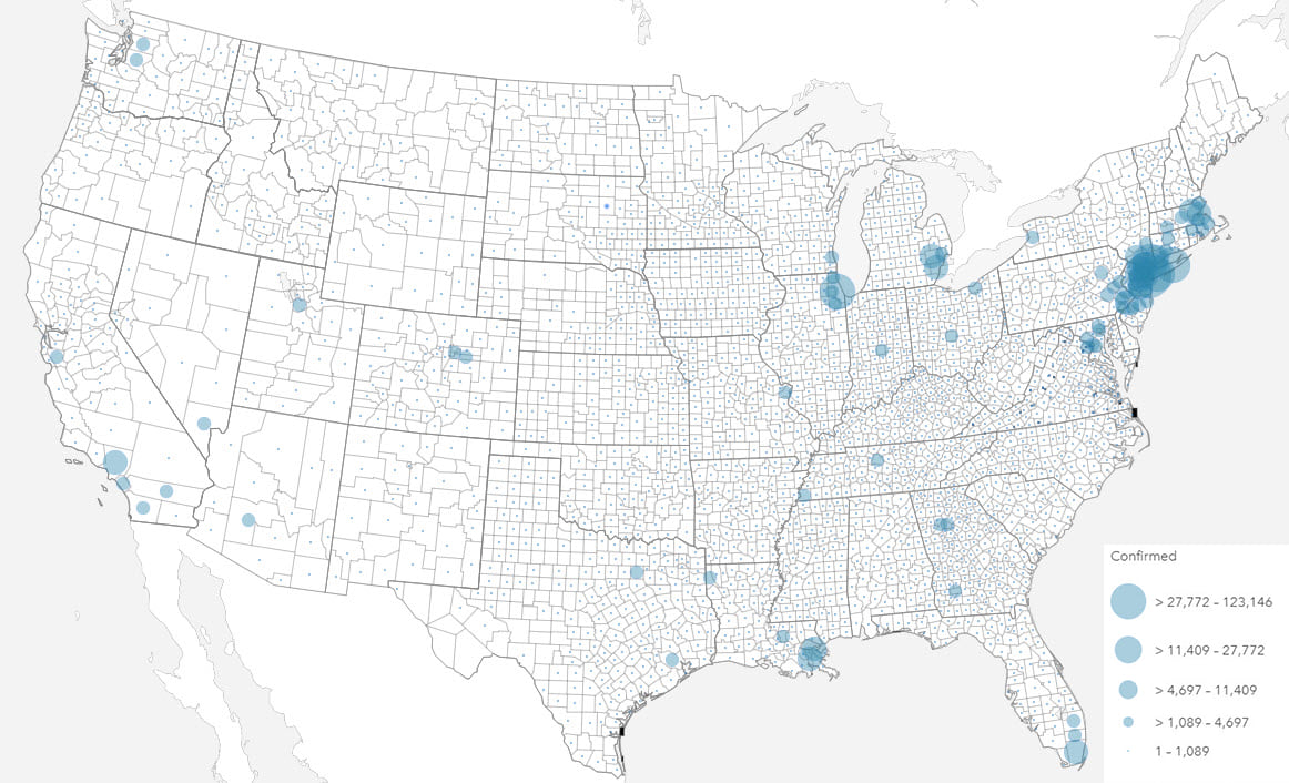
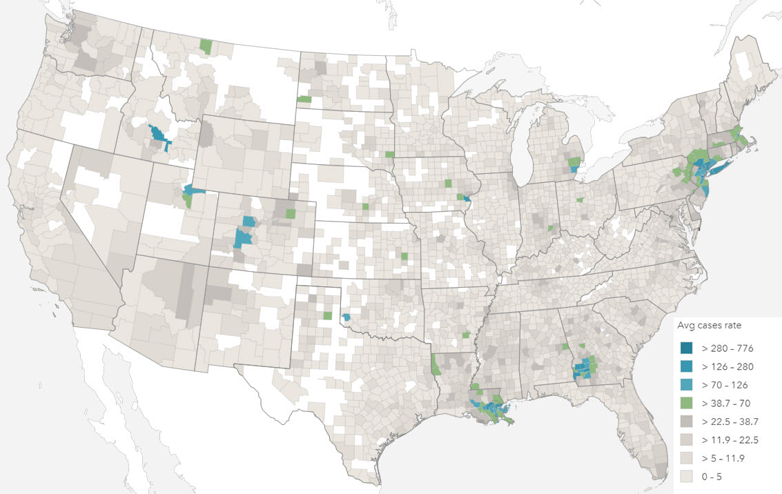
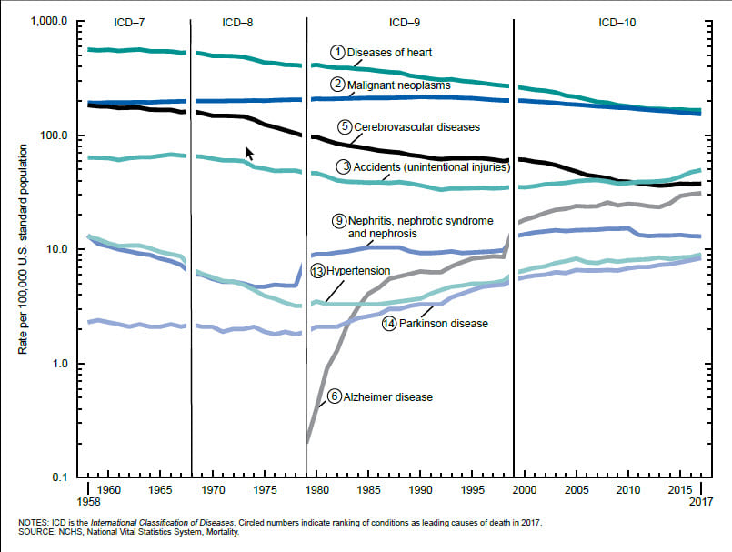
Even the simplest health event data will be collected, analyzed and reported in very different ways. Total numbers of cases, and rate of health events are often used interchangeably, yet each convey very different information.
The total number of health events can be valuable for capacity planning and funding. In times of health response, the number of health events such as death, birth and hospitalization are valuable to quantify the extent of any prevention measures required, or indeed, healthcare that may be needed.
In most other situations, the number of health events can only be understood with reference to the size of the population from which it is derived. In epidemiology, a rate is the frequency of event occurrence in a defined population over a specified period of time. Rates are, therefore, useful for comparing health events in different populations.
Mapping totals and rates also requires different techniques, most commonly using proportional symbols and choropleths respectively. The projection used to display your map should also be a consideration, particularly with rates, when values are shown by area, and particularly with larger areas (i.e. smaller scales).
Health data distributions
Prior to any modeling, data needs to be explored and well understood. Many approaches require a number of assumptions to be met. Health events are usually characterized by infrequent, sometimes recurring, events for example hospitalizations, that are non-normally distributed, highly positively skewed with a Poisson distribution (Poisson distribution is used to describe the distribution of rare events in a large population). In most health analysis, there are often strong interrelationships, and data collinearity is an important consideration for some methods.
To understand data distributions, histograms and boxplots, together with statistics such as skewness and kurtosis, can be used. Data correlations between variables can be evaluated using scatterplots and scatterplot matrices, while regression analysis can be used to estimate the strength and direction of the relationship between dependent and independent variables. Spatial data distributions should also be analyzed to check for data gaps, patterns or skew.
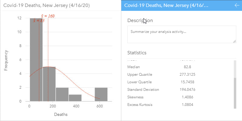
A histogram allows the distribution of numeric data to be explored. They allow visual assessment of distribution shape, central tendency, data variation and gaps or outliers in data values. Some statistics can be added to the histogram such as the mean, median and normal distribution. Additional related statistics can also be calculated on the data and, in ArcGIS Insights, are automatically included on the back of the chart cards to quantify the chart. A histogram with normal distribution is symmetrical and will have a skewness of 0. The direction of skewness is shown by the tail of the distribution so if the tail on the right is longer (as shown above), the skewness is positive. If the tail on the left side is longer, skewness is negative.
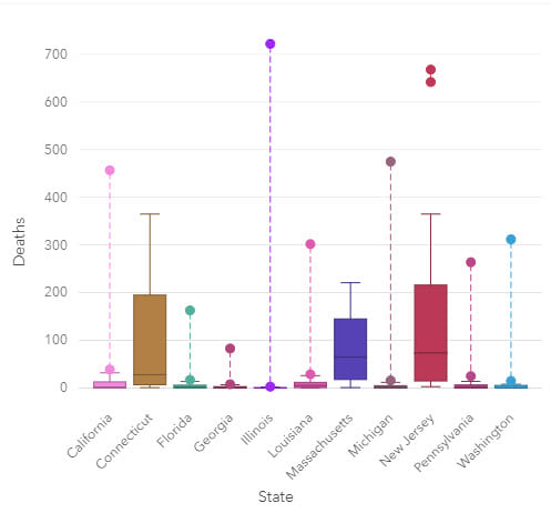
Box plots can be grouped by a categorical variable, such as state, which allows for a comparison of distributions. The data is plotted so that 50% of the data is inside the box between the lower (Q1) and upper (Q3) quartile and, the median is shown as a line. Whiskers contain a further 25% of the data, above and below the interquartile range (IQR), which is the length of the box (Upper quartile – lower quartile). Values that extend beyond 1.5 IQR are outliers.
Visually exploring data is a key step of analysis and can mitigate modeling errors. During modeling, data is often aggregated to ensure that there are enough data points in the analysis for it to have statistical robustness, but this step can hide missing data or data collection changes, such as changes in international classification of disease coding practices.
Different visualizations will give a different perspective on data and being able to explore and visualize data in numerous ways can help with understanding many aspects of the study data. The more involved the analysis, the more important it is to describe and visualize data before any modeling is carried out.
Temporal dimensions of health data
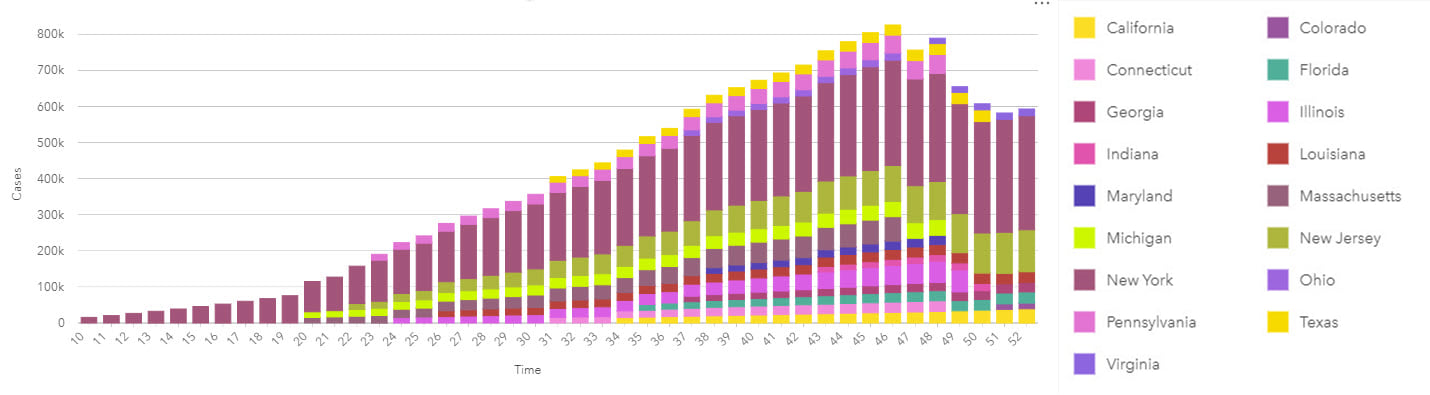
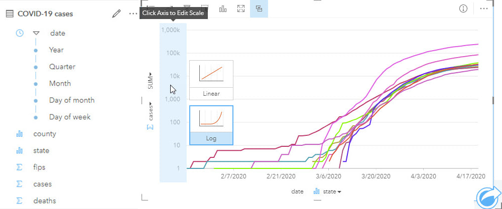
Time associations and patterns with epidemiological data are most commonly visualized using line graphs for continuous date/time data, and epidemic curves that traditionally use bars without gaps.
Epidemic curves graphically show the frequency of new cases compared to the date of disease onset. An epidemic or epi curve shows date or time of illness onset among cases on the x-axis and vertically, the y-axis shows the number of cases. The unit of time used is based on the incubation period of the disease and the time over which cases are distributed. The overall shape of the curve can reveal the type of outbreak (for example, common source, point source or propagated).
Epidemiological analyses can involve data that spans long periods of time (to capture sufficient events or rare outcomes), within which there may have been many changes to the data collection methodology. As part of the process of analysis, input data should be well understood, and limitations noted particularly for studies with complex interactions that may not be fully understood. The same might be true for new diseases which, by definition, will be poorly understood. Although past information and similar events will be used to understand potential patterns of disease spread over space and time, data reported in the early phases will be prone to unknown (and unquantifiable) error and uncertainty. This uncertainty has the additional impact of making it difficult to understand if previous events are in fact similar and, therefore, comparable.
Visualizing temporal data on a timeline helps to reveal data gaps, for example, in data collection. Analyzing data that may vary over space and time should not be done without evaluating the data prior to analysis, both temporally and spatially.
A lot of temporal analysis will use generic data, such as the results of decennial census surveys, to evaluate patterns among different population sub-groups. However, the further you are from a census year, the more the accuracy of that data will reduce. Although this limitation must be accepted, exploring the temporal differences between the known data may help modeling and can certainly help interpretation.
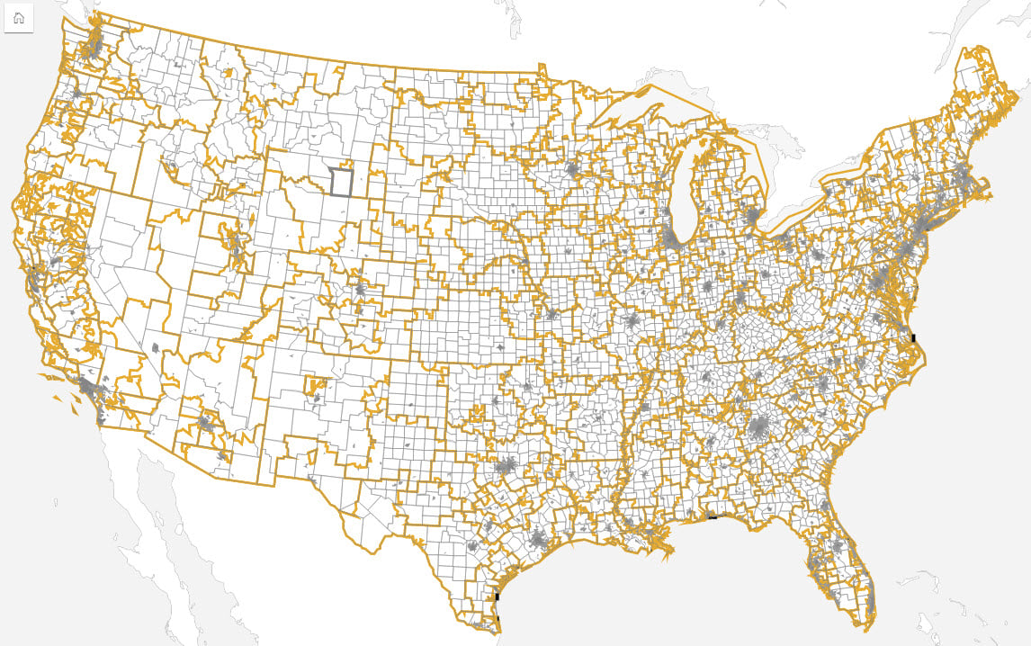
Dealing with different health geographies
Intervention and response areas can differ to those used for epidemiological analysis, with each having very different requirements. Response needs may be driven by health regions, for example, whereas analysis tends to be more closely aligned to census areas due to ancillary data availability and (often assumed) socio-economic homogeneity of those areas.
Spatial analysis can be used to define the study area(s). Filtering the data can be done by selecting areas from the map or using additional boundary datasets. This can be valuable to sub-divide data into exposed populations or cases and non-exposed or control populations. Most of the data used for analysis will be aggregated based on administrative boundaries, whereas exposed populations not defined by administrative areas.
In some cases, when the dataset contains spatial units as a data field, data can be analyzed non-spatially by different geographic boundaries. In other cases, when the data needs to be ‘shifted’ to geographic areas not contained in the dataset, spatial location can be used to ‘move’ the data to different areas. In these cases, the data can be available as individual counts or even total by area. Reapportionment of data between different geographies permits the translation of data between very different geographies and, thus, allows reporting of aggregated data at different boundaries.
Traditionally, there have been marked socio-economic differences between urban and rural populations. Although this trend is starting to change, spatial data accuracy and precision are often linked to population density, with rural areas tending to cover large areas that can encompass marked social and economic differences. These differences can result in disparities between urban and rural areas. Incorporating spatial analysis ensures that data can easily be stratified, for example by urban/rural areas for epidemiological modeling.
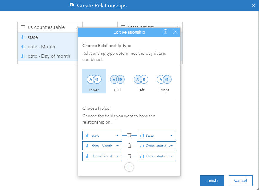
Different types of data joins for health analysis
Traditionally, a GIS stores spatial data as a feature by location. The data may be raster, using regular cells, or vector, using points, lines or polygons (areas). At each location there may be one or more associated pieces of information (for example, population by administrative area). However, in epidemiology, almost all analysis must include multiple components by location (for example, population by age and gender breakdown). Technically, this requires a one-to-many (feature to health and demographic variables) relationship.
To overcome these different data structures, data can to be joined as a step of the analysis so that each location, be that point, line or area, can be associated with multiple attributes or rows of information. This is a crucial step in ensuring that spatial and epidemiological analysis can be successfully integrated. Furthermore, in some cases, compound joins (for example, using location and time) are needed.
Summary
This blog has briefly outlined five topics of consideration in epidemiology and how ArcGIS Insights can be used as part of the analysis solution.
Many of these topics are far more involved and, as with all analytical work, effective analysis requires reliable data, in tandem with sound knowledge of previous relevant studies. An epidemiologist should be well versed in dealing with a lack of either and often, this is where true expertise lies.
Complex models and effective communication of results are a key part of the process. In Part 2 of this blog, we will explore those topics amongst others.

Commenting is not enabled for this article.