ArcGIS Insights allows all analysts to explore, visualize, and analyze GIS data with tabular business data. Interactive reports can then be shared with others who need to view, interact with, and understand the intelligence that has been created.
The Insights 2021.3 update is in ArcGIS Online (SaaS) now, just open the web application to see the new features. Insights in ArcGIS Enterprise (for your managed infrastructure) is available for download within MyEsri, and Insights desktop (Windows and Mac) is downloadable here.
Here’s a quick summary of the highlights:
- Temporal filter widget – a new way to filter your data, specifically for the unique needs of working with time and date fields.
- Reference table – a new option for visualizing your data within a table. It allows you to see granular record-level detail.
- View data source – the analysis view now provides the original source of data – whether it’s a path on disk, database connection and table, or ArcGIS feature layer.
- Public layers – a new resource for content is available, using ArcGIS Online. Thousands of datasets from organizations across the world are publicly shared and available.
- Customize the banner – the blue banner at the top of Insights is now configurable. Modify the color and icon to match your report.
- Export high resolution images – chart cards have the option to export as PNG or JPEG files.
Next, let’s dig into each of these a little bit deeper.
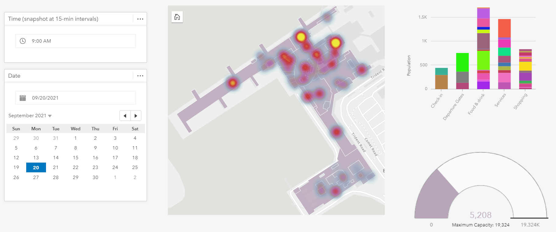
Temporal Filter widget
Time is a critical dimension and has some unique data considerations. We heard you loud and clear – you need simple and ample options for filtering by day and time. Please meet the new widget for filtering date and time data. Both analysts and viewers can define the date, time, date and time, or range. Results are then dynamically seen across all cards.
In the below example, we can understand how airport foot traffic varies throughout a day, by selecting the day and time. Explore this example live here.
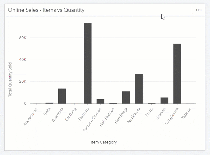
Reference Table
Sometimes you need a high-level data summary, other times you need to understand granular data detail. Insights now has a new reference table card to help deliver that granular data detail. While interacting with other cards and widgets, this table will communicate the raw data, meaning that values are not grouped or summarized.
When designing a report, you choose which dimensions to use and which to exclude from the table. Of course, this includes expected table features such as freezing columns, wrapping text, aligning text, graphic data bars for numeric fields, and the ability to style your table.
In the below example, watch how a reference table can easily be constructed.
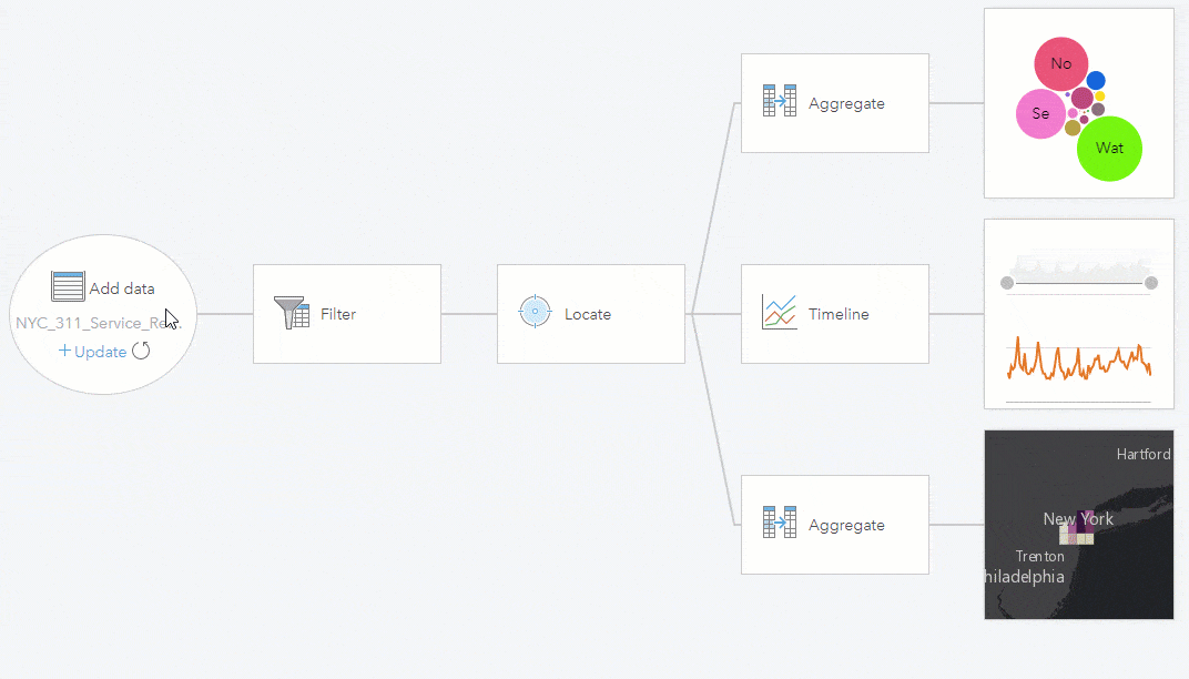
View the data source
Analysts need to understand the data being used. This includes where the data originated from, and currently lives. Is it a database table or view? Which database? Is it a feature layer, spreadsheet, other? Knowing the data source is crucial for understanding how the data updates, as well as recognizing data lineage. You can now view the original source of a dataset from the analysis view. This information is not included within shared reports for viewers.
Below, notice how the source of the NYC 311 service requests can be seen as a table living within the “Snowflake demo large warehouse” data connection.
Public data from ArcGIS Online
One of the greatest powers of GIS is to relate things (spatially) that are otherwise unrelated. The number of spatial datasets available to you for making these relationships just got a lot bigger. When adding data, there is now an option for accessing public layers in ArcGIS Online. Once added, it acts just like your own dataset – overlay it with other data, create relationships with it, and use it for analysis. In addition to adding public data – public models and themes can also be added to Insights.
This video shows how publicly shared ArcGIS Online content can be directly added to Insights.
Customize the banner
Interactive reports should feel authoritative and are capture the viewer’s attention. Another customization option is available to help in this area. The Insights’ horizontal blue banner and icon can now be customized – choose your own color for the banner and choose your own image for the icon. Once modified, it applies to all pages within your workbook.
This video shows how to customize the workbook banner and icon.
Export to high-resolution images
The static image of a chart is often needed within a document, slide presentation, or even a website. This image needs to be as crisp and clear as possible. Chart cards now have the ability to export to a high-resolution image. The image will reflect the current state of the chart, including any selections or filters that are applied. Analysts control if this option is available to the viewers of the shared report.
Notice that when a chart card is flipped, the new image export option is available.
…and more!
A more complete description of what’s new is available within the help documentation. You’ll notice other nice additions such as:
- Viewers are able to make selections on the map (single, box, lasso, zoom to selection, invert selection).
- Table joins can now be performed on time and date fields
- Connections to Snowflake and Google Big Query have the option to choose a schema to work with.
- Snowflake, Google BigQuery, and custom JDBC data connections have even more spatial capabilities
- Workbook packages are now a formal item type within ArcGIS Online and Enterprise. Workbook packages are a great way to import, export, and share your work.
Surely these new capabilities are motivation for revisiting how your data and challenges can be aided by location analytics. As a next step, here are some resources to give you a hand: a free trial, self-guided learn lessons, and videos.
Let us know what you think within the ArcGIS Insights Community space, we’d love to hear from you.


Article Discussion: