We are proud to release another ArcGIS Insights update. This release includes even more charting and analysis, with simplified ways of getting your job done.
Scatterplots are enhanced, maps with chart symbols are expanded, and a new filter option is available. Spatial aggregation is strengthened, more statistics are in analysis tools, and geometry can easily be calculated. Let’s dig in…
Calculate Geometry
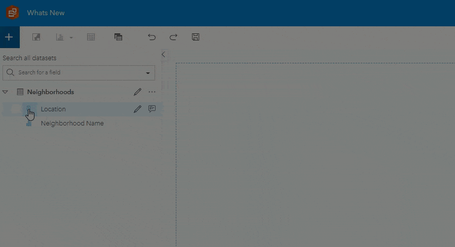
Putting your data on a map is foundational and a great start. The geometric representation (point, line, or polygon area) provides not only the ability to create map visuals, but also perform spatial analysis. We now have the ability to calculate area, perimeter, and length for polygons and lines. Once these numeric values are part of your data, you can do all sorts of valuable things, such as:
- Produce a total area or length covered, and then break it down category type. For example, a county could have 400 square miles (40%) developed, and 600 sqare miles (60%) undeveloped land.
- Derive ratios per unit area or length. For example, 500 cases per square mile or 3 incidents per kilometer. This also provides a way to normalize your data, for understanding comparisons between features or records. Normalizing your data is a key step for properly representing your data on a choropleth map.
Insights allows you to calculate area and perimeter for polygon data, as well as length for line data.
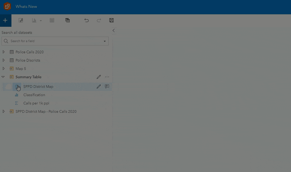
Maps with Chart Symbols, using numeric data
What’s better than charts and maps working interactively side by side? How about charts on a map! Pie and column charts with categorical (string) fields have already been available, but now these same charts can be enhanced further with a numeric or ratio field. The number field and chosen statistic are used to determine the sizes of the pie segments or heights of the columns. The workflow for creating these has been streamlined, create by dragging and dropping your data into a map.
Embed pie and column charts into your map, with sizing of those charts representing a numeric or ratio value.
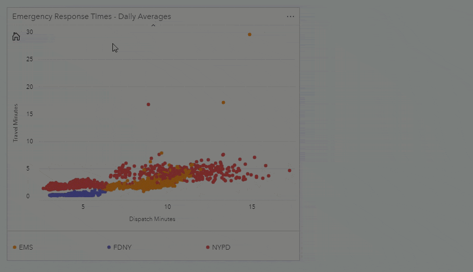
Scatterplot customization
Scatterplot now supports adjusting the size of point symbols. Use these settings to make your scatterplot more easily interpretable, especially when there are a smaller number of points, or large number of points clustered together.
Scatterplot point symbols can be styled.
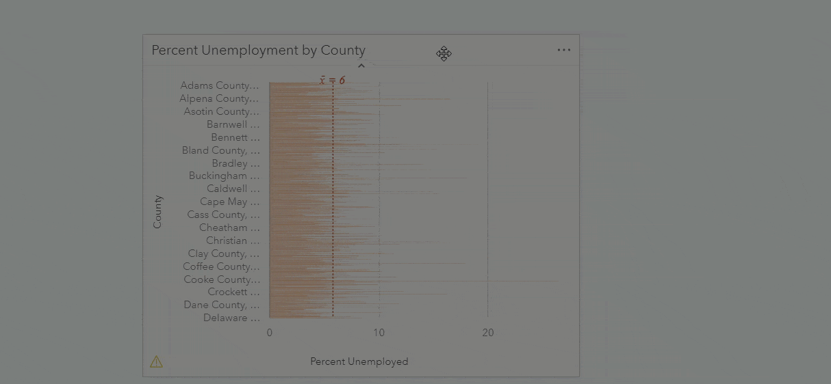
Top or Bottom n filters
The top n records and bottom n records can now be filtered at the card level for bar, column, bubble, line, and donut charts. This lets you quickly and easily identify those records that have high or low values. For example, which 10 neighborhoods have the most traffic accidents, or which 5 stores have the lowest annual sales?
Easily identify and visualize records with the highest and lowest values.
Give it a try
Plus, there’s more! Have a look at the help documentation for a formal and complete list of new capabilities and features added.
ArcGIS Online is now updated. After Thursday Oct 1st, you can download the new Insights Desktop version here and access the new ArcGIS Enterprise installation from MyEsri.
Sometimes it’s helpful to hear how others have gained insights by reading their story.
Need some guidance getting started using the software? Check out the new learn path, Perform analysis in ArcGIS Insights.
We’d also love to connect with you, whether it’s through GeoNet, LinkedIn, or the Ideas site.


Article Discussion: