In a previous blog we discussed some general themes relevant to emergency response and how ArcGIS Insights can be applied to these workflows. If you haven’t already, I’d suggest checking it out.
If you’re ready for more, then you’ll love this. In this blog I’ll be taking those themes and building them into a workbook. I’ll dive into using Insights and illustrate how to compile data, perform analysis, and generate some of the core visuals and metrics. Consider this a walkthrough for authoring a workbook geared towards developing a standards of cover document or self-assessment for accreditation.
Data
For simplicity, I’ll be keeping my initial data shopping list short. I’m assuming that these data layers are readily available within your agency. Any other inputs we’ll use are a bonus that we’ll source from elsewhere.
- Call logs: this data comes from a publish safety answering point (PSAP) and contains a record for every incoming 911 call. Additional measures like timestamps and incident type are also included.
- Fire stations: quite simply the location of stations within your service area. These locations will be used to help visualize resource distribution (and for some additional neat visuals).
- Response zones: these zones delimit boundaries defined by your agency and indicate the individual service area for units deployed across your agencies.
Preparation
As with any workflow, there are steps we can perform up front that will make our work easier. In this case, we’ll enrich our data, calculate fields, and classify data to prepare it for analysis.
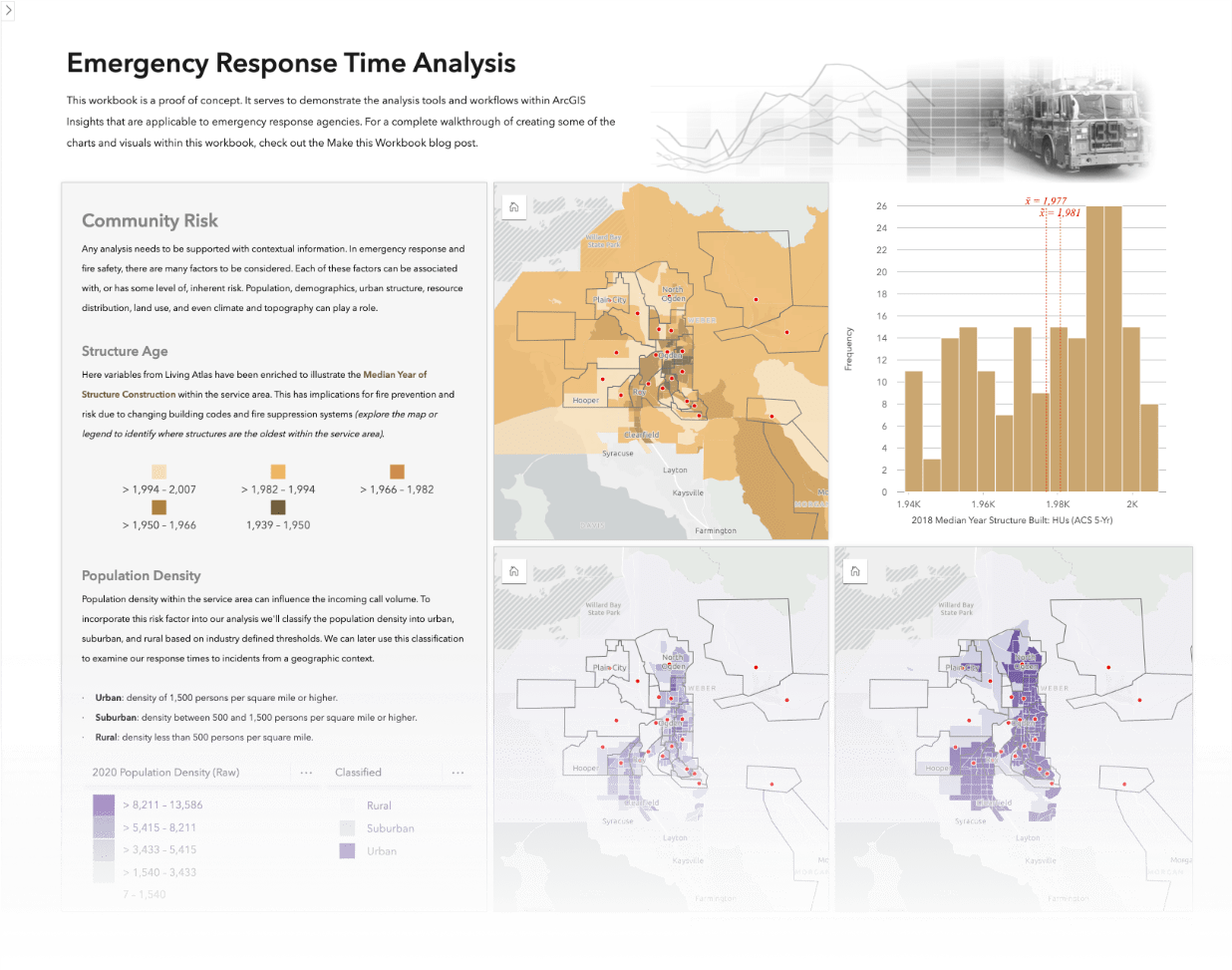
Population and Demographics
Incorporating the population and demographics within your agency’s service area is useful for providing context to our analysis. As mentioned in the previous blog, population density and age can help inform the community risk level within your service area.
Enrichment
Since we didn’t start out with any population data or reporting boundaries, I’ll demonstrate how to gather this data from Living Atlas and through data enrichment. Alternatively, this data may already exist within your organization’s portal and you could simply grab it from there.
First up is some reporting boundaries. I added US Census Block Group boundaries from Living Atlas and created a subset of the block groups in my study area. Next, I enriched these features with population variables. Additionally, you could browse for other variables that would add further context in terms of risk. Variables like median structure age, household density, and relative road density can also help frame your analysis.

Population Classification
This is a great start. We can create a map to illustrate how the population is distributed throughout our service area. We’ll go ahead and encode the broad classification of urban, suburban, or rural using this dataset. This classification will be used to segment incidents to report their response times within a geographic context.
We want to use the population density variable to classify our block groups into the following classifications:
- Urban: population density of 1,500 persons per square mile or higher.
- Suburban: population density between 500 and 1,500 persons per square mile or higher.
- Rural: population density less than 500 persons per square mile.
To classify the population density, we’ll add and calculate a new field using a series of `IF()` logical functions. With a simple expression we can classify the population density into the above groupings an assign a text attribute.
IF(Population Density >= 1500, “Urban”, IF(Population Density < 1500 AND Population Density > = 500, “Suburban”, “Rural”))

Pretty straightforward right? This almost brings me back to my number-crunching spreadsheet days. Now that our population density is classified, we can turn our attention to the preparation of the incident call data.
Call Data
The incident calls are at the core of our analysis. They contain a wealth of data that we can analyze to create actionable information. For instance, we can investigate trends in when and where incidents are occurring. These insights can be used to identify spatial or temporal trends and ultimately help anticipate service demand and allocate resource accordingly.
Split Times
I’ll start by looking at the temporal aspect of the data. Typically, the call data has a series of timestamps indicating when it was recorded, processed, when first responders were notified, and so on. Altogether, these timestamps describe how the call progressed through the emergency response continuum.
Calculating the elapsed time between these points yields metrics for response time, turnout time, travel time, and more. To calculate these measures let’s jump into the data table and calculate some more fields.
This time around we’ll use TIMEDIF() from the date functions to calculate the elapsed time, in seconds, between two times. I’ll repeat this for each time point of interest. The elapsed time measures will be used to report several metrics pertaining to response time performance.
Location
In addition to the timestamps, the incidents will also have a location. Whether defined by an address, coordinates, or perhaps both; enabling the location for this data provides a spatial context to the incidents.
In terms of our analysis, spatial context is exactly what we’re seeking. Ultimately, we’d like to identify which incidents occurred in urban versus rural environment and frame response times appropriately.
To accomplish this task, we’ll use a spatial join to append attributes from our block group layer to our incident data.
The population density classification from the intersecting block group now exists on our incident data. That essentially wraps up our data preparation! From here on out we’ll be tossing data around and creating visuals and metrics.

Deliverables
The obvious next question is “Where do we start and how can we use visuals to communicate the information we gain from our analysis?”. When conducting this type of response time analysis, a number of standards must be met (as outlined in the IAFC Standards of Response Coverage template). These standard highlight several core deliverables pertaining to historical incident data. Let’s examine these further and walk through how to create them with ArcGIS Insights (hint: we’ve already laid much of the groundwork).
Incoming Call Volume
If we look at the actual incident history and call volume, we can attempt to understand how service demand within the community fluctuates. Gaining insights from historical demand trends can help anticipate future demand. Incoming call data is often analyzed on a variety of temporal scales to understand how volume changes, hourly, daily, monthly, or yearly basis.
Call Volume Heat Chart
Heat charts, data clocks, and time series are just a few of the chart options in Insights that are well suited to visualizing this data. In addition, ArcGIS Insights helpfully parses elements of date information into their components. This simplifies the aggregation of calls by exposing the hour of the day, or day of the week, etc. from our call data. Firstly, I’ll start with visualizing the frequency of calls by hour of the day and day of the week. I’ve opted for using a heat chart in this case and dragged the Day of week and Hour to the chart drop zone.

I prefer a heat chart here since there are many bins on either axis. Additionally, I’ve found that the gridded structure of heat charts makes comparisons between days and times easier, as opposed to the circular structure of a data clock. We can immediately see when call volumes are greatest throughout each day and throughout the week.
I’ll spend a little time up front here to configure some formatting. I’ll configure the colour scheme, axis labels, and chart title now since it will save us some time in the next step.
Filtering Volume by Type
You’re obviously not limited to just this chart so let’s create another. This duplicate chart can be used to compare the volume of emergency and non-emergency calls. Copying and pasting our heat chart preserves all our formatting. Then we can make a few quick adjustments to the card filters to isolate the call types. Just like that it we’ve got two charts we can use to compare call volume by type.
This is just one example of how you could filter and visualize the call volume. You could filter out holidays, examine a particular call type, or a specific timeframe of interest. Go ahead, feel free to try out some other visualizations. Swapping visual types is as easy as clicking the ‘chart type’ picker in the card header.

Response Time KPI
Moving right along, let’s tackle a response time metric next. Reporting response times based on historical call data provides an indicator of past performance. These performance benchmarks are based on industry best practices and can be used to drive continuous improvement within the organization.
To create these metrics, we’ll dive back into the call data. It would be helpful to create an additional summary field to hold the total elapsed time pertaining to the response portion of the continuum.

With this new column we have a measure of how much time elapsed between being notified of the incident and arriving on scene. The measure of past response times is an important baseline performance indicator so appropriately, we’ll report it using a Key Performance Indicator (KPI) card.
KPI Configuration
Dropping our response time value into a KPI card gives us SUM of our Response Time. Not quite something that we can use. The real value of the KPI card really comes from additional configuration so let’s look at all the options. We can easily convert the SUM to a percentile PCTL, and we’re prompted to input a value. The industry standard is to report response time at the 90th percentile so I’ll use ’90’ here. Already this KPI indicator is much more useful.
In the style tab, I’ve also converted our KPI to a Gauge. An additional option here is to provide a Target and a Target label; this can be useful to provide an established objective for your agency’s response time and a marker will be added to the gauge. The marker provides a visual cue when assessing how actual responses times compare to your objective.

Geographic Context
Now we have ourselves a useful indicator! Let’s go just that little bit further. If we apply a filter to this card and filter using the classified population density that we spatially joined earlier, we can report the response times specifically for urban incidents. A quick copy/paste of our configured KPI card, and we can report the rural incidents by modifying the filter.

Unit Hour Utilization
Finally, let’s tackle something a little more involved. Analyzing trends in the call volume allows us to begin to anticipate demand and where resources may be required. We can also examine our agency’s ability to respond to those incidents at any given time based on resources. To accomplish this, we’ll create a chart of unit hour utilization (UHU).

Unit hour utilization is a standardized measure of workload. It is useful as a metric for reporting the amount of time a unit spends on emergency incidents. To calculate UHU, divide the time a unit is committed to incidents by the total time a unit would theoretically be available within that reporting period, typically this would a year. This yields a value expressed as a percentage indicating the amount of time a unit is committed and thereby unavailable for assignment to subsequent/concurrent calls.
UHU Calculation
Like calculating the response time, I’ll add yet one more field to contain to total elapsed time that a unit was responding to each incident. As an example, here’s my quick formula breakdown.
(TIMEDIF(arrived,complete,"mm") /60)
With a measure of time committed to each incident I’ll create summary table from the Arrived – Hour, Unit, and our newly calculated Incident time. This table records the time a unit was committed to an incident and ‘busy’. Bearing in mind this doesn’t account for other tasks such as, training, maintenance, out of service etc.
We’ll take this committed time and calculate what percentage it represents of each unit’s theoretical available time. I’ll add a column to our table result dataset to contain this measure and calculate it, assuming every unit is available 24/7, divide it by 8760 (hours in a year)
(Committed Time/8760)*100

The resulting UHU% column and the original Hour and Unit can be used to create our final heat chart to visualize the complete unit hour utilization. An additional chart is helpful to summarize the UHU metric and indicate the total percentage of time each unit it actively responding to an incident.
I’m going to add a trusty bar chart to this workbook using the Unit and UHU%. Sorting the data and adding a custom chart statistic at 25% will serve to indicate the 25-30% threshold where UHU rates can become problematic.
Summary
Congrats, you made it! We’re all finished here but that doesn’t mean you have to stop. I’d like to encourage you to try out just a few other tools, charts, analysis you could try. Chord diagram, drive-time analysis, and link charts are just a few that I think would be interesting to explore. These suggestions open new possibilities for visualizing your data and can’t take your analysis up a notch.
Through this walkthrough we’ve built a workbook with some core indicators used in emergency response analysis and shown how you can create them using Insights. There’s also a few tips & tricks sprinkled throughout. Hopefully this kickstarts the analysis of your own analysis dispatch data. If you’d like some more inspiration, suggestions, or reference be sure to check out this completed workbook. I’ve continued to build out what we’ve started here and experimented with a few bonus items. To dig into the details be sure to check behind the scenes and view the analysis model in the shared page where the methodology has been helpfully documented.


Article Discussion: