Creating actionable information from your data can yield a deeper understanding of patterns and trends contained within. Awareness of these trends can help guide future policies and inform better decision-making. Increasingly these data-driven approaches are being applied across a broad spectrum of industries. One such application that I’d like to discuss is within the realm of public safety and emergency response.
As with most applications, emergency response involves the analysis of an array of datasets from a variety of sources and formats. In particular, spatial and tabular datasets such as demographics, response zones, resources, and dispatch records all feed into the equation. Having had some experience preparing 9-1-1 dispatch records for analysis, I can say that it’s all too easy to get lost amongst the many rows of dispatch logs. However, the effort is worth it. Through incorporating all of these inputs we can conduct a holistic assessment of response times, service demand, and resource utilization. Data-centric measures generate from our analysis will ultimately form the basis of the decision-making process. For instance, empirical benchmarks can be applied to assess and guide objectives as well as inform future policies such as Standards of Cover and the process of Accreditation.
In this blog I’ve gathered a collection of relevant themes. I’ll aim to outline how ArcGIS Insights, as an intuitive platform for GIS experts and non-experts alike, can be used for performing this analysis. We’ll look at some of the datasets and charts that form the common deliverables and how these can be achieved. In addition, we’ll provide examples of how you can begin the analytical process and author compelling visuals to communicate your results.
Understanding Risk
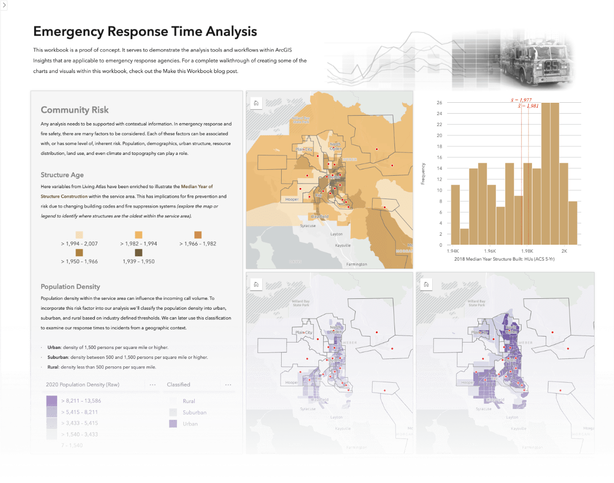
Any analysis needs to be supported with contextual information. In emergency response and fire safety, there are many factors to be considered. Each of these factors can be associated with, or has some level of, inherent risk. Population, demographics, urban structure, resource distribution, land use, and even climate and topography can play a role.
The first step is to provide decision makers with a sense of the scope and complexity of the risk factors. We need to visualize these variables and illustrate how they can influence the ability to respond to incidents. For instance, it’s useful to explain some general trends such as:
- Incidents in rural areas generally having longer travel times
- Densely populated areas generally have higher incident rates
- Industrial or manufacturing areas pose different hazardous material risks compared to residential areas.

These contextual data layers may come from a combination of internal or external sources. If putting out fires is your primary job description, wrangling this data may appear daunting. The good news is regardless of whether GIS staff within your organization maintain this content, or it comes from an external source, you can easily add it to Insights and use it. If you can’t source it, there’s a good chance you can get it from Living Atlas or by enriching your data.
Incident Patterns
Incident call data typically has a location, either an address or coordinate or perhaps both. It also has a temporal aspect in series timestamps. These timestamps are based on when the call was recorded and each sequential stage of the response continuum. Analyzing this data from both the temporal and spatial angles can help develop an understanding of demand within the service area.
The incident history can be examined in a number of ways but frequently aims to identify trends and patterns such as:
- When are calls occurring, are there times we experience higher volumes?
- Are there trends in the types of calls we’re receiving?
- Where are these incidents located?
- Is there a larger temporal trend that we need to be aware of?
Mapping incidents by geocoding enables the exploration of their spatial distribution. Further analyzing the location and density or aggregating them to a geographic level for reporting, such as response zones, yields useful visualizations and metrics. Additionally, we can compare this new information with the contextual risk layers and begin to ask questions of the data; either to validate our assumptions or investigate anomalies. For instance, we can begin to investigate questions such as “Why were there more calls in this area than we would anticipate based on population?”.
Using Heat charts, data clocks, or time series charts unlock temporal analysis opportunities and are useful visualizing incoming call volumes. Examining the call data from this perspective can expose patterns within the data. Charting the call volume trends can reveal when demand is greatest within the community and how it changes over both time and location. ArcGIS Insights helpfully parses elements of date information, simplifying the aggregation of calls by hour of the day, or day of the week.

With these insights in hand, we can provide decision-makers with information pertaining to temporal or spatial trends within the incident data. Through our analysis we can identify where and when your agency might be able to anticipate higher demand and allocate resources accordingly.
Assessing Response Performance
With community risk defined and service demand understood our analysis has sufficient context. Now to assess the performance of our agency in its ability to respond to those incidents.
As mentioned, the call data has a series of time stamp attributes. These stamps describe when that call came in, when it was processed, when first responders were notified, when they arrived, and so on. Elapsed time between these points can be used to measure how that incident progressed through the emergency response continuum. Some insights can be gained from analyzing these events such as:
- How much time is spent on the call types?
- Which part of the response continuum takes the most time?
- Where and when are our response times the longest?
- How do our response times to calls compare to our goals in urban or rural areas?
Analysis of timestamps can be performed with just a few of the field calculation formulas within ArcGIS Insights. Parsing each point in the response continuum with these calculations yields the time spent on each incident and during each stage. Performance metrics can be analyzed with this data.
Typically, we want to understand how much time elapsed between each stage of the response continuum. From the elapsed times we can evaluate whether response objectives were met. Assessment of response time is conducted based on the industry standard of the 90th percentile. Using the 90th percentile, as opposed to another statistic, is used to ensure that the analysis reports unit response performance for 90% of the incidents (or more commonly phrased “90% of the time”). We can use the spatial capabilities of Insights to spatially join the location of incidents, and their respective response times, with the contextual layers. Transforming our data in this manner allows the categorization of urban versus rural incident locations and accommodates the geographic context of response times.

Resource utilization and assessing the ability of units to respond to incidents is another aspect of analyzing response times. Call volume, mentioned previously, and the duration of an incident impact the ability of a unit to respond to concurrent calls. Analyzing the trends in incident volume and the time units are allocated at any given time can provide valuable insights into resource utilization.

Communicating Results
The dispatch calls contain an abundance of analytical possibilities. The examples discussed here are just the beginning. This data could be further explored to create additional results, visuals, and metrics.
Having prepared and performed the analysis, you’re well versed in the data and its intricacies. However, those involved in the decision-making process may not have the same background or breadth of knowledge. Therefore, it’s essential to effectively communicate the results of your analysis to inform the decision-making process.
Whether preparing to present your analysis to decision-makers or the broader public, ArcGIS Insights has options for sharing your work either directly, through sharing your analysis model (for others to repeat your analysis) or your workbook page, or even by incorporating it into various other apps like StoryMaps.
Summary
In this blog I’ve illustrated how ArcGIS Insights can be used to gather contextual information, analyze incidents spatially and temporally, and evaluate key performance metrics within a response time analysis workflow.
With this data-based evidence and a thorough understanding of risks, incident trends, and response performance agencies can make data-driven decisions within their future policies and strategies.
If this lands squarely in your area of interest, stay tuned for a future blog post where I’ll work through a practical example and create a sample workbook.


Article Discussion: