Recently, I built a web app using the ArcGIS API for JavaScript (ArcGIS JS API) where I visualized COVID-19 data in a time series animation. The app allows users to explore various visualizations of COVID-19 cases and deaths through time.
While the visuals and the animation stand well on their own, I wanted to present meaningful information to users on a county-by-county basis. On each click they would see a popup, complete with informative figures and charts. However, I had a problem — not all the data were available to me as field values.
Thanks to ArcGIS Arcade and a few JavaScript functions, I wrangled the data into a series of six charts. Despite the more than (gulp) 1,200 Arcade expressions needed to make the charts work, I was pleasantly surprised the popup still displayed with minimal delay. Read on to learn how you can generate Arcade expressions for displaying effective interactive charts in popups.

Check out this blog post where I describe the methodology behind creating each of the visualizations in this app.
Popups and charts
In the ArcGIS JS API, you can define popups containing one or more elements that display data about a selected feature. In most cases, the data come from fields in the layer. Field names are typically wrapped in curly braces to act as placeholders for the data values within a content element of a PopupTemplate.
// Popup template displaying the winner of an election
layer.popupTemplate = {
  title: "{COUNTY}, {STATE}",
  content: "{WINNER} won the presidential primary here with {WINNER_VOTES}."
};
But you can display more than just text in popups. You can add tables, attachments, images, charts, and other custom content such as widgets and HTML elements.
When it comes to charts, you can define bar, column, pie, or line charts by referencing data as an array of field names. The following snippet shows how you can create a column chart comparing the number of one-vehicle, two-vehicle, or three-vehicle households in a layer of census tracts, assuming these numbers are stored in separate fields.
layer.popupTemplate = {
  title: "{COUNTY}, {STATE}",
  content: [{
    type: "media",
    mediaInfos: [
      {
        type: "column-chart",
        title: "Number of households with one, two, or three registered vehicles",
        value: {
          fields: [
            "ONE_VEHICLE",
            "TWO_VEHICLES",
            "THREE_VEHICLES"
          ]
        }
      }
    ]
  }]
};

Creating new values from Arcade expressions
Sometimes the data you want to illustrate needs to be derived from one or more existing fields. It may even be stored as a non-number type like a string, or date.
This was the case with the Viral app, but it also went beyond not having all the data I wanted to display. The data I did have was represented as multiple values in a single string, not as a number.

This data format appears strange, but it was organized this way for good reason. The goal was to map multiple COVID-19 variables for each day and animate them through time. Each field in the layer represents all the data for one day, which could potentially contain several values, separated with a pipe character (i.e. |). This format allowed us to have all the relevant information for each feature in one layer, where the number of cases and deaths were stored in a single field for each day.

Read the Get to know the data section in a previous blog to learn more about the thinking behind this data format.
This is where Arcade comes in. Arcade allows you to parse and cast these values as numbers, and use them to calculate other values. For example, the following expression retrieves the number of cases from a field value, formats it, and returns it for display in the popup.
// value on 8/4/2020 is "5082|27" or 5,082 cases and 27 deaths
var currentDayValue = $feature["DAYSTRING_08_04_2020"];

// returns [ "5082", "27" ]
var parts = Split(currentDayValue, "|");

// returns 5,082
var cases = Number(parts[0]);
return Text(cases, "#,###");
Display a value from an Arcade expression
Arcade expressions are managed in the expressionInfos property of the PopupTemplate. You reference the result of the expression as you would a value coming from a field, except the term expression/ precedes the name of the expression.
layer.popupTemplate = {
  title: "{COUNTY}, {STATE}",
  content: `
    {expression/cases} cases were reported here,
    with {expression/deaths} resulting in death.`,
  expressionInfos: [{
    name: "cases",
    title: "Total COVID-19 cases",
    expression: `
      // value on 8/4/2020 is "5082|27" or 5,082 cases and 27 deaths
      var currentDayValue = $feature["DAYSTRING_08_04_2020"];

      // returns [ "5082", "27" ]
      var parts = Split(currentDayValue, "|");

      // returns 5082
      var cases = Number(parts[0]);
      return Text(cases, "#,###");
    `
  }, {
    name: "deaths",
    title: "COVID-19 related deaths",
    expression: `
      // value on 8/4/2020 is "5082|27" or 5,082 cases and 27 deaths
      var currentDayValue = $feature["DAYSTRING_08_04_2020"];

      // returns [ "5082", "27" ]
      var parts = Split(currentDayValue, "|");

      // returns 27
      var deaths = Number(parts[1]);
      return Text(deaths, "#,###");
    `
  }]
};
This allowed me to display several meaningful variables in the popup with a text element and a fields element.

Generating expressions
While all that content is good, I really wanted to add some charts that displayed how some of these variables changed over time, including total cases, deaths, doubling time, new cases, estimated active cases and recoveries.
The challenge with creating charts from Arcade expressions is that each chart object in the popup template expects a series of numeric field names. Because of the data format, I needed to reference an Arcade expression that generated each data point for each chart.
Given the number of days since the first reported case of COVID-19 had already passed the 200-day mark, that meant I needed more than 200 expressions for each of the six charts (or more than 1,200 expressions in total).
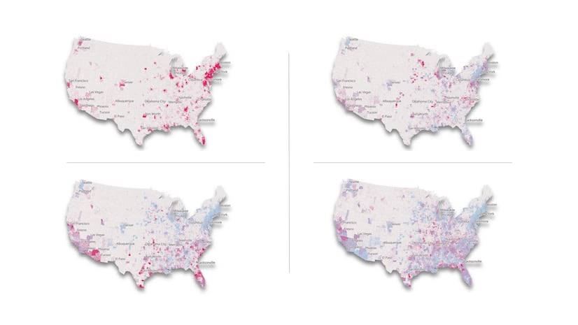
Since writing that many individual expressions would be absurd, I wrote a few functions in JavaScript to generate all the expressions I needed and place them in their proper places in the PopupTemplate. I was satisfied with the resulting charts, which you can observe in the image below (click the image to enlarge it).

I’ll use the active cases chart to demonstrate how this works. Since the number of active cases is not reliably reported, the CDC approximates this number with a formula:
active cases =
  (100% of new cases from last 14 days) +
  (19% of cases from days 15-25) +
  (5% of cases from days 26-49) -
  deaths
Since I have all the data I need to compute this value in various fields of each feature, I wrote a function that generates the Arcade expression that approximates the number of active COVID-19 cases for a given date.
Note the getFieldFromDate function, which builds the field name for the data required from specific dates.
Expand to view the function
export function createActiveCasesExpression(currentDateFieldName: string){
  return `
    function getFieldFromDate(d) {
      var fieldName = "DAYSTRING_" + Text(d, "MM_DD_Y");
      return fieldName;
    }

    var currentDayFieldName = "${currentDateFieldName}";
    var currentDayValue = $feature[currentDayFieldName];
    var currentDayValueParts = Split(currentDayValue, "|");
    var currentDayCases = Number(currentDayValueParts[0]);
    var currentDayDeaths = Number(currentDayValueParts[1]);

    var parts = Split(Replace(currentDayFieldName,"DAYSTRING_",""), "_");
    var currentDayFieldDate = Date(Number(parts[2]), Number(parts[0])-1, Number(parts[1]));

    // Active Cases = (100% of new cases from last 14 days
    // + 19% of days 15-25 + 5% of days 26-49) - Death Count

    var daysAgo14 = DateAdd(currentDayFieldDate, -14, 'days');
    var daysAgo15 = DateAdd(currentDayFieldDate, -15, 'days');
    var daysAgo25 = DateAdd(currentDayFieldDate, -25, 'days');
    var daysAgo26 = DateAdd(currentDayFieldDate, -26, 'days');
    var daysAgo49 = DateAdd(currentDayFieldDate, -49, 'days');

    var startDate = Date(2020, 0, 22);

    var deaths = currentDayDeaths;

    if (daysAgo15 < startDate){
      return currentDayCases - deaths;
    }

    var daysAgo14FieldName = getFieldFromDate(daysAgo14);
    var daysAgo14Value = $feature[daysAgo14FieldName];
    var daysAgo14ValueParts = Split(daysAgo14Value, "|");
    var daysAgo14Cases = Number(daysAgo14ValueParts[0]);
    var daysAgo14Deaths = Number(daysAgo14ValueParts[1]);

    var daysAgo15FieldName = getFieldFromDate(daysAgo15);
    var daysAgo15Value = $feature[daysAgo15FieldName];
    var daysAgo15ValueParts = Split(daysAgo15Value, "|");
    var daysAgo15Cases = Number(daysAgo15ValueParts[0]);
    var daysAgo15Deaths = Number(daysAgo15ValueParts[1]);

    if (daysAgo26 < startDate){
      return Round(
        (currentDayCases - daysAgo14Cases) +
        ( 0.19 * daysAgo15Cases )
        - deaths
      );
    }

    var daysAgo25FieldName = getFieldFromDate(daysAgo25);
    var daysAgo25Value = $feature[daysAgo25FieldName];
    var daysAgo25ValueParts = Split(daysAgo25Value, "|");
    var daysAgo25Cases = Number(daysAgo25ValueParts[0]);
    var daysAgo25Deaths = Number(daysAgo25ValueParts[1]);

    var daysAgo26FieldName = getFieldFromDate(daysAgo26);
    var daysAgo26Value = $feature[daysAgo26FieldName];
    var daysAgo26ValueParts = Split(daysAgo26Value, "|");
    var daysAgo26Cases = Number(daysAgo26ValueParts[0]);
    var daysAgo26Deaths = Number(daysAgo26ValueParts[1]);

    if (daysAgo49 < startDate){
      return Round(
        (currentDayCases - daysAgo14Cases) +
        ( 0.19 * ( daysAgo15Cases - daysAgo25Cases ) ) +
        ( 0.05 * daysAgo26Cases ) -
        deaths
      );
    }

    var daysAgo49FieldName = getFieldFromDate(daysAgo49);
    var daysAgo49Value = $feature[daysAgo49FieldName];
    var daysAgo49ValueParts = Split(daysAgo49Value, "|");
    var daysAgo49Cases = Number(daysAgo49ValueParts[0]);
    var daysAgo49Deaths = Number(daysAgo49ValueParts[1]);

    deaths = currentDayDeaths - daysAgo49Deaths;
    var activeEstimate = (currentDayCases - daysAgo14Cases) +
      ( 0.19 * ( daysAgo15Cases - daysAgo25Cases ) ) +
      ( 0.05 * ( daysAgo26Cases - daysAgo49Cases) )
      - deaths;

    return Round(activeEstimate);
  `;
}
This expression and its containing expressionInfo object needed to be generated for each day in the dataset. The following function does this by taking the date of the first reported case and yesterday’s date as the startDate and endDate parameters.
View code snippet
function createTotalActiveCasesExpressionInfos(startDate: Date, endDate: Date) {
  const expressionInfos: ExpressionInfo[] = [];

  let currentDate = startDate;

  while (currentDate <= endDate){
    const currentFieldName = getFieldFromDate(currentDate);
    expressionInfos.push( new ExpressionInfo({
      expression: createActiveCasesExpression(currentFieldName),
      name: `total-active-${currentFieldName}`,
      title: formatDate(currentDate)
    }));
    currentDate = getNextDay(currentDate);
  }
  return expressionInfos;
}
Putting it together
Once the expressions and their info objects are generated, I generate FieldInfo objects for formatting tooltip values, and the list of expression names to reference in the chart.
const activeExpressionInfos =
  createTotalActiveCasesExpressionInfos(initialTimeExtent.start, initialTimeExtent.end);
const activeExpressionNameList =
  activeExpressionInfos.map( expressionInfo => `expression/${expressionInfo.name}` );
const activeExpressionFieldInfos =
activeExpressionNameList.map(function(name:string){
  return {
    fieldName: name,
    format: {
      places: 0,
      digitSeparator: true
    }
  };
});
With all the required elements now created, the popup template can then be pieced together.
View code snippet
layer.popupTemplate = {
  title: `{Admin2}, {Province_State}, {Country_Region}`,
  // request all data at once to improve UX
  outFields: ["*"],
  content: [
    // include other text and
    // fieldInfos content items here
    {
      type: "media",
      mediaInfos: [
        {
          type: "line-chart",
          title: "Estimated active cases",
          value: {
            fields: activeExpressionNameList
          }
        }
        // include other charts here
      ]
    }
  ],
  fieldInfos: activeExpressionFieldInfos,
  // concat field infos from other content elements
  expressionInfos: activeExpressionInfos
  // concat expressionInfos from other charts and tables
};
Once added to the PopupTemplate, the user can now see an interactive chart representing active COVID-19 cases as they increased and decreased over time.

Check out this GitHub repo, which contains all the source code, to see how the popupTemplate is assembled.
Final Thoughts
While the popup performs reasonably well with so many Arcade expressions, it can still take a while to load if the user clicks an area that returns several features. The number of expressions grows as the layer updates with new data each day. So I may need to simplify the popup as the pandemic matures.
Also, the popup is considerably slower when opened on mobile devices. Therefore, I disabled it and degraded other parts of the app when a mobile device is detected.
On a final note, the experience for creating many chart values with Arcade expressions certainly isn’t ideal. This workflow is a bit hard to follow and takes some effort to replicate. The ArcGIS JS API team is exploring ways to improve the user and developer experience for creating charts from Arcade expressions. This includes prototyping the ability to author a single expression that returns multiple values per chart, as opposed to authoring many expressions that return only one value each.
Regardless, you can use the techniques outlined in this post to create charts from Arcade expressions today!

Article Discussion: