There’s no doubt the COVID-19 pandemic has been the most analyzed and talked about story of the year, and we’re still in the middle of it. Like you, I have experienced a fair amount of COVID fatigue, and I admit I have tired of seeing an overload of COVID-19 maps and data viz.
Despite that, I started playing around with COVID-19 data in the ArcGIS API for JavaScript (ArcGIS JS API), which resulted in my creation of Viral, a web app that explores the impact of COVID-19 in the United States with animations of several variables.
This project has cured by COVID fatigue (for now), as I find myself opening this app and exploring new parts of it at some point every day. So open the app! (better on desktop than mobile) and explore the variables in the dropdown to observe how each changes through time.
Open the app | Visualization overview | Get to know the data
Getting started
This project started when a colleague sent me a link to this GitHub repository of COVID-19 data maintained by the Johns Hopkins University Coronavirus Resource Center. It is freely accessible to developers, allowing you to create innovative apps for exploring this data.
The GitHub repo contains two relevant spreadsheets: one for tracking the number of COVID-19 cases reported each day, and the other for tracking the total number of deaths.
The values are updated each day as an accumulated total. For example, a value of 500 cases on July 1 means that a county reported a total of 500 cases to date by July 1. If the value for July 2 is 530 that means 530 cases were reported by July 2, or that there were 30 new cases reported on July 2.
It’s time series data where the time aware data is stored in separate columns tied to a single row. Since I’ve worked with data like this before, I wanted to see if I could try something new with this dataset.
The development process of Viral was eye-opening in the sense that I could take basically two or three variables, and transform them into 10 eye-catching animated maps using ArcGIS Arcade.
You can create apps just like this by leveraging the powerful rendering capabilities of the ArcGIS JS API. Read on to learn more about the process, or skip the data section and browse the summary of the visualizations before getting into the details.
Get to know the data
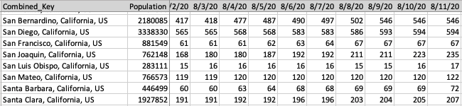
Since total cases and deaths are both critical variables that work together in telling the COVID-19 story, I wanted to combine these into a single table.
Several colleagues of mine combined these numbers with population data for each county into a single layer in a hosted feature service. One column for population. One column for each day where the value is a string containing the number of cases and the number of deaths separated by a pipe character (i.e. |).

This format allows us to have all the relevant information for each feature in one layer while reducing the number of table columns to a single column per day (as opposed to one column per attribute per day). Since the time aware data is available as columns for each feature, we can use Arcade to parse the data and calculate new values such as the growth and speed of infection.
If we had stored this data in a separate related table, we wouldn’t be able to access the data for visualization purposes with Arcade (for performance reasons). Having it all available on each feature was the way to go.
Transform the data with Arcade
ArcGIS Arcade allows us to transform the raw counts of cases and deaths into meaningful information.
Each visualization’s expression parses the number of cases and number of deaths for the selected day. I use those values to calculate new variables to drive the color, size, or opacity of the visualization.
// value on 8/4/2020 is "5082|27" or 5,082 cases and 27 deaths
var currentDayValue = $feature["DAYSTRING_08_04_2020"];

// returns [ "5082", "27" ]
var parts = Split(currentDayValue, "|");

// returns 5082
var cases = Number(parts[0]);
// returns 27
var deaths = Number(parts[1]);

// returns 372909
var population = $feature.POPULATION;
This snippet represents how each of these variables are defined in the expressions described below.
Visualize the data
Now that we have the raw data values (i.e. cases, deaths, population) at our fingertips, we can visualize the same layer in several meaningful ways. The following are several visualizations I made just from using these three values.
Total cases | Total deaths | Total cases per 100k | Deaths as a % of cases | New cases | Doubling time | Active cases | Active cases per 100k | Density of cases
Total cases
To visualize total cases reported to date, I created a size variable (graduated symbols) and referenced an expression that simply returns the cases variable.
return cases;
Full Expression
// value is "5082|27" or 5,082 cases and 27 deaths
var currentDayValue = $feature["DAYSTRING_08_04_2020"];

// returns [ "5082", "27" ]
var parts = Split(currentDayValue, "|");

// returns 5082
var cases = Number(parts[0]);
return cases;

Open the app | Back to visualization overview | Get to know the data
Choosing the size range of the icons is tricky, especially since the numbers grow larger as the data updates. I chose to assign the largest symbol in the renderer to a data value larger than the max value to allow the animation to grow without me having to update the renderer every day.
I also symbolize the largest data values with very large icons (larger than 200px) to better capture the magnitude of cases in high population areas like New York, Los Angeles, Phoenix and Miami compared to other areas.
Deaths
Total deaths are similarly visualized with a size variable referencing the same expression, except that it returns the deaths variable.
return deaths;
Full Expression
// value is "5082|27" or 5,082 cases and 27 deaths
var currentDayValue = $feature["DAYSTRING_08_04_2020"];

// returns [ "5082", "27" ]
var parts = Split(currentDayValue, "|");

// returns 27
var deaths = Number(parts[1]);
return deaths;

Open the app | Back to visualization overview | Get to know the data
Note that I use large symbols in this map that aren’t proportional to the symbols in the cases map. However, I intentionally make the largest icon smaller than the largest icon in the total cases map. This visually demonstrates the number of deaths will always be smaller than the number of cases, while still giving significant size to the outliers, like New York where the number of deaths is much higher than the rest of the country. I would lose this effect if I maintained a symbol size truly proportional to the cases renderer.
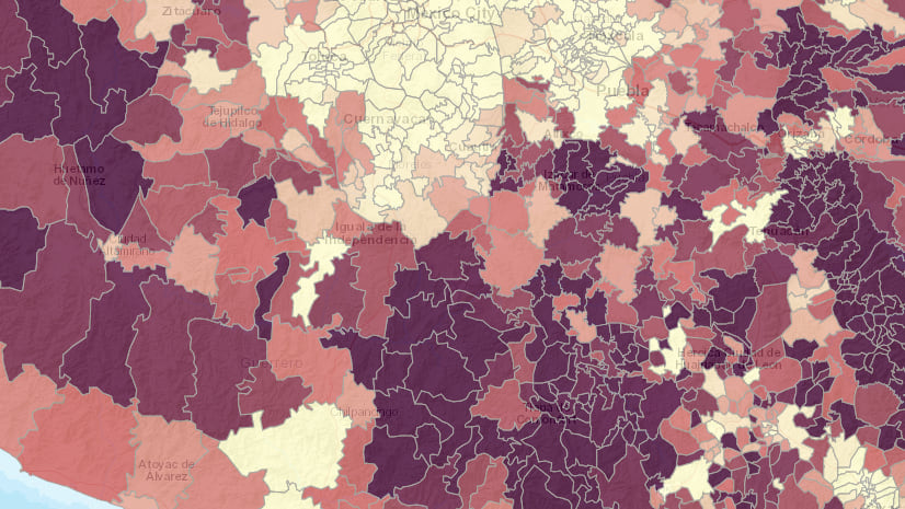
Total cases per 100k
Mapping total counts doesn’t tell the whole story. Normalizing data as a rate helps us understand the overall impact in a particular area. For example 100 COVID-19 hospitalizations in a rural county would be much more difficult to manage than 100 hospitalizations in a large city.
To visualize the impact COVID-19 has had in each county, I created an expression to return the number of cases per 100,000 people. This variable is represented with a continuous color ramp where dark colors indicate a higher rate of infection.
return (cases / population ) * 100000;
Full Expression
// value is "5082|27" or 5,082 cases and 27 deaths
var currentDayValue = $feature["DAYSTRING_08_04_2020"];
// returns [ "5082", "27" ]
var currentDaySplit = Split(currentDayValue, "|");
// returns 5082
var cases = Number(currentDaySplit[0]);

// returns 372909
var population = $feature.POPULATION;
//returns 1362.8
return (cases / population ) * 100000;
Open the app | Back to visualization overview | Get to know the data
The challenge with this map is the rate will keep growing each day, so I may need to adjust the color stops periodically as the pandemic matures.
Deaths as a percentage of cases
The following expression returns the percentage of cases that result in death. The size visual variable indicates the total number of deaths and color represents the percentage of cases that resulted in death.
return IIF(cases <= 0, 0, (deaths / cases) * 100);
Full Expression
var currentDayValue = $feature["DAYSTRING_08_04_2020"];
var parts = Split(currentDayValue, "|");

var deaths = Number(parts[1]);

return IIF(cases <= 0, 0, (deaths / cases) * 100);

Open the app | Back to visualization overview | Get to know the data
Note the high fatality rate in large cities like New York and Detroit. Even though Los Angeles and Chicago have a similar number of cases as New York, they have much lower fatality rates.
I also added a map of total deaths per 100,000 people as another way to view death rate normalized by population (as opposed to cases).

New cases
A common way of tracking the progress of the pandemic is by monitoring new cases reported each day. We shouldn’t simply subtract the number of cases from the previous day because of the inconsistent nature of reporting numbers. Instead, we should calculate a rolling average. I chose to visualize the 7-day rolling average of new cases reported per day.
Since the data already reflects a running total, all we have to do is average the accumulated cases for the seven preceding days. This is where Arcade can be really powerful.
return Round((currentDayValueCases - previousDayValueCases) / unit);
The value of currentDayValueCases is the equivalent of cases in previous expressions (i.e. the number of cases today). The previousDayValueCases is the number of cases reported unit days ago. To get the number of cases and deaths from any other date, I wrote the following Arcade function to create the field name from any date value.
function getFieldFromDate(d) {
  var fieldName = "DAYSTRING_" + Text(d, "MM_DD_Y");
  return fieldName;
}
Now I can access the number of cases and deaths from any date within the same feature!
Full Expression
var unit = 7;
var currentDayFieldName = "${currentDateFieldName}";
var currentDayValue = $feature[currentDayFieldName];
var currentDayValueParts = Split(currentDayValue, "|");
var currentDayValueCases = Number(currentDayValueParts[0]);
var currentDayValueDeaths = Number(currentDayValueParts[1]);

var parts = Split(Replace(currentDayFieldName,"DAYSTRING_",""), "_");
var currentDayFieldDate = Date(Number(parts[2]), Number(parts[0])-1, Number(parts[1]));
var previousDay = DateAdd(currentDayFieldDate, (-1 * unit), 'days');
if (Month(previousDay) == 0 && Day(previousDay) <= 21 && Year(previousDay) == 2020){
  return 0;
}

var previousDayFieldName = getFieldFromDate(previousDay);
var previousDayValue = $feature[previousDayFieldName];
var previousDayValueParts = Split(previousDayValue, "|");
var previousDayValueCases = Number(previousDayValueParts[0]);
var previousDayValueDeaths = Number(previousDayValueParts[1]);

return Round((currentDayValueCases - previousDayValueCases) / unit);

Open the app | Back to visualization overview | Get to know the data
Being able to access data from any date opens up many more visualization possibilities, such as doubling time…
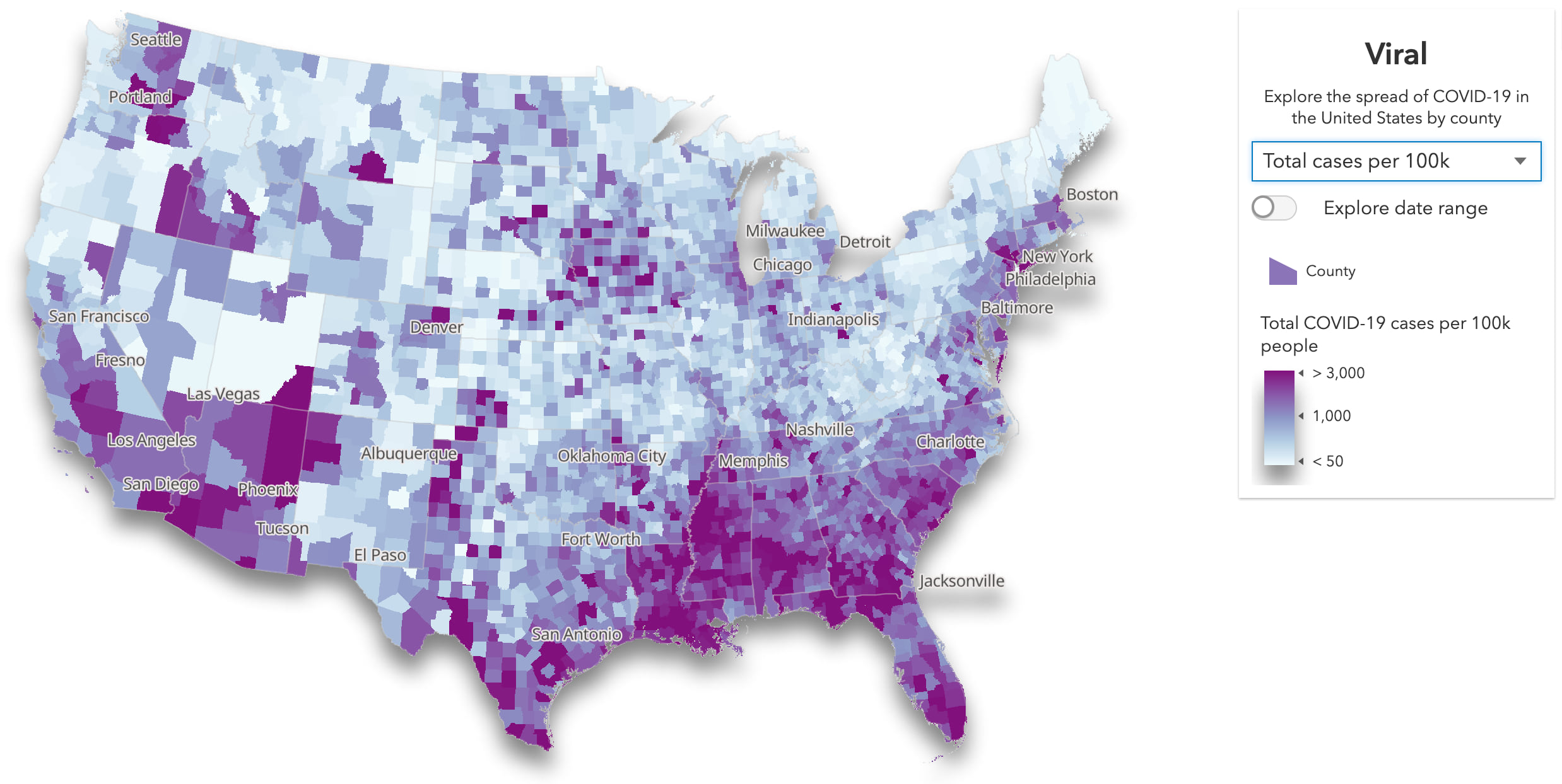
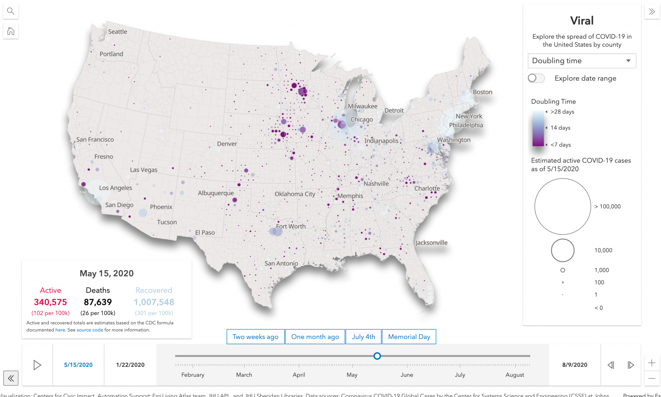
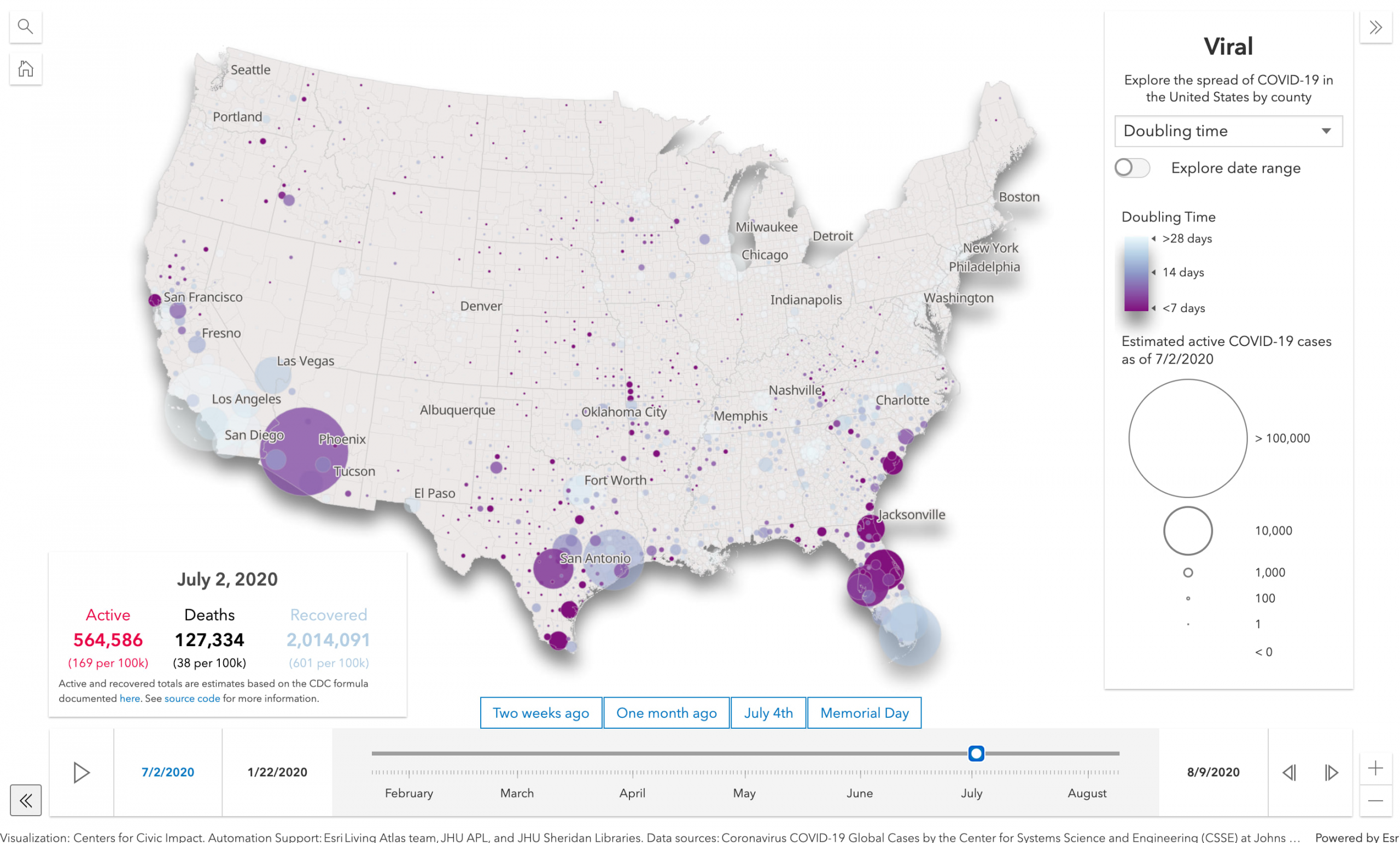
Doubling time
Doubling time indicates how fast the virus is spreading in a county. The expression below returns the number of days it took for the number of cases on the selected date to double. For example, if a county’s number of accumulated cases increased from 100 to 200 within seven days, then the doubling time would be seven days.
Expression
var unit = 14;
var currentDayFieldName = "${currentDateFieldName}";
var currentDayValue = $feature[currentDayFieldName];
var currentDayValueParts = Split(currentDayValue, "|");
var totalCasesValue = Number(currentDayValueParts[0]);

var parts = Split(Replace(currentDayFieldName,"DAYSTRING_",""), "_");
var currentDayFieldDate = Date(Number(parts[2]), Number(parts[0])-1, Number(parts[1]));
var previousDay = DateAdd(currentDayFieldDate, (unit * -1), 'days');

if (Month(previousDay) == 0 && Day(previousDay) <= 21 && Year(previousDay) == 2020){
  return 0;
}

var previousDayFieldName = getFieldFromDate(previousDay);
var previousDayValue = $feature[previousDayFieldName];
var previousDayValueParts = Split(previousDayValue, "|");
var previousDayCasesValue = Number(previousDayValueParts[0]);

var newCases = totalCasesValue - previousDayCasesValue;
var oldCases = totalCasesValue - newCases;

if(newCases == 0 || oldCases == 0){
  return 0;
}

var doublingTimeDays = Floor(unit / (newCases / oldCases))
return IIF(doublingTimeDays >= 0, doublingTimeDays, 0);
Open the app | Back to visualization overview | Get to know the data
Darker colors indicate faster doubling times. I chose to set stop values in increments of weeks (7 days is one week, 28 days is four weeks or about a month), since a one-week time frame is easily relatable to most people. For example, when the animation is running, it’s easy to pick out areas where the number of cases was doubling every few days as opposed to every few weeks.
The size represents the number of people actively sick with COVID-19.
Active cases
Another way to visualize the state of COVID-19 in an area is to render the number of people currently sick.
Since the numbers of people who are actively sick and those who have recovered are not reliably counted, we need to estimate them. The CDC published a formula that allows us to estimate these numbers. Charlie Frye explains and documents this formula in the COVID-19 Trends layer in the ArcGIS Living Atlas of the World.
Here’s how it looks in Arcade:
var activeEstimate = (currentDayCases - daysAgo14Cases)
  + ( 0.19 * ( daysAgo15Cases - daysAgo25Cases ) )
  + ( 0.05 * ( daysAgo26Cases - daysAgo49Cases) )
  - deaths;

  return Round(activeEstimate);
Full Expression
var currentDayFieldName = "DAYSTRING_08_04_2020";
var currentDayValue = $feature[currentDayFieldName];
var currentDayValueParts = Split(currentDayValue, "|");
var currentDayCases = Number(currentDayValueParts[0]);
var currentDayDeaths = Number(currentDayValueParts[1]);

var parts = Split(Replace(currentDayFieldName,"DAYSTRING_",""), "_");
var currentDayFieldDate = Date(
  Number(parts[2]),
  Number(parts[0])-1,
  Number(parts[1])
);

// Active Cases = (100% of new cases from last 14 days
// + 19% of days 15-25 + 5% of days 26-49) - deaths

var daysAgo14 = DateAdd(currentDayFieldDate, -14, 'days');
var daysAgo15 = DateAdd(currentDayFieldDate, -15, 'days');
var daysAgo25 = DateAdd(currentDayFieldDate, -25, 'days');
var daysAgo26 = DateAdd(currentDayFieldDate, -26, 'days');
var daysAgo49 = DateAdd(currentDayFieldDate, -49, 'days');

var startDate = Date(2020, 0, 22);

var deaths = currentDayDeaths;

if (daysAgo15 < startDate){
  return currentDayCases - deaths;
}

var daysAgo14FieldName = getFieldFromDate(daysAgo14);
var daysAgo14Value = $feature[daysAgo14FieldName];
var daysAgo14ValueParts = Split(daysAgo14Value, "|");
var daysAgo14Cases = Number(daysAgo14ValueParts[0]);
var daysAgo14Deaths = Number(daysAgo14ValueParts[1]);

var daysAgo15FieldName = getFieldFromDate(daysAgo15);
var daysAgo15Value = $feature[daysAgo15FieldName];
var daysAgo15ValueParts = Split(daysAgo15Value, "|");
var daysAgo15Cases = Number(daysAgo15ValueParts[0]);
var daysAgo15Deaths = Number(daysAgo15ValueParts[1]);

if (daysAgo26 < startDate){
  return Round(
    (currentDayCases - daysAgo14Cases) +
    ( 0.19 * daysAgo15Cases ) -
    deaths
  );
}

var daysAgo25FieldName = getFieldFromDate(daysAgo25);
var daysAgo25Value = $feature[daysAgo25FieldName];
var daysAgo25ValueParts = Split(daysAgo25Value, "|");
var daysAgo25Cases = Number(daysAgo25ValueParts[0]);
var daysAgo25Deaths = Number(daysAgo25ValueParts[1]);

var daysAgo26FieldName = getFieldFromDate(daysAgo26);
var daysAgo26Value = $feature[daysAgo26FieldName];
var daysAgo26ValueParts = Split(daysAgo26Value, "|");
var daysAgo26Cases = Number(daysAgo26ValueParts[0]);
var daysAgo26Deaths = Number(daysAgo26ValueParts[1]);

if (daysAgo49 < startDate){
  return Round(
    (currentDayCases - daysAgo14Cases) +
    ( 0.19 * ( daysAgo15Cases - daysAgo25Cases ) ) +
    ( 0.05 * daysAgo26Cases ) -
    deaths
  );
}

var daysAgo49FieldName = getFieldFromDate(daysAgo49);
var daysAgo49Value = $feature[daysAgo49FieldName];
var daysAgo49ValueParts = Split(daysAgo49Value, "|");
var daysAgo49Cases = Number(daysAgo49ValueParts[0]);
var daysAgo49Deaths = Number(daysAgo49ValueParts[1]);

deaths = currentDayDeaths - daysAgo49Deaths;
var activeEstimate = (currentDayCases - daysAgo14Cases)
  + ( 0.19 * ( daysAgo15Cases - daysAgo25Cases ) )
  + ( 0.05 * ( daysAgo26Cases - daysAgo49Cases) )
  - deaths;

return Round(activeEstimate);

Open the app | Back to visualization overview | Get to know the data
This makes it easier to understand which locations are (or were) recovering versus others that still experience high numbers of people who are sick.
Active cases per 100k
This renderer visualizes each county based on the estimated number of people actively sick per 100,000 people. This shows the rate of people who are currently sick, which helps us understand the current impact of COVID-19 on an area.
return (activeEstimate / population ) * 100000;
Full Expression
var currentDayValue = $feature["DAYSTRING_08_04_2020"];
var currentDayValueParts = Split(currentDayValue, "|");
var currentDayCases = Number(currentDayValueParts[0]);
var currentDayDeaths = Number(currentDayValueParts[1]);

var parts = Split(Replace(currentDayFieldName,"DAYSTRING_",""), "_");
var currentDayFieldDate = Date(Number(parts[2]), Number(parts[0])-1, Number(parts[1]));

// Active Cases = (100% of new cases from last 14 days
// + 19% of days 15-25 + 5% of days 26-49) - deaths

var daysAgo14 = DateAdd(currentDayFieldDate, -14, 'days');
var daysAgo15 = DateAdd(currentDayFieldDate, -15, 'days');
var daysAgo25 = DateAdd(currentDayFieldDate, -25, 'days');
var daysAgo26 = DateAdd(currentDayFieldDate, -26, 'days');
var daysAgo49 = DateAdd(currentDayFieldDate, -49, 'days');

var startDate = Date(2020, 0, 22);

var activeEstimate = 0;
var deaths = currentDayDeaths;

if (daysAgo15 < startDate){
  activeEstimate = currentDayCases - deaths;
  return (activeEstimate / population ) * 100000;
}

var daysAgo14FieldName = getFieldFromDate(daysAgo14);
var daysAgo14Value = $feature[daysAgo14FieldName];
var daysAgo14ValueParts = Split(daysAgo14Value, "|");
var daysAgo14Cases = Number(daysAgo14ValueParts[0]);
var daysAgo14Deaths = Number(daysAgo14ValueParts[1]);

var daysAgo15FieldName = getFieldFromDate(daysAgo15);
var daysAgo15Value = $feature[daysAgo15FieldName];
var daysAgo15ValueParts = Split(daysAgo15Value, "|");
var daysAgo15Cases = Number(daysAgo15ValueParts[0]);
var daysAgo15Deaths = Number(daysAgo15ValueParts[1]);

if (daysAgo26 < startDate){
  activeEstimate = Round( (currentDayCases - daysAgo14Cases)
    + ( 0.19 * daysAgo15Cases ) - deaths );
  return (activeEstimate / population ) * 100000;
}

var daysAgo25FieldName = getFieldFromDate(daysAgo25);
var daysAgo25Value = $feature[daysAgo25FieldName];
var daysAgo25ValueParts = Split(daysAgo25Value, "|");
var daysAgo25Cases = Number(daysAgo25ValueParts[0]);
var daysAgo25Deaths = Number(daysAgo25ValueParts[1]);

var daysAgo26FieldName = getFieldFromDate(daysAgo26);
var daysAgo26Value = $feature[daysAgo26FieldName];
var daysAgo26ValueParts = Split(daysAgo26Value, "|");
var daysAgo26Cases = Number(daysAgo26ValueParts[0]);
var daysAgo26Deaths = Number(daysAgo26ValueParts[1]);

if (daysAgo49 < startDate){
  activeEstimate = Round( (currentDayCases - daysAgo14Cases)
    + ( 0.19 * ( daysAgo15Cases - daysAgo25Cases ) )
    + ( 0.05 * daysAgo26Cases ) - deaths );
  return (activeEstimate / population ) * 100000;
}

var daysAgo49FieldName = getFieldFromDate(daysAgo49);
var daysAgo49Value = $feature[daysAgo49FieldName];
var daysAgo49ValueParts = Split(daysAgo49Value, "|");
var daysAgo49Cases = Number(daysAgo49ValueParts[0]);
var daysAgo49Deaths = Number(daysAgo49ValueParts[1]);

deaths = currentDayDeaths - daysAgo49Deaths;
activeEstimate = (currentDayCases - daysAgo14Cases)
  + ( 0.19 * ( daysAgo15Cases - daysAgo25Cases ) )
  + ( 0.05 * ( daysAgo26Cases - daysAgo49Cases) ) - deaths;

return (activeEstimate / population ) * 100000;

Open the app | Back to visualization overview | Get to know the data
Density of cases
The final visualization allows us to use a dot density renderer to visualize how many people are currently sick, how many have recovered, and how many have died in each county on a selected day.
This helps us see areas that have been affected by the virus, areas that have generally recovered, and areas that are still experiencing high rates of infection. Since each dot represents a specific number of people, it has a more personal feel to it.
This renderer requires we estimate the number of people once infected with COVID-19 who have since recovered. Using the same formula to calculate active cases, we can estimate this number in the following way.
// Estimate of the number of people who recovered
var recoveredEstimate = Round(cases - activeEstimate - deaths);
Full Expression
var currentDayValue = $feature["DAYSTRING_08_04_2020"];
var currentDayValueParts = Split(currentDayValue, "|");
var currentDayCases = Number(currentDayValueParts[0]);
var currentDayDeaths = Number(currentDayValueParts[1]);

var parts = Split(Replace(currentDayFieldName,"DAYSTRING_",""), "_");
var currentDayFieldDate = Date(Number(parts[2]), Number(parts[0])-1, Number(parts[1]));

// Active Cases = (100% of new cases from last 14 days
// + 19% of days 15-25 + 5% of days 26-49) - deaths

var daysAgo14 = DateAdd(currentDayFieldDate, -14, 'days');
var daysAgo15 = DateAdd(currentDayFieldDate, -15, 'days');
var daysAgo25 = DateAdd(currentDayFieldDate, -25, 'days');
var daysAgo26 = DateAdd(currentDayFieldDate, -26, 'days');
var daysAgo49 = DateAdd(currentDayFieldDate, -49, 'days');

var startDate = Date(2020, 0, 22);

var activeEstimate = 0;
var deaths = currentDayDeaths;

if (daysAgo15 < startDate){
  activeEstimate = currentDayCases - deaths;
  return (activeEstimate / population ) * 100000;
}

var daysAgo14FieldName = getFieldFromDate(daysAgo14);
var daysAgo14Value = $feature[daysAgo14FieldName];
var daysAgo14ValueParts = Split(daysAgo14Value, "|");
var daysAgo14Cases = Number(daysAgo14ValueParts[0]);
var daysAgo14Deaths = Number(daysAgo14ValueParts[1]);

var daysAgo15FieldName = getFieldFromDate(daysAgo15);
var daysAgo15Value = $feature[daysAgo15FieldName];
var daysAgo15ValueParts = Split(daysAgo15Value, "|");
var daysAgo15Cases = Number(daysAgo15ValueParts[0]);
var daysAgo15Deaths = Number(daysAgo15ValueParts[1]);

if (daysAgo26 < startDate){
  activeEstimate = Round( (currentDayCases - daysAgo14Cases)
    + ( 0.19 * daysAgo15Cases ) - deaths );
  return (activeEstimate / population ) * 100000;
}

var daysAgo25FieldName = getFieldFromDate(daysAgo25);
var daysAgo25Value = $feature[daysAgo25FieldName];
var daysAgo25ValueParts = Split(daysAgo25Value, "|");
var daysAgo25Cases = Number(daysAgo25ValueParts[0]);
var daysAgo25Deaths = Number(daysAgo25ValueParts[1]);

var daysAgo26FieldName = getFieldFromDate(daysAgo26);
var daysAgo26Value = $feature[daysAgo26FieldName];
var daysAgo26ValueParts = Split(daysAgo26Value, "|");
var daysAgo26Cases = Number(daysAgo26ValueParts[0]);
var daysAgo26Deaths = Number(daysAgo26ValueParts[1]);

if (daysAgo49 < startDate){
  activeEstimate = Round( (currentDayCases - daysAgo14Cases)
    + ( 0.19 * ( daysAgo15Cases - daysAgo25Cases ) )
    + ( 0.05 * daysAgo26Cases ) - deaths );
  return (activeEstimate / population ) * 100000;
}

var daysAgo49FieldName = getFieldFromDate(daysAgo49);
var daysAgo49Value = $feature[daysAgo49FieldName];
var daysAgo49ValueParts = Split(daysAgo49Value, "|");
var daysAgo49Cases = Number(daysAgo49ValueParts[0]);
var daysAgo49Deaths = Number(daysAgo49ValueParts[1]);

deaths = currentDayDeaths - daysAgo49Deaths;
activeEstimate = (currentDayCases - daysAgo14Cases)
  + ( 0.19 * ( daysAgo15Cases - daysAgo25Cases ) )
  + ( 0.05 * ( daysAgo26Cases - daysAgo49Cases) ) - deaths;

  return Round(currentDayCases - activeEstimate - currentDayDeaths);

Open the app | Back to visualization overview | Get to know the data
Since dot density uses color blending in high density areas, I needed colors that blend well together. This was tricky especially since I wanted to assign each variable a color that emotionally reflected the nature of the variable.
- Active cases – red, which is typically associated with something bad.
- Recovered cases – blue, which is a calm color. Recovering is good.
- Deaths – black, often associated with death. Black effectively blends with lighter colors in small quantities, making this a great choice for a variable that is much smaller in magnitude than the other two.
The blending effectively shows the transition of areas recovering from mostly active cases to recovered cases.
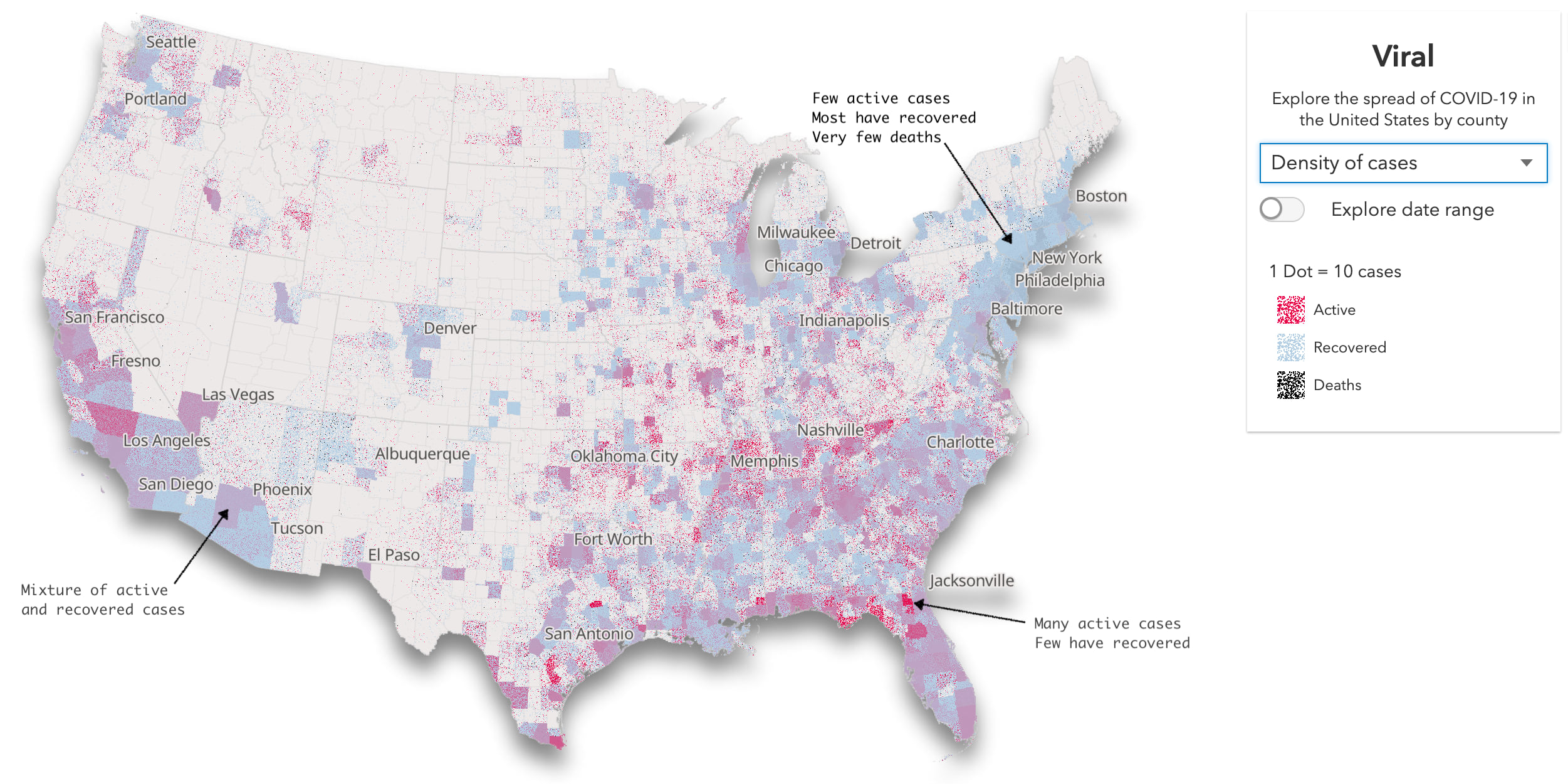
In the high death rate areas, such as New York City, you still see the scars of the pandemic’s toll as the black dots blend with the soft blue dots to indicate that many, unfortunately, didn’t recover from their illness.

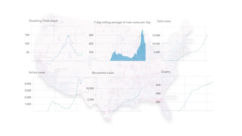
Explore each variable through time
I added a TimeSlider to allow the user to explore each of these variables for any date. Typically the TimeSlider is used to filter features in a time-enabled layer based on either a range of dates or a moment in time. It’s a nice widget that allows you to view data representing objects that move positions over time like boats or airplanes, or events of physical geography like weather patterns and earthquakes.

However, in mapping data that changes over time in features with fixed positions, like U.S. counties, this approach becomes unnecessarily inefficient very quickly. It would require a feature for each county (including its geometry) for each day. Following this model, we would have more than 634,000 features representing counties only for the purpose of recording new data values for each day. For static features like mapping COVID-19 in counties, this approach doesn’t scale well.
Since the daily totals are included in a single layer of 3,142 counties, I can use the TimeSlider only for the purpose of updating the layer’s renderer. Each time the user moves a slider thumb to change the date, rather than filter features, the app simply updates the renderer on the same set of features. This requires referencing data in a new field and calculating new Arcade expressions with each slider update.
The user can use the slider to view data for a specific date, or press the play button to animate the change over time. The following animation shows how doubling time and active cases changes over time.
While watching the animation above, you may have noticed patterns of rapid spread, like in the midwest in May…
Or in the south after Memorial Day…
Visualize change between two dates
Once you toggle the Explore date range switch, a second thumb will appear on the TimeSlider and you will be able to explore how the selected variable changed between any two dates. Or you can choose from several presets I provide, like Last 2 weeks or Since Memorial Day.
These presets can provide meaningful temporal context into patterns you may have noticed in the animation, but not associated with specific days, like national holidays. Relative temporal bookmarks like what happened in the last two weeks? or are we doing better than we were one month ago? also reveal if things are improving or worsening in certain areas.

. While the overall number of active cases decreased, many areas experienced an increase in active cases.")
Since date ranges tend to reveal patterns of increase or decline, I chose to use diverging color ramps to capture whether the selected variable grew or declined in the selected time span. The Esri Color Ramps guide page came in handy throughout this design process.
I created these visuals of change over time by generating a larger Arcade expression that either subtracts the results of two expressions (start date and end date)…
export function expressionDifference (
  startExpression: string,
  endExpression: string,
  includeGetFieldFromDate?: boolean
): string {
  const getFieldFromDate = getFieldFromDateFunction();

  const base = `
    function startExpression(){
      ${startExpression}
    }

    function endExpression(){
      ${endExpression}
    }

    return endExpression() - startExpression();
  `

  return includeGetFieldFromDate ? getFieldFromDate + base : base;
}
…or calculating the percent change between the expressions…
export function expressionPercentChange (
  startExpression: string,
  endExpression: string,
  includeGetFieldFromDate?: boolean
): string {
  const getFieldFromDate = getFieldFromDateFunction();

  const base = `
    function startExpression(){
      ${startExpression}
    }

    function endExpression(){
      ${endExpression}
    }
    var startValue = startExpression();
    var endValue = endExpression();

    return ( ( endValue - startValue ) / startValue ) * 100;
  `

  return includeGetFieldFromDate ? getFieldFromDate + base : base;
}
Final thoughts
By using just three attributes (number of cases, number of deaths, and population), you can use Arcade to gain additional insight into the growth or decline of COVID-19 (or any demographic variable). How fast is it growing? When did it start? When did it end? Is the rate higher or lower than neighboring features? These are all questions you can answer by writing a few Arcade expressions and referencing them in a series of renderers.
Furthermore, you can leverage the TimeSlider to update time-aware renderers so users can explore how data not only change spatially, but temporally too. It’s not just about animation, but about giving the user the ability to focus on meaningful date ranges to visualize how the variables changed.
I followed a similar pattern to build popups with charts for each county. But that’s a post for another day.

Hi ,
Is there any sample project for this ?
Thanks
The source code is here: https://github.com/ekenes/covid19viz