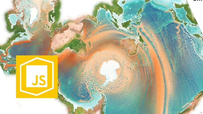
At the Esri 2020 Developer Summit plenary I presented a web app, One Ocean, which allows you to interactively explore data from Esri’s open Ecological Marine Unit (EMU) dataset. This app is one example of how you can prepare a massive dataset for data exploration in the browser using the ArcGIS API for JavaScript (ArcGIS JS API).

The app allows the user to explore temperature, salinity, direction, and velocity at various depths throughout the world’s ocean. It renders the data in the Spilhaus projection, which displays what we typically consider multiple oceans as one continuous body of water.
You can view the five-minute demo of this app as it was presented at the Developer Summit in the video below.
Jeremy Bartley and I recorded a one hour Developer Summit virtual session, Best Practices for Building Web Apps that Visualize Large Datasets, in which we discuss and demonstrate how to optimize large datasets for web applications. Check out the video below.
You can also access the session slides and demos in my Dev Summit 2020 GitHub repo. This blog will highlight some of the steps that went into creating the One Ocean app to demonstrate the principles Jeremy and I discussed in the session above.
Get to know your data
I’ve been interested in the EMU data since it was made available to the public a few years ago. In fact, anyone can freely download the full dataset as an ArcGIS Pro package.
Upon downloading the package, I came to the daunting realization that I was dealing with a massive dataset – a 4 GB geodatabase containing nearly 52 million points.
.")
These are the key points I learned prior to processing it:
- The data is represented as 52 million points in a single layer
- It requires 4 GB of data
- Each point is located at every ¼ degree of latitude/longitude
- Up to 102 points are stacked at each location (from sea surface to ~5,000m depth)
- There are 12 attributes per point (temperature, salinity, phosphate, oxygen, silicates, EMU cluster, etc.)
Since data of that size is too large to work with in the browser, Jeremy and I brainstormed ways to work with it in a meaningful way.
Data processing
Users frequently ask about the limit for the number of points or features the ArcGIS JS API can render in a web application. Ultimately, it depends on a number of factors: the device, the browser, the speed of the internet connection, network latency, etc. But 4 GB of data is too large in any scenario.
Our goal was to reduce the size to be as small as possible without compromising the story or the desired experience. That involved processing our data using the following methods:
Table pivot
Our first order of business was to reduce the number of rows in the table. Since the original layer has up to 102 points (or rows) at each x/y location, we felt we could flatten the table to one row for each x/y coordinate.
Preparing all the attribute data for each geometry in a single row allows the ArcGIS JS API to update the underlying data values driving the visual properties of the renderer at up to 60 fps without reprocessing geometries on the GPU. This prevents flashing when the renderer updates with new data.
The goal was to take a table that looked like this:

And pivot it to a table with fewer rows (one unique row per location), but more columns…

Conveniently, my colleague Keith VanGraafeiland had already done this. By using a series of spatial joins in ArcGIS Pro, he was able to create a new layer with one point per x/y location. Now our data looked like the following:
- The number of points was reduced to 677,109 features! Now the layer contained one row per x/y location with fields for each attribute at each depth level.
- This introduced a new problem – Now the layer has 1,224 fields, or 102 fields for each variable for each depth level (e.g. temp_1, temp_2, temp_3, etc. ). In other words, the temperature at depth level 1, depth level 2, etc. at each location.
Geometry thinning
While the table pivot significantly reduced the number of points, 677,000 features is still too many for a global extent. Knowing each point was ¼ degree apart, we experimented with thinning points to every ½ degree.
We accomplished this using a Select Layer By Attribute operation in ArcGIS Pro with the SQL expression in the image below.

This reduced the number of points all the way down to 84,711 features. This resulted in a new layer symbolized with blue points in the image below.

While the data looks more coarse at this scale, the ½ degree resolution still works great at a worldwide extent.

Attribute thinning
Feature services are limited to 1,024 columns. So I removed about 300 fields to make the layer publishable at 960 fields.
After publishing, I created a hosted Layer View and limited the number of fields to only the attributes I was concerned with: temperature, salinity, direction, and velocity.
After all the processing we were able to reduce the data to a manageable 84,711 points and 317 attributes. However, that many attributes for that many points still results in more than 311 MB of uncompressed data.
Thanks to performance improvements made in the ArcGIS JS API and hosted and enterprise feature services over the last year, we can reduce that size down to 145 MB of compressed data.
How the ArcGIS JS API and ArcGIS Online improve web app performance
There are a number of things the ArcGIS JS API and ArcGIS Online do in tandem to improve the efficiency of rendering more data more efficiently in the browser. These can be viewed by opening your developer tools and inspecting the network traffic for the feature service queries.
The image below shows an example of a query the ArcGIS JS API makes to a hosted ArcGIS Online feature service.

PBF – Data is requested in protocol binary format (PBF) to improve vertex encoding and therefore speed up drawing times.
outFields – The ArcGIS JS API only requests fields required for rendering plus any specifically requested by the developer. This can significantly reduce payload size, improving download speed. (In the One Ocean app I requested all fields for reasons mentioned in the Fast, client-side analytics section below.
Quantization – Quantization parameters ensure the client only requests one vertex per pixel based on the view tolerance. The query in the image above indicates each pixel had an approximate size of 4.9 km. Vertices in the returned geometries are guaranteed to conform to that tolerance, except for point data. Since point geometries aren’t dropped from the response, quantization doesn’t make much of a difference in performance for the One Ocean app. However, it can have a major impact in reducing payload size for polygons and polyline geometries.
Tiled requests – The resultType: tile parameter is the API’s way of telling the server the query can be repeated in multiple clients and should therefore be cached as a feature tile.
The responses for these requests will look like those the image below. Note the outlined columns.

Content-Encoding – Data is compressed using Brotli compression for efficient data transfer.
Caching – The x-cache: Hit from cloudfront indicates the response comes from the CDN cache. The x-esri-ftiles-cache-compress: true indicates the response is cached as a feature tile on the server. ArcGIS Online takes advantage of several tiers of feature tile caching on the server and CDN (for public layers only). This reduces load on the server and underlying database, significantly improving performance. Paul Barker wrote an excellent blog detailing how this works.
All of these concepts help improve the time it takes to load the data. This is evident in large layers where these improvements go a long way in improving performance.
Fast, client-side analytics
Despite those performance improvements, the One Ocean app still makes heavy queries, totaling up to 145 MB of data. That requires the user to wait about 30 seconds before they can use the app on a desktop browser (we chose to block mobile devices from loading the app because of the enormous size of the data). While 30 seconds is a long amount of time, the wait is worth it. Once all that data is loaded, you can explore authoritative data spanning the vast global ocean without the need for fancy software or an advanced knowledge of oceans. An ocean full of data is at your fingertips!
While the ArcGIS JS API dynamically requests data as needed by the renderer, I opted to request it all up front by setting the layer outfields to [*].
const emuLayer = new FeatureLayer({
  portalItem: {
    id: "9ff162e1ea1a4885acd8c4ceeab588a5"
  },
  outFields: ["*"]
});
Even though this makes for a very long initial load time of just under 30 seconds, this allows the app to update the underlying data values driving the visual properties of the renderer without reprocessing geometries on the GPU or requesting additional attributes from the server.
Every time the user explores the data by switching a variable or moving the depth slider, the renderer updates in the following way:
Click to show/hide the code
emuLayer.renderer = {
  type: "simple",
  symbol: {
    type: "web-style",
    name: "tear-pin-1",
    styleName: "Esri2DPointSymbolsStyle"
  },
  visualVariables: [{
    type: "color",
    // temp_1, temp_2, temp_3, etc
    field: `temp_${getLevelFromDepth(depthSlider.values[0])}`,
    stops: [
      { value: 0, color: "#1993ff" },
      { value: 5, color: "#2e6ca4" },
      { value: 15, color: "#403031" },
      { value: 27, color: "#a6242e" },
      { value: 30, color: "#ff2638" }
    ]
  }, {
    type: "size",
    // Velocity_1, Velocity_2, Velocity_3, etc
    field: `Velocity_${getLevelFromDepth(depthSlider.values[0])}`,
    minDataValue: 0,
    maxDataValue: 0.5,
    // update size based on view scale
    minSize: {
      type: "size",
      valueExpression: "$view.scale",
      stops: [
        { value: 7812500, size: "12px" },
        { value: 15625000, size: "8px" },
        { value: 31250000, size: "6px" },
        { value: 62500000, size: "4px" },
        { value: 125000000, size: "2px" },
        { value: 250000000, size: "1px" }
      ]
    },
    maxSize: {
      type: "size",
      valueExpression: "$view.scale",
      stops: [
        { value: 7812500, size: "32px" },
        { value: 15625000, size: "20px" },
        { value: 31250000, size: "16px" },
        { value: 62500000, size: "12px" },
        { value: 125000000, size: "6px" },
        { value: 250000000, size: "4px" }
      ]
    }
  }, {
    type: "rotation",
    // Direction_1, Direction_2, Direction_3, etc
    field: `Direction_${getLevelFromDepth(depthSlider.values[0])}`,
    rotationType: "geographic"
  }]
};
Note the red outlines in the snippet below. It’s not the color and size properties that change with each slider update. Rather, it’s the attribute names driving the visualization that update.

Each slider value corresponds to a depth level used in the field names (e.g. temp_1 indicates the temperature value for a point at the first depth level. temp_2 is the temperature at the same location at the next depth level, etc.). For each slider value change, I simply update the renderer to point to each of the field names for the depth level indicated by the slider.
Then the ArcGIS JS API takes over and quickly makes the update so we can see how temperature, salinity, current speed, and current direction change for each location at various depths of the world’s ocean.


Wrap up
There’s a lot the ArcGIS JS API and ArcGIS Online do to help improve web app performance. But that doesn’t excuse the app developer from doing what they can to reduce the size of large datasets in the browser.
Remember to do the following to reduce the size of your data if possible:
- Familiarize yourself with the data
- Preprocess the data (e.g. table pivots) to leverage powerful JS API capabilities
- Thin the geometries
- Thin the attributes
Here are some related resources to check out:


Excellent presentation and explanation of the best practices for large datasets. Just the thing I was looking for.
In our case, we have a polyline feature class host from ArcGIS Enterprise, and a single row entry in the attribute table constitutes multiple lines. Since the shape length combines all the lines, we can’t use this filter.
What would you recommend in this case? Should we go with a view resolution filter and reduce the incoming feature?
As for ArcGIS enterprise, which version includes the Dynamic Faeatue tiles functionality that supports response caching?
Hi! Glad you hear you found this content useful. ArcGIS Enterprise version 10.7.1 and later support all of the performance improvements (e.g. quantization, pbf queries, tile caching) as ArcGIS Online hosted services, with the exception of CDN caching (for security reasons). However, Enterprise services still have caching on the server level, and of course the browser.
Regarding your polyline scenario. I wouldn’t normally recommend view resolution filter if other alternatives are available. I think it could work, but keep in mind the server is already quantizing geometries for you. This basically means that depending on the view scale, your geometries are guaranteed to only have on vertex per pixel in the view. This significantly improves performance already. Using a view resolution filter basically does the same, but more aggressively, so you may not get a result that looks good. I think you should try it. However, I will always recommend filtering based off another attribute, perhaps length doesn’t work here, but maybe if you have lines classified in a string field (e.g. high, medium, low) or as an ordinal field (1st, 2nd, 3rd), you could do it that way more effectively.
Great article and presentation. This inspired me to dive into the data set and see what other updates could be made to improve the portability, further enhancing mobile use. Here, I’m expanding on the Data thinning and design.
While reducing the total field count is essential to controlling field sprawl, you also need to review the field types. Floating Point and Integer number types can take up more room than the data requires. Double precision floating point fields take up 8 bytes, Single precision only takes 4 bytes. Use a ‘float’ instead of a ‘double’ if your data doesn’t require the range and precision of a Double! Likewise, a Long Integer takes up 4 bytes and a Short takes 2 bytes. Use a Short if your data doesn’t require a Long!
String fields are your biggest storage consumer! If you have Text fields that have common strings replicated across many rows, consider changing to a Coded Value Domain. This will change your field to an Integer, creating a ‘code’ and ‘value’ list in the data set or service properties. This allows the Application to pull back and store a small lookup table in memory, used to translate and display the cached text matching the ‘code’ in the field value. The space savings can be staggering! For the EMUOptimized layer in the download, it consumes 2.18 GB on its own with indexes. After replacing 5 Text fields with CVDs, the layer dropped down to only 826 MB! The only downside to using this is that users need to specify the ‘code’ for the text they want to filter on, nothing the App can’t handle, right?
Keep in mind that these changes apply to any index you create as well. An index on a Short Integer field is MUCH smaller than an index on a Text field!
Publishing the 677k row optimized data layer online without using any indexes consumes 447 MB, same layer with CVDs only consumes 162 MB. And this is before thinning to 1/2 degree! Accessing with PBF had a slight improvement using CVDs, but the uncompressed data is typically half the size, which improves device storage use!
Jeremy; Kristian, any other limitations or issues with this approach that you know of?