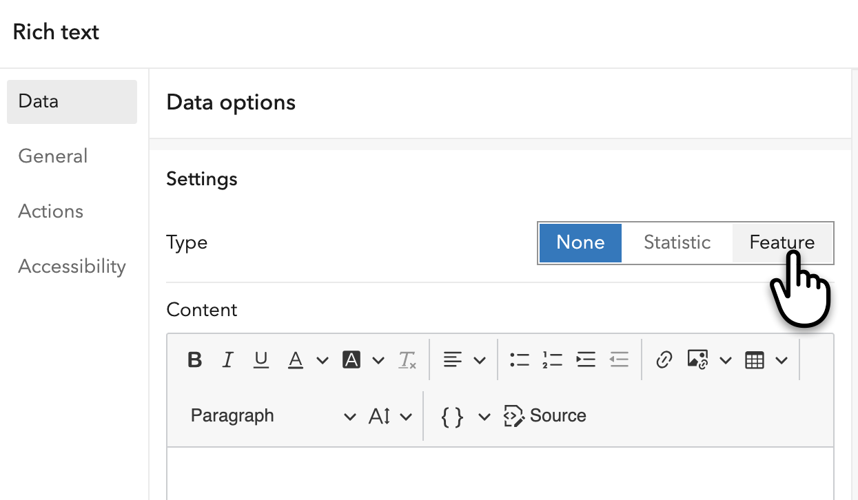
With the June 2026 release, the rich text element in ArcGIS Dashboards has evolved from a static content tool into a flexible, data-driven experience. When you add a rich text element to your dashboard, you’re now presented with three options: None, Statistic, or Feature.
This may feel familiar if you’ve worked with other data visualization elements in Dashboards, such as indicator, table, or charts. The default None option is unique to rich text and is intended for adding static context, whether that’s an introduction to your project or a brief guide to navigating the dashboard. To power your rich text with data, choose Statistic to summarize your data as a single key metric, or choose Feature to present information from individual features in a rich and interactive way.
Feature-based rich text can be an effective alternative to a scrolling list if you prefer a card-style presentation, or to a feature-based indicator if your dataset contains text-heavy attributes that vary in length.
This sample dashboard is built using the World Heritage Sites layer from ArcGIS Living Atlas. On the left, a series of charts provides high-level summaries of the data across multiple dimensions. At the center of the dashboard, a feature-based rich text element powers the Site tour panel, which combines descriptive content, image, and links to the original UNESCO webpages for each site. Paired with the map, it enables the users to explore locations in greater detail while maintaining geographic context.
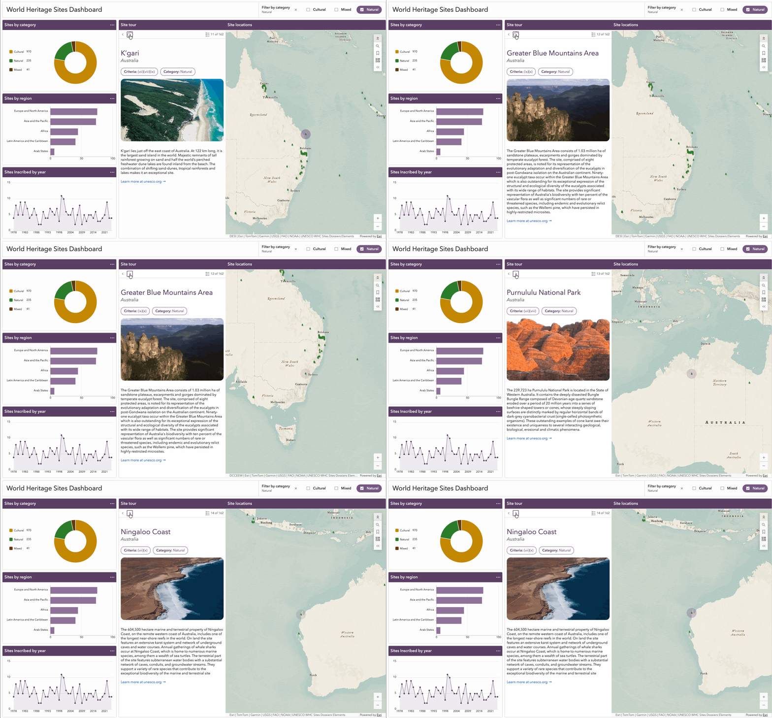
While the Site tour panel in this example may appear highly customized, creating an experience like this is actually quick and straightforward. In the following sections, we’ll walk through the process of configuring a feature-based rich text element and refining its layout and styling to create visually appealing, easy-to-scan content.
Configure a feature-based rich text element
Like any other data-driven dashboard element, it all starts with selecting a data source. Once you switch the Type option to Feature, you can choose from a layer in a web map or web scene, a standalone layer, or a data expression. You can then refine the data by applying filters and defining sort criteria.
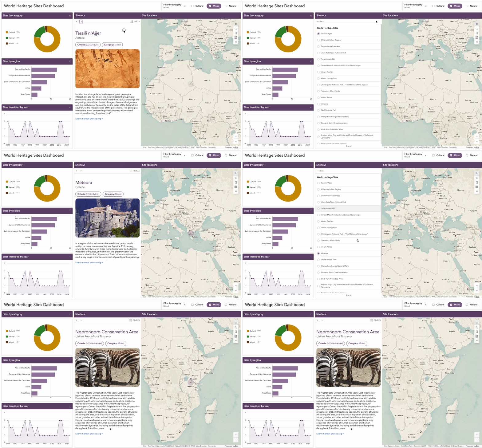
Enabling Show feature menu allows users to view a full list of features and quickly jump to a specific one. In our World Heritage Sites example, the feature menu provides an easy way to browse all available sites by their names. By default, the labels displayed in the feature menu are derived from the layer’s display field or the title configured in the layer’s pop-up settings.
The text editor serves as your blank canvas for designing both the content and layout of the element. To add feature-based content, use the Insert {} button to access a dropdown list of field names from your data source. In our documentation, these field references are often referred to as dynamic text. Selecting a field inserts a dynamic text placeholder directly into the editor, where it can be formatted just like static text by adjusting the font size, color, and style.
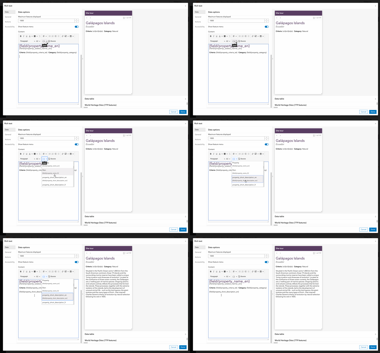
The real magic of dynamic text is that it automatically displays the value of the referenced field and updates as users navigate between features. This makes it easy to create data-driven content without writing a single line of code.
You can also leverage dynamic text to construct URLs for images and hyperlinks at the feature level. Simply enter the field reference using the {field/field_name} syntax, or copy and paste an existing dynamic text placeholder into the appropriate location.
Because dynamic text is displayed only as a placeholder within the editor, images and hyperlinks that rely on dynamic URLs may appear broken while you’re editing. To see how your content will actually appear to users, use the element preview on the right.
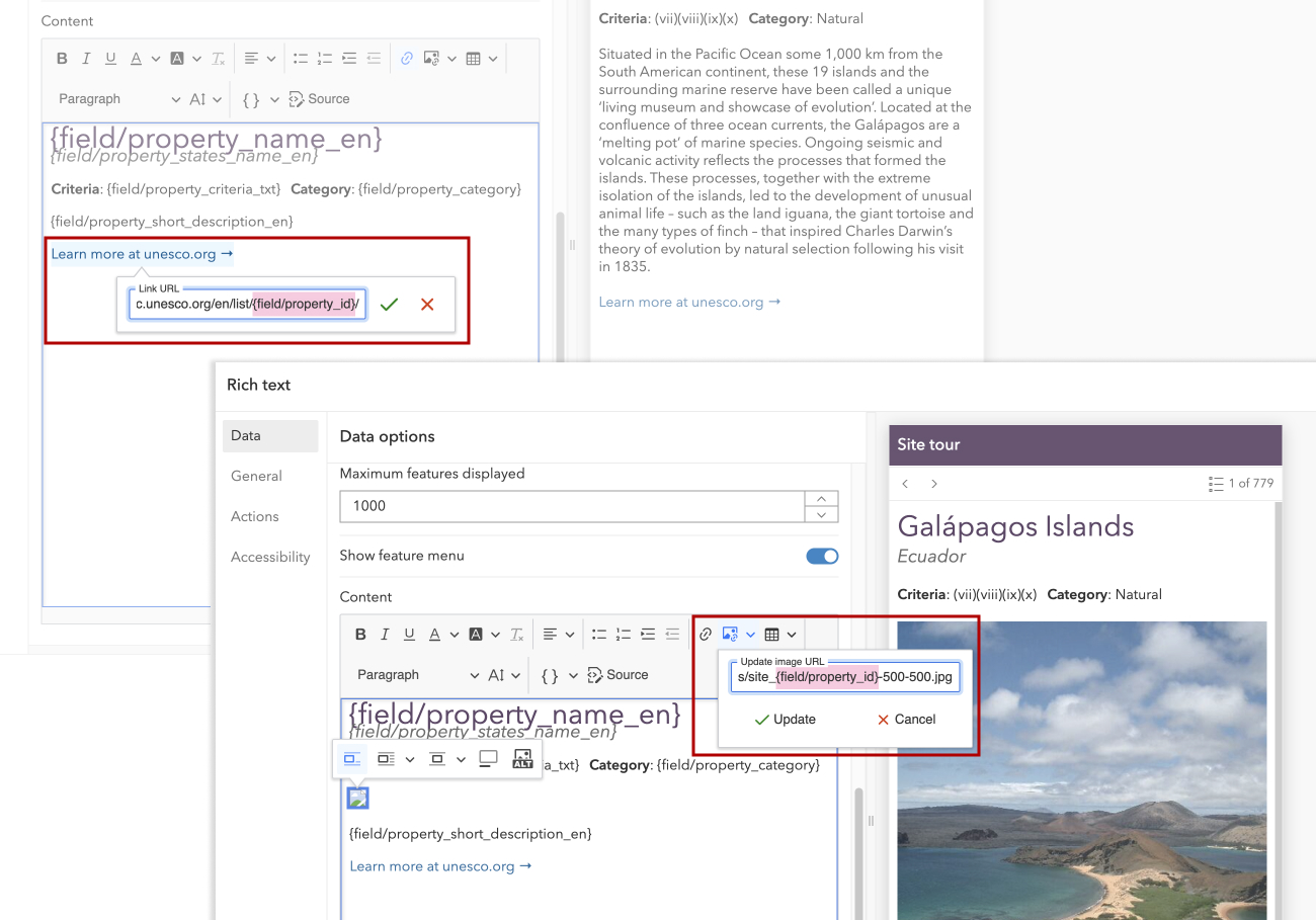
With just a few clicks and a little customization in the text editor, we’ve created a clean and cohesive Site tour panel that combines text, images, and links into a compelling browsing experience.
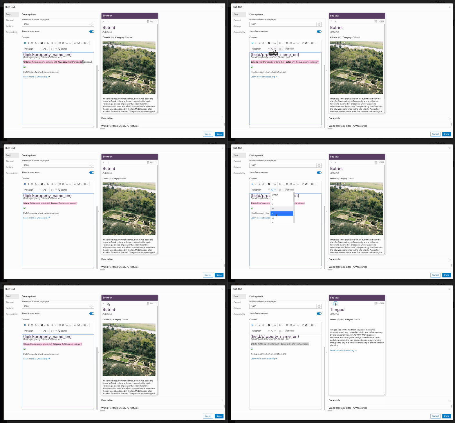
Let’s take it a step further and explore how Source mode can provide additional control over the layout and styling of your content.
Unlock advanced customization in Source mode
If you’ve worked with rich text before, you’ve probably already encountered Source mode. It allows you to directly edit the HTML that controls how your rich text is rendered behind the scenes, giving you the flexibility to fine-tune the structure and styling of your content beyond what’s possible through the editor interface.
In our World Heritage Sites example, there are two additional customizations we’ll make to achieve the final look and feel of the Site tour panel:
- Transform the Criteria and Category fields into polished pill-style labels.
- Display the site image in a consistent horizontal card format with a fixed height.
To achieve the desired effect, I replaced the original blocks for the two labels and the site image with the following HTML:
<div style="display:flex;gap:10px;margin-bottom:5px;">
  <div style="background-color:#ffffff;border-radius:14px;border:1px solid #5a3e63;color:#5a3e63;font-size:14px;padding:6px 12px;">
    <strong>Criteria:</strong> {field/property_criteria_txt}
  </div>
  <div style="background-color:#ffffff;border-radius:14px;border:1px solid #5a3e63;color:#5a3e63;font-size:14px;padding:6px 12px;">
    <strong>Category:</strong> {field/property_category}
  </div>
</div>
<figure class="image image_resized" style="height:auto;width:100%;">
  <img style="border-radius:15px;display:block;max-height:250px;object-fit:cover;"
src="https://whc.unesco.org/uploads/sites/site_{field/property_id}-500-500.jpg"
alt="a photo of {field/property_name_en}">
</figure>
If you’re new to HTML, don’t worry—today, you no longer need to know every line of HTML to build polished web content. Focus instead on common styling patterns and how they influence the final appearance of your content.
If you haven’t already, create a copy of this sample dashboard to experiment with Source mode at your own pace.
Design considerations for custom HTML
Keep it light.
The code snippet above highlights an important consideration when working in Source mode: without a mechanism for storing and sharing CSS stylesheets, styling must be applied through inline styles. Notice that to create the pill-style Criteria and Category labels, the same set of style properties has to be repeated for each <div> element. Therefore, it’s generally best to keep custom styling lightweight and use it to enhance specific parts of the layout rather than rebuild the entire interface in HTML.
Accessibility matters.
When working with custom HTML, keep in mind that your dashboard may be viewed on different devices and by users with varying needs. In our Site tour panel, because every image is site specific, it should be treated as meaningful content. To provide a descriptive text alternative for screen reader users, a dynamic alt text is added to reference the site name. If you instead choose to treat your image as decorative, simply add alt="" to instruct screen readers to ignore it.
Keep your layout flexible.
Another important consideration when working in Source mode is to use simple structures and flexible layout patterns. In our example, we use display:flex on the parent container to position the two pill-style labels side by side while allowing them to adapt gracefully to different screen sizes. Flexbox is generally the recommended approach for building and controlling layouts in modern HTML.
Think twice before using tables.
While table elements (e.g. <table>, <tr>) can also be used for layout, they often introduce unnecessary complexity and can become difficult to maintain. The text editor includes a table option, but remember that ArcGIS Dashboards also provides a dedicated Table element with stronger data-driven capabilities, better built-in accessibility support, and greater control over styling. You can learn more about accessibility in the Table element in this blog.
Before inserting a custom table into your rich text element, consider whether a standalone Table element would better serve your use case. In many cases, keeping tables out of rich text improves both maintainability and accessibility.
Summary
Data-driven rich text opens up new ways to present data in ArcGIS Dashboards. Whether you’re building a card-style information panel or a more efficient browsing experience for text-heavy attributes, the Feature option provides a flexible way to display information from individual features in an engaging, easy-to-scan format.
For many use cases, the built-in text editor and dynamic text capabilities are all you need to create compelling data-driven experiences. When used judiciously, Source mode provides additional flexibility for refining layout and styling. By keeping customization lightweight and targeted, you can create rich text elements that are both visually appealing and easy to maintain.
We can’t wait to see how you use data-driven rich text to level up your dashboards.

Article Discussion: