As 2025 ends, ArcGIS Dashboards continue to evolve with features and updates that make it easier to design clear, interactive, and meaningful dashboards. This year’s updates focused on improving clarity, enhancing visualizations, and giving dashboard authors more precise control over how they present information.
Below is a summary of the key capabilities introduced this year:
- Dual-axis charts
- Element headers
- New date field types
- Date selector slider
- Configure data sources
- Themes
- Google analytics

Dual axis charts
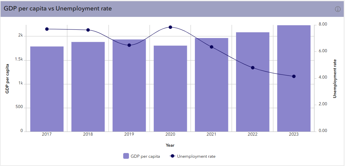
One of the most impactful additions this year is the dual axis option for multiseries charts. This feature lets you plot two metrics with different scales on the same chart, helping users better understand relationships that previously required separate visuals.
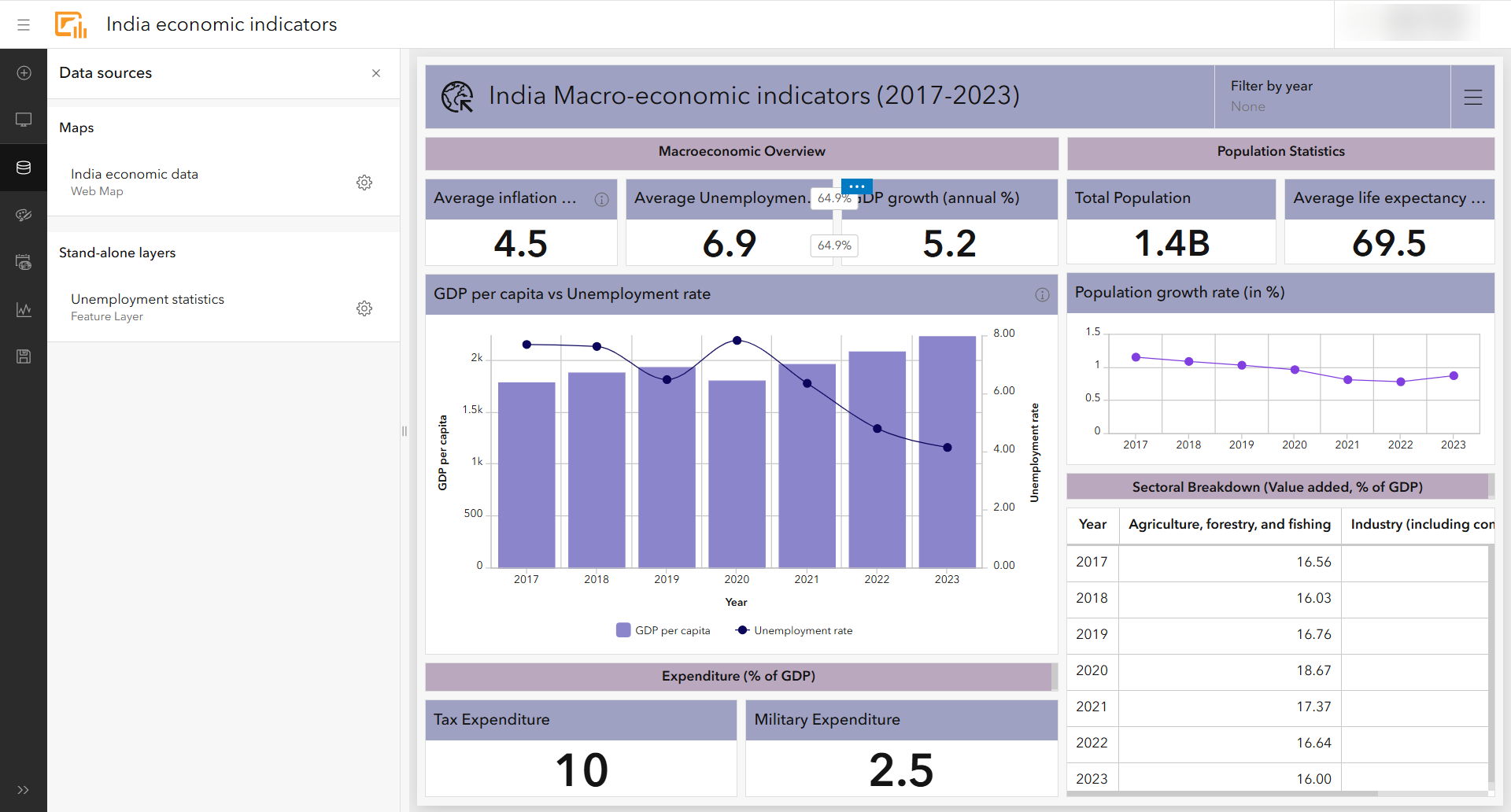
In this India Economic Indicators dashboard, dual axes charts make it easier to compare trends such as GDP growth vs. inflation. This helps reduce visual clutter while strengthening analytical clarity.
Element headers
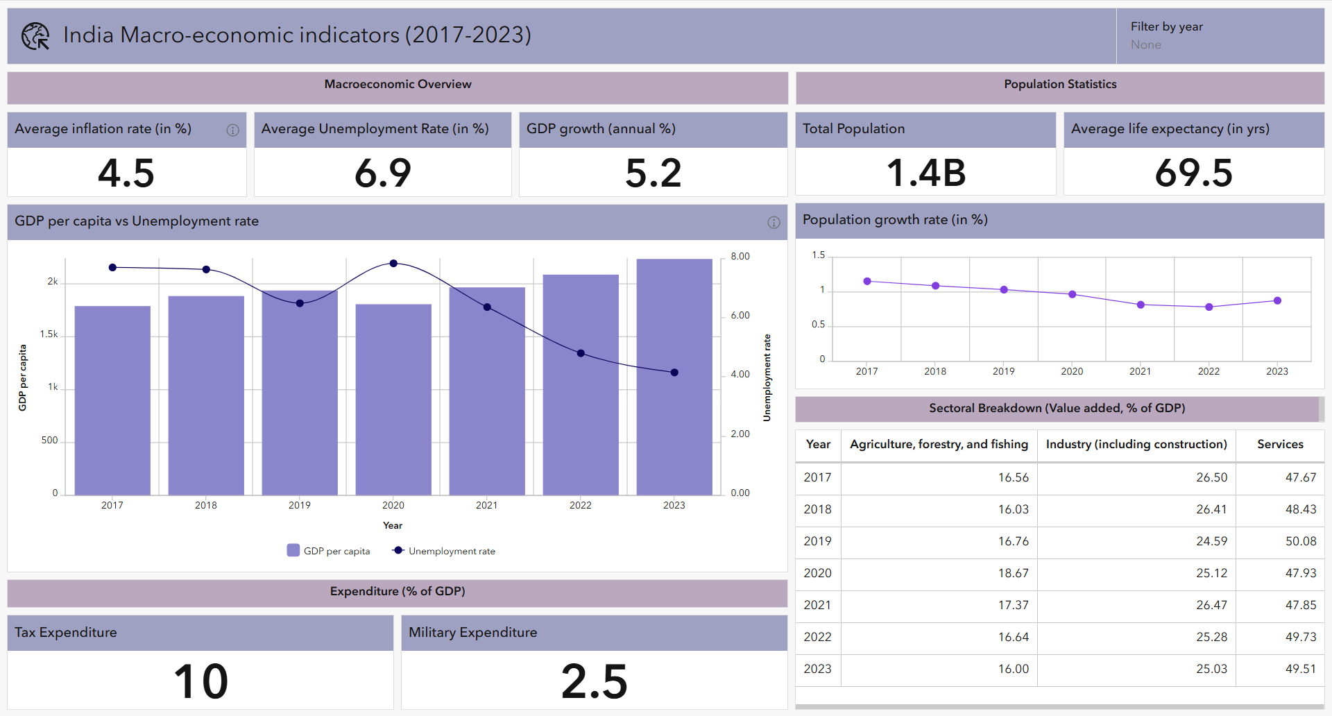
Dashboard elements received a major upgrade through headers. Authors can now:
- Add uniform titles across multiple elements
- Provide additional context with the new More information button and add disclaimers or metadata
- Customize header fonts, sizes, and colors
You can see these improved headers throughout the dashboard, where clear labeling helps guide users across metrics, maps, and charts.
New date field types
To support diverse datasets and time-based analysis, ArcGIS Dashboards introduced new date field types:
- Date only
- Time only
- Timestamp offset
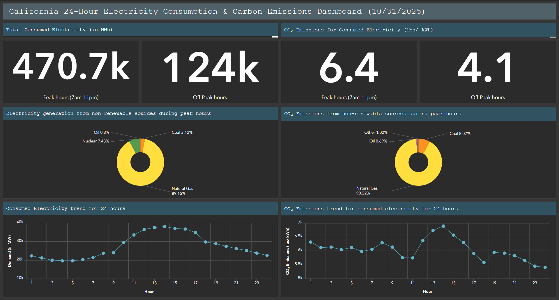
These formats allow dashboards to better reflect the original structure of the data critical for energy load monitoring, hourly operations, or global datasets with time-zone-aware timestamps.
In the Energy consumption dashboard, these new date types improve how temporal patterns are visualized and filtered.
Date selector slider
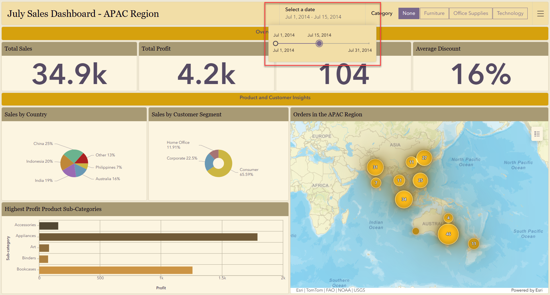
The new date selector slider brings a more intuitive timeline experience to Dashboards. Users can now drag a handle to adjust date ranges and immediately see charts and indicators update in response.
This is especially effective in the Sales and India Economic Indicators dashboards, where exploring trends over days, weeks, or months becomes much more fluid.
Configure data sources
The new Data sources panel gives authors a single location to view, repair, or replace data connections across the entire dashboard. This simplifies management for dashboards with many layers or expressions.
While it’s featured only briefly in this year’s demonstrations, it’s a foundational improvement that will help authors maintain scalable, reliable dashboards going forward.
Header styling
This year also introduces more visual customization options through flexible header styling in themes. Authors can now fine-tune:
- Fonts
- Font sizes
- Text colors
- Foreground (accent) colors
Across the featured dashboards, these enhancements help create a cleaner, more consistent look, whether aligning to organizational branding or improving visual hierarchy for readers.
Google Analytics
For authors who want to better understand dashboard engagement, ArcGIS Dashboards now supports Google Analytics Measurement ID integration. With it, you can monitor how users interact with your dashboards.
Looking Ahead
The updates delivered throughout 2025 give dashboard creators more control, precision, and flexibility than ever before. Whether you’re comparing complex indicators, managing time-specific data, or designing dashboards that reflect your organization’s brand, these enhancements make it easier to craft data experiences that drive insight and action.
To explore these features in more depth or start building your own dashboards, visit the ArcGIS Dashboards Resources page.
Thanks for joining us for this year’s look back. Cheers to another year of smarter, more informative and intuitive dashboards!

Excellent summary of Dashboard updates! The new date/time field types, slider selector, and dual-axis charts are particularly useful — they really expand how we can explore and visualize time series data. Excited to see what’s next!