Why some dashboards feel…uncomfortable
Ever open a dashboard and immediately feel overwhelmed, distracted, or unsure where to look first—without knowing why?
That reaction usually isn’t about the data itself. It’s a response to visual noise: competing colors, excessive emphasis, and design decisions that pull your attention in too many directions at once.
Some advice
This video walks through where this noise comes from and how to calm it…
0:00 Introduction
0:23 Anti-patterns: What not to do
1:46 Dashboards are about questions
2:24 How to tame a dashboard
3:56 Closing
Key Takeaways
Where Dashboard Noise Comes From
- Over-emphasized themes and heavy styling compete with the data for attention.
- Excessive or inconsistent color use creates visual clutter and distraction.
- Randomly arranged content and weak hierarchy force users to hunt for meaning.
- Dense text and incorrect visualization choices increase cognitive load.
- Dashboards designed for everyone often end up serving no one particularly well.
Dashboards Should Answer Questions
- Effective dashboards are built around a small set of clear, intentional questions.
- Common questions include: Is everything ok?, How are we performing?, and What’s changing?
- When the question is unclear, the design becomes unfocused and noisy.
- Let the questions—not the data or available charts—drive layout and emphasis.
How to Tame a Noisy Dashboard
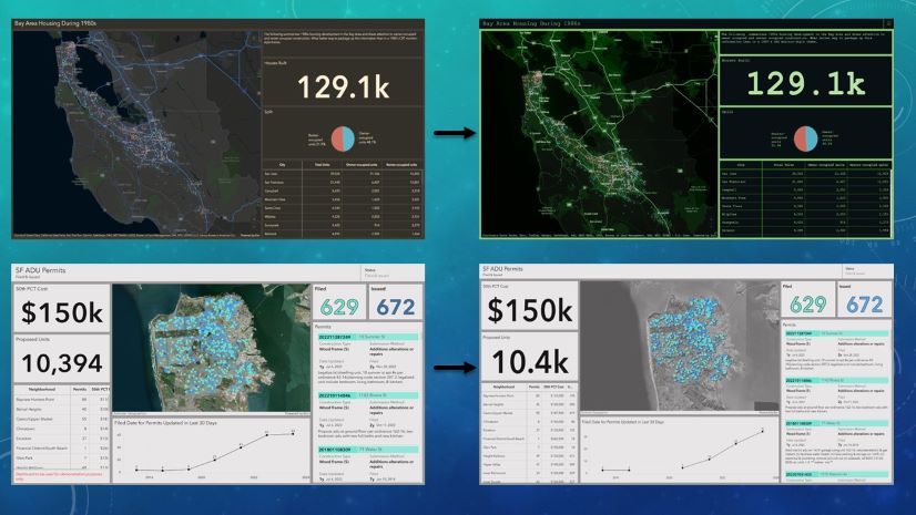
- Make the dashboard look “boring” to reduce friction and improve scanability.
- Remove anything that doesn’t directly support the primary question.
- Establish a clear visual hierarchy so users know where to look first.
- Use mild themes and subtle colors, reserving strong emphasis for what truly matters.
- Let one key insight shine, instead of trying to highlight everything at once.
- To learn how to apply the map muting technique, check out this blog post.
Thank you for watching! We love the work that you are doing and would love to see your favorite examples. Feel free to share your dashboards in the comments!


Avoiding pitfalls of dashboard creation is essential for designing something extremely valuable for an organization. Thanks for these ideas!