They say a picture is worth a thousand words – and the same can be said for an icon. Icons are simple images that communicate a clear and simple meaning. They can attract immediate attention to areas that need action, convey information and identify the status of something.
Using Arcade (new in the ArcGIS Dashboards Beta), we can display different icons in an indicator based on conditions in your data. For example, displaying a check mark when values are in the “good” zone and a warning icon when values are in the “bad” zone, or displaying an upwards arrow when counts have gone up and a downwards arrow when counts have gone down.
A good example is monitoring incoming call volume. We can use this technique to compare the current 24-hour count of calls with the 30-day average and draw attention to any significant spikes or dips using icons – like in the indicator below.

First, we want to set up our indicator’s data.
1. In the Data tab, from the Statistic drop-down, choose Count to get a count of your calls (or whatever data you want to use).
2. Apply a filter on your date/time field is within the last 24 hours.

3. Enable Reference and again, get the count of calls (or whatever data you’re using), but this time, apply a filter on you date/time field is within the last 30 days. Turn off the Include current toggle to exclude today from the time span.
Now it’s time to go into the Arcade editor and create our conditions.
4. In the Indicator tab, click Enable.
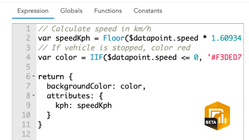
5. In the Arcade editor, delete the lines above the return statement and paste the following lines.
The above expression is taking the current 24-hour count (todaysCount) and the average of the last 30 days (avgDaily) and using them in a percent change calculation (percentChange) to determine the increase or decrease in call volume. The icon variable is declaring at what percent change value does which icon display.
Finally, let’s declare our actual icons.
6. Below the Arcade editor, under Icons, click +Add and select an icon that represents the condition of when the change is < -2, and give it the name down.
7. Repeat for the other conditions and give them the appropriate names (ok, up, warning)
8. In the properties being returned, reference the icon and todaysCount variables for the iconName and middleText properties respectivley. Add a title for your topText. Your final expression should look like the one below.

Here’s the result for what the indicator looks like when different conditions met.

Take this technique and apply it to your own data to see how Arcade can be used in your dashboards to better communicate statuses. You can take this technique further and make these icons pop even more, by defining colors for each condition using the iconColor property. Check out the advanced formatting documentation for more information on defining properties in your elements.
The Dashboards team at Esri is excited to see how you use Arcade in your own dashboards to communicate information using icons and conditions. If you can, share your innovative dashboards with us using #ArcGISDashboards.


Article Discussion: