Ready to level up?
In Layer styling in ArcGIS for Power BI, we explore how your brain is wired to process visual information and how ArcGIS for Power BI’s foundational symbol types help you communicate data visually. If you’ve been styling your layers with those, you’ve already elevated your reports from “here’s where my data is” to “here’s what my data means”.
But what happens when your questions get more sophisticated? What if you want to compare many attributes at once, show the relationships between two variables, or show which category is the winner in every region on your map?
That’s where advanced symbology comes to the rescue. In this post, we will cover four recently added symbol types: Pie (Donut) chart, Dot density, Predominant category, and Relationship.
Before you begin
One important note: these four advanced symbol types only work with demographic layers and feature layers and added from ArcGIS Online, as well as joined result layers from the Join layers analysis tool. In addition, the new layer styling options are available for both Guest users and ArcGIS users.
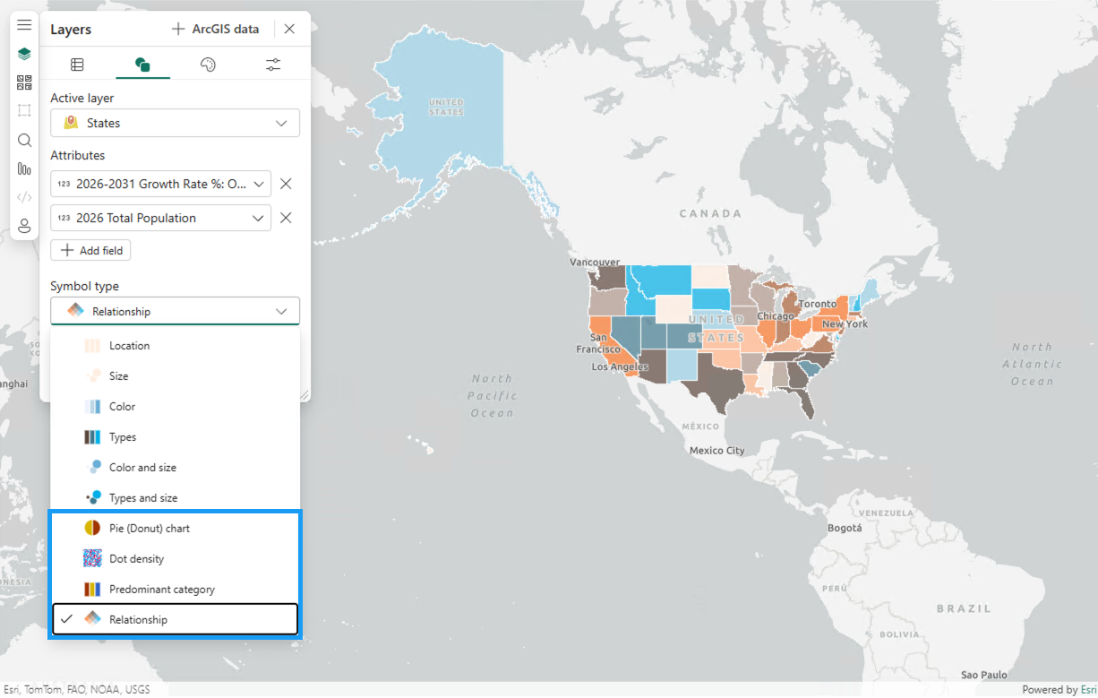
You will find these options by clicking the Symbology tab in the Layers pane, choosing your (feature, demographic or joined result) layer in the Active layer dropdown, and picking a style from the Symbol type dropdown menu. Smart mapping will do the heavy lifting here. Once your layer has the right ingredients (your data’s attributes), you will see several advanced options appear in the menu.
Pie (Donut) chart
Every feature on your map has a story, and sometimes that story is made of “parts of a whole”. The Pie (Donut) chart symbol type shows the proportions of categorical data associated with each feature on a map, making it ideal for visualizing things like language diversity across Northern California, where each pie slice represents a different language spoken within that area.
To activate this option, add two or more numeric attributes to the Symbology tab. If you are more of a donut person, head to the Style options tab and adjust the Shape slider under Chart Styling to hollow out those pies. We don’t judge.

Dot density
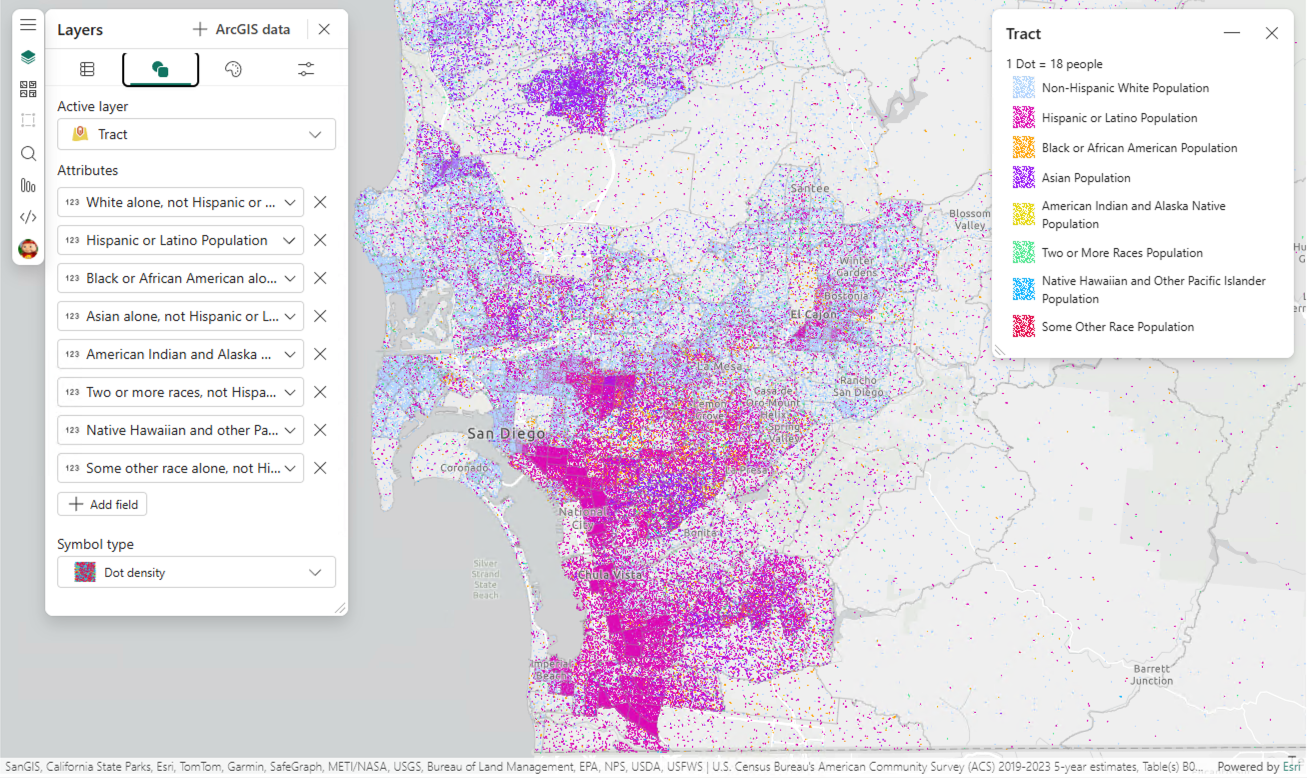
Dot density is a great way to show the concentration and density of a numeric attribute across polygon layers, where every dot represents a count of something (or someone). Different colored dots can even let you compare multiple attributes at once, like population by race across a location.
Add one or more numeric attributes on the Symbology tab, and the Dot density option appears in the Symbol type menu. Make sure you spend some time with the Dot value slider (if the setting is disabled, turn off the Vary dot value by scale option) on the Style options tab until the pattern clicks; if the dot value is too low, your map becomes a solid wall of dots, too high and meaningful patterns will disappear.
Predominant category
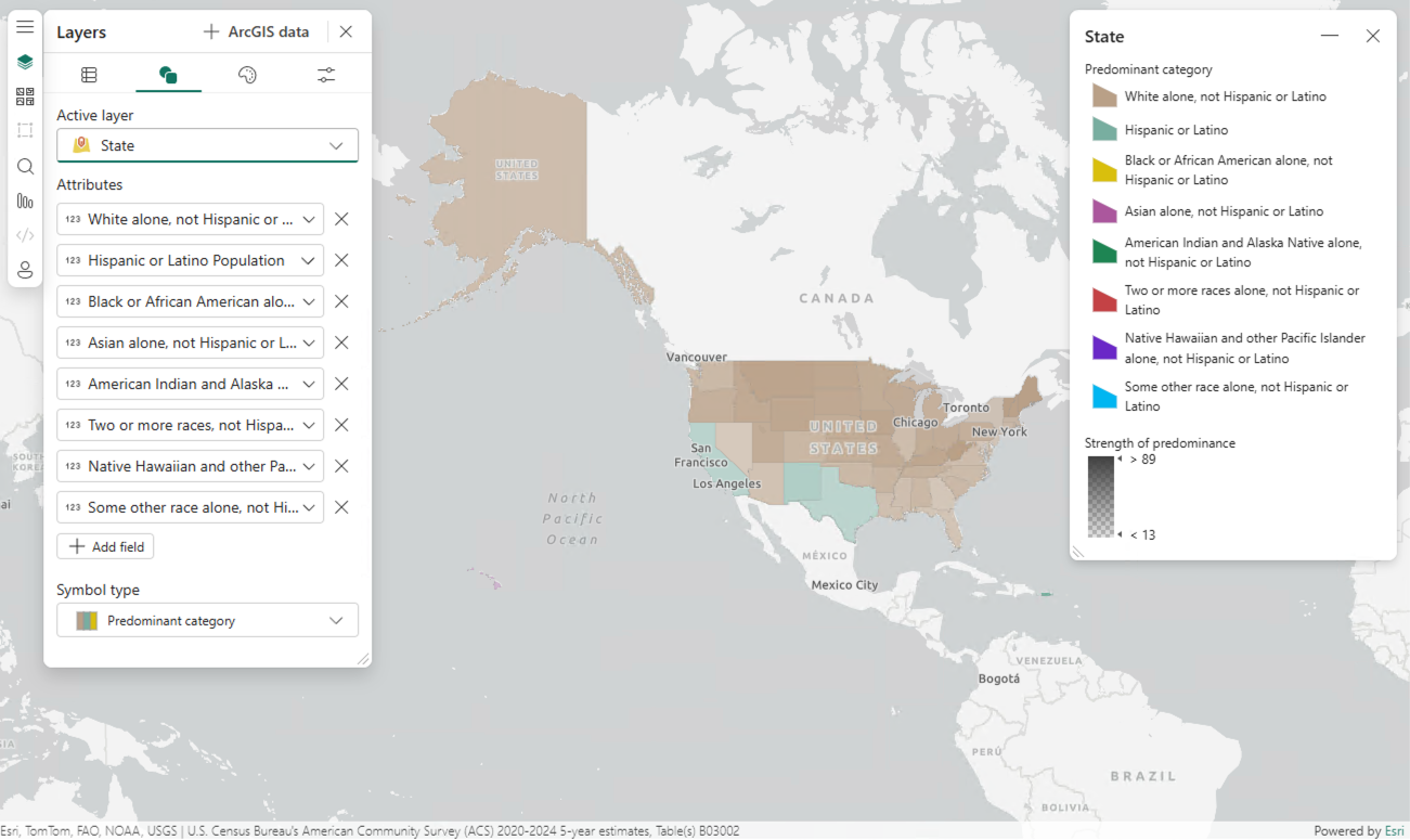
Another question often asked of categories is which one stands out the most. The Predominant category style compares multiple related attributes and highlights the category with the highest value in each feature. Color identifies which category is present, while opacity shows how strongly it stands out from others.
To get started with this style, add two or more numeric attributes on the Symbology tab, and may the best attribute win!
Relationship
Last but certainly not least, the Relationship style is for those moments your report consumers want more than just “where” and start asking “why”. Built on the bivariate choropleth mapping technique, it gives each of two numeric attributes its own color ramp and combines them, so you can see where both values are high, where both are low, and where one value is high while the other is low.
Add two numeric attributes on the Symbology tab and select Relationship from the Symbol type menu. Then play with the Focus option on the Style options tab to spotlight the corner of the relationship you care about most, like where both values are high. You can also adjust the classification Method and other options too.
After all, good maps answer questions. Relationship maps reveal the questions hiding between the answers.

So, which one should you choose?
Think of it this way. If your questions are “what’s the composition at each location?”, reach for the Pie (Donut) chart. If it’s “how is this count spread out, and how do multiple counts compare?”, Dot density is your friend. Wondering “which category wins in each area, and by how much?”. That’s Predominant category. And if you’re asking, “do these two variables relate, and where?”, Relationship style has your answer.
Start exploring today!
Advanced symbology is where your maps stop simply describing your data and start analyzing it. Pair these styles with a well-chosen basemap and you’ll be answering questions your report consumers didn’t even know they had.
For step-by-step details, check out the Symbol types and other pages in the ArcGIS for Power BI documentation, and learn how to add layers from ArcGIS Online to unlock these styles.
As always, we would love to hear how you use map visualizations in your reports. Share what you’re creating with us on our Esri community page!


Article Discussion: