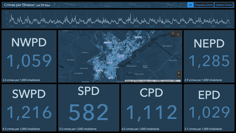
ArcGIS Dashboards enables you to use a variety of visual elements to see the status of people, services, assets, and events in real-time. It enables you to easily visualize analytical or statistical data results.
Pie chart elements commonly appear on dashboards. Their purpose is to visualize part-to-whole relationships. There is, however, contention over their effectiveness and frequent mis-use. It is taxing on the mind to interpret angles and areas presented in a pie chart. Thus, it is important to keep them simple and consider using alternative chart options. The following contrasts effective and ineffective uses of a pie chart.
This article will suggest how to use pie charts effectively (“Dos”) and how to address common mistakes (“Don’ts”), providing tips for improving them and offering alternative chart options.
Effective Use of a Pie Chart
Pie charts are for displaying relative proportions. For example, one could use a pie chart to display the percentage of officers on duty, on break and off duty. Or, they could present the percentage of male and female voters. Because of their visual complexity pie charts are most effective when they display the proportions of 2-4 categories of data, or at most 6.
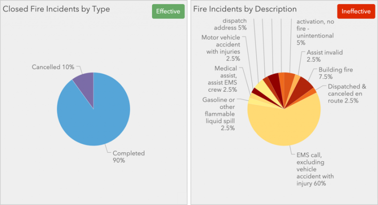
Let’s say we are building a dashboard for a fire chief which is reviewed daily to understand statistics of recent fire incidents. An effective use of a pie chart would be to display the breakdown of closed incidents by the percent completed vs. cancelled.
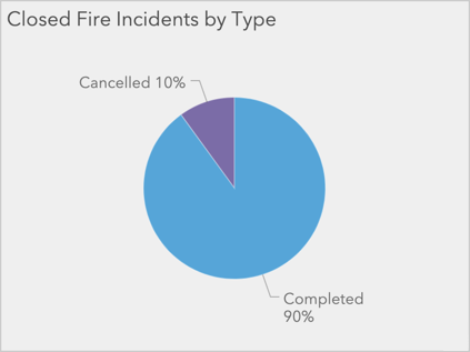
The relative proportions of cancelled and completed incidents are quickly understood. The labels are legible, and the colors have a good amount of contrast.
Some principles for effective pie charts:
- The number of slices should remain between 2 to 6.
- The slices should be ordered in a meaningful way.
- Labels should be concise and easy to interpret.
- Unique colors with good contrast should be used to differentiate slices.
Now let’s look at what happens when you don’t follow these principles.
Poor Use of a Pie Chart
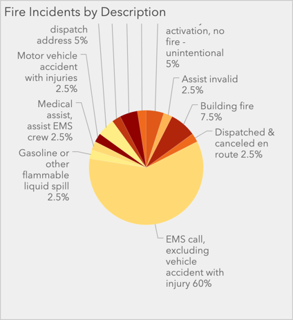
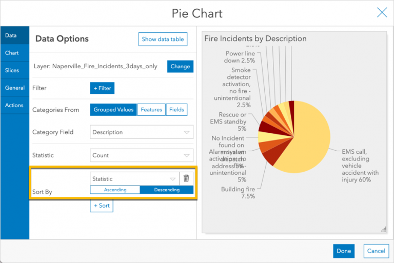
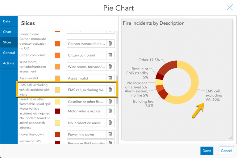
Continuing with the fire chief’s dashboard, suppose we try to visualize the relative proportions of fire incident types using a pie chart. There are many different classifications of incidents with detailed descriptions. For colors, we try using a fire-colored ramp. The following is the result:
Let’s evaluate how effective it is based on the principles above:
- The chart has 12 slices. As a result, it is very busy, labels don’t draw well, and it is difficult to compare the angles and areas of each slice.
- The slices are ordered alphabetically. Although it might initially seem logical, it forces the eyes to do lots of scanning to compare sizes.
- The labels include long strings that are difficult to read and cause the chart to look jumbled.
- Some of these colors are very similar and difficult to make out. It also causes one to consider whether the similar colors are related in some way.
With this in mind, I hope is has become clear that this is an ineffective chart. Let’s consider a couple options we have: (1) make adjustments to improve it and (2) consider an alternative way to visualize the data.
Tips to Improve a Complex Pie Chart
To reiterate, a pie chart is for displaying relative proportions. In the previous section we created a complex, ineffective pie chart. Let’s go through some tips for improving it. First, sort the slices based on size.
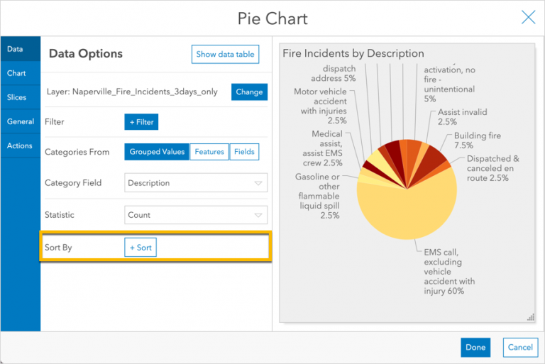
For the Sort By property, choose Statistic and the Descending option to sort the slices from largest to smallest as you go around clockwise, starting at the top.
Next, consider whether your audience really needs to see all of the small slices. Perhaps the fire chief only needs to see the most frequent incident types. So, let’s group the small slices together. This can be done in the Slices tab with the Grouping % property.
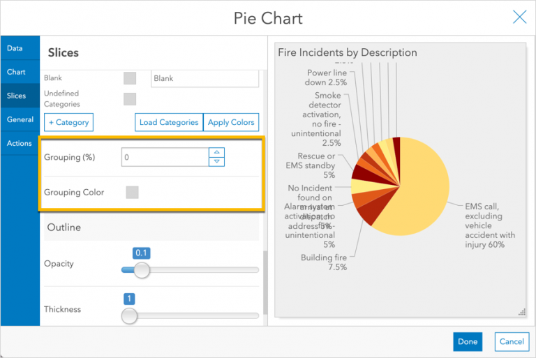
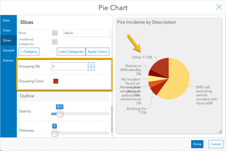
Set the Grouping % to 5 so that all slices with a percentage of 5 or less will be grouped into an “Other” slice. What a big improvement. Now there are only 6 slices.
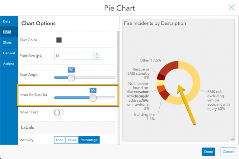
Even with this improvement, the pie chart is visually complex for the mind to interpret its angles and areas. Turning it into a donut chart eliminates the inner angles and lets the mind instead measure lengths (as bent lines). In the Chart tab add an inner radius percentage, such as 65%.
Having shorter labels improves readability of the chart. If you are unable to address the long text in your data set, use label overrides to abbreviate and shorten how the text displays. Update the labels in the Slices tab.
Another technique to improve the readability of long labels and the percentage values can be to use a legend instead of labels with leader lines. The downside is that the user’s eyes must work to match the legend to the slice on the chart. Use discernment in choosing which one to display. Don’t display both at once, as it is redundant and adds clutter.
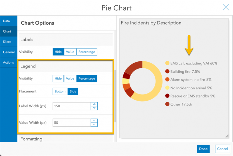
The chart has come a long way and is much more effective now. However, even with these improvements, it is wise to consider whether alternative charts might offer a better way to visualize the data.
Consider Alternative Ways to Visualize It
If you find yourself working hard to get your pie chart looking good, it may be time to consider visualizing it differently. Often the serial chart element is a better choice for data with more than four categories.
Let’s circle back to our fire incident dashboard. We want to display the breakdown of incident types for the chief, particularly the most frequently occurring types. Displaying this in a serial chart we can get the following:
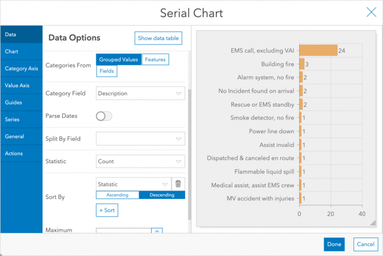
The incident types are aligned in legible category labels, and it is easy to compare the bar sizes. It has become evident that the data is sparse, with only one occurrence of several types of incidents – not obvious in pie charts.
To simplify the chart further, we can limit it to the first “n” categories to show only the most frequent incident types. Apply a Maximum Categories value of 5 to only show the first 5.
Note: The maximum categories property shows the first “n” categories and does not handle ties.
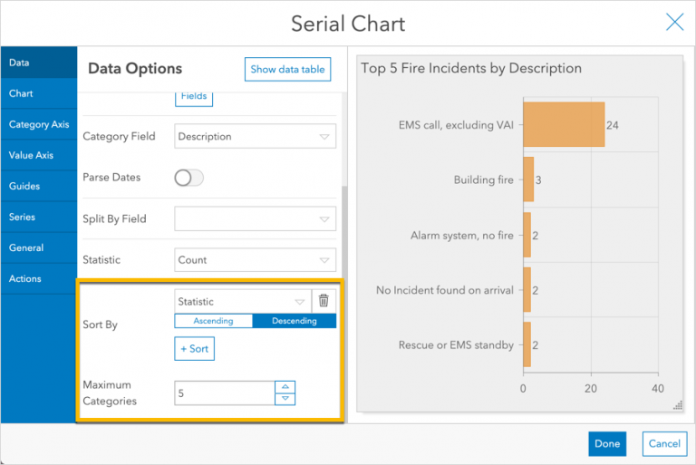
This serial chart effectively communicates the five most common incident types with their counts. This is arguably more legible and easier to interpret than the pie chart, even with the improvements.
Dos and Don’ts Summary
The principles and tips above can be boiled down in several dos and don’ts of pie charts.
| Don’t | Do | |
|---|---|---|
| Slices | Don’t have an excessive number of slices. | Keep the number of slices less than 6. Consider the donut configuration or, better yet, use a SerialChart instead. |
| Sorting | Don’t use a seemingly random sort order to the categories. | Sort based on slice size, for example the statistic in descending order. |
| Labels | Don’t use long names for labels – they might not render well and are difficult to read. | Use concise names and abbreviations in your data. If needed, utilize label overrides. |
| Colors | Don’t use a color more than once. | Use unique colors for each category and make sure they have enough contrast for good legibility. |
If you’d like to take a look at how I created these charts, you can view the dashboard or create a copy to edit (sign into your account).
I hope these tips help you build better charts and dashboards. We, the ArcGIS Dashboards team at Esri love to see what you create and hear how we can continue to improve. If you are able, please share them on Twitter or LinkedIn tagged with #ArcGISDashboards. Post questions and feedback in geonet.

Commenting is not enabled for this article.