By Rajinder Nagi, Esri Research Cartographer
We got a really interesting question on Ask a Cartographer earlier this month and since we had long wanted to make this type of map, we jumped on the opportunity to test out the methods. Here is the (paraphrased) question:
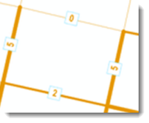
“I would like to analyze the location of about 320 bicycle and pedestrian crashes in a city over a 6 year period. About 2/3 of the points have XY values. The other third, I manually placed using a description of the location. I would like to display the locations in a more meaningful way than just points. Would I be able to do a dot density map or some type of heat map? Attached is a map I found in another place. Is it possible to replicate this in GIS?”
What this user wanted to do was to vary the width of the road segments to reflect the number of accidents — this is a very effective way to show the quantitative data (number of accidents) for the line features (road segments). So we got the user’s sample data and tested the workflow to achieve the results she was looking for, as shown in the attachment to her original question.
1) First of all your road data need to be topologically correct. What that means is that the roads need to split at the intersections. This needs to be the case so that each line segment of road between intersections is a unique feature. Then you can assign the accident data to the related road segment. To split the roads at the intersections, use the Feature To Line tool (for an ArcInfo level license) – this tool will create a feature class (or in your case shapefile) containing new lines generated by your original lines and splitting them at their intersections. Another option available at the ArcEditor and ArcInfo license levels is Splitting lines at intersections with Planarize Lines.
The one data issue that you may have is the fact that some accidents may fall directly on the intersections of the road segments and will be counted for each road segment in that intersection. To take care of this, double check your data and make sure each accident is associated with one road segment. (This would actually be a fairly rare situation as the accident point would have to fall exactly on the intersection point.)
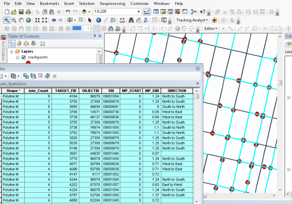
2) Now that your road data are topologically correct, use the Spatial Join tool to transfer the attributes from the accidents feature class to the roads feature class. In your case, the Target features will be your roads line feature class and the Join Features will be your accidents points feature class. Select as the Join operation ‘JOIN_ONE_TO_ONE’. Using this option, if multiple Join Features are found that have the same spatial relationship with a single Target Feature, the attributes from the multiple Join Features will be aggregated. A column called Join_Count is added to the Target Features. Join_Count will record the number of accident matches per road segment. You may want to use a small search radius in case the accident points are not exactly on the roads. Once you have set the options, run the tool.
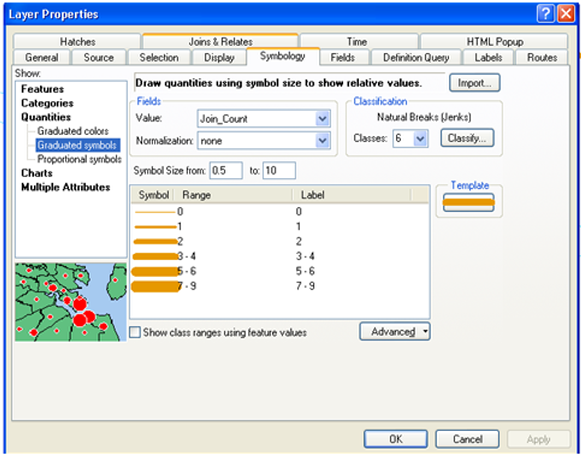
3) Now that you have the Join_Count attribute that identifies the number of accidents for each road segment, you can use it to symbolize the roads so that segments with more accidents are wider than those with less. To do this, use the Quantities – Graduated symbols renderer on the Symbology tab of the Layer Properties for the roads feature class. Set the symbol size values to reflect what your want your narrowest and widest roads to look like – the others will be scaled appropriately between these extremes.
4) You can also label the roads with the accident count if you want to. On the Labels tab of the Layer Properties, the Label Field would be Join_Count. To achieve results like those shown below, on the Labels tab, click Symbol, then click Edit Symbol, and on the Advanced Text tab, check the option to use a Text Background. Then you can set the symbol properties for the background.
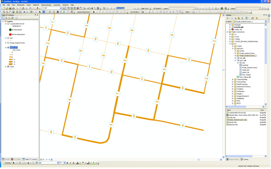
You now have the solution you were looking for! You can also use this for other quantitative distributions for line features, for example, the amount of traffic for road segments, the amount of discharge for river segments, the number of birds along migration routes, etc… Hopefully you will find other great uses for this wonderful mapping technique!
Thanks to Aileen Buckley and Ashley Pengelly for their help with this blog entry.

Article Discussion: