Johns Hopkins University is now providing data in a map layer by county for COVID-19 cases and deaths. See the announcement. This layer is created and maintained by the Center for Systems Science and Engineering (CSSE) at the Johns Hopkins University. This feature layer is supported by Esri Living Atlas team and JHU Data Services. See the FAQ or contact Johns Hopkins for more information.
Johns Hopkins University is interested in working with states who are providing county case data as a feature layer, so that JHU can source from the state directly. Contact Johns Hopkins University for more information.
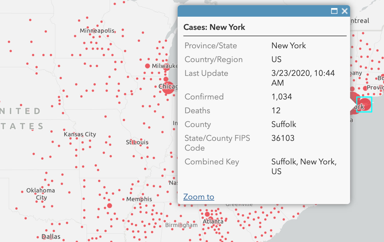
Due to limitations in how the data is collected and reported, this new layer contains only confirmed cases and deaths. Although there are fields for active and recovered, they are not being updated and can be ignored for the US. The “Combined Key” field gives the county name, state and country.
IMPORTANT NOTICE:
1. Fields for Active Cases and Recovered Cases are set to 0 in all locations. John Hopkins has not found a reliable source for this information at the county level but will continue to look and carry the fields.
2. Fields for Incident Rate and People Tested are placeholders for when this becomes available at the county level.
3. In some situations, cases have not been assigned a location at the county scale. Those are still assigned a state but are listed as unassigned and given a Lat Long of 0,0.


Is a csv version of the table data available for the public, and if so, where?
Check the notes on the JHU Dashboard page for current information on this topic.
See the Johns Hopkins Dashboard
Yes, see the links in the first paragraph. Several will lead you to the JHU sources available for download.
Jim, thank you very much!!! This is fantastic!! BRAVO!
So helpful, thank you!
Here is a sample web map that utilizes the County level data for the US at the right scales, and shows counts of Active cases outside the US where that data is available. The popups use Arcade to determine the right information to show for locations around the world and in the U.S.
This is huge, thank you!!
Thank You Esri and Johns Hopkins University! We have it in our Operations Dashboard for Audubon https://audubon.maps.arcgis.com/apps/opsdashboard/index.html#/e43d484191614f3fa1ace1c5e64d273b
Hey Jim Herries!
Good work.
can you please inform me that , the data Is it available publicly or not. Kindly inform
Thank you so much for your time
Yes, it is available publicly. See any of the links in the article above.
Hello Jim,
Thank you for sharing this. It is really helpful. We are using this map layer using our Power BI ArcGis Plugin.
I just noticed and wanted to bring to your attention that this map layer is showing a red dot on lot of counties even there is no confirmed, death or active cases.
For example if you search for Mason, TX, USA (Mason County) and zoom out from the link below, you will see a red dot for this county even there is no Covid-19 activity.
I think this is what we are using in our Power BI
https://www.arcgis.com/home/webmap/viewer.html?url=https://services1.arcgis.com/0MSEUqKaxRlEPj5g/ArcGIS/rest/services/ncov_cases_US/FeatureServer/0&source=sd
Thank you,
Nikhil
Thanks for pointing that out. I see it has been fixed now in the layer, where a filter “Confirmed > 0” is now applied. A MIN value in the legend of 1 would have had the same effect as a filter. A MAX value that is too small may cause features to suddenly stop drawing if the # of cases exceeds whatever you save as your MAX value. So think ahead to a worst case scenario and set your MAX value to that, to future-proof your classifications. If you turn off classification, you won’t have to worry about the MAX value issue.
Hi Jim! What is the best way to get the total for the US? Adding up the states seems to be off. Thanks!
Use this layer for the Countries total.
Hi Jim, We are looking for a layer that is dynamically updated with State Closure information. I’ve looked through the living atlas and haven’t found anything. Have you seen an AGOL layer such as that?
Many thanks and keep up the good work,
Ron Salz
Chief Cartographer
National Wildlife Refuge System
I have not, but here’s a useful search pattern where you specify what you want in the title, and add other words to contextualize the search: title:closure covid
Just saw this today: https://arc-nhq-gis.maps.arcgis.com/apps/webappviewer/index.html?id=ebe29d4c1fca4ac292d00dbd54ed37e9
Morning Jim,
Am I correct in saying that the counties of the Bronx, Queens and Kings are still missing from the following rest service ?
https://services1.arcgis.com/0MSEUqKaxRlEPj5g/arcgis/rest/services/ncov_cases_US/FeatureServer/0
This is the fourth time I’ve posted on a blog. But still no clarification.
Regards.
Jeremy.
Jeremy, I checked the layer and there is data for a feature named “New York City” which represents the 5 boroughs. To see it, open the layer, hit “Change style” and set the max value to something like 1,000,000 so that the feature draws. Right now, NYC has 210,000+ total cases, but the classification has a max value of 100,000 so the feature doesn’t draw. I’ve let the team know about this, so it should get corrected in the layer, but you don’t have to wait for that if you’ve put the layer into a web map or other app yourself.