Inspired by hackathons, we combined a one-day, mentored sprint with weeks of preparatory sessions on storytelling and GIS tools with Esri’s assistance.
At IMPACT Initiatives, data and research drive smarter humanitarian and development decisions around the world. In early 2024, the Ukraine mission sought the ArcGIS StoryMaps team’s assistance in piloting an internal “story mapathon” to boost adoption of ArcGIS StoryMaps, strengthen cross-team collaboration, and surface human-centered stories from complex datasets. Below, three members of the Ukraine team describe how they brought together GIS specialists, researchers, and communication experts to spur innovative data storytelling. They also suggest ways you can replicate their approach in your own organization. The conversation has been edited for clarity and brevity.
Q. Can you introduce IMPACT Initiatives and your roles for readers?
A. Mariia Tomashchuk, GIS Specialist, Cross-Cutting Technical Team: At IMPACT Initiatives, our mission is to support evidence-based decision-making for humanitarian and development actors through data, research, and analysis. We work globally to provide timely and relevant information to improve the lives of people affected by crises.
I support teams transforming data into visual products including ArcGIS StoryMaps, ArcGIS Dashboards, and spatial analysis. I also lead internal technical capacity-building initiatives like the story mapathon, technical workshops, and GIS capacity-building sessions.
A. Kateryna Pomazanna, Senior Assessment Officer, Durable Solutions Unit: My work focuses on forced displacement, particularly on understanding the experiences, needs, and intentions of displaced populations including Ukrainian refugees abroad, those who have returned, and internally displaced persons (IDPs).
A. Mackenzie Seaman, Research Manager, Humanitarian Needs & Monitoring Unit (HNMU): I oversee three assessment projects: the Multi-Sector Needs Assessment (MSNA), Joint Market Monitoring Initiative (JMMI), and Humanitarian Situation Monitoring (HSM). These projects gather and analyze data on household needs, front-line settlements, and cash-intervention feasibility across Ukraine.

Q. What inspired the story mapathon and motivated you to use maps for storytelling?
A. Tomashchuk: In early 2024, we wanted to visualize shifting humanitarian needs through maps. Working with my colleague, Alina Belobra, we built on past successes with ArcGIS StoryMaps to create a comprehensive story in just over a week. Our rapid turnaround sparked curiosity about the process; how GIS, storytelling, and data analysts collaborated, so we decided to scale the experience across the entire country mission.
A. Pomazanna: Longitudinal data inherently tells a story because we track the same respondents over time through displacement, return, and reintegration. Mapping those journeys grounds them in place and reveals how difficult, exhausting, and profound they are. The map-based storytelling became a bridge between individual experience and broader trends.
Q. What innovative approaches or tools stood out during the story mapathon?
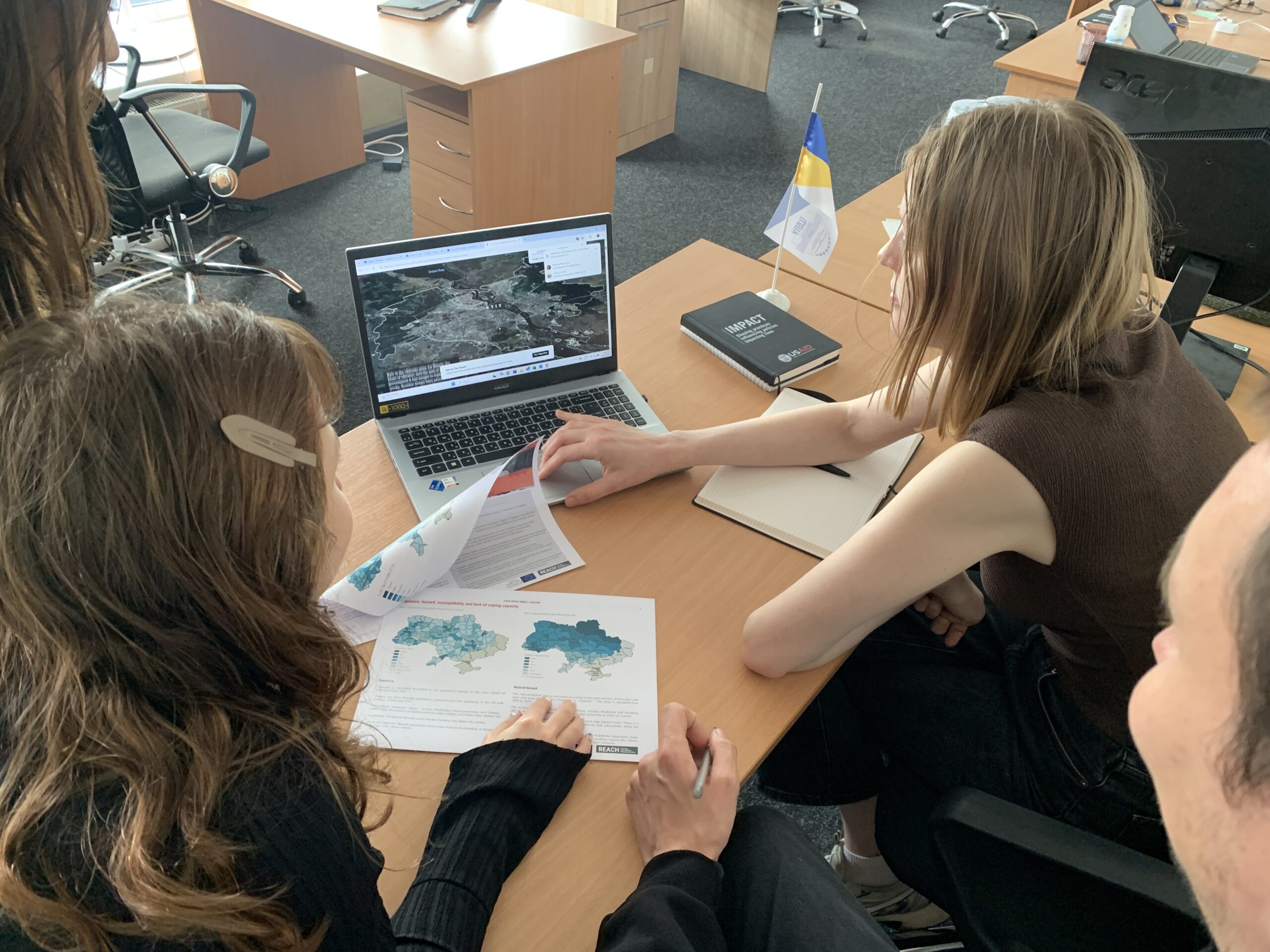
A. Tomashchuk: Inspired by hackathons, we combined a one-day, mentored sprint with weeks of preparatory sessions on storytelling and GIS tools with Esri’s assistance. After the event, we offered expert consultations on GIS, design, and communications to help teams finalize interactive, visually engaging stories.
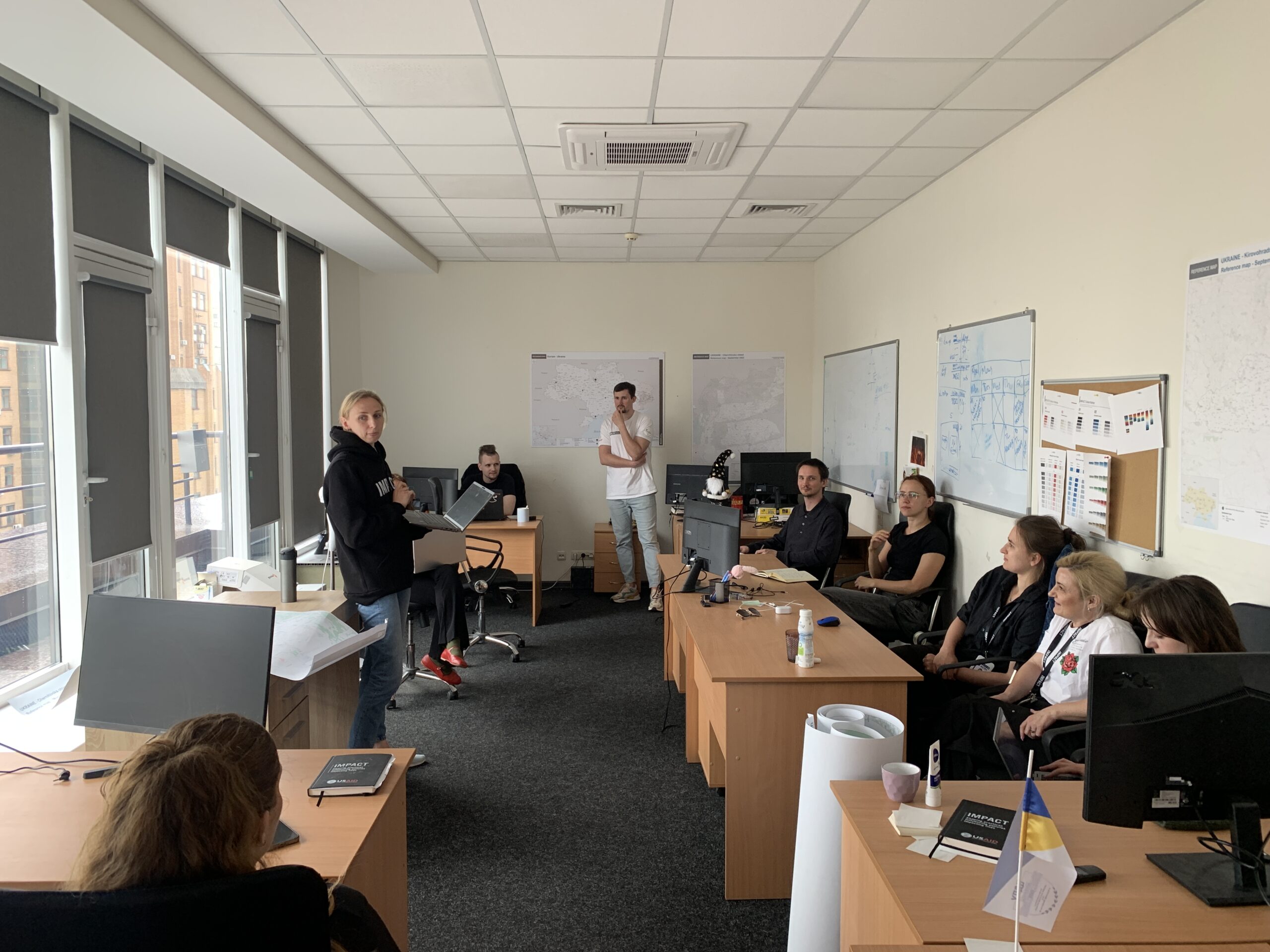
A. Seaman: Having everyone co-located, research, data analytics, GIS, was critical. We walked through visual options together, iterated in real time, and benefited from face-to-face collaboration, especially since our MSNA team is usually dispersed.
Q. Which stories resonated most, and why?
A. Tomashchuk: Two stories were created based on the story mapathon insights. Unsafe returns, this map uses high-quality data and respondent quotes to humanize return journeys. Beginning with voices of the displaced, it vividly traces each path on the map.
A. Seaman: Also, The Urban Rural Divide by the MSNA team. A key asset of ArcGIS StoryMaps is its ability to tell a compelling, personal narrative via visuals. We turned a multi-sector impersonal dataset into an interactive human narrative on rural-urban needs, making technical data accessible to a wider audience. The story expanded the opportunity for a more diverse audience to encounter MSNA data.

Q. How does storytelling through maps foster innovation and creativity?
A. Tomashchuk: Teams learn to see research through each other’s eyes. GIS understands the assessment group’s vision and vice versa improving teamwork. We realize that ArcGIS StoryMaps is a powerful advocacy tool for the organization, making data accessible and understandable to the broader public through visuals and storytelling.
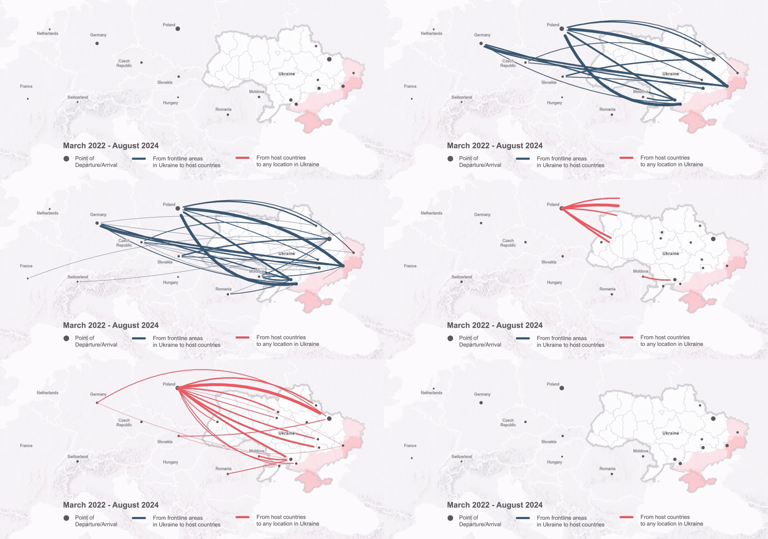
A. Pomazanna: With Unsafe Returns, we visualized emerging data patterns through real human stories. Our longitudinal research revealed people returning from abroad to frontline areas. We had the numbers, but not the ‘why.’ The story brought these trajectories to life, transforming abstract data into lived experiences and showing that, for many people, return is not voluntary but driven by constraint, exhaustion, and lack of options. That shift pushed us to collaborate creatively across roles and reframe displacement as a human story, not just movement.
A. Seaman: The MSNA story challenged us to create a visual narrative from the data, spotlighting rural urban differences that lend themselves to both maps and images. This mindset has carried over to other projects, prompting us to ask: which story can we mine from our data to give it a human face?
By treating data as interactive visual maps, images, and dynamic charts instead of static tables and graphs, authors re-examine their findings from new angles. This visual approach often uncovers fresh insights, shapes different recommendations, and deepens our understanding of the data.
Q. How did the mapathon enhance your communication strategies?
A. Tomashchuk: We turned our ArcGIS StoryMaps experience into a lesson-learned session, which shaped the story mapathon’s goals: fostering collaboration, providing expert advice on storytelling and GIS, and working hands-on with real research data.
A. Pomazanna: The story mapathon brought analysts, researchers, and technical staff together sparking discussions about both substance and feasibility. Researchers gained insight into mapping constraints, and GIS colleagues understood the emotional and ethical weight behind the data. The format humanized displacement and return by illustrating their complex, often painful realities.
A. Seaman: Storytelling through maps allows less technical audiences to encounter IMPACT data in a friendly, accessible way. CSOs, NGOs and other organizations can view spatial narratives at a glance, then dive deeper into the data that informs their programming.”
Q. What challenges did you face, and how did you overcome them?
A. Tomashchuk: High workloads forced us to postpone the mapathon until each team could participate. We aimed for a rapid, mission-wide rollout, but balancing innovation speed with the need to train everyone was difficult given the scope of work.
Q. How can other organizations replicate your success?
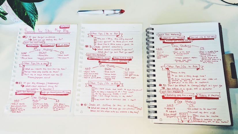
A. Tomashchuk: Invest time, budget, and team resources from the beginning. Carefully choose the project that will best tell the story in the format that will be planned. Don’t be afraid to make mistakes or start over.
Listen to your team and adapt. We had surveys at all stages of the story mapathon. This helped us identify gaps and adapt the strategy and processes based on feedback. Overall, the feedback from the participants was very positive and inspiring.
Conclusion
The IMPACT Ukraine story mapathon proves that innovation thrives where data, storytelling, and cross-functional teamwork intersect. By partnering with the ArcGIS StoryMaps team, IMPACT Initiatives has not only amplified its staff’s ability to craft compelling, map-based stories but also accelerated internal adoption of ArcGIS StoryMaps to drive impact. As you consider your own data storytelling journey, consider a story mapathon to spark rapid uptake of new technologies across your organization.



Commenting is not enabled for this article.