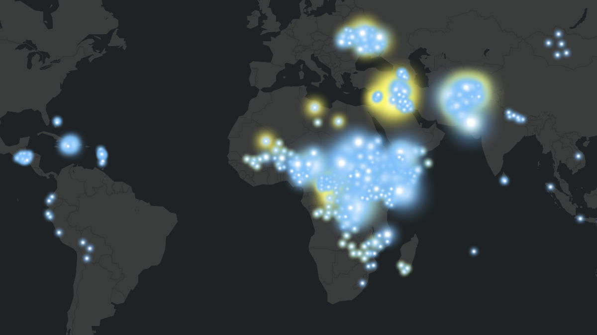
Human mobility data is complex, and getting it into the hands of people who can use it to drive decisions is even more challenging. That’s where storytelling with technical data becomes essential. Recently, the International Organization for Migration (IOM) partnered with Esri’s ArcGIS StoryMaps team to bring the Displacement Tracking Matrix dataset in the ArcGIS Living Atlas of the World to life through the story Tracking Human Mobility.
The StoryMaps team worked closely with IOM to guide and advise on storytelling strategies that would add value to this critical dataset. The goal was simple: introduce the dataset in a clear, engaging way and inspire others to explore it, use it, and integrate it into their own work.
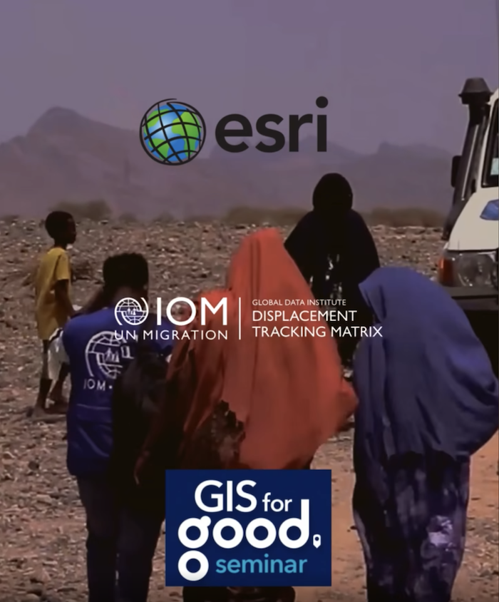
What began as a data showcase quickly evolved into a model for how organizations can humanize technical information through purposeful storytelling that gives equal weight to data and visuals. The result has already increased the dataset’s visibility, including a presentation at the GIS for Good Seminar in Geneva, which expanded its reach among humanitarian and development professionals.
Why the DTM in the Living Atlas matters for storytelling with technical data
The Displacement Tracking Matrix (DTM) is far more than just another dataset. It is widely recognized within the humanitarian system as a core source of data on internal displacement, providing essential information on Internally Displaced Persons (IDPs) and returnees. This data supports operational planning, policy decisions, and advocacy efforts worldwide.
To make this critical resource more accessible, IOM has focused on simplifying and modernizing data sharing, publishing aggregated DTM data in the ArcGIS Living Atlas of the World. This step ensures the dataset is discoverable, trusted, and ready for integration into other analyses.
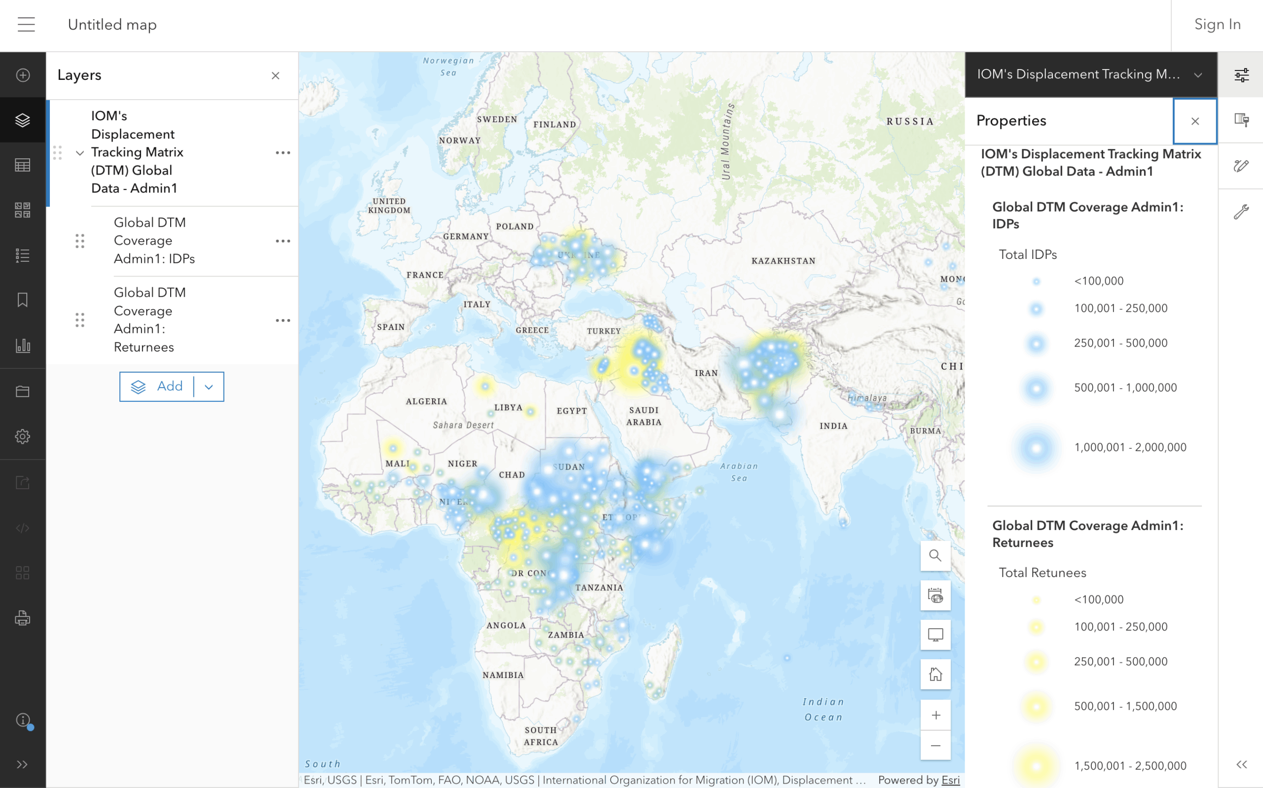
By working with Esri to publish and maintain the dataset in the Living Atlas, IOM has made it easier for users to combine displacement data with environmental, hazard, climate, and socio-economic layers, enabling richer, cross-sector insights.
This interoperability moves the dataset beyond specialist use cases and into broader decision-making contexts. NGOs, researchers, governments, and private-sector teams can now integrate displacement data alongside other indicators, making it a powerful tool for planning and response.
Turning access into understanding
Publishing data is only one part of the equation. Demonstrating how it can be understood and applied is equally important. Pairing the DTM dataset with clear storytelling shows how complex humanitarian data can support informed decisions when presented in a balanced, accessible way.
The collaboration emphasized that making public data understandable is as critical as collecting it. By weaving together maps, supporting visuals, and concise narrative, the story presents displacement data in a way that is approachable for both technical and non-technical audiences.
The value of early cross-team collaboration
One of the most impactful aspects of this partnership was the early involvement of both GIS and communications teams. Instead of adding communications at the end, both groups shaped the narrative from the start. This shared ownership clarified the story’s purpose and ensured the final product aligned with how different audiences engage with data.
Framing the story around the connection between data, people, and technology kept the narrative focused and accessible. This approach also translated well across channels, helping the story reach and resonate with audiences beyond traditional GIS users.
Visuals as strategic storytelling tools
Selecting the right visuals was just as important, and as strategic, as analyzing the data. Photos and videos were carefully curated from IOM’s extensive global archive to ground the dataset in real-world experiences. These visuals didn’t simply complement the data; they gave it context and a pulse, helping the team identify which patterns to emphasize and which questions to explore.
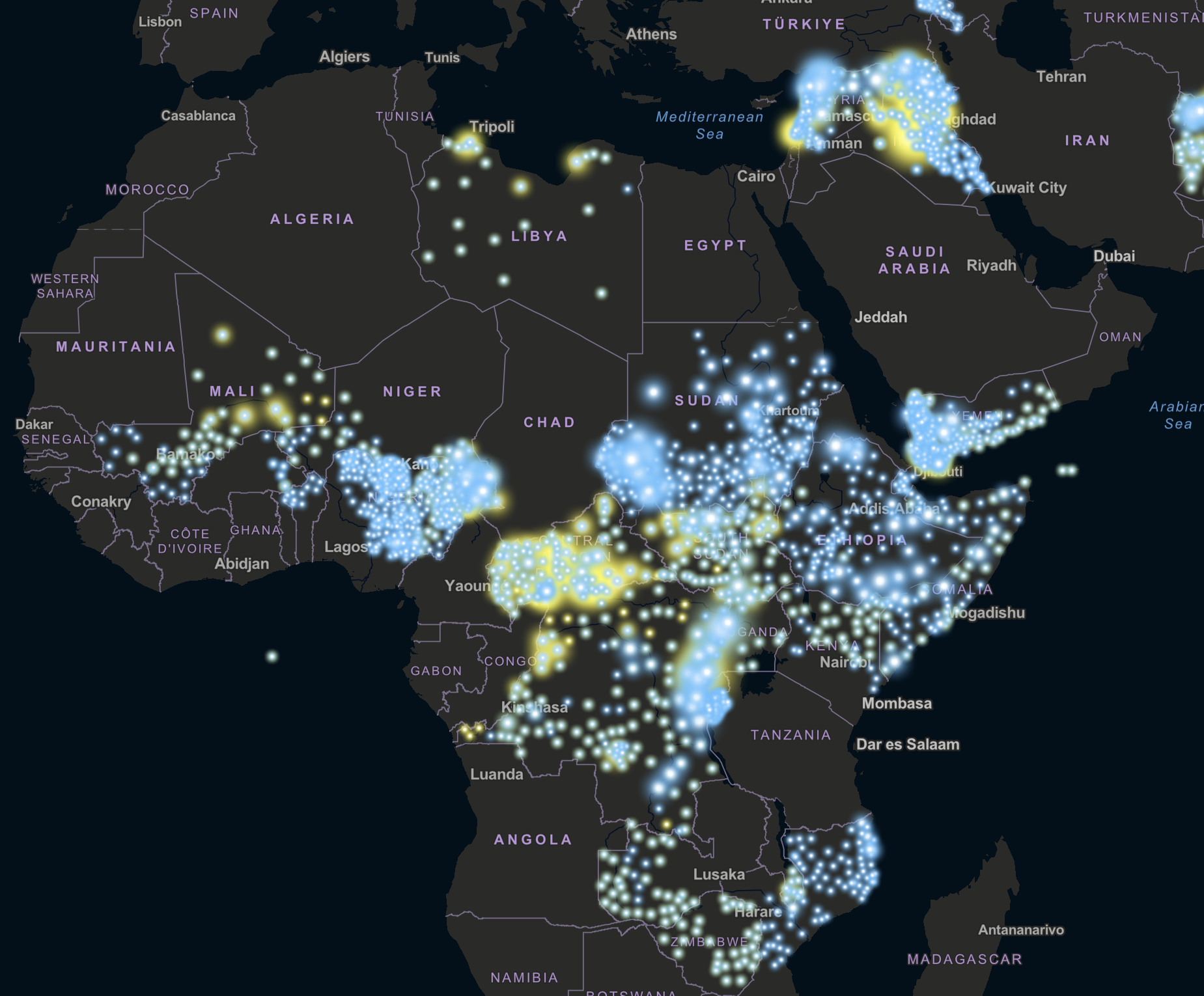
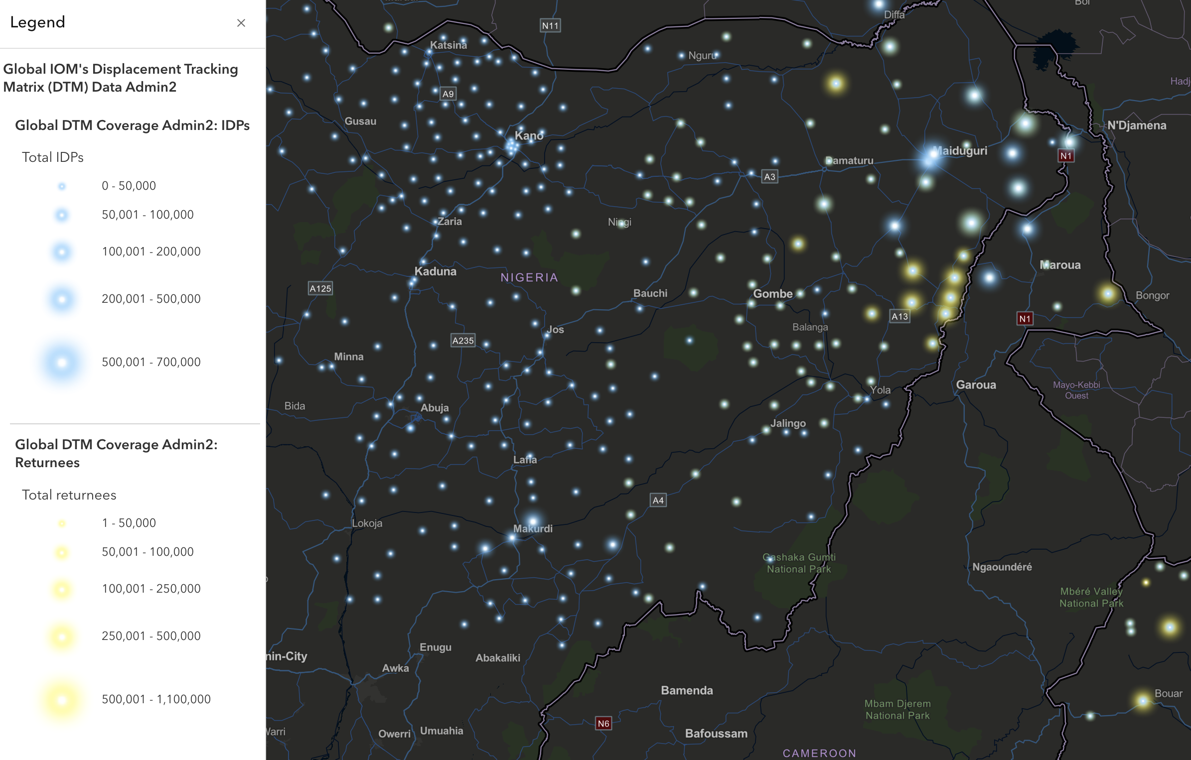
For example, mobility routes and displacement patterns were highlighted in countries such as Mozambique, Nigeria, and Ukraine, where robust data and compelling imagery were available. Combined with thoughtful map choreography and interactive map actions, these examples demonstrate how the dataset can be explored and applied in different geographic and operational settings. Each snapshot reinforces the dataset’s practical value and illustrates how others might use it in their own work.
Practical advice for telling stories with technical data
The collaboration offers several lessons for organizations working with large or technical datasets:
- Focus on the most meaningful insights and trends rather than overwhelming audiences with raw numbers.
- Frame visuals within a clear narrative that explains where displacement is happening, why it is occurring, and what it means for people on the move.
- Enrich maps and charts with photos, testimonies, and field insights to guide understanding – especially for audiences without technical backgrounds.
Tools like ArcGIS StoryMaps make it possible to transform complex datasets into visual narratives that are easier to navigate and act on. When paired with datasets published in the Living Atlas, these stories help bridge the gap between information and impact, turning technical data into actionable insights.
Extending reach beyond the map
The collaboration didn’t stop at creating the story, it also shaped how the dataset and narrative were shared more broadly. Outreach focused on clearly communicating why the data matters, how technology helps make sense of human mobility, and how partnerships strengthen data dissemination.
Presenting the work at the GIS for Good Seminar in Geneva reinforced the importance of impact-focused communication. By emphasizing outcomes over technical detail, the team made the data relevant to a wider audience and set a new standard for how future content will be approached.
Lessons you can apply
This collaboration demonstrates what’s possible when teams work across disciplines and lead with both technical datasets and human-centered stories. It offers a practical model for working with global data:
- Bring GIS and communications teams together early. Joint planning ensures clarity and alignment from the start.
- Give equal weight to data, media, and words. When visuals are treated as analytic tools, data resonates and becomes more actionable.
- Pair datasets with contextual stories. Use ArcGIS StoryMaps to turn complex datasets into stories that connect quickly and clearly. Publishing these stories alongside datasets in the Living Atlas increases visibility and reuse.
- Focus outreach on human impact and clear language rather than technical detail.
As more organizations look for ways to communicate complex information to global audiences, this approach to storytelling with technical data can help bridge the gap between insight and action. When datasets are paired with clear storytelling, they become more usable and more impactful.
Next time you’re working with technical datasets, don’t keep the story in the numbers. Bring your GIS specialists, communications professionals, and subject matter experts together from the start. Collaboration across teams can turn complex data into clear, actionable stories that can make a difference.

Article Discussion: