
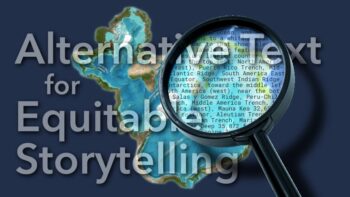
When you create digital content, making sure that it’s accessible to everyone is vital, and your content’s structure is the key to your story’s success. By making your site compliant with ADA Title II Web and Mobile Accessibility and Web Content Accessibility Guidelines 2.1 AA standards, you ensure that anyone can access your story. This article provides best practices and guidelines using ArcGIS StoryMaps’ built-in accessibility features to help you easily structure stories that everyone can access.
The integrated accessibility features in the StoryMaps builder provide a vital framework screen reader software uses to navigate the content. This structure helps all readers better understand your story, including those affected by neurodivergence or focus and attention span challenges. And don’t forget that most people tend to skim content first to decide if it’s worth a closer look.
Before we dive in, it’s worth mentioning that design strategies that support accessibility are often simply good design habits. By integrating accessibility considerations into your workflow at the start of your project that build on ideas from our Planning before you start your story and Narrative structures for stronger storytelling articles, you can ensure that you’re using the best story design strategies available. Let’s get started!
Create a navigable structure using text tags
A navigable structure is essential to making your story accessible for people using screen readers.
To create the navigable structure in the ArcGIS StoryMaps builder, authors assign a tag within the text block by highlighting the text and assigning the type. The options include: H1, H2, H3, paragraph, and lists. The following are some best practices:
Use headings and subheadings consistently to outline your story
Ideally, your story outline plan includes logical headings and subheadings. Write short, consistent, and predictable heading levels for your story. Apply the tags: Heading 1 for major sections, Heading 2 for subsections, and Heading 3 for more detailed sections. These tags allow assistive technologies to jump between sections. Don’t skip levels — for example, jumping from H1 to H3 is not recommended.

Enable story navigation
The H1 tag creates the text used on the story navigation bar near the top of your story, which you can activate in the design panel of the story builder. You can also edit the story navigation text to make it shorter. These headings also make your story easier to read at-a-glance.

Keep paragraphs short
Another way to help your readers is by using short paragraphs they can skim and still get the gist of your story. Put the most important information in the first sentence of your paragraph — or the first paragraph of several — to support skimming.
Group related items in lists
The StoryMaps builder includes tags for bulleted and numbered lists. This formatting is optimized for screen reader software to interpret. Grouping related content also supports reader understanding.
Create lists that use the same grammatical pattern for each group item. For example, start each entry with the same part of speech, such as a noun or verb. Keep lists short, otherwise you defeat the purpose of the list. You may also consider using the built-in table block to group data or related information.
Use plain language
The plain language writing style ensures that the content is clear, concise, and understandable. Many government organizations require using plain language style for certain content. The following tips should help:
Write clearly in an active voice
Write in an active voice — for example, “We mapped the coordinates” rather than “The coordinates were mapped”— to help readers better understand your message. Keep your sentences short and focused on one idea to help your readers process the information. Finally, use clear transitional phrases to help your readers follow the story.
Choose your words carefully
While you should write for your audience, try to choose simple, easy to understand words. For example, the words “use” instead of “utilize” and “before” instead of “prior to” can help English language learners more easily navigate your content. Similarly, avoid using figurative language, such as metaphors and idioms, which do not translate well and are culturally dependent. A common expression in one language or culture may not make sense to people from another culture.
When sharing technical terms, define them the first time they appear in the flow of the text. Use a similar idea with acronyms, abbreviations, and initialisms and spell them out on first use; then use the acronym consistently afterward.
When discussing data or context, explain what the data represents, and what it means and does not mean. Also, plainly share publicly available information related to your data collection or interpretation methods.
Other considerations related to text and plain language include using consistent styles, such as:
- Write short descriptive text for links
- Avoid using excessive all-caps, bold, or italicized text to add emphasis
- Skip overly decorative fonts
Additionally, avoid using emojis or icons in running text since screen readers may interpret them as code that the listener can’t understand.
Format for visual breaks
While headings are a great way to organize your story, making visual breaks is an important part of the reader’s experience. A wall of text (whether read or heard) can be both psychologically intimidating and difficult to cognitively process. Try the following tips to visually balance your story:
Add media to create balance
Place helpful media, such as a photo or map, next to or after blocks of text. Media should serve a dual purpose: to support your text and to create a natural pause and reset the reader’s attention. Include concise captions that connect the media back to the narrative to further support accessibility.
Too much media can create an imbalance that adds exhaustive scrolling, distracting from your story. Consider section separators that visually signal topic transitions and provide a visual break without adding length.

Assess story length
The final guideline for creating accessible story structure and text is to review your story’s length and scope. Your time is finite — and your reader’s time is, too. Empathize with readers and be mindful of how long it takes to read your story. The following tips should help you ensure that your story length is accessible:
Keep the scope tidy
When editing your story, remember to keep your content succinctly focused on the ideas you first outlined that you want your reader to understand. If your content strays into too much detail or if you find that you’re scrolling a lot, your story is probably too long, and you should consider revising your outline and story. Perhaps your story’s scope would be better as a story collection, or you might move some of the non-essential details into links, downloads, or an appendix-style section.
Minimize repetition
If you cover a point in a map caption, shorten the surrounding paragraph. But there’s an exception — add a summary of key takeaways at the end of your story.
Your takeaway
Now you’ve learned how to create and add a structure to your story to make it more accessible to everyone; key takeaways are:
- Create a navigable structure that uses tags for headings, subheadings, and lists
- Write in plain language, choosing simple words and avoiding idioms
- Use short paragraphs and media to create visual breaks
- Keep length in mind — if it’s too long, you’ll lose your audience


Commenting is not enabled for this article.