Urban planning is rarely about evaluating a single future. More often, planners need to compare multiple alternatives.
Imagine you’re working on redeveloping a neighborhood. One scenario prioritizes housing, another focuses on jobs and commercial activity, and a third introduces additional green space. Each option has trade-offs, and stakeholders need clear information to make informed decisions.
ArcGIS Urban makes it easy to design, visualize, and evaluate these alternatives in 3D. However, comparing metrics across multiple scenarios and turning those comparisons into stakeholder-ready reports has often required additional work outside of Urban.
That’s where the new scenario comparison report comes in.
In this blog post, you’ll learn how to use the new scenario comparison report to compare planning scenarios in Microsoft Excel. We’ll explore how to analyze metrics across multiple scenarios, create charts for presentations and reports, and build a reporting workflow that can easily be updated as planning scenarios evolve.
Exporting and exploring the report in Excel
Getting started is simple.
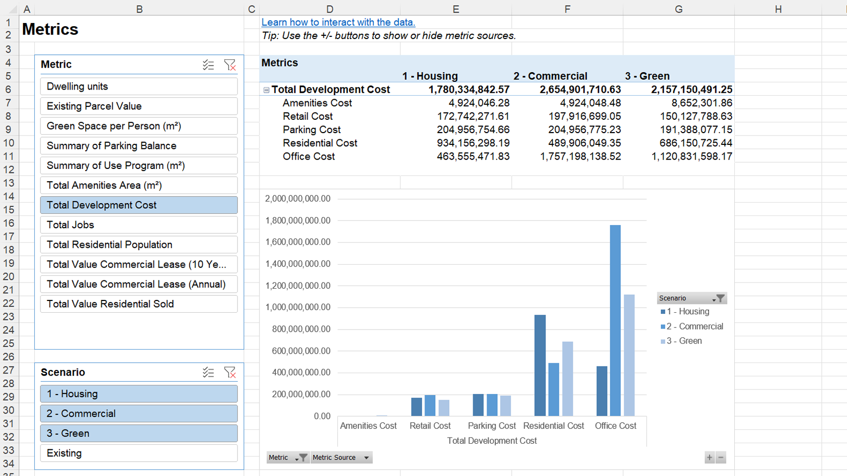
From the plan editor, open the plan menu and select Download scenario comparison report. ArcGIS Urban generates an Excel workbook containing metrics, space-use areas, and zoning or land-use areas for each scenario.
Once opened in Microsoft Excel, you can immediately start exploring the data. The report is built on pivot tables and charts, making it easy to compare scenarios from different perspectives. Filter by scenario or metric, show or hide metric sources, and rearrange data elements.
The tables and charts update automatically, helping you explore and compare planning alternatives interactively.
Customizing and styling charts
Most planning organizations already have established report templates and chart styles. Instead of starting from scratch, you can adapt the scenario comparison report to match your existing reports.
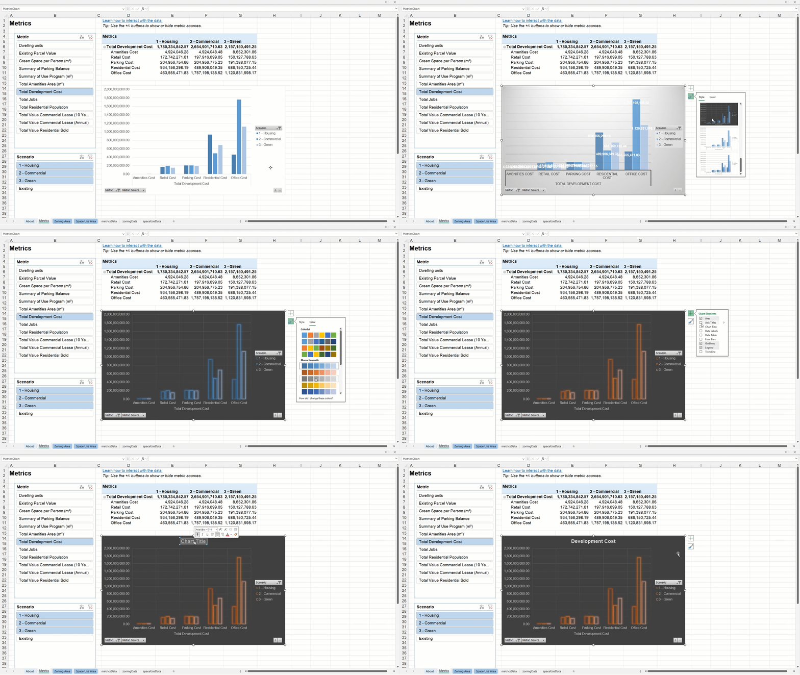
Because the report is built with standard Excel tables and charts, you can use familiar Excel tools to update colors, chart types, labels, and layouts. This makes it easy to create polished, presentation-ready visualizations that align with your organization’s reporting standards. When you’re happy with the result, simply copy and paste charts or tables into your reports and presentations.
Updating the report as scenarios evolve
Planning scenarios rarely stay the same. As assumptions change and designs evolve, reports often need to be updated as well.
The scenario comparison report is designed for this iterative workflow. Behind the scenes, the workbook contains supporting data sheets with the raw scenario data. The pivot tables and charts in the report are based on these sheets.
To update an existing report, export a new scenario comparison report from ArcGIS Urban and open both workbooks in Excel. First, delete the data sheets in the original workbook, then copy the data sheets from the newly exported report into it. Finally, refresh the data to update the tables and charts. Your custom formatting, chart styles, and report layout remain intact while the numbers are updated.
Key take aways
The new scenario comparison report makes it easy to compare planning scenarios and turn the results into stakeholder-ready reports. With a single export, you can analyze metrics, space-use areas, zoning areas, and land-use areas across all scenarios in a familiar Excel environment.
Built on standard Excel pivot tables and charts, the report can be adapted to match existing report templates and presentation styles. It also supports an iterative workflow: by replacing the underlying data sheets and refreshing the workbook, you can update charts and tables while preserving your formatting.



Article Discussion: