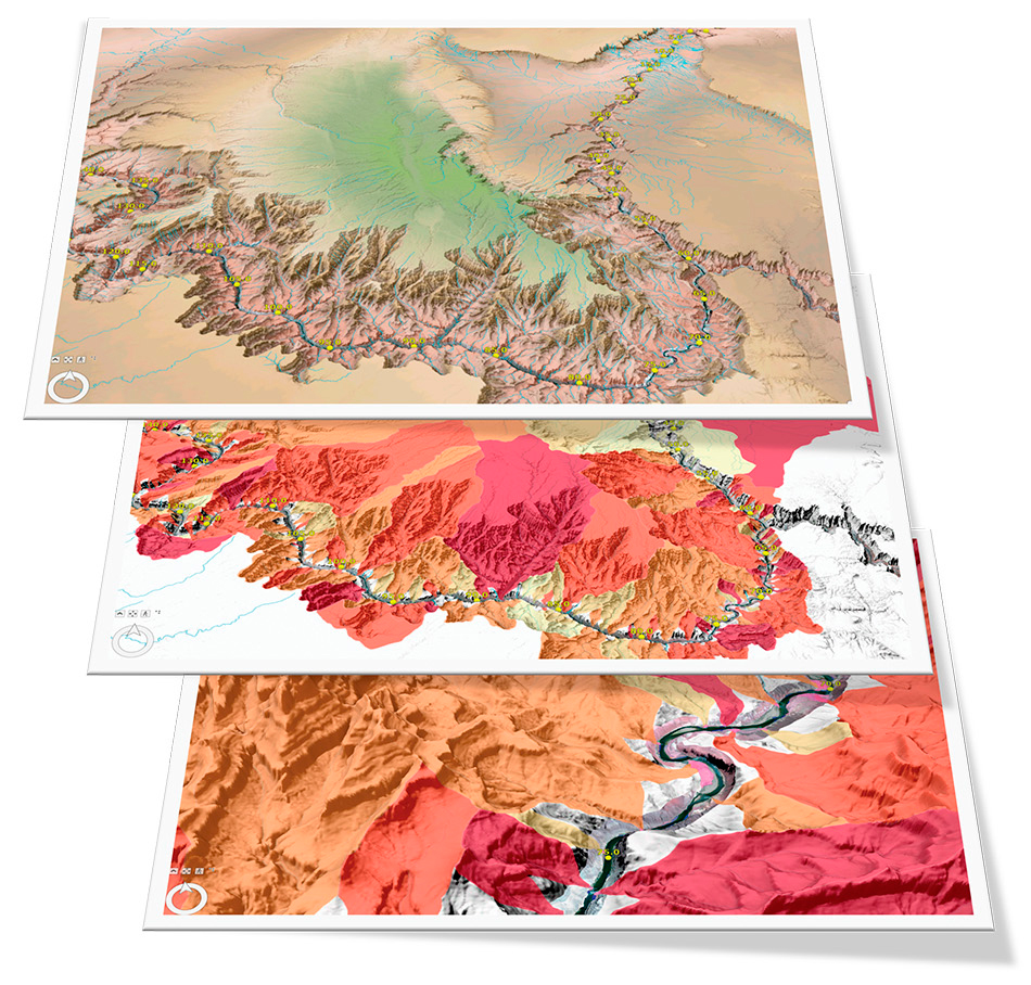
Category
New CTA Buttons
sub title
Testing the new UI buttons. Option: with the primary button set to solid background. Internal and external link should not have an icon. Only video, document and download link would have icons

Set to default test theme color. Redrum RED #FF0000
Category
sub title
Testing the new UI buttons. Option: with the primary button set to solid background. Internal and external link should not have an icon. Only video, document and download link would have icons
Category
sub title
Testing the new UI buttons. Option: with the primary button set to transparent background. Internal and external link should not have an icon. Only video, document and download link would have icons

Category
sub title
Testing the new UI buttons. Option: with the primary button set to transparent background. Internal and external link should not have an icon. Only video, document and download link would have icons

Category
sub title
Testing the new UI buttons. Option: with the primary button set to transparent background. Internal and external link should not have an icon. Only video, document and download link would have icons

Category
sub title
Testing the new UI buttons. Option: with the primary button set to solid background. Internal and external link should not have an icon. Only video, document and download link would have icons

Category
sub title
Testing the new UI buttons. Option: with the primary button set to transparent background. Internal and external link should not have an icon. Only video, document and download link would have icons

Category
sub title
Testing the new UI buttons. Option: with the primary button set to transparent background. Internal and external link should not have an icon. Only video, document and download link would have icons

Category
sub title
Testing the new UI buttons. Option: with the primary button set to transparent background. Internal and external link should not have an icon. Only video, document and download link would have icons

Category
This is the default blue buttons
Testing the new UI color buttons. the primary is solid, the secondary is outlined and third is a text link.

Category
This is the default blue buttons
Testing the new UI color buttons. the primary is solid, the secondary is outlined and third is a text link.
Category
This is the black and white buttons
Testing the new UI color buttons. the primary is solid, the secondary is outlined and third is a text link.
Category
This is the black and white buttons
Testing the new UI color buttons. the primary is solid, the secondary is outlined and third is a text link.