The Relevance of Cartography: A Cartographer’s Perspective
Borders and maps are inseparable. These simple boundary lines might even be the reason cartographers exist, since many of the very early maps delineated territory. But, actually, borders aren’t simple at all. They change constantly.
If there are no prominent border conflicts happening in the world, a cartographer might hear, “What do you do? Everything has been mapped.” When territorial disputes do make headlines, though, people will exclaim to cartographers, “Wow, you must be very busy with all these new borders.”
The desire to continue conversations about topics that constantly change—such as urban growth; long- and short-term weather dynamics; or, of course, borders—might depend on the crowd. And sometimes it makes more sense to just change the topic to something easier to talk about, like that new shop downtown or how good the desserts look. But there is no shortage of cartographic discussion material because borders on maps exist in an abundance of different forms.
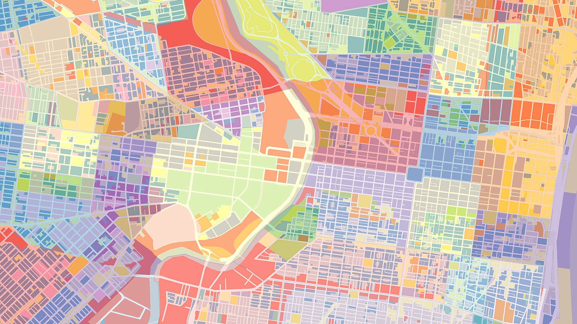
People are probably most familiar with administrative borders for countries, states, or municipalities. On many maps, such as those from National Geographic, a band of color along the border enhances the boundaries. On other maps, each area is given a different color—and, as Robin Wilson argues in Four Colors Suffice: How the Map Problem Was Solved, only four colors are needed to indicate different areas on a map with no color ending up next to itself.
Even nonadministrative maps have borders. Geologic and soil maps, for example, delineate different entities by using borders. The same is true for maps that show contour lines, plans, and even weather patterns.
Borders of all kinds are often disputed though. Looking at the world map, there are many countries that do not agree on the exact location of the border. In fact, one might find several maps that depict the same border in different places, depending on which country the map comes from.
Which map should be created, then? A map with a neutral view seems logical, but that might be the most challenging map to make from a design perspective due to the complexity of all parties’ territorial claims. Take, for instance, the South China Sea, where China, Vietnam, Malaysia, Indonesia, Brunei, and the Philippines have conflicting territorial claims. Those are complicated boundaries.

Perhaps a de facto map that illustrates the situation on the ground could be created. Or maybe an official map—one that shows how the United Nations recognizes the situation—would work best.
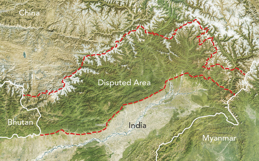
Some international map providers have even offered localized maps of areas with ambiguous boundaries, such as the eastern border between India and China. So the Indian version of the map portrays the disputed territory of Arunachal Pradesh as part of India, while the Chinese version envelops the area inside the country’s own borders, indicating that it is South Tibet.
In discussions among disagreeing countries, this kind of mapping can be viewed as cartographic aggression, wherein a country uses a map to claim territory. Accordingly, borders in geopolitics can be dangerous.
Sometimes territorial fights are executed on the square centimeter—on postage stamps. For example, several countries have issued stamps with maps that claim parts of Antarctica. If we were to overlay these stamps from the United Kingdom, Chile, and Argentina, the resultant map of Antarctica would have interesting overlaps.
These weird situations aren’t always so far away from home though. On the Belgium-Netherlands border, there is a Belgian municipality called Baarle-Hertog that is scattered within the Dutch municipality of Baarle-Nassau. And even within the Belgian territory in the Netherlands, one again finds Dutch parcels. This particular situation—having borders within borders—results in a perfect dataset on which to practice the validity of your topological algorithms.
Another interesting situation is when only geographic names are used to identify an area. Amazonia in South America and the Sahara in North Africa are notable regional examples. These types of toponymic delineations also exist at the local level within cities or states. Little Havana in Miami is one such place, as is Skid Row in Los Angeles. It might be interesting, actually, to define these fuzzy borders via crowdsourcing, asking locals whether or not they think they belong to such a region or neighborhood.
Borders on most physical maps, such as soil maps, look very authoritative. But one has to realize that those maps are mostly interpretations based on a relatively small set of observations. Sometimes borders on soil maps are hard, like when bedrock bounds sand. But sometimes they’re not. Along a riverbank, for example, sand melds with clay, and we end up with a transition zone rather than a sharp boundary—though a line is still drawn.
This is similar for maps of noise zones around airports or those that depict flood risks. The borders we see on these maps are the result of interpolation and interpretation. Planning maps sometimes even have blurred borders on purpose—to try to keep commercial businesses at a distance from residential areas, for example.
Borders are found on all maps, and they are a challenge for cartography in many ways. Nevertheless, map design should inform properly so that map readers can accurately shape their opinions of a situation. To ensure this, the mapmaker should indicate the discipline (interpretation, interpolation, or measurement) or the political viewpoint by which the borders were defined.
Many decisions—good and bad—are made based on the borders drawn on maps. The more information map readers have about these borders, the more likely they are to make good decisions.
About the Author
Menno-Jan Kraak is professor of geovisual analytics and cartography at the University of Twente in the Netherlands, where he has been teaching since 1996. He has a degree in cartography from the Faculty of Geographical Sciences at Utrecht University and received his PhD in cartography from Delft Technical University. Kraak has written extensively on cartography and GIS. His book Cartography: Visualization of Spatial Data, written with Ferjan Ormeling, has been translated into five languages. He also wrote Mapping Time: Illustrated by Minard’s Map of Napoleon’s Russian Campaign of 1812, published by Esri Press in 2014. Kraak is a member of the editorial boards of several cartography journals, including the International Journal of Cartography. He currently serves as president of the International Cartographic Association.