You may have an ArcGIS Online organization subscription that you have not activated. If you have an ArcGIS for Desktop or ArcGIS for Server license that is current on maintenance, you automatically receive an ArcGIS Online subscription. Ask your ArcGIS Online administrator to provision your account with GeoPlanner for ArcGIS.
If you do not have ArcGIS Online and/or GeoPlanner, you can use evaluation copies to work this tutorial. Obtain evaluation copies of ArcGIS (which includes ArcGIS Online) and GeoPlanner for ArcGIS at esri.com/products/free-trials.
Using GeoPlanner for ArcGIS with the GeoPlanner Template for Green Infrastructure Planning provides the methodology and tools to help you apply geodesign principles and use the data on intact areas provided by Esri to identify green infrastructure and preserve it first. To learn more about the value of preserving green infrastructure, see “Ensuring a Better Future” in this issue.
The GeoPlanner Template for Green Infrastructure Planning uses data about your community extracted from the Esri map of the National Intact Habitat Cores Database. With this data and the methodologies built into the online map, you can visualize and test land use, natural resources, and landscape architecture scenarios with real-time dashboards and sketch tools. This enables you to make evidence-based decisions about development and conservation.
This tutorial provides step-by-step instructions on how to create a project in GeoPlanner that uses the GeoPlanner Template for Green Infrastructure Planning with the online apps and datasets available on the Esri Green Infrastructure website.
Getting Started
- Go to GeoPlanner and sign in using your ArcGIS Online credentials if not already logged into ArcGIS Online.
- Click Create New.
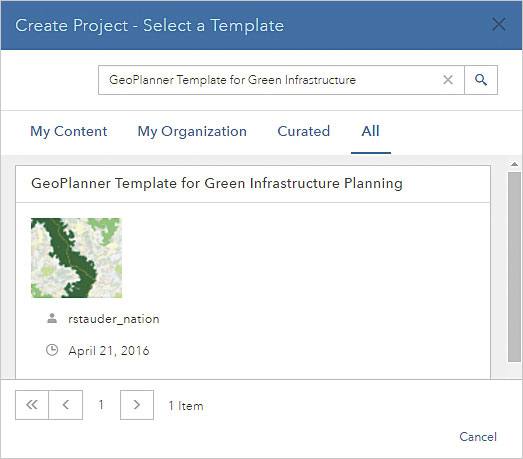
- In the Search box in the upper-right corner of the app, type GeoPlanner Template for Green Infrastructure Planning and click All to search all locations.
- After the search locates the GeoPlanner Template for Green Infrastructure Planning, click the Select button.
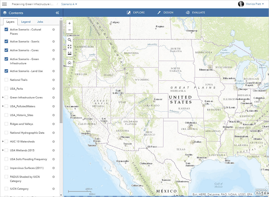
- Provide a title, summary, description, and tags for your project. Click Create. GeoPlanner uses the template to create a design feature service, a scenario, and a project. When it completes this process, it opens a map.
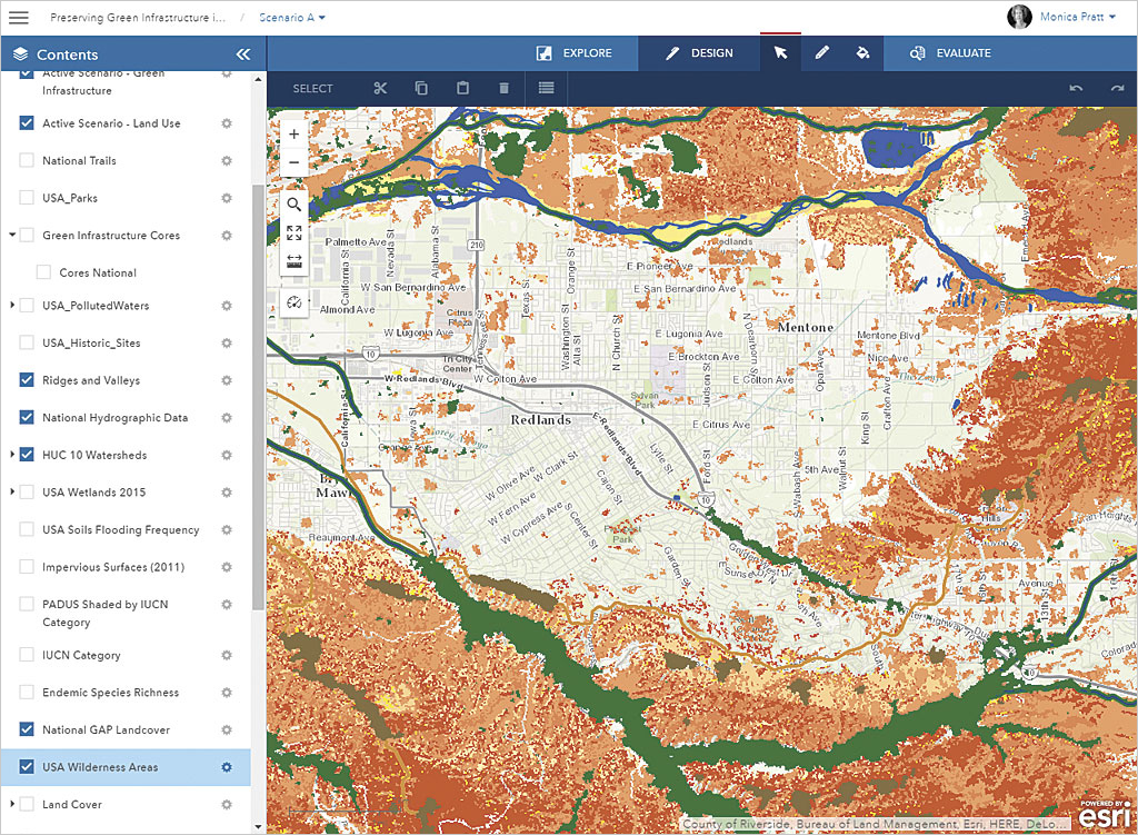
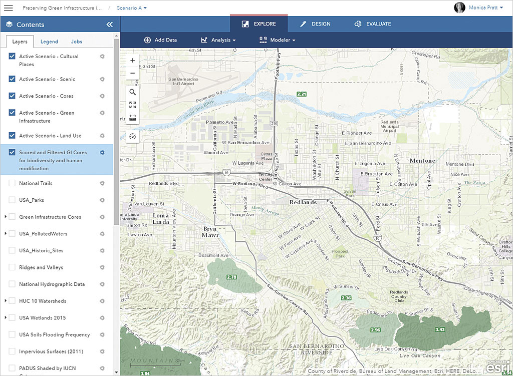
- Open the legend and notice that the template has automatically added green infrastructure datasets, such as watershed areas and green infrastructure cores, to the project and has symbolized them.
Generating a Filtered Layer
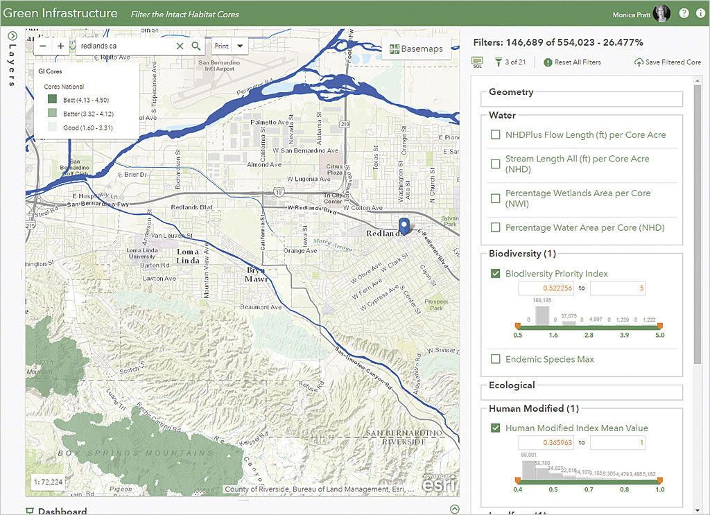
In the next steps, you will use the Set Priorities app located online at the Filter the Intact Habitat Cores page on the Esri Green Infrastructure website to filter data from the National Intact Habitat Cores database to set priorities for your community. The Set Priorities app lets you create layers that can be used for geoaccounting and assessment layers in GeoPlanner dashboards and gives a more complete understanding of how an area performs or behaves.
- Go to the Filter the Intact Habitat Cores page to access the Set Priorities app. Sign in using your ArcGIS Online organization credentials. The list of available layers is located on the left side. The list of filters that can be applied is located on the right side.
- Type a community name or ZIP code into the Search box to zoom to your community and enable the filters.
- Examine the filters. They are grouped into related topics. Hover over the name of a filter to learn more about it and the methodologies it employs. Click the name of the filter then the settings wheel to see statistics, data range presets, and data range from slider values. Check the box next to the filter to view its options.
- The Min and Max boxes let you enter minimum and maximum values for the filter.
- The range slider sets the range of values used by the filter based on the values in the Min and Max boxes. The values used can be adjusted manually by using the + and – buttons or by clicking on the histogram bin to limit the range to that bin.
- A histogram chart based on the current data range is displayed on top of the range slider. It uses 10 bins, and each bin is labeled with the count in that bin.
- Adjust the settings for at least one filter to enable the Save Filtered Cores button. The map updates interactively to reflect any changes you make to the filter settings.
- When finished choosing and adjusting the values for the filters, click the Save Filtered Cores button. Provide a meaningful name for the map service generated. You will receive notification when the map service has been successfully created and added as an item in the My Content section of ArcGIS Online.
- Open this item in ArcGIS Online and provide item details such as use restrictions. Click Share and share with everyone.
Weighting the Filtered Layers
The next steps take the filtered layers created in the previous process as input for the Set Weights app located on the Score the Intact Habitat Cores web page of the Green Infrastructure site.
- If you are not currently signed into your ArcGIS Online organization account, sign into the Score the Intact Habitat Cores again with your ArcGIS Online credentials.
- Zoom to your community using the name of the location or its ZIP code to enable the Find Filtered Cores button. The filtered green infrastructure layers will be enabled if the number of filtered cores in the current view is less than 1,500 (the maximum currently allowed).
- Click the Find Filtered Cores button and choose the filtered layers created in the previous process. Two presets are available: GI Center Defaults (default weights as defined by the Green Infrastructure Center) and Biodiversity Defaults (similar to the GI Center defaults with a slight bias toward biodiversity). The score for each core is calculated based on the user-specified weights for each parameter.
- Change the weight for a parameter by updating the slider value. Note that all weights are relative to each other. As you change relative weights, the chart will update with the new relative weights.
- A hosted service will be created in ArcGIS Online based on the filters and map extent of the input. The app will ask you to name the service created from the filter map service and notify you when the new GI Cores hosted service has been successfully created.
- You can change the weights for a filtered layer by changing the sliders and either click the Update button to calculate the new score for each core and update the hosted service or click Save As to save the new weights as a new hosted service.
- Additional filtered services can be processed if desired. When finished, close the Find Filtered Cores dialog box.
Import Core Data into a GeoPlanner Scenario
Scenarios are unique planning alternatives. GeoPlanner allows you to sketch and paint scenario features to help you envision possible futures. Instead of sketching new features, you can start a scenario based on existing conditions by importing feature data into a scenario.
- Return to GeoPlanner to use the hosted service just generated. Click the search icon and type the community name to zoom to the location.
- In the top menu, click Explore > Add Data.
- In the Search for Data, click My Content and sort results by date to locate and choose the scored and filtered core service. Click Add.
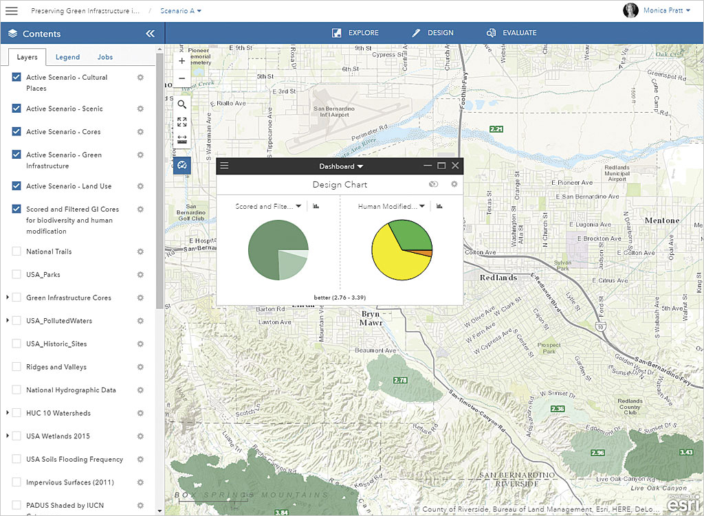
- Click the dashboard icon (clock) and click the down arrow below Dashboard and choose Design a chart. Click the down arrow on the left side and choose the scored and filtered core service to generate a chart from it.
- Click the down arrow on the right side and choose another data source to create a chart for comparison.
- Hover over the charts to reveal the tool-tips that show information about the data.
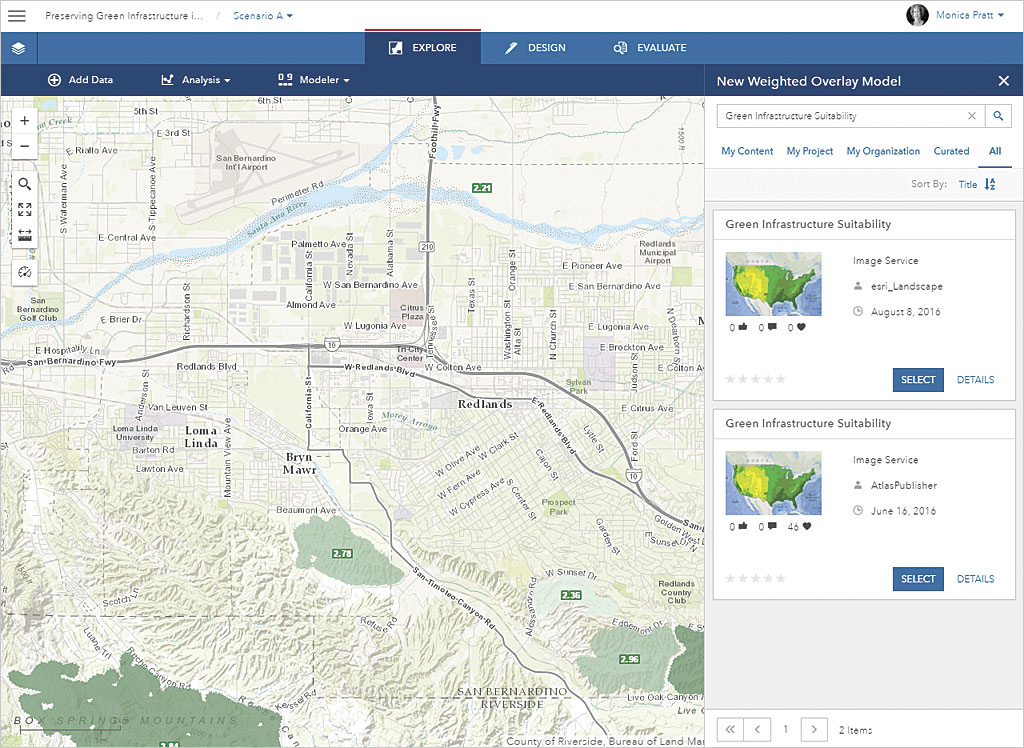
Generating a Model from the Green Infrastructure Suitability Service
GeoPlanner helps you locate areas of risk or opportunity through suitability analysis and evaluate multiple factors at once by classifying, weighting, and combining different types of layers.
Suitability analysis in GeoPlanner uses a modeler widget that exposes services that have unique content that you can use to ask questions and visualize answers spatially. The latest update to GeoPlanner contains a new Green Infrastructure Suitability analysis service. This service contains layers useful for green infrastructure planning.
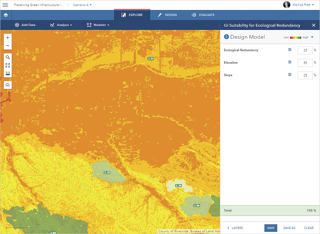
This example uses the Green Infrastructure Suitability analysis service to locate areas in the continental United States that are on steep slopes at high elevations and have a high ecological redundancy.
- In GeoPlanner, click Explore > Modeler and choose New Model from the dropdown.
- In the search box at the top of the New Weighted Overlay Model dialog box, type Green Infrastructure Suitability and click All.
- Click Select. In the Select Layers pane, check on Ecological Redundancy, Elevation, and Slope. Click Design Model.
- Click the color ramp dropdown and choose the Red to Green ramp (second choice in the dropdown list).
- Set the following weights:
- Ecological Redundancy: 25
- Elevation: 50
- Slope: 25
- Click Save and type a name for your model. Click Save again.
You can now use the model just generated in GeoPlanner’s dashboards to understand the performance characteristics of an area.