It is not easy to create simple, standardized legends of values for datasets that have nonlinear distributions. This exercise will show you an easy and quick way to make these legends in ArcMap.
In the natural sciences, public safety, demographics, and many other fields, data may display nonlinear value distributions. In these distributions, many samples display low to moderate values, while some samples display very high outlying values. Geochemical data typically exhibits this exponential distribution.
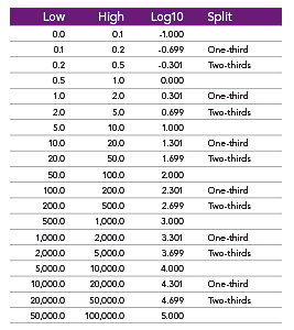
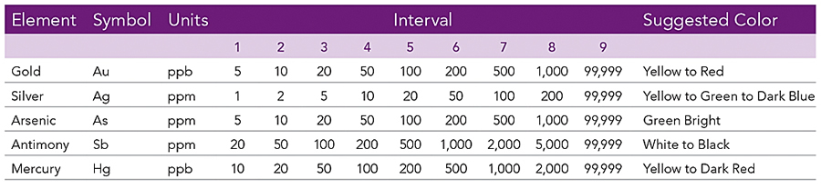
I found that by starting a series with a decimal multiple of 1, 2, or 5 and building an increasing decimal series using these intervals, I closely approximated a one-third common log division (three nearly equal bins) between each major Log10 decimal interval (e.g., 1, 10, 100…). Table 1 shows this distribution. I find that legends created using these “almost” logarithmic breaks are easy to create, reproducible, and reusable.
This exercise shows how to create these legends quickly. It also stresses data discovery and investigation and revisits useful tools including Symbol Levels and Graphs.
Getting Started
Download the data [ZIP] and unzip it on a local machine. Start ArcCatalog and inspect the dataset. This dataset for Battle Mountain, Nevada, has been used in previous training exercises. The Geochemistry geodatabase contains the same soil, rock, and stream sediment data that was imported from a Microsoft Excel spreadsheet in the first exercise of this series. [See “Importing Data from Excel Spreadsheets: Dos, don’ts, and updated procedures for ArcGIS 10” in the Spring 2012 issue of ArcUser.] Completing previous exercises in the series isn’t necessary. This data supports a stand-alone tutorial.
In ArcCatalog, inspect the Soil_Points feature class. Open its attribute table and inspect the five elements, AU_PPB, AG_PPM, AS_PPM, SB_PPM, and HG_PPB. Notice that the elements are either in parts per billion (ppb) or parts per million (ppm) and that the unit used has been incorporated into the field name. Sort the data and inspect minimum and maximum values for more than 20,000 elements.
The first Battle Mountain exercise standardized this data stored in a spreadsheet and imported the sample records into a file geodatabase table. In the next exercise, that data was displayed in ArcMap and saved as point feature classes. Prebuilt continuous legends were then applied. This exercise will present a method for creating a clean legend for this logarithmically distributed data.
Battle Mountain Basemap
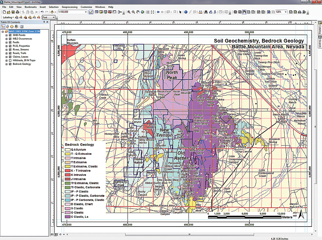
Close ArcCatalog and open ArcMap. Navigate to the new Battle_Mountain07 folder and open Battle_Mountain07.mxd. Inspect the project area, initially shown in layout view at a scale of 1:150,000. Notice that all layers in the TOC are visible, except a topographic hillshade raster. Geochemical data is not shown but will be added after performing some housekeeping.
In ArcMap’s text menu, click File and select Map Document Properties. Set the Default Geodatabase to \Battle_Mountain07\GDBFiles\Geochemistry.gdb.
Check mark Store relative pathnames. Save these updates and save your project.
Switch from layout view to data view. Notice that the display scale is no longer 1:150,000. This is okay. In the TOC, right-click the data frame name and open Properties. Enable the Maplex Label Engine and explore properties. Notice that the projection is universal transverse Mercator (UTM) Zone 11N, the datum is North American Datum 1983 (NAD 83), and units are meters.
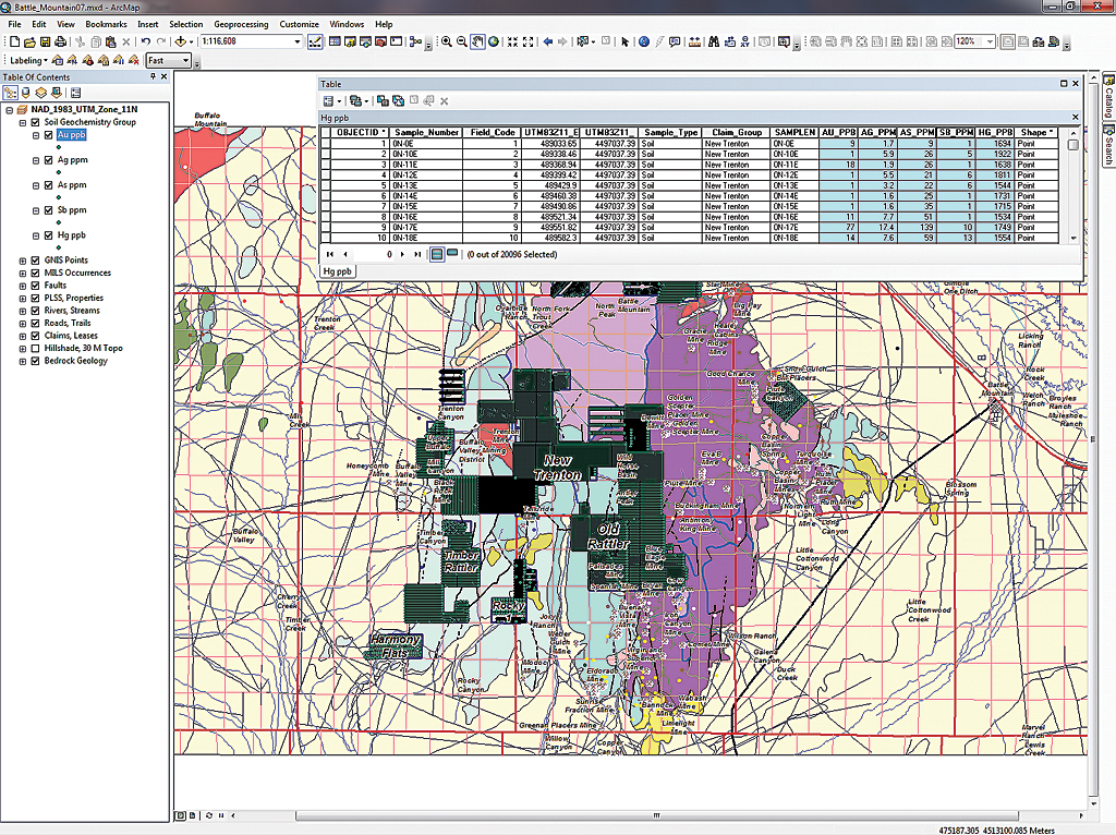
Loading, Replicating, and Grouping Soil Geochemistry Points
- Click the Add Data button, and navigate to and open \Battle_Mountain07\GDBFiles\Geochemistry.gdb. In the Catalog window, verify that Geochemistry.gdb is now set as the Home geodatabase.
- Highlight Soil_Points and click Add. Once Soil_Points loads, open its attribute table and inspect the fields for all five elements. Close the attribute table.
- Now, create five copies of Soil_Points—one for each element. In the TOC, right-click Soil_Points and select Copy. Select Layer name, right-click, and choose Paste Layer(s). Repeat Paste Layer(s), creating three more copies of the Soil_Points layer, making a total of five copies of Soil_Points in the TOC.
- Select all five layers, right-click, and select Group. Rename the new group Soil Geochemistry Group.
- In the group Soil Geochemistry Group, rename each layer to represent individual elements, beginning with Au ppb. Don’t forget to include the units in the name. Name the rest of the layers Ag ppm, As ppm, Sb ppm, and Hg ppb. Save the project.
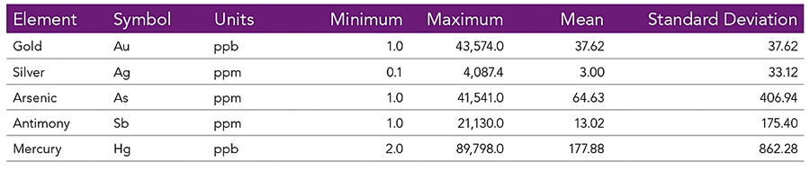
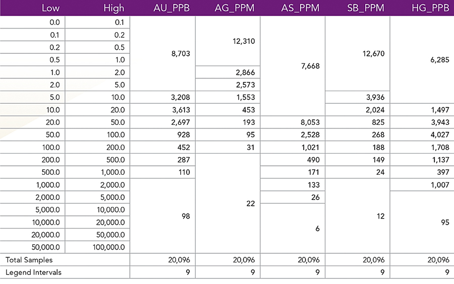
- Open the attribute table for Au ppb and right-click each element in the table and choose Statistics to display a histogram of the values. Compare the statistics for each element to the values in Table 2. The numbers should match exactly.
- Right-click the header for each element in the table and choose Properties. Notice that units and data types are different. Au, As, Sb, and Hg are all long integer data types. Ag is a double precision type. Au and Hg are measured in ppb, while Au, As, and Sb are measured in ppm.
Creating a Legend for Gold
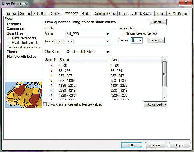
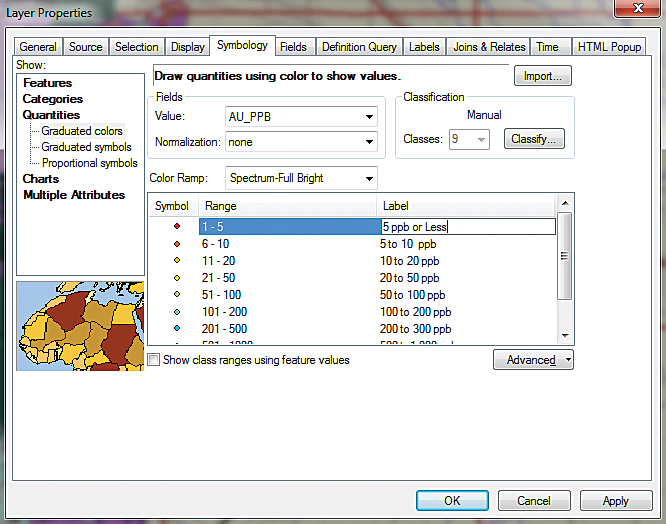
- In the TOC, select Au ppb, right-click, and open Properties. Choose the Symbology tab and specify a Quantities > Graduated colors legend. Under Fields, set Value to AU_PPB. Under Classification, change the number of classes to 9. Change the display of the color ramp from graphic to text by right-clicking the Color Ramp and unchecking Graphic View.
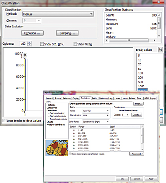
- Click the Classify button, and in the Classification window, under Break Values, change the first value to 5. Replace the rest of the existing break values with 10, 20, 50, 100, 200, 500, and 1000. (Hint: After typing each value, use the down arrow to move to the next line. If you mistype a value, you can update it manually or start over.)
- Replace the final value with 99999 to include all Au values. The maximum Au value for this dataset is 43,574. By specifying 99999 as an upper limit, this legend may be applied to other datasets with Au values between 0 and 99,999 ppb.
- To view the new logarithmic intervals, draw a small box with your mouse along the Classification’s y-axis, beginning just below 1 and extend slightly to the right. Watch as the graph redraws.
- Continue your selection until you bracket values between 0 and 500. Observe that intervals (bins) increase exponentially in size as you move to the right.
- Inspect the histogram in the background to see how many records might be in each bin. Zoom in further, if you wish. Click OK to close the Classification window.
- On the Symbology tab, change the labels for the classification to friendlier ones that include the units (e.g., for the range 6–10, change the label to 5 to 10 ppb). For Au, As, Sb, and Hg, which are integer values, you can include actual values (6 to 10) or data ranges (5 to 10, with 5 not included in the range). For Ag, a double precision field, you must use data ranges. Label the final classification value More than 1,000 ppb.
- Click OK and inspect the legend. Save the project.
Inspecting Data in a Scatterplot Graph
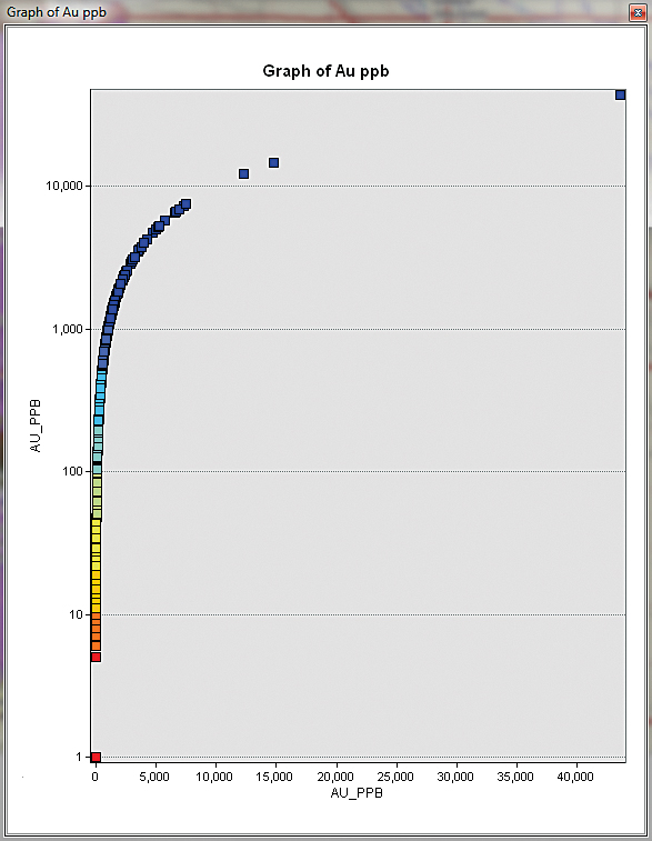
Let’s use a scatterplot graph to quickly view the Au data in these new classifications or bins.
- In the ArcMap standard menu, select View > Graphs > Create Graphs.
- In the first Create Graphs Wizard pane, set Graph type to Scatter Plot. For the Y field, select AU_PPB from the drop-down. For the X field (optional), also select AU_PPB. The interim results are displayed. Leave other fields unchanged. Click Next.
- In the Axis Properties box, check Logarithmic to reset the y-axis. Inspect and confirm your logarithmic distribution. Notice the nine spectral color intervals, from red to violet.
- In the graph, the y-axis represents the logarithmic plot of Au data, compared to a linear plot along the x-axis. There are many low values and just a few extremely high values.
- Click Finish to complete the graph.
- You can close this graph and revisit or modify it later using View > Graphs > Graph Manager. By the way, 43,574 ppb represents 1.400 troy ounces of gold per short ton of material. This is quite high for a soil sample. Perhaps a small particle of gold in a stream was collected. We should revisit this point! In any case, save your project. Later you can create similar graphs for Au, As, Sb, and Hg.
Including Creating a Combined Color and Size Point Scheme
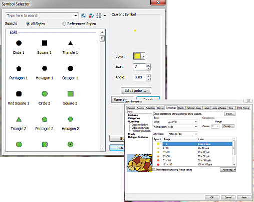
- Double-click Au ppb to reopen the symbology. In the grid under the Color Ramp section, left-click the header labeled Symbol and choose Properties for All Symbols.
- The Symbol Selector will open. Use the search box to set all symbology to Circle 1 [under the Esri set], with a size of 15 points and accept the default color.
- Set the color ramp to Yellow to Red.
- Manually set the symbol size. Begin by double-clicking the symbol for 5 ppb or less and setting the size to 7 points. Go through and change the symbol size for all symbols using a 1 point increment (i.e., 5 to 10 ppb is 8 points, 10 to 20 ppb is 9 points, and so on.)
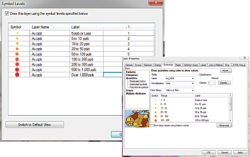
- Click the Symbology Advanded tab and select Symbol Levels. Check the Draw this layer… box and Switch to Advanced View.
- Assign a display order of 1 to 5 ppb or Less and continue down to value 9 for Over 1,000 ppb. Click OK twice to apply these updates.
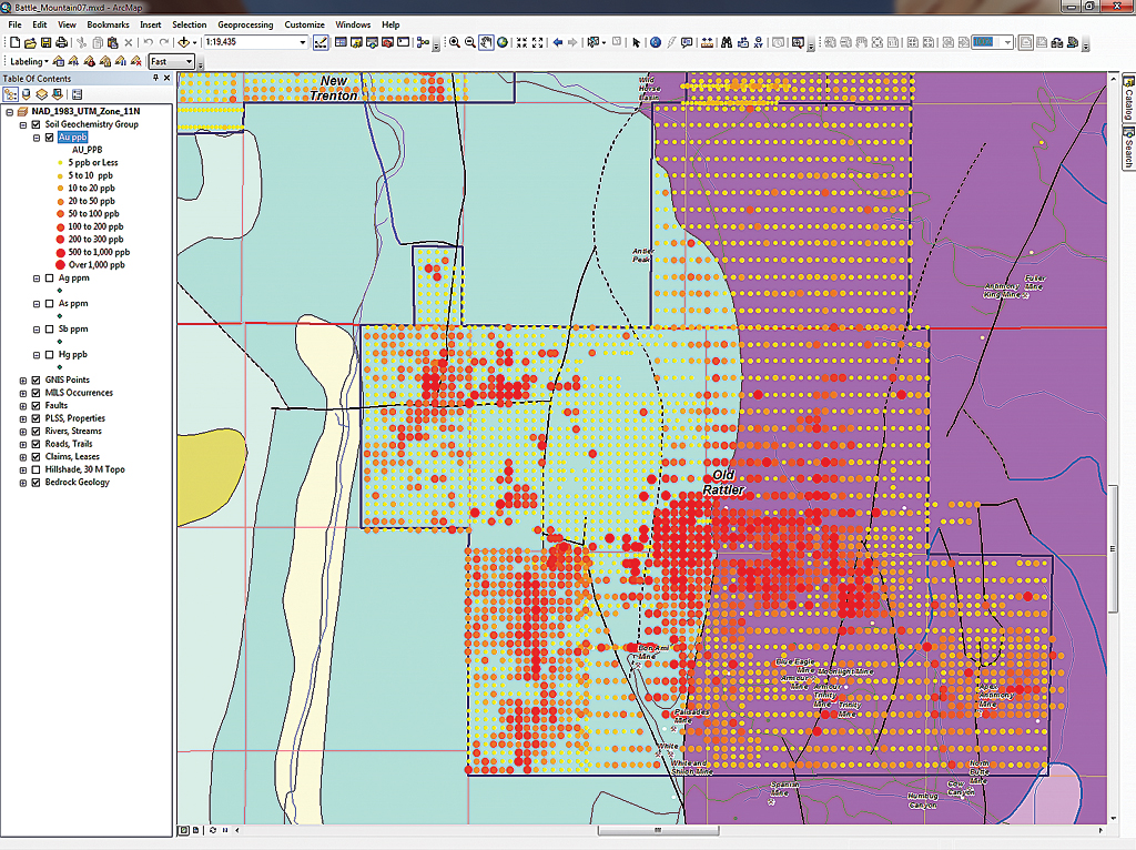
- Zoom to Bookmark Old Rattler 1:25,000, inspect your work, and then save the project.
- High gold values plot as large red circles on top of lower values. Now, we can visualize and locate that nugget, which appears to be about 100 meters east of a mapped stream.
Symbolizing Other Elements
Continue creating logarithmic legends for Ag, As, Sb, and Hg. Use the same workflow that you used for Au and apply the intervals and color ramps listed in Table 3. All legends will include 9 internals, but the beginning and ending values will vary. Proceed carefully and save your work often. If you are especially curious (and to validate your legends), see if you can match the sample count in each elements bin to the values in Table 4.
Saving Logarithmic Legends as Layer Files
Because all layers for these elements have been added to a group layer and are a single TOC object, they can be saved together as a Layer file for the entire group. The symbology for each element can also be saved as an individual Layer file. Be sure to store each Layer file inside the \Battle_Mountain07\GDBFiles folder, using relative paths. Although only Au ppb is visible, the other elements are available and can be individually displayed.
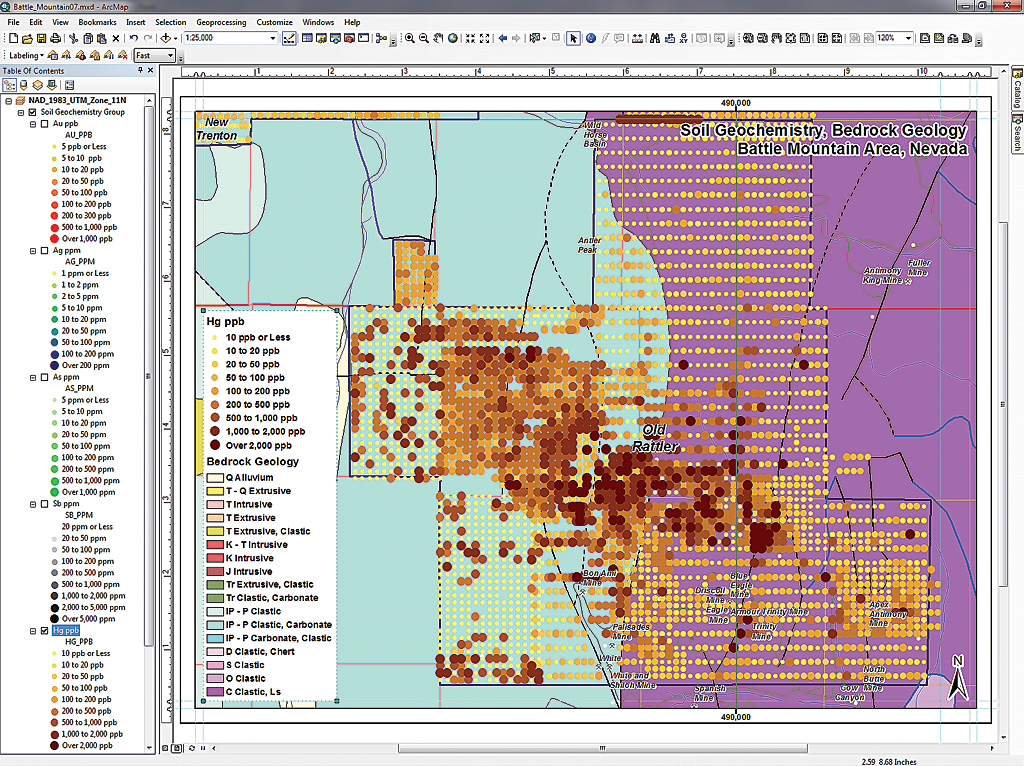
Adding Soil Geochemistry Layers to the Legend
The next step is to add all five layers to the map legend.
- Switch to layout view, right-click on the legend, and select Properties.
- On the General tab, select all five elements in Map layers and copy them into Legend Items.
- Switch to the Items tab and use the General tab to set fonts for all layers. Set each item’s Layer Name Symbol to Arial 11 points black and the Layer Symbol to Arial 11 points black. Be sure to set them all!
- Close Legend Properties, turn on each layer individually, and inspect your work. If satisfied, save your map once more, and you are finished.
Summary
This tutorial presents many tools, shortcuts, and tricks that I have developed over many years, going way back to the days when I used log graph paper. I use this symbology workflow almost daily, and it has stood the test of time. Try these tricks out on your own data.
Acknowledgments
Thanks again to my Battle Mountain data providers and my peers in earth sciences and public safety for their invaluable contributions.