Most planetary science missions are essentially mapping missions. Numerous types of maps can be created from imagery of the planets, meaning that many of those pictures are ultimately transformed into some form of cartography. Thus, maps represent a primary visualization medium that scientists use to study Earth and its neighbors in the solar system.
This year, NASA’s MErcury Surface, Space ENvironment, GEochemistry, and Ranging (MESSENGER) spacecraft, the first probe to orbit and entirely map Mercury, ended its 11-year mission by slamming into the surface of the solar system’s innermost planet. Before it crashed in April 30, 2015, MESSENGER gifted science with imagery that produced several global high-resolution basemaps that revealed many of the planet’s secrets. Paul K. Byrne, assistant professor of planetary geology at North Carolina State University and a MESSENGER visiting investigator, explains to Esri writer Matthew DeMeritt how mapping helped to interpret the remote-sensing data collected by MESSENGER and how GIS enhances investigation of our solar system.
DeMeritt: How did you become involved with the MESSENGER mission, and did your GIS background help you become a visiting investigator? Was GIS part of the mission from the outset?
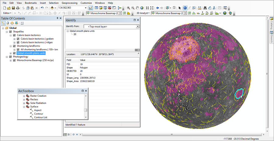
Byrne: I was very fortunate to join the MESSENGER team as a postdoctoral fellow, based at the Carnegie Institution for Science’s Department of Terrestrial Magnetism, in Washington, DC. I applied for the position shortly after finishing my PhD, in which I studied the evolution of giant volcanoes on Mars, using GIS techniques to map landforms on their flanks. My experience with Esri ArcGIS and the use of two- and three-dimensional image and topographic data was definitely a boon to my getting hired by the MESSENGER team because I had the training and background to combine the types of data we were going to get of Mercury. From the start, the mission placed a large focus on using GIS to analyze and make sense of what we were seeing on Mercury. All the data we downlink were, after some processing, made GIS-ready, and so it was a fairly straightforward task to drop it into ArcMap and get mapping!

DeMeritt: In the fall 2012 ArcNews article “Surveying Mercury” [published while MESSENGER was in the process of sending the first image data back to Earth], you said that cartography was pretty much the most important way to interpret the geology of any planetary body. What are the most significant discoveries that MESSENGER has made, and how do they illuminate our models of terrestrial planet formation, if at all?
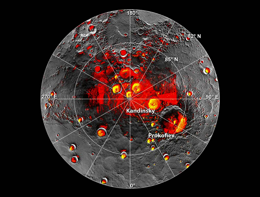
Byrne: We’ve had such a successful mission with MESSENGER that it’s impossible to say which onediscovery is the most important. There have been so many. For example, MESSENGER data have been used to produce maps of so-called permanently shadowed craters—craters near the poles in which sunlight literally never reaches the crater floors. Inside many of these craters, MESSENGER spectrometer, altimeter, and image data together show that not only are there deposits of organic, volatile compounds present but also deposits of water ice. We’ve even been able to directly image some of these exposed ice deposits. That ice had been identified from radar measurements taken from Earth long before MESSENGER and had even been hypothesized to be water ice, but to confirm that hypothesis with multiple datasets was a major achievement of MESSENGER’s mission.

DeMeritt: To what extent did the maps generated from Mariner 10 spacecraft—the first-ever probe to visit Mercury—inform the mission?
Byrne: We’d be remiss to ignore what Mariner 10 told us about Mercury, even if that mission was completed four decades ago. Mariner 10 only saw about one-half of Mercury’s surface in its three flybys from 1974–1975, but that half was enough to calibrate our understanding of the planet and frame the questions that MESSENGER was designed to answer.
DeMeritt: Was GIS used to extrapolate information from those old maps?
Byrne: Absolutely. The United States Geological Survey has done a wonderful job converting Mariner 10 data to a GIS-compatible format, which means we can make direct comparisons between MESSENGER and Mariner 10 data within the ArcGIS environment seamlessly. We’ve been able to start with the Mariner 10 quadrangles [slightly overlapping rectangular maps of a planetary surface established by the US Geological Survey that cover 7.5 minutes of latitude and 7.5 minutes of longitude] and compare them with imagery from MESSENGER. That comparison enabled scientists to look for geological units, landforms, and so forth in areas that Mariner 10 didn’t see—basically the whole northern hemisphere. We did this to answer the question of whether what we saw in that one hemisphere in the 1970s is representative of the planet as a whole. It turns out that, in the main, this is the case.
Mariner 10 data have also helped us understand how best to produce geological maps of Mercury. The different quadrangles published after the Mariner 10 mission weren’t always entirely consistent with each other: the boundaries between different geological units might change location from one quadrangle to another or disappear between neighboring quadrangles entirely. MESSENGER team members are currently developing a new, global geological map with MESSENGER data, incorporating the lessons we can learn from earlier mapping with Mariner 10 images. All of this analysis takes place within GIS.

DeMeritt: The Mariner 10 flyby of Mercury in the 1970s showed what looked like buckles on the surface, seemingly indicating that the planet shrank over time. Was one of the objectives of MESSENGER to measure the contraction with a more detailed basemap?
Byrne: Yes. One of the big questions raised by the Mariner 10 mission was whether the cliff-like scarps we see in abundance on one half of the planet are also on the other half. Mariner 10 only observed Mercury’s southern hemisphere. Determining the amount that Mercury contracted tells us a lot about its interior structure and volcanic history. We used photogeological images to first map the lengths and characterize the distributions of these scarps across the entire surface, using the Editor tools within ArcMap. We could then add topographic data to the project and use ArcGIS 3D Analyst to determine the topographic profile of a subset of these mapped scarps. With that information, together with some basic statistical assumptions about the geometry of faults underlying these scarps, we were able to calculate the extent to which Mercury had contracted. We were pleasantly surprised when we found that Mercury has shrunk in radius by as much as seven kilometers, which is the biggest global contraction of any terrestrial body we’ve observed in the solar system so far.
DeMeritt: How important is stereo imagery in studying Mercury’s landforms?
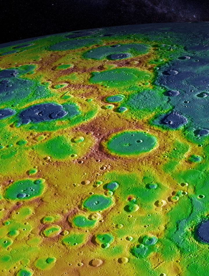
Byrne: Geology itself is manifest in 3D, so investigating any geological body, process, or relationship requires that the third dimension be incorporated. Being able to explore the surface of Mercury with topographic data, whether obtained through stereophotogrammetry or through interpolation of altimetry data, represents a powerful advantage in our quest to understand the planet’s geology and history. Digital elevation models [DEMs] have, for instance, been used to quantify large-scale topographic warps in the planet’s lithosphere, the origin of which we still don’t fully understand. And topographic data can tell us the thicknesses of lava flows in impact craters, the depths of explosive volcanic vents, and even the large-scale shape of the planet. Without these data, our understanding of Mercury would be much poorer.

Since all MESSENGER data—indeed, data from all NASA missions that can be analyzed in GIS—are published in an ArcGIS-compatible format, the [ArcGIS for Desktop] Spatial Analyst and 3D Analyst extensions are our go-to tools for exploring topographic data. We can also use other applications that are part of ArcGIS for Desktop such as ArcScene and ArcGlobe to visualize subtle variations in relief, investigate relationships, or even vertically exaggerate the landscape of DEMs produced from MESSENGER imagery and altimetry data. A personal favorite of mine is to use the ArcToolbox Conversion tool to export various ArcMap layers to KML files for visualization in Google Earth. That’s a very powerful instrument for scientific analysis, conference presentation, and educational outreach.
DeMeritt: What would be your dream GIS for investigating planetary geology?
Byrne: Processing and analyzing topographic data must underpin any mission in which we gather knowledge about a planetary body’s geology, whether that’s from an orbiter, lander, or rover. Flying uncrewed aerial systems through the atmospheres of Venus or Mars, say, or remotely operating a boat on the lakes of Titan would be enhanced by high-resolution topographic data. So my dream GIS would be a fully immersive GIS technology. Virtual reality software and hardware would enable almost fieldwork-scale investigation of planetary surfaces. That would be a major step in science education and outreach and even in preparing astronauts for on-the-ground work on the moon or Mars!

