
Maps about hurricane damage, emojis, the Alamo, the Arctic, and sea turtles and sharks were among the winners of the Map Gallery Competition at the 2017 Esri User Conference, held last July in San Diego, California.
Thousands of conferencegoers visited the Map Gallery in the Sails Pavilion at the San Diego Convention Center, stopping to admire and study the maps. During a special reception, mapmakers answered people’s questions about their work. Among the best aspects of touring the Map Gallery are the takeaways, such as learning about a new cartography technique or getting an idea for an upcoming mapping project.
Contributions to the Map Gallery are important and valued. The work of hundreds of organizations and individuals represents not only a snapshot in time of the state of cartography and mapping but also a current portrait of the state of our world and our communities. Exhibiting a map in the Map Gallery is an opportunity to inspire and learn from others and generate ideas among peers. This helps foster the incredible culture of collaboration, community, and support for one another that’s seen year after year at the conference.
The Map Gallery competition kept the judges—all of whom are Esri geographers and/or cartographers—busy during the week of the conference, selecting what they deemed were the best maps. Here’s a list of the first-place winners:
Best of Show—Centers for Disease Control and Prevention (CDC)—Geospatial Research, Analysis and Services Program (GRASP) for The Environmental Burden Index: Estimating Environmental Quality by Peer Group
This winning map fully embodies The Science of Where. The authors have mixed and matched traditional and modern cartographic aesthetics. The poster strikes a good balance between map and marginalia. The focal point is the map, but there is a lot of information in the margins that does not distract from the map. Color balance and hues are beautifully expressed and easy to differentiate. The cartography in this map is not just for show but serves as the authors’ method of demonstrating a complex explorative analysis. It’s one of those maps that you see from far away and want to check out, and when you see it up close, you never stop finding new bits of information.

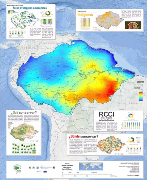
Best Map Series or Atlas—World Wildlife Fund (WWF) Colombia for Atlas of Conservation Opportunities in the Amazon Biome under Climate Change Considerations (View the story map.)
In this category, the judges looked for a visually appealing collection of maps that had continuity. The winning map series has a central, coordinated theme. The judges thought these bilingual maps were informative without being confusing. The collection also has a well-balanced presentation of maps, legends, and narration and are engaging both online and in print. The color schemes are attractive and distinctive. To quote one of the judges, “The unified artistic theme really makes an impact!”
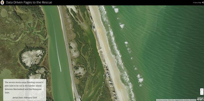
Best Instructional Map—St. Johns County, Florida, for Data Driven Pages to the Rescue
In this category, the judges look for a map that demonstrates strong logic from which the audience can learn or replicate a workflow or process. The Data Driven Pages to the Rescue story map makes great use of mixed media to tell a compelling story about how St. Johns County used the Data Driven Pages toolset in ArcMap to create 75 maps in 24 hours, showing the locations of structures that were damaged by Hurricane Matthew in 2016. In addition to telling this incredible story, the workflow was shared so others could learn from it. The authors fully employed the capabilities of the Esri Story Map Cascade app to create a visually striking, engaging story map and an interactive learning experience for the audience. One of the things the judges liked about this map was that it kept their attention from start to finish.
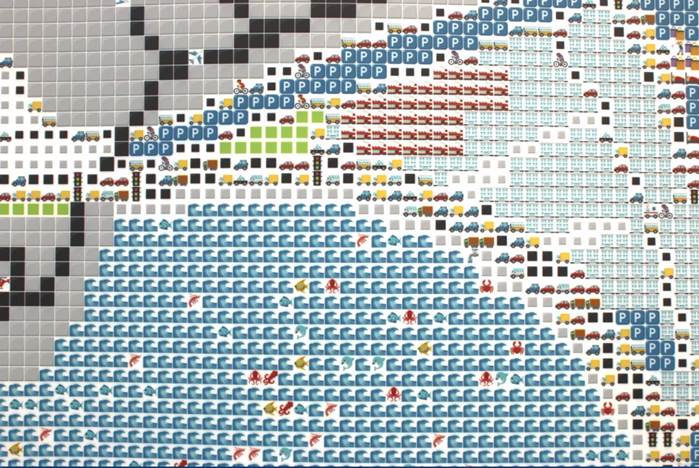
Most Unique Map—Europa Technologies for The Emoji Map of San Diego
This category is always a Map Gallery favorite. Designed to support work of an innovative or experimental nature, it gives mapmakers an opportunity to go beyond the defaults. The concept for The Emoji Map of San Diego is delightfully simple but beautifully executed. View it in this video. The map is large, but its size worked well for the scale of the room in which it was presented. It hooks into a modern social media phenomenon that naturally gives the map modern appeal. The map draws people in from a distance, and the resolution comes into focus as they approach. It’s colorful, playful, and truly unique!
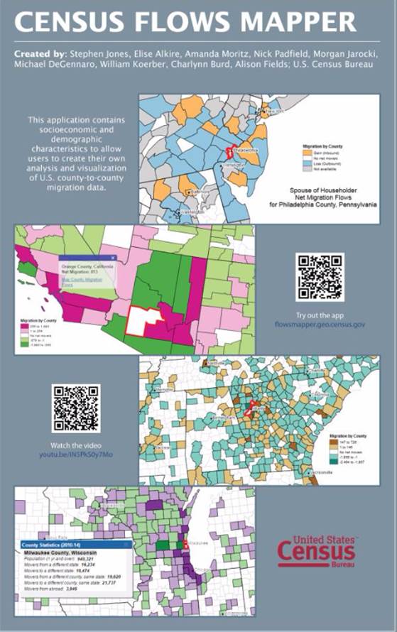
Best Use of an API in a Map—US Census Bureau for the Census Flows Mapper application
Maps in this category make specific use of an Esri API as a core component in the design and publication of a stand-alone online map product. The judges were particularly impressed by this map’s simplicity and ease of use and how effectively it shows a complex dataset integrated with an intuitive user interface.
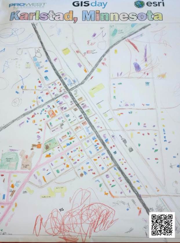
Best Student Map for up to Age 12—Pro-West & Associates in Walker, Minnesota, and the Tri-County School’s preschool class in Karlstad, Minnesota for The GIS Day Community Coloring Map
The Best Student Map winners are among the most inspiring in the Map Gallery. The winning map for this category, with entries from children up to the age of 12, is charming! These preschool mapmakers even (mostly) stayed within the lines.
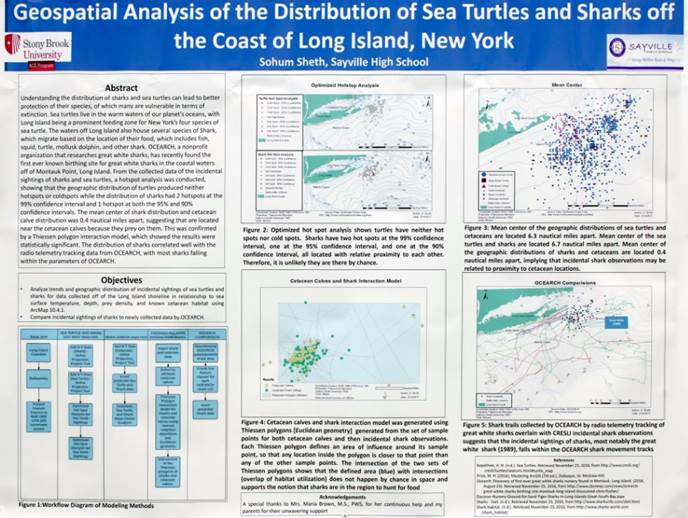
Best Student Map Ages 13–18—Sohum Sheth of Sayville High School in West Sayville, New York, for Geospatial Analysis of the Distribution of Sea Turtles and Sharks off the Coast of Long Island, New York
Sohum’s map represents a surprisingly in-depth analysis of a complex issue for which the results are presented in a clear and compelling way.
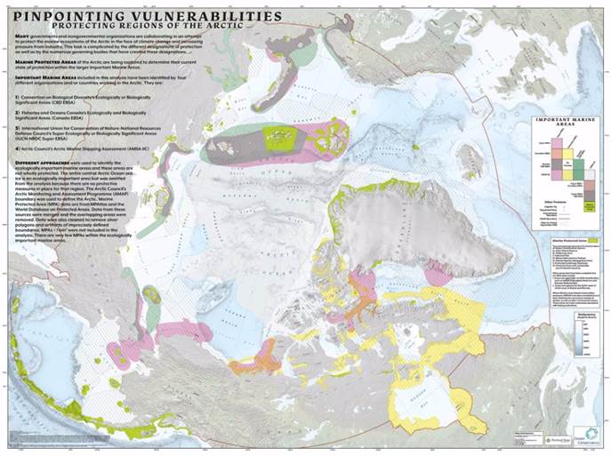
Best Student Map—Post Secondary, University, and Postgrad—Gabriel Rousseau and Kyle Lempinen from the Bureau of Land Management, Oregon State Office, for Pinpointing Vulnerabilities—Protecting Regions of the Arctic
This winning entry maps protected and other important marine areas. It exhibits professionally executed cartography with subdued colors, a clear presentation of overlapping categories, and a well-balanced layout for a page with complex map marginalia.
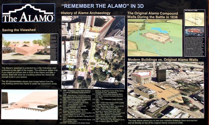
Most Exemplary Story Map—Pape-Dawson Engineers for “Remember the Alamo” in 3D
In this category, the judges were looking for an appropriate use of an Esri Story Maps app, including customization of the app rather than the use of default settings. The story map also needed to be simple to navigate. The winning story map progressively reveals the history of the Alamo in 3D. The beautiful historical models are shown in context with current road and building features, placing readers within a realistic environment where they can appreciate the scale and the changes made through history by urban development. Line-of-sight visualizations clearly demonstrate the perspectives from interesting locations within the Alamo. This story map is an excellent example of well-paced storytelling, thoughtful cartography, and an immersive use of 3D.
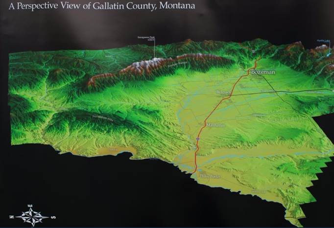
Best Large-Format Printed Map—Gallatin County for A Perspective View of Gallatin County, Montana
In this category, maps should demonstrate that the final size is suitable for the theme and be designed for viewing in a large gallery space. This map of Gallatin County, home of the city of Bozeman, suits this category well and provides an aerial view of the area’s dramatic terrain and unique geographic features. This map diverges from traditional “North is Up” orientation. East is up, allowing for better label placement. The exclusion of neighboring areas creates a focused look at this US county.
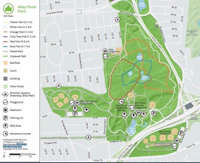
Best Small-Format Printed Map—New York City Parks for Alley Pond Park
Despite its size, the top map in this category has an impressive cartographic design. Not only is it very easy to read, it’s also beautiful to look at. It was clear to the judges that great thought and effort went into how to communicate information about Alley Pond Park, including the trail system. A subtle hillshade effect was well used, and the map includes a clever depiction of white dashed lines in the legend. Overall, this map serves as an excellent example of how to effectively communicate graphic information.
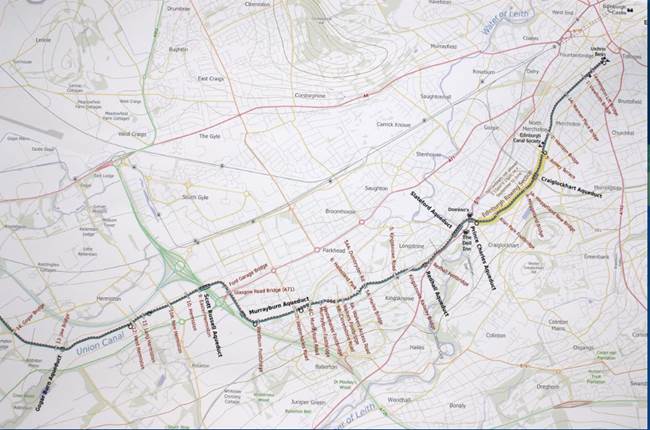
Best ArcGIS Pro Map—City of Fort Collins, Colorado, for The Union Canal (Fallkirk to Edinburgh)
Map author Doug Cain pushed the boundaries of ArcGIS Pro to create clean, haloed labels for this map. Note the excellent use of muted pastel colors. At a glance, this map might seem traditional, but the closer you get, the more you can appreciate its modern cartographic appeal. Cain has crafted a beautiful, visual hierarchy that makes the canal stand out from the background.
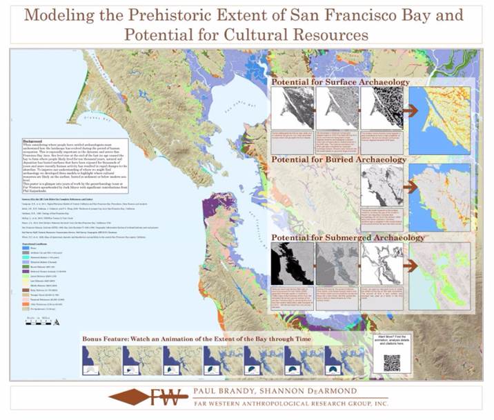
Best Analytic Map—Far Western Anthropological Research Group Incorporated for Modeling the Prehistoric Extent of San Francisco Bay and Potential for Cultural Resources
GIS presents opportunities to understand our world on a new level, which is what makes this category so powerful. The winning entry identifies and communicates the issue it presents, using maps and additional graphics but focusing on the methods, techniques, and processes used in the analyses. The judges were particularly impressed by how the landscape evolution analysis enables historical understanding. The progression of spatial analyses is depicted in an easy-to-understand layout. The colors are pleasing, too. This entry also includes some interactivity, with a link to a time lapse animation and details of the analysis online. (View the story map.)
View a complete list of Map Gallery Competition winners.