
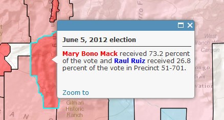
Using color in your web map pop-ups can offer more meaning and context to the information presented within them and make your pop-ups stand out. In the example below, a pop-up in a 2012 election map highlights the Republican candidate’s name in red and the Democratic candidate’s name in blue.
The use of color in the pop-up makes it easy to understand the candidate’s party affiliations.
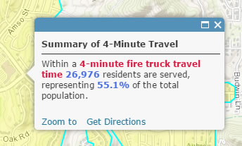
In the example below, color was used for emphasis.
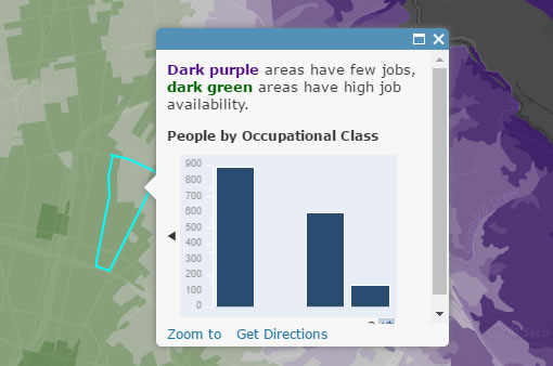
Color can also be used in a pop-up to echo the legend or to make a complex legend easier to understand.
Add Color to Pop-ups
Adding color to pop-ups is easy. Follow these three steps:
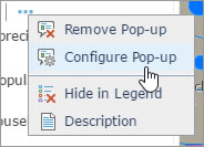
Step 1. Click the layer options button (…). An example of how to do this is provided below.
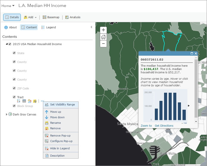
Then choose Configure Pop-up.
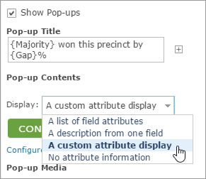
Step 2. Choose A custom attribute display.
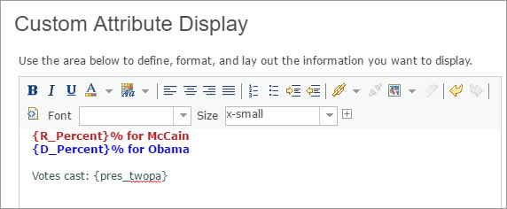
Step 3. Enter text and attributes in the Custom Attribute Display panel, and change colors as desired. In the example below, a presidential election results map from 2008 was configured with a custom attribute display, and results were displayed in different colors to indicate party affiliation.
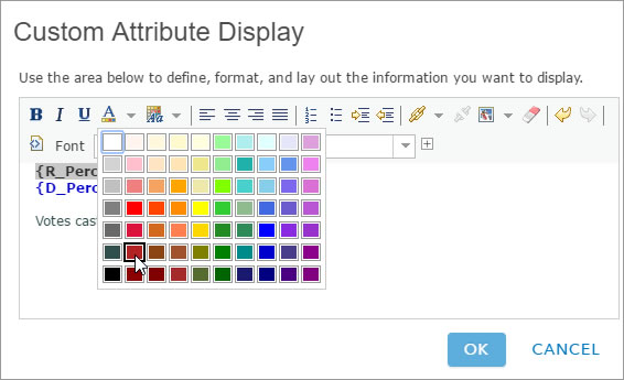
Note that attributes appear in braces, and color can be added like other text. Select the text and attributes, click the Foreground Color tool, then choose the desired color.
Tip: As with many visual techniques, use pop-up color sparingly. Too many colors may be distracting or detract from the overall map aesthetics.
For more information, see View pop-ups.