European Cities Are Getting Warmer
ArcGIS Online Helps Tell the Story
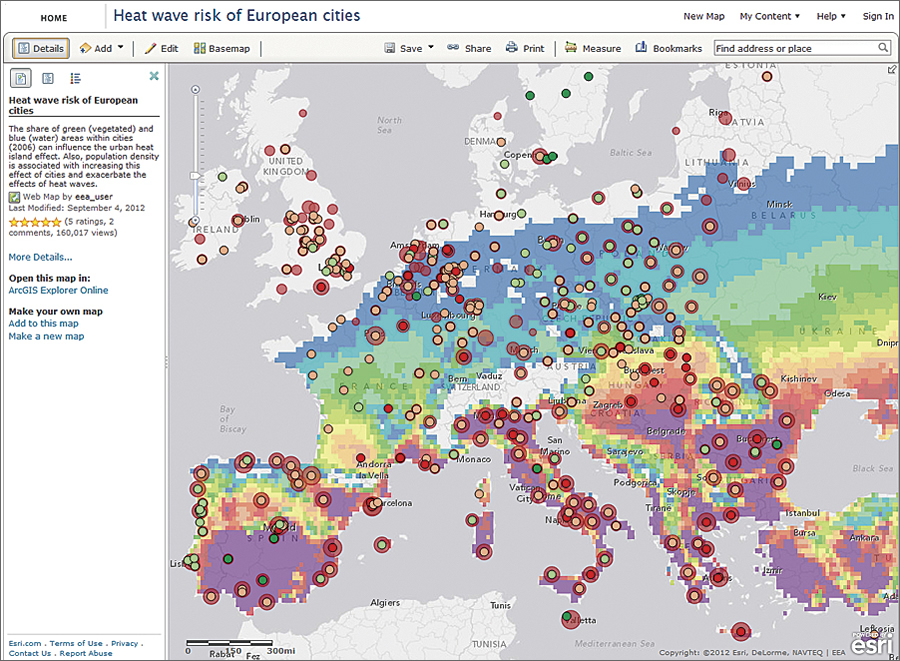
The European Environment Agency's heat wave risk map, powered by ArcGIS Online, shows that the southern region of Europe is most likely to see an increase in daytime and nighttime temperatures due to global climate change. (Source: EEA.)
Less than 24 hours after the European Environment Agency (EEA) posted an interactive web map on its Eye on Earth website, the map received more than 100,000 views. Clearly, the impact of global climate change on weather patterns is of interest to many people, regardless of their location.
The map was originally created by EEA for its Urban adaptation to climate change in Europe report (EEA Report No. 2/2012) and shows the heat wave risk for 500 European cities. The map combines the simulated number of both tropical nights and hot days, with population density and share of green and blue urban areas. Vegetation and water areas, along with population density, can influence the urban heat island effect. For example, high population densities are associated with a lack of green space, high building mass, and high production of anthropogenic heat per area. Italy; some parts of southern France; southern Spain; and area around the cities of Belgrade, Serbia, and Bucharest, Romania, are clearly vulnerable.
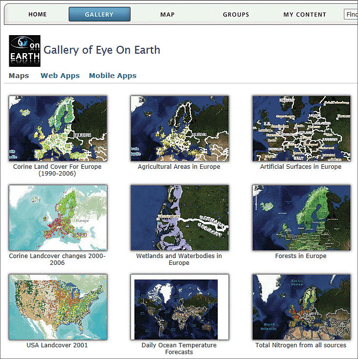
Eye on Earth, EEA's custom website powered by ArcGIS Online, features many environmental maps and invites users to share their observations and data.
The heat wave risk map was created by EEA and shared through the Eye on Earth site using ArcGIS Online. The backdrop for the data is the Light Gray Canvas Map, one of the ArcGIS Online basemaps that's well suited to overlaying datasets. The map author added layers of green (vegetation) and blue (water) urban areas extracted from the Urban Atlas product; population density; and combined tropical nights (minimum temperature exceeds 20�C) and hot days (maximum temperature exceeds 35�C) for the periods 1971-2000, 2021-2050, and 2071-2100, an output based on multiple regional climate models from European FP6 project ENSEMBLES (see below the list of datasets and methodology used). The map also includes pop-up windows for the 500 cities that show the city name, city code, and percentage of green vegetation and blue urban area for each location.
This type of map can easily and quickly be made in ArcGIS Online by anyone. Start with one of the ArcGIS Online basemaps best suited to your needs. In addition to the Light Gray Canvas Map, you can choose from street, topographic, and imagery maps. Then simply add the layers—either a layer that has been shared on the web, for example, through ArcGIS for Server or Open Geospatial Consortium, Inc., Web Map Service services; KML or CSV layers; or your own data stored in a delimited text file, GPS Exchange Format, or shapefile. A detailed description and tags provide context and help others find your map.
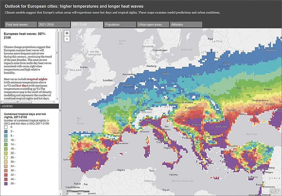
The European Environment Agency's (EEA's) map of heat wave risk of European cities inspired the above ArcGIS Online story map "Outlook for European cities: higher temperatures and longer heat waves." Tell your own stories using Esri's storytelling templates and from within the ArcGIS Online map viewer and publish your web maps into them. (Source: EEA.)
EEA made the web map publicly available on its Eye on Earth site for anyone to access. The map is interactive, and users can combine different datasets from the EEA report, for example, adding the number of elderly people who are generally more affected by heat. Datasets made available by other organizations can also be added.
To view the heat wave risk map, go to eyeonearth.org, or visit arcgis.com.
Datasets and Methodology Used
- GMES Urban Atlas, reference year 2006
- Urban Morphological Zones (2000)
- Urban Audit database (EUROSTAT)
- Fischer, E. M., and C. Sch�r, 2010, � Nature Geoscience
- European FP6 project ENSEMBLES