Recovery.gov Rapidly Evolves
Increasing Transparency, Accountability
Highlights
- Recovery.gov has added a map gallery and developer center.
- Maps compare areas of need with recovery investments.
- It is the first government-wide system to move to the cloud.
For more than a year, Recovery.gov has given U.S. residents the ability to see how the government is spending money from the Recovery Act in their neighborhoods and across the country. A rich, online map of recipient-reported data provides the primary view into this comprehensive data depicting where award recipients are investing the allotted $275 billion from contracts, grants, and loans.
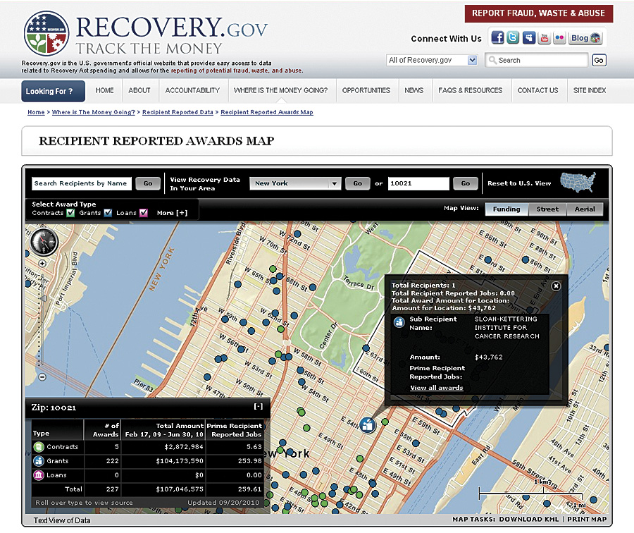
Midtown Manhattan shows the locations of awards as dots that reveal details of Recovery Act funding for the area.
"When we built the site, one of our principal goals was to make it relevant for citizens, not Washington insiders," says Mike Wood, director of Recovery.gov. "The easiest way to do that was with maps that allow people to do a ZIP Code search and see what money is being spent and where the projects are in their local community."
The Recovery.gov Web site gives people the necessary tools and data to ask questions and draw conclusions about how and where the money is being spent, exemplifying President Barack Obama's call for transparent and accountable government. Using GIS provides a streamlined way to bring in huge amounts of data and make it available in a way that all citizens can easily understand.
"This sort of transparency in government spending has never existed," says Earl E. Devaney, chairman of the Recovery Accountability and Transparency Board. "The challenge was to design a system to capture the data [FederalReporting.gov] and a separate system to display that data to the public in a visually pleasing, easy-to-understand, and interactive way—the maps being the biggest piece in that."
Building on Success
In October 2010, the Recovery.gov team, led by Maryland-based prime contractor Smartronix, launched several new features on the Web site to improve user experiences, including a new map gallery and developer center that enhance the site's ability to deliver transparency and accountability.
Results from focus groups and stakeholder meetings made one thing abundantly clear: People wanted to know how recovery money was impacting their own neighborhoods. Responding to this insight, the board's technical staff and the Smartronix team worked to implement new features, like the map gallery, that showcase maps to allow richer interaction and analysis by mashing up recipient reports with other interesting and relevant data.
The map gallery primarily features interactive thematic maps; many of them compare areas of need with recovery investments, for example, job training awards versus unemployment, community-oriented policing services versus U.S. population density, and education awards versus population under 18 years of age. New maps will be added to the gallery over time.
"Showing areas of need can help decision makers understand where to invest, and for the money that's already out there, we can see if it is meeting existing needs," Wood points out.
Other maps in the gallery show the progress of recovery projects that have not been started, are in progress, or are completed. Edward Tufte, member of the recovery board's advisory panel and professor emeritus of political science, statistics, and computer science at Yale University, created the map titled Lights-On, which gradually lights up to show the distribution of awards from February 17, 2009, to September 30, 2010.
The Recovery.gov team also added a developer center to include information pertaining to machine-readable access to recipient-reported data. These resources include a state data summary widget to post data summaries on personal or business Web sites and an ArcGIS mapping API for developing high-performance, simple-to-use mapping applications that users can easily embed in Web pages. Developers can use this authoritative data to create their own mashups, widgets, and applications. Recovery.gov invites and encourages developers to share their results with others through the Recovery.gov site.
"It's important to make the data easier to use with APIs, because we hope developers and other people will take the data and create innovative maps or use it in an application to analyze it in a way we might not have thought of," says Wood. "I think that's the real power in making this information available in new ways that will make it even more transparent than it is now."
Trailblazing
In addition to the groundbreaking nature of this site, the speed with which the recovery board's team built the site was remarkable. Contracting, development, construction, testing, and deployment for Recovery.gov and the site where recipients actually report their spending—FederalReporting.gov—had to be completed in five months.
In addition to the site being completed on time, the recovery board continues to respond quickly as new data comes in. Since October 1, 2009, recipients have been reporting on the progress of their recovery projects each quarter. Incoming data is reviewed for errors and posted on Recovery.gov within a few weeks, or earlier if possible.
"If you look at traditional federal methodology, the feds generate data and take months and months to climb through it," says Wood. "By the time they put out reports, the information is stale. With Recovery.gov, the data is almost real time. We're collecting data at the end of a quarter in a 10-day period, and we're posting it 20 days later. That's light speed for financial information."
On the recipient-reported data map, data includes the amount of the award, jobs created, and the status and description of the project. Citizens, watchdog groups, and local governments can examine the details of investments and report suspicions of fraud, waste, and abuse in their neighborhoods on the site.
The recipient-reported data provides a comprehensive look at recovery efforts around the nation with a compliance rate for recipient reporting that is slightly more than 99 percent. Since reporting began in 2009, noncompliance continues to drop, and Recovery.gov leaders, including Wood and Devaney, believe that transparency is driving this compliance as the board posts the names of those who failed to report.
After recipients report their data, the Recovery.gov team pulls the information it needs into a sophisticated data warehouse. Then the data is brought into the mapping application running on ArcGIS Server and hosted in the Amazon Elastic Compute Cloud. This cloud-based approach improves efficiency and provides flexibility and scalability for varied demand. Wood also explains that it reduces costs for hardware administration. It is the first government-wide system to move to the cloud.
"My job is transparency," says Wood. "I don't want to worry about how many servers I have or if the hardware is operating appropriately. I am able to pass that to Amazon for them to worry about, and I can focus on transparency and making the data available."
For more information, visit Recovery.gov. In July 2009, Smartronix, Inc., a Maryland-based firm experienced in federal and military IT projects, was awarded the Recovery.gov 2.0 project. The team includes three subcontractors—KPMG, Synteractive, and TMP Government—and technology partners Microsoft, SAP, and Esri, among others.