ArcUser
Winter 2012 Edition
Make Maps People Want to Look At
Five primary design principles for cartography
By Aileen Buckley, Esri
This article as a PDF.
 Cartographers apply many design principles when compiling their maps and constructing page layouts. Five of the main design principles are legibility, visual contrast, figure-ground organization, hierarchical organization, and balance. Together these principles form a system for seeing and understanding the relative importance of the content in the map and on the page. Without these, map-based communication will fail.
Visual contrast and legibility provide the basis for seeing the contents on the map. Figure-ground organization, hierarchical organization, and balance lead the map reader through the contents to determine the importance of things and ultimately find patterns.
This article introduces you to these five principles and explains their importance in cartography. It's worth noting that these principles are not applied in isolation but instead are complementary. Collectively, they help cartographers create maps that successfully communicate geographic information.
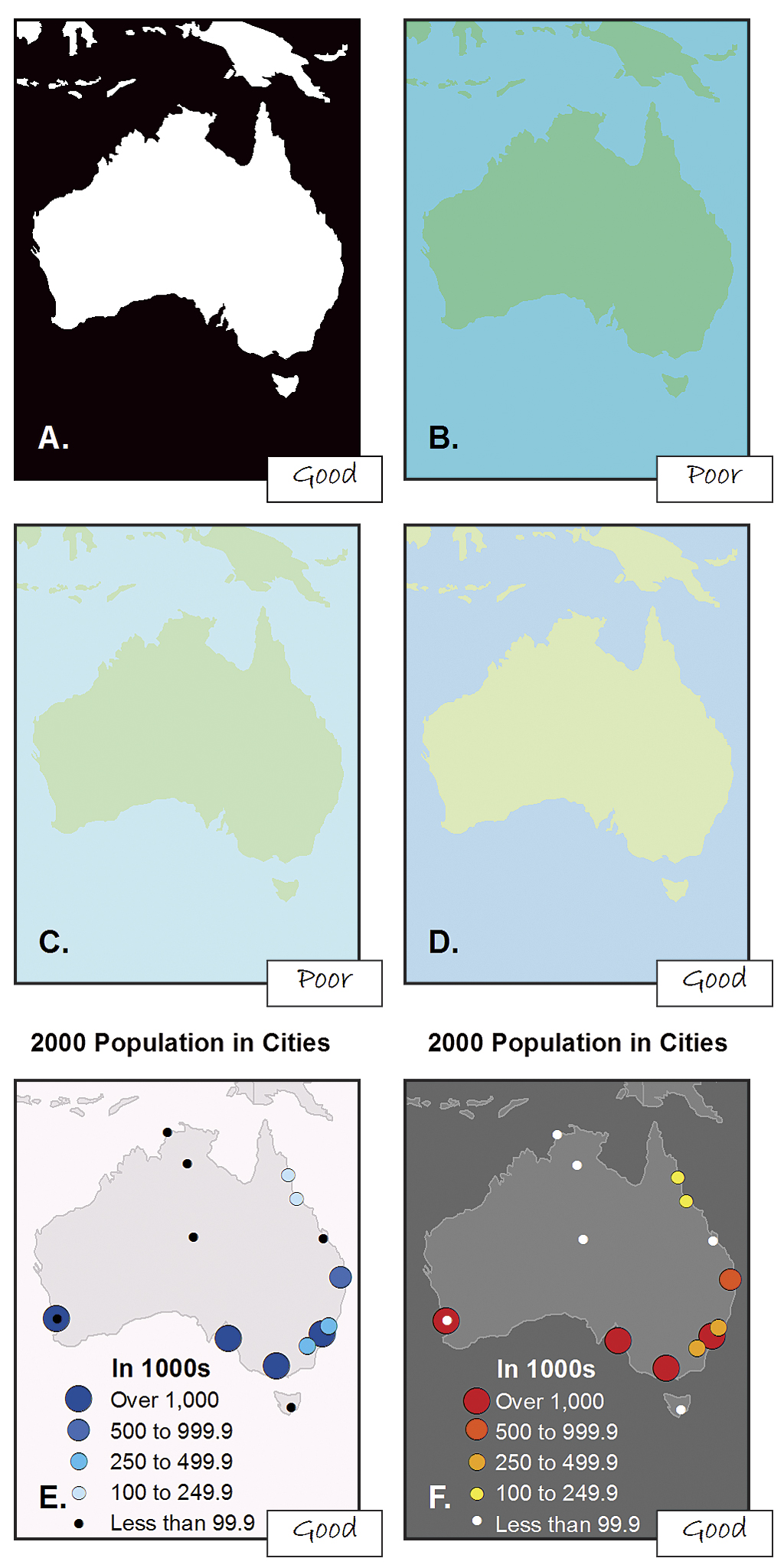
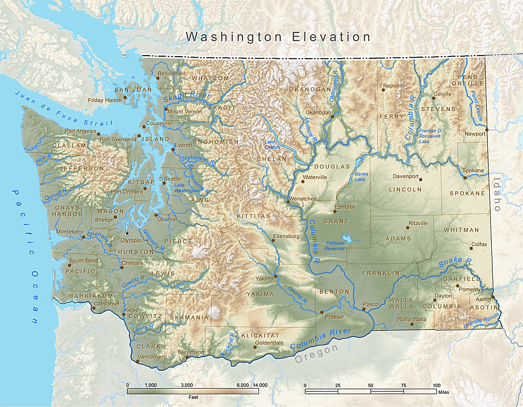
Figure 1. Although black and white (A) provide the best visual contrast, this is not always the best color combination for maps. When using colors of similar high (B) or low (C) saturation (brightness), the hues (blue and green, in this case) must be distinguishable. If they are not, varying the saturation or value (lightness or darkness) of a color (as with the water in D) can create the contrast that is missing. Operational overlays should contrast with the basemap (E and F).
1) Visual Contrast
Visual contrast relates how map features and page elements contrast with each other and their background. To understand this principle at work, consider your inability to see well in a dark environment. Your eyes are not receiving much reflected light, so there is little visual contrast between the objects in your field of view and you cannot easily distinguish objects from one another or from their surroundings. Increase illumination, and you are now able to distinguish features from the background. However, the features will still need to be large enough to be seen and understood so that your mind can decipher what your eyes are detecting.
The concept of visual contrast also applies in cartography (Figure 1). A well-designed map with a high degree of visual contrast can result in a crisp, clean, sharp-looking map. The higher the contrast between features, the more some features will stand out (usually features that are darker or brighter). Conversely, a map that has low visual contrast can be used to promote a more subtle impression. Features that have less contrast appear to belong together.
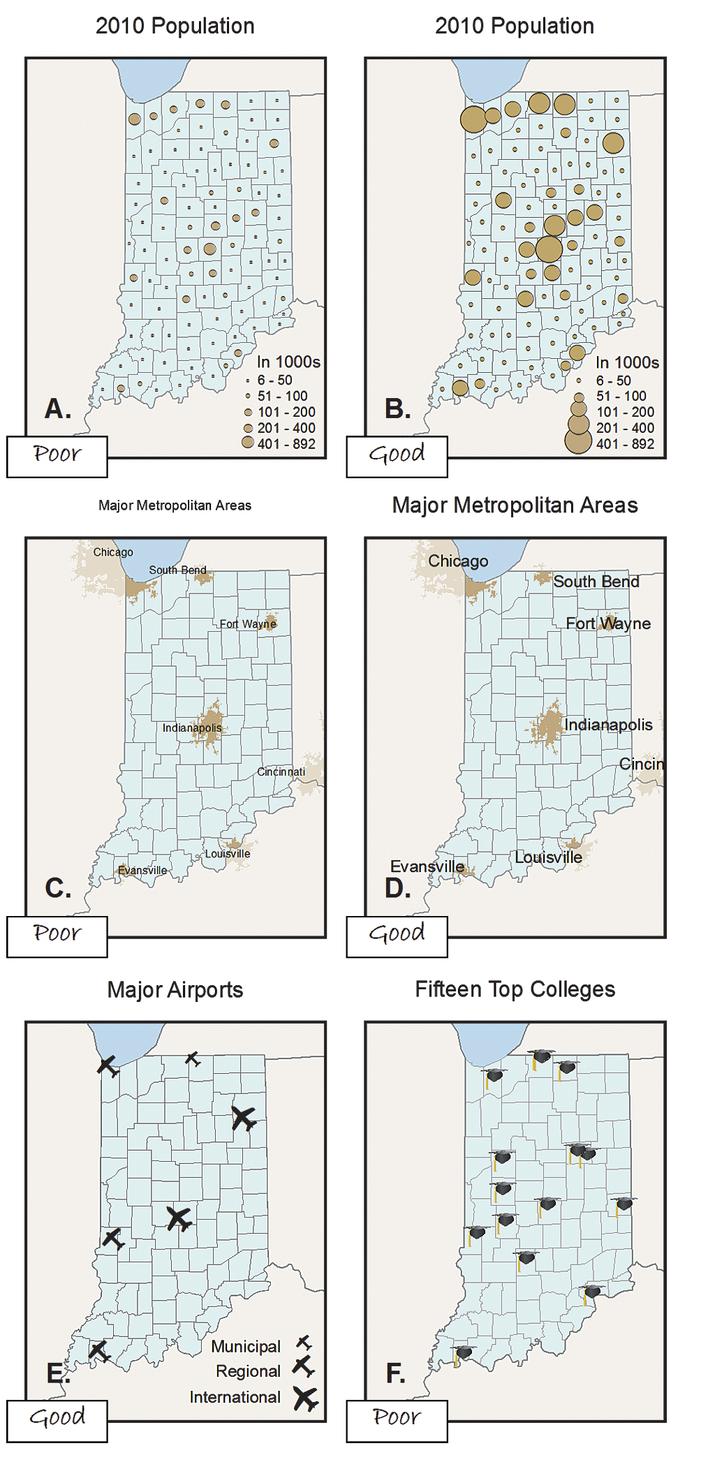
Figure 2. Symbols (A) and text (C) that are too small are illegible. Appropriately sized symbols (B) and text (D) can be easily distinguished and read. Using familiar geometric icons, such as an airplane for airports (E), helps readers immediately understand the meaning of the symbol. More complex symbols, such as a mortarboard for universities (F), need to be larger to be legible.
2) Legibility
Legibility is the ability to be seen and understood. Many people strive to make their map contents and page elements easily seen, but it is also important that they can be understood. Legibility depends on good decision making when selecting symbols. Choosing symbols that are familiar and are appropriate sizes results in symbols that are effortlessly seen and easily understood (Figure 2). Geometric symbols are easier to read at smaller sizes. More complex symbols require more space to be legible.
Visual contrast and legibility can also be used to promote the other design principles: figure-ground organization, hierarchical organization, and balance.
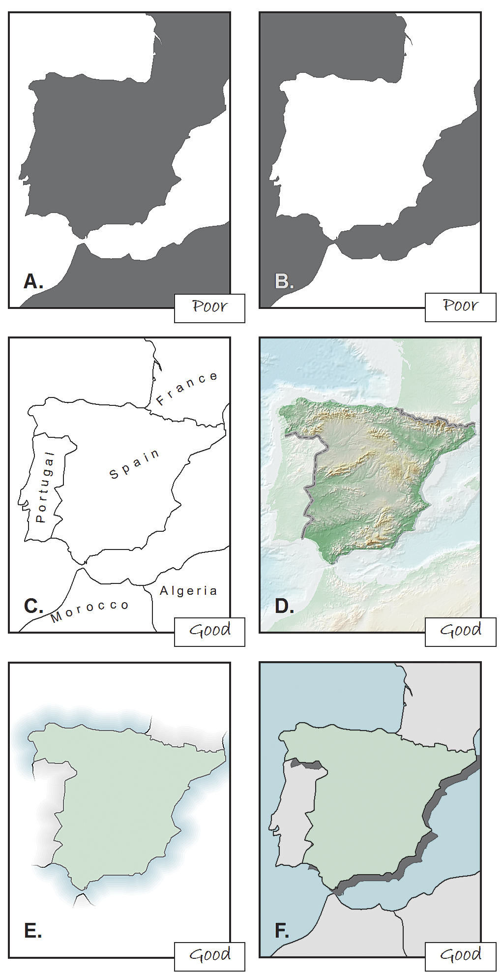
Figure 3. It is sometimes hard to tell what is the figure and what is the ground (A and B). Simply adding detail to the map (C) can help map readers distinguish the figure from the ground. Using a whitewash (D), feathering (E), or a drop shadow (F) can also help.
3) Figure-Ground Organization
Figure-ground organization is the spontaneous separation of the figure in the foreground from an amorphous background. Cartographers use this design principle to help map readers focus on a specific area of the map. There are many ways to promote figure-ground organization, such as adding detail to the map or using a whitewash, a drop shadow, or feathering.
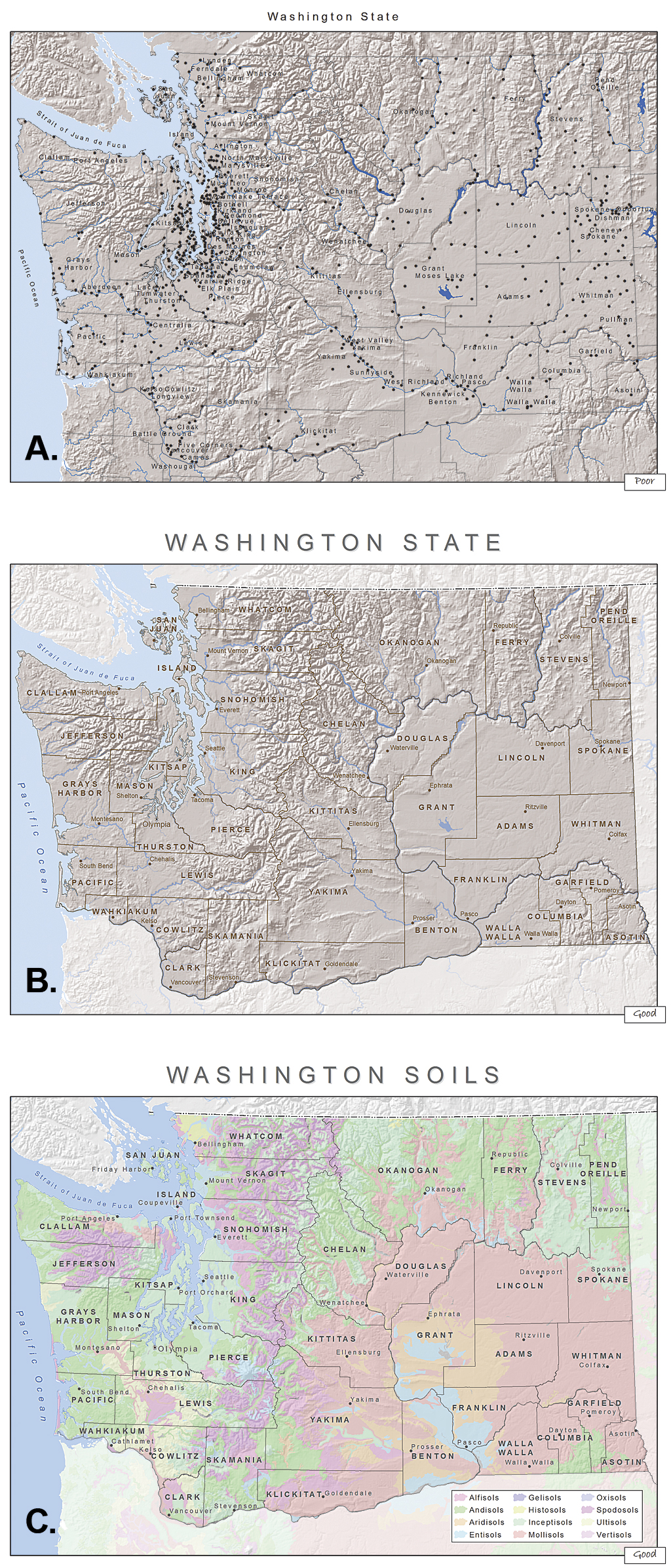
Figure 4. When the symbols and labels are on the same visual plane (A), it is difficult for the map reader to distinguish among them and determine which are more important. For a general reference map (B), using different sizes for the text and symbols (e.g., city points and labels), different line styles (e.g., administrative boundaries), and different line widths (e.g., rivers) are some of the ways you can add hierarchy to the map. When mapping thematic data (C), the base information (e.g., county boundaries and county seats) should be kept to a minimum so that the theme (e.g., soils) is at the highest visual level in the hierarchy.
4) Hierarchical Organization
As noted in Elements of Cartography, Sixth Edition, one of the major objectives in mapmaking is to "separate meaningful characteristics and to portray likenesses, differences, and interrelationships." The internal graphic structuring of the map (and, more generally, the page layout) is fundamental to helping people read your map. You can think of a hierarchy as the visual separation of your map into layers of information. Some types of features will be seen as more important than other kinds of features, and some features will seem more important than other features of the same type. Some page elements (e.g., the map) will seem more important than others (e.g., the title or legend).
This visual layering of information within the map and on the page helps readers focus on what is important and lets them identify patterns. The hierarchical organization of reference maps (those that show the location of a variety of physical and cultural features, such as terrain, roads, boundaries, and settlements) works differently than for thematic maps (those that concentrate on the distribution of a single attribute or the relationship among several attributes). For reference maps, many features should be no more important than one another and so—visually—they should lie on essentially the same visual plane. In reference maps, hierarchy is usually more subtle and the map reader brings elements to the forefront by focusing attention on them. For thematic maps, the theme is more important than the base that provides geographic context.
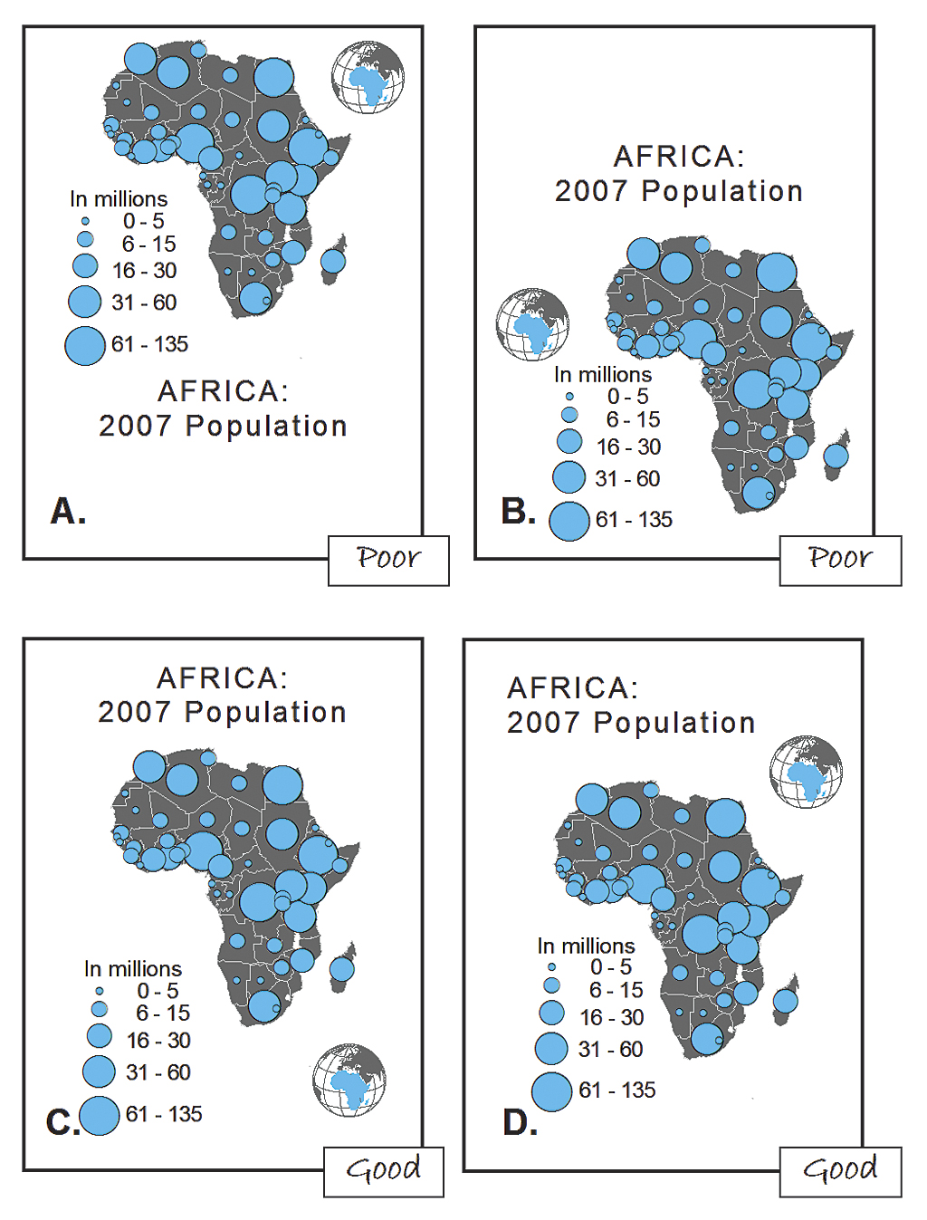
Figure 5. Positioning heavier elements together can make the page look top-heavy (A) or bottom heavy (B). Centering the map slightly above center (C) ensures that it is in the most prominent position on the page. The position of elements can also cause the eye to move in a desired direction. In D, the title is the first thing read, followed by the locator map, then the map of Africa, and finally the legend.
5) Balance
Balance involves the organization of the map and other elements on the page. A well-balanced map page results in an impression of equilibrium and harmony. You can also use balance in different ways to promote edginess or tension or create an impression that is more organic. Balance results from two primary factors: visual weight and visual direction. If you imagine that the center of your map page is balancing on a fulcrum, the factors that will tip the map in a particular direction include the relative location, shape, size, and subject matter of the elements on the page.
Together these five design principles have a significant impact on your map. How they are used will either draw the attention of map readers or potentially repel them. Giving careful thought to the design of your maps using these principles will help you to assure that your maps are ones people will want to look at!
Resources
These cartography textbooks provide more in-depth discussions of the design principles described in this article and how they are applied in cartography.
Dent, Borden D., Jeffrey S. Torguson, and Thomas H. Hodler. 2009. Cartography: Thematic Map Design, Sixth Edition, 207–222. Boston, MA: WCB-McGraw Hill.
Robinson, Arthur H., Joel L. Morrison, Phillip C. Muehrcke, A. Jon Kimerling, and Stephen C. Guptill. 1995. Elements of Cartography, Fifth Edition, 324–330. New York City, NY: John Wiley & Sons, Inc.
Slocum, Terry, Robert B. McMaster, Fritz C. Kessler, and Hugh H. Howard. 2009. Thematic Cartography and Geographic Visualization, Third Edition, 212–221. Upper Saddle River, NJ: Pearson Prentice Hall.
About the Author
Aileen Buckley is the lead of the Esri Mapping Center, an Esri website dedicated to helping users make professional-quality maps with ArcGIS. She has more than 25 years of experience in cartography and holds a doctorate in geography from Oregon State University. She has written and presented widely on cartography and GIS and is one of the authors of Map Use, Seventh Edition, published by Esri Press.