ArcUser Online
Spring 2011 Edition
Visualizing Disease
Understanding epidemics through maps
by Tom Koch
This article as a PDF.
Maps are the workbench on which ideas are fashioned in a manner that permits them to be argued and, often, tested. The workbench may be tidy or messy, depending on the workman. The real focus is the work itself. And so it is with maps. A map is not a representation of work that has been completed but the presentation of arguments about the relationships between things.
Most maps are not beautiful, and that's okay. A map that is dull or plain may do the job just as well as one that is beautiful. Sometimes, it does the job better. At least, that's the way it is with the maps I care about and make—maps of disease and its causes.
In 2003, Esri Press supported my desire to write a book about the history of disease mapping, an area of study that had been overlooked. The result was Cartographies of Disease (Esri Press, 2005). This book tells a story of maps, beginning in the seventeenth century, that argue the presence of specific diseases in an environment.

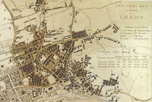
Figure 1: In his map of Leeds, Edwin Chadwick included income disparity and disease information to correlate poverty and disease incidence. Because population data was available from wards, data was aggregated at that level.
This book took for granted the idea of disease. Disease Maps: Epidemics on the Ground does not begin with that assumption. Its subject is how maps have transformed observations of a set of symptoms (e.g., diarrhea, fever, vomiting) into identifiable diseases that can be studied so their causes can be identified. Considered from this perspective, a map is a workbench for exploring ideas about disease and testing those ideas in the crucible of a general epidemic or a localized outbreak. Maps permit the exploration of the relationship between observed incidence and suspected cause.
Maps make many isolated cases into a single class of events that share similar symptoms and a single diagnosis. Placing events in a map illustrates not only the relationship of individual events to each other but also the relationships of these events to the physical, political, and social constructs that define the environment where the outbreak occurred. Mapping sets the resolution and scale for a given argument about the relationship between disease and the environment. It places these events in context.
From this perspective, maps are about numbers and statistics. Nobody maps a single, unique event in blank space. When the unique becomes common—when one becomes a set of 5, 500, or 50,000—an argument can be fashioned and a map constructed. While once paper, pen, compass, and protractor were used, now typically the mapping tools in GIS are employed.
Although the history of this process is long, the conclusions are unassailable. Maps place isolated events into categories that can be used when considering their organization and relationship to the world. The proof lies in any of the many thousands of maps of disease made over the last several hundred years.
Mapping Disease in the 19th Century
Look at Edwin Chadwick's famous 1842 map of Leeds, taken from his seminal exploration of the relationship between health and social welfare (Figure 1). Chadwick, a noted English social reformer, symbolized the streets where the working class, trades people, and the upper class resided using darker to lighter brown hatching. To this social mapping, Chadwick added red dots signifying the homes of those who died in the first pandemic from cholera in the 1830s and dark blue dots signifying the homes of those who reportedly died of respiratory diseases. This permitted him to argue a correspondence between health and class, as defined by income and mortality. In effect, Chadwick redefined the disease he mapped as outcomes of social inequality rather than solely of personal habit or bad luck.
Chadwick's map would garner little praise from teachers of contemporary GIS today. The browns used to indicate different classes are too similar and thus difficult to distinguish. The red dots have faded and are hard to see. The dark blue dots are almost black and fade into the browns. The clutter beneath the legend and the aggregated health statistics seem, on first glance, to have little to do with the map graphic.
Look, however, at what Chadwick accomplished. This map, based on data returned by the first modern census (1839), transformed the geography of income inequality into a geography of disease. Chadwick reordered the city streets to present different levels of income based on employment. To emphasize that data, his map depicted the buildings in the densely populated core of the city.
To this he added blue and red dots symbolizing the homes of those who had died of cholera and respiratory disease. As a cause of death, these two had little in common except their greater prevalence among the poor than the rich. In mapping them, Chadwick made them equivalent and argued their relation to income.
In those days, nobody was sure what cholera was and how it was distinguished from other diarrheic conditions. Cholera, cholera morbus, and promontory diarrhea were some of the many clinical definitions used on death certificates of the day. Chadwick took these disparate mortal diagnoses and made of them all a single class of event (denoted by a red dot) that he could set against the social determinants he believed influenced cholera mortality.

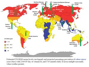
Figure 2: This map projects the likely worldwide decrease in colon cancer incidence if vitamin D supplements were used. The reduction is greatest in areas with least sunlight. Map courtesy of Frank Garland.
Similarly, respiratory disease meant many things (e.g., flu, pneumonia). He conflated these events into a single class that could be presented with cholera events in the landscape of urban employment and income.
Chadwick's map argued these diseases as outcomes of social failure. Because there were more dots in the streets with lower income than those with higher income, mortality was therefore inversely related to income level and income level to employment. The map was too busy to do anything but suggest this conclusion. However, it served admirably to suggest this.
From this map and its database (as we would call it today), Chadwick was able to draw a series of associations that are summarized in his designation of "good" and "bad" streets in the city's various districts. Good streets were those with fewer deaths, which resulted from lower population density and higher income levels. Bad streets were those with more deaths, which resulted from greater population density and lower income level. Cholera and respiratory disease thus became markers for a mortality correlated across the landscape of inequalities whose health consequences his map argued.
The map is filled with computations and simple statistics summarized in the legend. Each death has a location in space—a latitude and longitude. From this information, myriad calculations can be derived. All this computation took place behind the map to permit his conclusions about healthy and unhealthy, or good and bad, streets based on the relationship between income and mortality.
As a cartographic work, the map is probably a failure. As a representation of Chadwick's reasoning, the map is somewhat confusing but serviceable. As a workbench on which Chadwick gathered the elements of his argument and organized the data, the map was an astonishing success. Since 1842, thousands of maps have been rendered in many countries at a range of scales that make the same argument: the real cause of illness is often poverty.
Mapping Disease in the 20th Century and Beyond
Few maps stand alone. Most maps owe their existence to other maps as conceptual harbingers. Typically, each map contains a mapped history of an argument's development. Chadwick's map of Leeds was based on an earlier rendering of the city. We do it a disservice when we call this a basemap as if it was somehow unimportant to the argument. Through mapping the physical structure of the city and overlaying economic and medical analytics, the relationship between these aspects can be understood.
Consider a map created by Frank Garland, an epidemiologist and professor of family and preventative medicine at the University of California, San Diego, and his colleagues that predicted a potential decrease in colon cancer rates if vitamin D supplements were used as a preventive measure. On one level, the map presents a sophisticated statistical argument for a relationship between vitamin D and cancer. It calculates the presumed effect of increased use of supplements based on current disease rates and the assumption these cancers are related to natural vitamin D from exposure to sunlight. One would think this is a simple graphic summarizing complex statistics that are anything but cartographic.
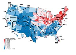
However, this map is only the latest in a series of maps. In their first paper in 1984, Garland and his brother, Cedric, overlaid gradients of sunlight exposure on county mortality data for colon cancer Figure 2). The resultant map showed a strong inverse relationship between levels of solar intensity and death rates of colon cancer. Later studies found a similar correlation for other cancers (see Figure 3) and diabetes. The Garlands and other researchers have worked to isolate vitamin D as the active element in sunlight's apparent cancer protection and to establish the likely effect on cancer rates of increased vitamin D supplementation during periods of low sunlight. The conclusion, promised but not explicit in these maps, is compelling: over time, a daily usage of vitamin D supplements would decrease worldwide cases of breast and colorectal cancer by 450,000 cases a year.

Figure 3: This map presents the researcher's fundamental insight: there is a correlation between breast cancer rates and the degree of sunlight with its strong natural vitamin D component. Map courtesy of Frank Garland.
In the map, the bars show the projected percentage of colon cancer prevention. The argument this map makes is dependent on previously mapped cancer rates. The Garlands' map is based on maps of US sunlight gradients and the apparent congruence between those isobars and the mapped incidence of specific cancers. Hidden in the map—but present in the thought behind it—is the argument that changing vitamin D levels effectively reduces cancer rates.
Medicine, Maps, and the World
Maps of disease are the workbench on which theories are cobbled together and investigated. However, it is a history that is still only half told. Cartographers have emphasized the aesthetics and graphic history of their medium but have shortchanged the ideas maps present. This is not surprising. To see maps as the medium of an increasingly statistical investigation requires knowing something about statistics generally and (more important) about the statistics of the subject being mapped. Alas, those trained in mapmaking are often not skilled in handling statistics.
Chadwick didn't use computerized mapping. Neither did John Snow or the hundreds of others whose maps of cholera, yellow fever, plague, respiratory disease, tuberculosis, and other diseases have helped advance our knowledge of disease, health, and pandemic outbreaks. But GIS certainly makes things easier.
GIS doesn't stand alone, of course. It is the workbench of a range of statistical programs—from Excel to SASS and SPSS—that permit numbers to be joined to the map. Back in the 1960s, this required large, mainframe computers and old, clumsy Fortran. Today, it still sometimes requires large computers, but most of the work can be done more easily on a laptop.
From then to now, what has not changed is the plasticity of the map as a medium in which ideas are generated, formulated, and argued using the best tools (graphic and statistical) available. Because medicine is my area of interest, it is in this area that I researched the legacy of the map as the workbench of new theories. I could as easily have used the history of city maps, national maps, air and sea cargo routes, or almost any other subject to make the same point.
About the Author
Tom Koch is a medical geographer and ethicist who is also engaged in public health studies. He is based in Toronto, Canada.