|
The Magazine for
Esri Software Users
|
|
|
Map Layers as Graphic Elements in ArcView GIS
By Jonathon Corbridge, California Regional Office
When creating a map, we carefully classify and symbolize the data, agonize over just the right font and label placement, and tastefully locate any other elements. Many of us are so accustomed to considering map features as displayed spatial data that we can miss opportunities to use the functionality built into ArcView GIS to manipulate features for a graphic effect. Take a fresh look at the themes you want to display and try a few of the techniques described in this article. They can help you create a better- looking map that communicates data more effectively. These techniques aren't difficult or even highly technical-they just require that you have a firm grasp on the map's purpose and the map user's understanding of the information.
Buffers as Graphic Elements
Buffers are polygons drawn a specified distance from a feature. Buffers can be used as graphic elements to enhance maps by creating a subtle border between two regions or a beautiful graphic of a shoreline. Generating buffers is very easy. This functionality is built into ArcView GIS.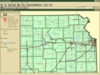 Follow the steps below to highlight a polygon boundary by creating a buffer inside the polygon area and saving it as a separate shapefile. Creating a separate shapefile allows for greater flexibility in symbolizing and placing the border. A more subtle color, close to the original polygon's color, is used for the buffer shapefile. This will make the border defined by the buffer shapefile less likely to conflict with other linear features on the map. It will also eliminate extra colors outside the map's focus area and help maintain a hierarchy within the map. Follow the steps below to highlight a polygon boundary by creating a buffer inside the polygon area and saving it as a separate shapefile. Creating a separate shapefile allows for greater flexibility in symbolizing and placing the border. A more subtle color, close to the original polygon's color, is used for the buffer shapefile. This will make the border defined by the buffer shapefile less likely to conflict with other linear features on the map. It will also eliminate extra colors outside the map's focus area and help maintain a hierarchy within the map.
Subtly Highlighting Borders
- Start ArcView GIS and open the desired project. Make the theme that contains the feature you want to enhance active.
- Select the feature you want to buffer.
- Choose Theme>Buffers from the View menu to bring up the Buffer wizard.
- In the first wizard dialog box, choose Features of a Theme as the item to buffer.
- In the second wizard interface, select At a Specified Distance as the method used to create the buffer and enter a number for the width of the buffer. Choose distance units that are appropriate to the scale of the map.
- In the third wizard dialog, create the buffer using the Only on the Inside of the polygon parameter. Specify that the buffer be saved as a new theme and assign a name and location for the new file. The new buffer theme will be added to the current view.
- The next step is to remove outlines from the shapefiles. In the table of contents for the view, double-click on the original feature theme in the legend to bring up the Legend Editor.
- From the Legend Editor, double-click on the symbol to bring up the symbol palettes and choose the Fill Palette. At the bottom of the Fill Palette select None from the drop-down box labeled Outline. Click on Apply in the Legend Editor.
- Repeat Steps 7 and 8 for the buffered theme.
- In the legend, double-click on the buffer theme to invoke the Legend Editor. Double-click on the symbol and change the color to match the original polygon, but do not close the Color Palette.
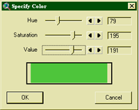 Click on the Custom button in the Color Palette to bring up a dialog to specify a custom color for the buffer. Click on the Custom button in the Color Palette to bring up a dialog to specify a custom color for the buffer.
- The Specify Color dialog adjusts the hue-saturation-value components of the color. Move the Value slider to the left or type in a value that is 20 to 30 units lower than the value component for the original polygon. This will make the fill color slightly darker so that the buffer shapefile will create a shadow just inside the outline of the polygon but won't create an aggressive stripe. Depending on fill color for the original polygon, the value may need to be reduced by as little as 10 or as much as 50 units. Trial and error, as well as your own taste, will determine the final setting.
More Subtle Borders
If the goal is to show the distribution of a phenomenon rather than its limits, turning off or muting polygon outlines may be desirable. Creating a slightly darker outline or using a dashed line to mark a boundary are two ways to de-emphasize boundaries but still have them visible. To create an outline color that is slightly darker than the polygon fill color, follow the steps in the previous section and reduce the Value setting very slightly when creating the custom color for the buffer. Adding a dashed line to show a border can be easily done using a script that ran in the January–March 2000 issue of ArcUser magazine, in an article by Thomas Purk in the Hands On section. Using this script, available from the ArcUser Online Web site, in combination with the techniques described in the previous section, Subtly Highlighting Borders, will produce a dashed line with a background shadow that makes boundaries obvious without competing with the other linear that you wish to emphasize.
Buffering Water Features
Two different effects can be created for shorelines using buffers-ramped blues simulating gradually deepening water and isolines that mimic bathymetric contours.
Color-Ramped Shoreline
- Follow Steps 1 through 4 from the preceding section on highlighting a polygon boundary.
- In the second dialog box of the Buffer wizard, choose to create buffers as multiple rings (concentric polygons) instead of at a set distance. Typically, five to seven rings work best. Make one more buffer than the number of graduations of color you want to see in the final product. Again, the distance units will depend on the scale of the map.
- In the third wizard dialog choose to create buffers only outside the polygon. Save the buffers to a new file and specify the file name location. Click on the Finish button. The new buffer shapefile will appear in the view.
- Double-click on the buffer theme to bring up the Legend Editor. Change the Legend Type to Graduated Color and use the buffer distance as the Classification Field.
- The next step removes the black outlines between the rings of the buffer theme. Still in the Legend Editor, double-click on each color in the Symbol column to bring up the symbol palettes. Choose the Fill Palette and select None from the drop-down box labeled Outline. Click on Apply in the Legend Editor. Do not close the Legend Editor.
- Double-click the last classification and use the Color Palette to make that selection (buffer ring) the same color as the water feature. Double-click on the first color for the first buffer classification and use the Color Palette to make it much lighter than the water feature.
- Hold down the Control button and select the first and last buffer classifications and click on the Ramp button (the rightmost button in the lower portion of the Legend Editor) to create a color ramp between the first and last colors.
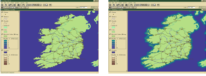 Color ramping produces the illusion of gradually deepening water. Experiment with the color ramp to discover the most pleasing color combinations.
Shoreline Isolines
- Create a multiple-ring buffer theme as described in the previous section, Color-Ramped Shoreline, by following Steps 1 through 3.
- In this case the polygon outlines should be on (the default setting), and the fill should be changed to transparent. Invoke the Legend Editor and Fill Palette as described previously to make these changes. Do not close the Legend Editor.
- Still in the Legend Editor, select the first classification and use the Color Palette to make it just a shade darker than the water feature.
- Select the last classification and make it much darker than the water feature.
- Hold down the Control button and select the first and last buffer classifications and click on the Ramp button (the rightmost button in the lower portion of the Legend Editor) to create a color ramp between the first and last colors.
This will create a series of isolines that imply a calculated depth. In some cases this can be misleading, so use this technique when it is understood by the audience that this does not represent actual bathymetry. If you have access to real bathymetric contours, the same technique can be used. Experiment with color combinations to determine the best version of the color ramping for the lines.
Stack Themes for Special Effects
For linear features, stacking the same linear theme is an easy way to create great-looking cased lines. Look closely at the standard cased line symbols that come with ArcView GIS and you'll notice that the end of each line segment shows the rounded edge of the line casings covering up the line symbols. By making the line on the bottom theme wide enough to show on either side of the line symbol on top of it, you can make a cased line that is uninterrupted.
Multiple point feature themes can display additional attribute data. For example, placing a round dot symbol classified by color on top of the same theme symbolized with pie charts can communicate several different relationships between the data. Care must be taken in making the symbols large enough to be meaningful. Also, don't overload the user with too much information for each feature. In the pie chart example, three to four attributes will work, but any more than that could confuse the reader. There is no definitive answer-experiment with various combinations to learn which solution communicates the data most effectively.
A very simple yet effective way to neatly define the extent of all the polygons is to sandwich data layers between a bottom polygon theme and a top theme. The top theme describes the extent of all the themes below it by circumscribing them with a heavier line.
- If you don't already have a shapefile that describes that exact boundary of the polygons, select the polygons that will make up the area of interest.
- Create a new shapefile containing the selected polygons by choosing Theme>Convert to Shapefile.
- Use the GeoProcessing extension that comes with ArcView GIS to dissolve the polygons' boundaries. Choose File>Extension and check the box next to GeoProcessing to load the extension.
- The View GUI will be modified to include the GeoProcessing wizard. Choose View>GeoProcessing Wizard and select Dissolve Features Based on An Attribute. Select an attribute that will be common to all polygons in the selection such as Area and name and determine a location for the output shapefile.
- The output shapefile will be added to the legend. Double-click on it to bring up the Legend Editor, change the fill to transparent, and increase the width of the outline.
- Invoke the GeoProcessing wizard again and choose Clip One Theme Based on Another. Make the input theme the original theme containing all the polygons and the polygon overlay theme the new shapefile created in Steps 2 through 5. Name and determine a location for the output shapefile.
- In the view, stack the dissolved theme above the new clipped shapefile. The top theme's wider outline hides the ends of all the other linear and polygon themes under one crisp outline.
Conclusion
These are just a few simple ways you can improve the appearance and clarity of maps created using ArcView GIS. These techniques don't require any additional software or special output devices-just a little time and a creative approach to communicating your message to map users.
Acknowledgment
The author thanks Charlie Frye of Esri for his assistance with the images and data used to create the illustrations for this article.
| |
