ArcUser
Summer 2012 Edition
Compelling Thematic Cartography
By Kenneth Field, Esri Senior Research Cartographer
This article as a PDF.
ArcGIS Online has opened up the world of mapmaking, supporting anyone to author and publish thematic web maps in interesting ways on an unlimited array of topics. This article explores why it is important to think about design when creating thematic maps.
A recent survey by the author and Damien Demaj identified examples of maps that exemplify great design. This survey found that only 23 percent of these maps were made by people with a background in cartography. Great thematic maps like Charles Minard's map of Napolean's retreat from Moscow or Harry Beck's London Underground map were created by an engineer and electrical draftsman, respectively.
The bottom line is that you don't have to be a cartographer to make a great map, but knowing something about how design helps tell your story will give you a head start. Design is an important part of the mapmaking process. It makes the author think about how the map (an information product) supports a particular message. In essence, design is a road map.
Whether a skilled map designer or a mapping novice, everyone can make a map, but how do mapmakers create compelling maps? It's simple: have a great idea and a clear objective and figure out how best to present the information by manipulating the data and displaying it effectively. Good content is crucial. Figuring out how to display it clearly and add creativity to grab the audience's attention will not only make them want to look at your map but be able to use and understand it easily.
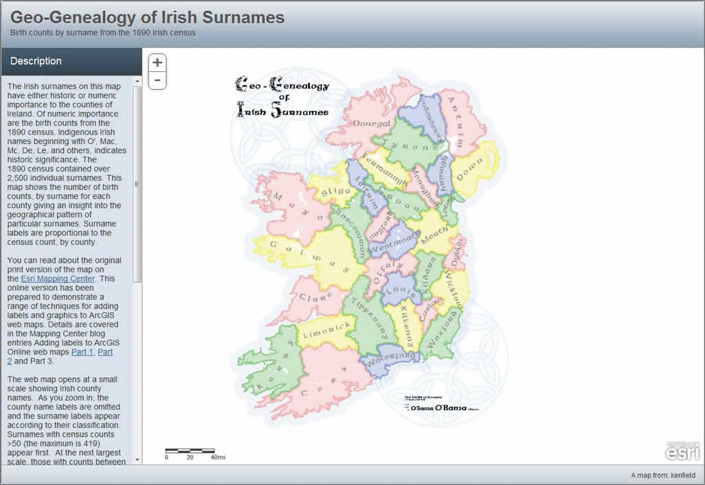
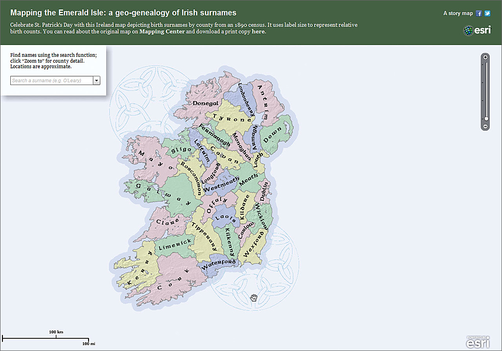
The multiscale nature of web maps and applications requires carefully structuring the information as demonstrated by the Geo-Genealogy of Irish Surnames web map created for ArcGIS Online (top) and Mapping the Emerald Isle map application (bottom).
Technological change has always challenged cartography. Huge changes were brought about by the printing press and the computer. Now, the Internet is creating new and exciting opportunities. However, until the technology matures and people learn how to deploy it successfully, it often leads to weak products. Fortunately, web mapping is maturing rapidly. Many early pushpin-style mashups have given way to more imaginative thematic maps that harness new ways of representing data.
Regardless of the type of map or the technology used to create it, consider these cautionary words by noted American geographer and cartographer John K. Wright: "An ugly map, with crude colors, careless line work, and disagreeable, poorly arranged lettering may be intrinsically as accurate as a beautiful map, but it is less likely to inspire confidence." Let's think about how you can make a great thematic map that is compelling and reaches or exceeds the expectation of its intended audience through the practical application of design.
Clarity of Purpose
You have some great thematic data and you want to share it. Establishing your goal is the first consideration. Without a goal, you won't have a plan to follow. Are you making a map that allows people to interrogate data? Do you want to convey a story or a particular message?
A goal is more than just mapping an interesting dataset. You have to define what the hook is for your map. Start by asking strong questions of the data. What will readers want to understand about the map's theme? The map is really just a graphic portrayal of the answer to a question. It helps establish how you are going to go about designing the visuals to support that goal. A great map should tell an honest story, so don't employ mapping techniques that distort. Some types of thematic map have specific data format requirements, so be careful that distortions don't creep in.
Figuring Out Your Readership
If you're not telling a story to an audience who will care, you cannot expect that audience to pay much attention. Once you've established your purpose, you need a design strategy that makes your map accessible to that audience.
This isn't necessarily about making your map simple and easy to understand. You shouldn't necessarily simplify a subject's complexity, because the detail in the data is often the interesting part. Instead, it's about developing clarity. Ideally, you want to make complex information digestible in visual form through an elegant representation.
The complexity of your data may require a little time to understand. That's fine. Not everything needs to be distilled to remove complexity. Maps don't have to overgeneralize or simplify the data. It's perfectly possible to present hundreds of thousands of pieces of information sensibly on a single map. Rich content often helps garner interest by presenting complexity in a simple way. Conversely, distilling a big chunk of data is not easy. Also consider the reader's patience and ability to consume the ideas in your map. Designing great maps requires understanding the quantitative skills of data presentation. The best-designed maps exist as a symbiosis between smart quantification and beautiful and elegant design.
Preparation and Authority
While it's true that it's easy to drag some data into a web map, it doesn't mean your map will have a clear purpose. A believable map often requires a good amount of background research and data preparation. This is all about approaching this task with a certain amount of rigor.
While understanding your data is the first step, understanding how it might be processed into a suitable form for mapping is crucial. Rich data is great, but it is even better when presented by someone who clearly understands it and knows how to tell its story. Another way of thinking about preparing your map is to ensure your story has comparisons. Allowing your reader to compare one place to another promotes interest and a reason to explore the content. Without comparisons, it is hard to get a sense of what is important. What is an outlier? What trends might exist in the map? Good preparation and research answer these questions and make them visible on the map.
A related issue is demonstrating that you have created an authoritative map. While your map should be able to speak for itself, it should include a link to—and some explanation of—the raw data. An accompanying write-up provides an opportunity to explain why your map findings are important, as well as highlight other interesting findings. If your map warrants further explanation, but that explanation doesn't fit within the graphic itself, you can provide this information to help. Being open about your data sources also encourages readers to believe in your map. If you appear to have nothing to hide, you build trust in your map and you as its author.
Visual Prudency
Creating thematic web maps is not about putting all your data on the map. Being prudent about what you show at what scale and at what level of detail is key to creating a graphic structure that works at a range of scales. Many ambitious datasets call for a map that gracefully handles large scale to small scale while maintaining proper spatial relations. This allows the viewer to explore the data. Smaller scales can be quickly understood, but the viewer examines more minute details at larger scales.
A visually elegant map is achieved by paying close attention to how different elements interact visually. Color is often the most recognizable of these components. If it is used effectively, it highlights something unique or encodes a particular aspect of the data. Don't use color to attract attention: the map's theme should do that. Instead, use color to help tell the map's story rather than detract from it. Annotation is also important. By carefully using labels, explanatory text, and pop-ups, you help the reader understand the context of individual elements as well as how they hang together in the overall composition.
Diversity of Approach
It's easy to become familiar with one pattern of working. If you create maps regularly, your maps can end up looking very similar. Instead, try exploring alternative ways of representing data. Vary the type of map or the graphic treatment applied. Not only will you demonstrate flexibility and versatility, but you'll force yourself to approach each new map independently and figure out how to present that dataset in an interesting, engaging fashion. Begin each mapping task independently from those you've done previously and you will retain freshness. Try to induce the viewer to think about the substance of the map rather than about the methodology, graphic design, or technology used to produce it. Finally, your map should create an emotional response in the viewer, encouraging them to explore further.
Summary
The new web mapping paradigm has created exciting possibilities for anyone to author and publish thematic maps using ArcGIS Online. You don't have to be a cartographer, but knowing what makes a successful map helps you design a map that people will want to use and explore. It will encourage you to develop imaginative ways of preparing and visualizing your data.
For an example of how these techniques can be applied, see the accompanying article "Making Thematic Data Work as a Web Map," which describes how the data was prepared for display as a print map, a web map, and a web map application. Each one required specific design considerations to take advantage of the medium used.
About the Author
Kenneth Field has more than 20 years of experience in cartography and GIS and holds a doctorate from Leicester University, UK. Prior to joining the Mapping Center, he was the course director of GIS at Kingston University. He has published and presented widely on cartographic design and is currently the editor of The Cartographic Journal.