July - September 2007
July - September 2007 |
||||||||
|
|
||||||||
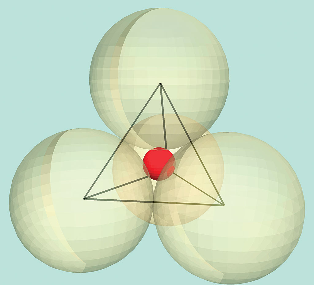
The basic building block of all silicate minerals is the silica tetrahedron comprised of four large oxygen atoms and one smaller silica atom. Any three of the four oxygen atoms are coplanar, so a model of such a structure would lie flat on a table. As shown in Figure 1, the tetrahedron is created by drawing lines in three dimensions to connect the centers of the four oxygen ions. The resulting shape is a tetrahedron, a four-sided pyramid with an equilateral triangle for each face. The silica atom is suspended in the middle of the tetrahedron.
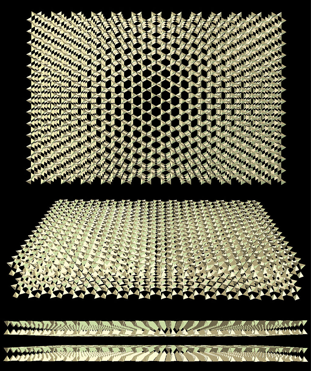
Silica tetrahedra combine by sharing oxygen atoms and are often represented as touching at one or more vertices. The resulting atomic structural frameworks are important because their geometry is reflected in certain physical properties of minerals such as the directions in which they will easily break. Figure 2 shows a sheet silicate structure displayed in ArcScene and viewed from above. The regularity of the spacing between adjacent tetrahedra made the models straightforward to create in a spreadsheet, given the geometry of an equilateral triangle. A rotate attribute was used to account for both orientations of tetrahedra. The spreadsheet was added to ArcMap as an event theme and exported as a shapefile before being displayed in ArcScene.
Displays of such structures in three dimensions may assist learning through interactive visualization or manipulation. For example, mica minerals have sheet structures that allow layers to be peeled off as paper-thin sheets with about the same effort it takes to remove a Post-It note from a pad. This is because silica tetrahedra form two-dimensional sheets with strong bonds (like a Post-It note), but the bonds between these layers are much weaker (like the mild adhesive on the back of the Post-It note). The same theme shown in Figure 2 can be added to ArcScene multiple times to represent separate sheets as shown in Figure 3. Sheets are offset from each other by adjusting the base height, and marker symbols are inverted for two of the four sheets displayed to approximate the correct atomic structure. In the interactive ArcScene environment, the perspective can be adjusted to view the sheet structure from above, at an oblique angle, or between layers and along the planes of weakness. Hue-Saturation-Value Color Space
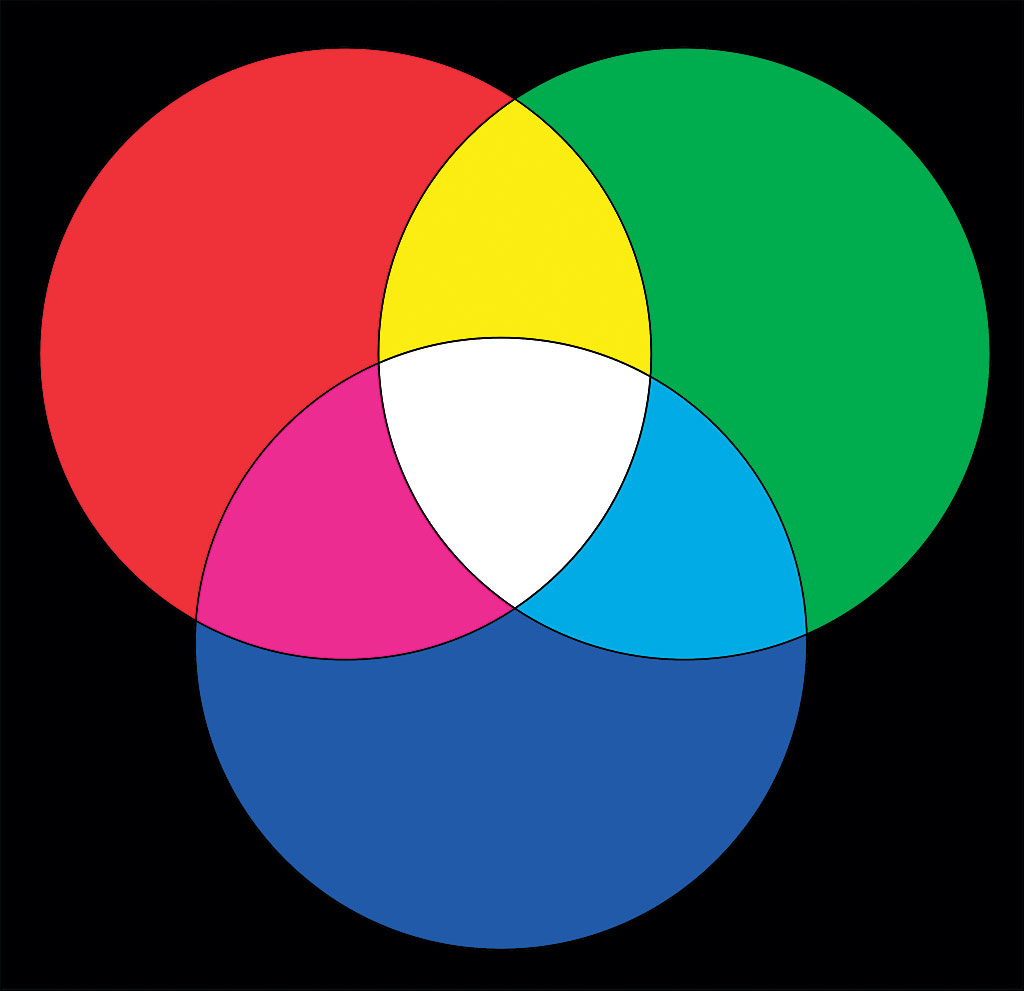
Color models are constructs for showing, selecting, varying, and combining colors. The simplest displays show "all or nothing." Figure 4 shows an example of the additive colors used in the red-green-blue (RGB) color model. This Venn diagram is similar to results achieved with the Union operation in GIS. For example, the red area is 100 percent R, 0 percent G, and 0 percent B; the yellow area is 100 percent R, 100 percent G, and 0 percent B; and the white area is 100 percent R, 100 percent G, and 100 percent B. More complex displays are required to show how colors mix in any desired proportion. Although the RGB color model can be extended to a three-dimensional cube in a Cartesian coordinate system, the RGB color model is not ideal for picking colors. This is because it is not a perceptually based system. Other color systems include variables more in tune with the way colors are often described. One frequently used system is the HSV color model. With this system, richer or darker colors result from changes in the S and V values, respectively.
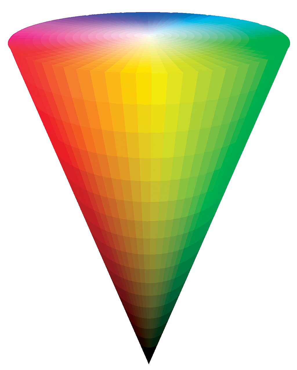
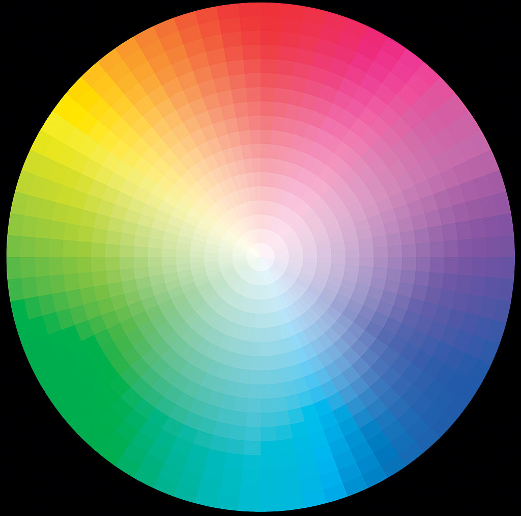
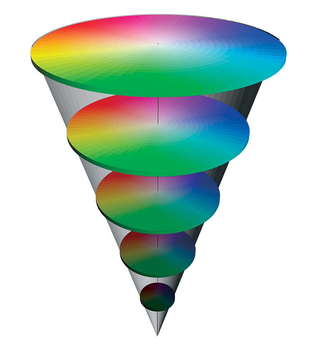
The HSV color model, created with ArcMap and displayed in ArcScene, is shown in Figure 5. It looks like a cone pointing downward. The flat, circular top shows changes in H and S only. Hues of the rainbow change around the circumference of the color circle. Moving toward the middle of the circle, all colors become more pale or less rich as they approach the white center. The Value (V) changes down the axis of the cone. All colors change from being light to very dark. Along the central axis, white changes to black. A three-dimensional display of this color system can be created using GIS. This application begins with making the top of the cone with a polygonal representation of five-degree increments of latitude and longitude for the northern hemisphere, shown in bright yellow on the left side of Figure 6. This grid is then projected into a polar map projection (as shown on the right side of Figure 6). Hue and Saturation are varied with longitude and latitude, respectively. The resulting unprojected colors are shown in Figure 7. Once projected, they define the top of the HSV color model shown in Figure 8. The top of the HSV model can be copied and modified to create the cone beneath. First, it is necessary to make a three-dimensional surface on which the colors will be draped. This is accomplished by creating a TIN based on the latitude. New colors are then assigned to the circle that will be draped over the cone. In Figure 5, Hue continues to vary with longitude, but now Value varies with latitude. All colors along the outside of the cone are fully saturated. The resulting HSV color model in Figure 5 may look like a solid, but the GIS representation is really a hollow cone with a lid on top. However, it is possible to show any number of horizontal layers through the HSV color model. This model makes a copy of the top layer and adjusts the value of all colors by an equal amount. The new layer can then be positioned by offsetting its base height in the three-dimensional display to correspond to the Value level in the HSV cone. The size of the color circles is also scaled to account for decreasing diameters moving down the cone. Figure 9 shows four horizontal cuts through the HSV cone. Each cut represents a 20 percent variation in Value.
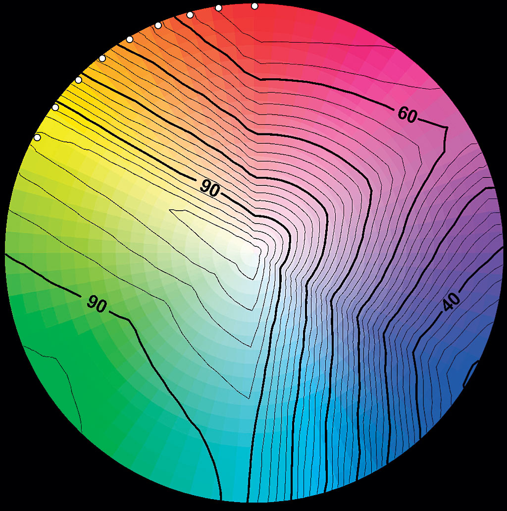
This HSV color model can now be related back to the RGB color model. The image in Figure 10, created with ArcScene, shows a visualization of the contribution of blue to all fully saturated HSV colors. The plateau centers over blue and including all colors beneath represents a contribution of B = 100 percent. Moving toward the opposite side of the color circle centered on yellow, blue's contribution decreases to B = 0 percent along the edges of the bottom color circle. The decreased contribution of blue moving toward the red- orange-yellow-green colors follows a surface shaped like a portion of a cone. This one-third of a cone has sloping "wings" on either side. The wings are centered over the red-to-magenta and green-to-cyan portions of the HSV color model. The relative contributions of red and green to the color circle can additionally be displayed in a similar manner as shown in Figure 11. Figure 11 contains much more information than the Venn diagram in Figure 4, but the same relationships are apparent here. For example, there are only three radial lines along which two of the additive colors each contribute 100 percent and the other contributes 0 percent, centered over cyan, magenta, and yellow. There is only one point where all three colors contribute 100 percent—the white center of the HSV color model. A quick glance at Figure 7 or Figure 8 convinces most people that some colors are brighter than others, despite all having the same HSV Value of 100 percent. Magenta, even more than cyan—and especially yellow—appear much more luminous than neighboring colors. It is possible to quantify these changes in luminosity by relating the HSV color model to another color model, the International Commission on Illumination's CIE-LAB color model. Using ArcMap, luminosity for all the HSV colors that appear in Figure 8 was calculated and contoured in Figure 12. Isoluminosity values vary from 100 percent (white) to just less than 30 percent (fully saturated blue).
Understanding the spatial patterns of luminosity change in the HSV color space provides opportunities for creating distinctive cartographic displays. For example, hillshaded maps almost always vary the Value in HSV color space, causing somewhat muddied hues in the resulting maps because pure hues are intermixed with shades of gray. A hillshading effect, however, can also be achieved by varying luminosity of pure hues. In keeping with the nongeographic nature of this article, luminosity-based hillshading is applied to a Martian landscape using colors associated with the white dots spanning the fully saturated red-orange-yellow hues in Figure 12. The resultant rendering is shown at the top of Figure 13. For this otherworldly terrain, the brightly variegated alternative contrasts with the comparably lackluster hillshading shown at the bottom of Figure 13. SummaryThe world abounds with spatial data that is not tied directly to some geographic coordinate system. Although GIS software may not be specifically designed for all such applications, its flexibility and versatility open up possibilities limited only by the user's imagination. For more information, contact Pat Kennelly About the AuthorPat Kennelly is an assistant professor of geography in the Department of Earth and Environmental Science at C.W. Post Campus of Long Island University. He is interested in cartography, three-dimensional rendering and applications of GIS to earth and environmental science. He has contributed previous articles to ArcUser. His most recent article, "Virtual Campus 101: A Primer for Creating 3D Models in ArcScene," cowritten with Suzanne Gross, appeared in the April–June 2005 issue and is available from ArcUser Online. |