ArcWatch: Your e-Magazine for GIS News, Views, and Insights
April 2011
Understanding Japan's Earthquakes from a Geospatial Perspective
Disasters such as the recent magnitude 9.0 earthquake that rocked Japan and triggered a deadly tsunami are being studied today by scientists and other researchers using geospatial technology. Their authoritative research will be published in the weeks, months, and years to come.
Whether natural or human caused, hazards take place across space and time and, therefore, can be better understood using GIS, spatial data, and the geographic framework. While scientists run models and test hypotheses, viewing a variety of maps of earthquake-related web GIS maps and using ArcGIS for further analysis can give everyone a better geospatial perspective of what occurred.
Mapping options seem to be increasing by the day. Over the past 18 months, Esri has hosted social media maps using ArcGIS Server for many of the major world events that have occurred during this time period, including the political unrest in Egypt; the Gulf of Mexico oil spill; and the earthquakes in Haiti, Chile, New Zealand, and Japan. This map shows the earthquakes that occurred leading up to and following the massive quake off the coast of Japan on March 11, 2011. United States Geological Survey (USGS) provided the data. It contains a shakemap, which measures how people there felt the earthquake. The map also has Twitter, Facebook, and YouTube links that can be used to learn about the events through real-time postings by people on the ground in these locations. As always, the data user needs to critically examine where these postings have come from, but these citizen-science collected datasets are becoming valued components in not only understanding hazards but also coordinating rescue operations that save human lives.
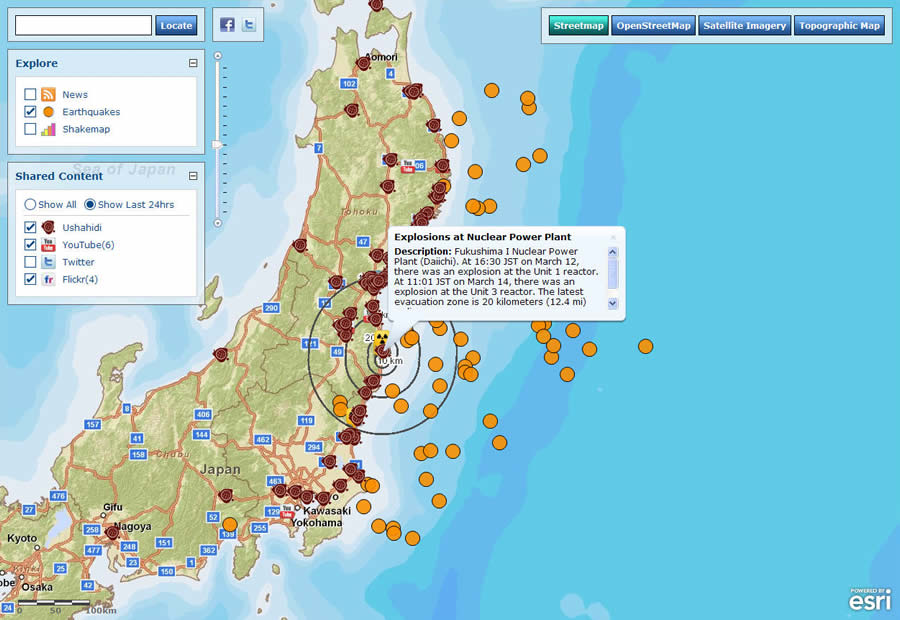
This map displays social media from Ushahidi, YouTube, Twitter, and Flickr related to the earthquakes, tsunami, and nuclear plant disasters in Japan, along with the location of recent quakes.
Esri has also posted the How Japan Shifted map, which shows how much the country's landmass shifted because of tectonic plate movement. The landmass shift was derived using products acquired from NASA's Jet Propulsion Laboratory (JPL). The map includes a time slider tool that shows the location and time of aftershocks of a magnitude greater than 5.0. Also, the Tsunami Movement map models the movement of a tsunami in the Pacific Ocean. The Pacific Disaster Center (PDC) created a model that predicts how a tsunami would travel given an earthquake the size of the magnitude 9.0 that struck off the coast of Sendai, Japan.
ArcGIS Online's Maps and Apps
ArcGIS Online includes a powerful set of maps and applications for analyzing events such as the earthquake that struck off Japan's northeast coast. Search the site for "latest earthquakes" or "recent earthquakes near Japan." The search will yield web maps that show the cluster of earthquake epicenters. Click on the icons to view, in a pop-up window, the location, magnitude, time, and depth of each quake and other information. The pop-up window also has a Zoom to button that lets you zoom in closer to see where the quake occurred.

An examination of recent earthquakes in Japan using ArcGIS Online reveals the cluster of earthquakes northeast of the island of Honshu. Individual earthquakes may be selected and examined, all in the online environment using a standard web browser.
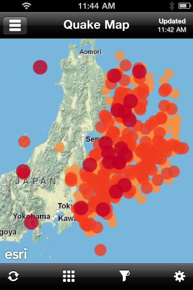
This image shows epicenters of quakes in and around Japan using the QuakeFeed application. The image was taken from a smartphone a week after the major earthquake struck.
Spatial analysis is also increasingly possible on mobile devices. QuakeFeed is an app from Artisan Global that runs on iPhone. It allows the listing, mapping, and querying of current earthquakes anywhere in the world. This image (right) shows epicenters of quakes in and around Japan according to data taken from a smartphone a week after the major earthquake struck.
Another easy way to start examining the earthquake cluster, tsunami, and environmental situation is to investigate the latest earthquake data from Japan and elsewhere at this USGS-hosted site.
The data at this site can be examined spatially using the online map at USGS. To ask deeper questions, this data can be saved as a text file, then brought into ArcGIS and analyzed by mapping the data on latitude and longitude coordinates. The distribution of the earthquakes can be compared with plate boundaries to determine how many earthquakes occurred within a certain distance of the plate boundaries. These plate boundaries can be found as a layer package in ArcGIS Online.
Population data can also be added as a layer package or a map service called ESRI_Population_World at ArcGIS Online to determine how many people lived within 10 kilometers of the coast or 100 kilometers of the magnitude 9.0 earthquake's epicenter. The mean center and directional distribution of the cluster of earthquakes can be measured with the Spatial Statistics toolbox in ArcGIS.
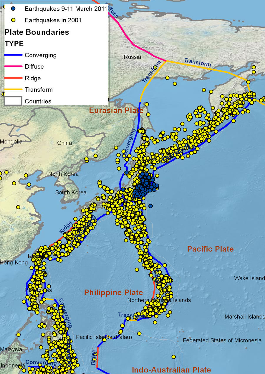
Comparing historical earthquakes from 2001 to the earthquakes that occurred March 9-11, 2011, in ArcGIS shows that while the magnitude of the recent earthquake was unusually large, the clustering of earthquake epicenters to the northeast of Honshu is commonplace. Examining the data in this way also reveals that the plate boundaries in this region form an X, with Japan at the center of the X.
A large cluster of 165 earthquakes struck off the east coast of Honshu, Japan, March 9-11, including the biggest quake. But was this cluster unusual in comparison with past seismic activity in the region? To find out, compare the pattern of earthquakes that occurred over these three days against all the earthquakes from a particular year. The 23,581 earthquakes that occurred during 2001 were chosen and examined at a scale that includes all of East Asia. The cluster no longer appears significant: the ocean east of Honshu is prone to earthquakes, though the magnitude 9.0 earthquake was the fourth largest ever recorded according to the historical USGS earthquake data examined. In mapping the data, notice the X-shaped pattern of earthquakes with the center of the X on Honshu. Also notice an unnamed, wedge-shaped plate extending northward, underlying the seismically active Kamchatka Peninsula in the far east of Russia. More could be done with the tools and data, but this illustrates how a GIS can be effectively used to understand the events spatially and temporally.
GIS and the spatial perspective gives people a deeper understanding of natural disasters. That helps them become more aware of natural hazards like earthquakes and better prepare for them. Organizations also can use GIS to make the wisest choices possible about how to help those in need. What will you do with the plethora of data and GIS tools at your disposal?