Crain's Chicago Business Uses Mapped Data to Keep the Magazine's Readers in the Loop about Trends
By Carla Wheeler, ArcWatch Editor
Data is king in Crain's Chicago Business magazine's annual Market Facts section, where numbers tell the story of how Chicagoans live, work, and play.
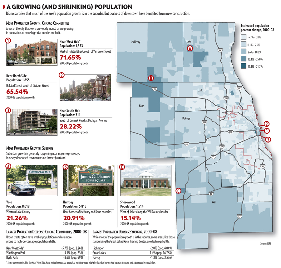 This map, using data from Esri, shows where the population is growing and declining in the Chicago area. |
But rather than having to wade through reams of statistics to find out, for example, where cell phone bills are the highest in the metro area, all Market Facts' readers need to do is look at a map to see the answer: The neighborhoods along the North Shore and the suburbs west and south of downtown.
Esri provides Crain's Chicago Business with business, consumer spending, demographic, and other data for Market Facts, a 25-page annual special section filled with a compendium of small nuggets of information that illustrate the demographic, consumer spending, employment, technology, and lifestyle trends that shape greater Chicago.
"Market Facts gives you all the data you would need to live and work in Chicago," says Matthew Carmichael, research director at Crain's Chicago Business (www.chicagobusiness.com), a magazine read mainly by executives of medium to large companies. "We compile as much useful data as we can cram onto a page—the fundamental, bread-and-butter building blocks of data that you would need to feed into your business analysis: where you want to locate your business, where you want to live, where your customers are, and how to reach out to them."
While the information in the issue is culled from nearly 100 sources, the data provided by Esri is a definite focal point. Some of the data is delivered in the form of maps, created using Esri's software, or in Excel tables, which Crain's converts into maps, pie charts, tables, and graphs. The last issue of Market Facts, for example, used maps to illustrate:
- Population shifts such as the growth in neighborhoods where high-rise condos are replacing industrial buildings.
- Where the amount of money spent per household each year for health care exceeded $9,000 or fell below $2,300.
- Levels of annual disposable income across the metro area, the highest being $170,813 in the village of Kenilworth.
"Mapping it—especially some of this kind of data—it's really easy to see trends in just a quick glance," said Carmichael, who is starting to use ArcGIS Desktop himself to make some of the maps. "The more time you spend with a map, the more you can see."
How Crain's Came to Use GIS and Esri Data
 This map shows that the average annual spending per household on entertainment was highest in the Kenilworth neighborhood of Chicago. |
Crain's Chicago Business started to request maps and data for Market Facts from Esri in 2006, when Carmichael came aboard as research director at the magazine. Before that, the demographic and economic data was often solely published in the form of pie charts, graphs, and lists. The lists were sometimes difficult to make heads or tails of in an analysis, said Carmichael. "It wasn't really all that compelling, especially in its presentation," he said.
Published in one issue, for example, were two sets of estimated 2020 population figures for every municipality in the Chicago area, laid out in rows and columns for two and a half pages. The way it was presented, it was hard to decipher why the numbers were significant, said Carmichael. "I couldn't figure out why this was important, why it was taking up all this room, and what the two different 2020 columns were for."
Finally, a footnote revealed that the charts were the municipalities' population projections based on whether or not a third airport would be built in the Chicago area. But Carmichael said it was hard to look at the tab charts and see which municipalities would be big winners and losers, populationwise, if a new airport opened.
"It seemed like such great data to display on a map," he said. "At a glance, you would get nothing out of this chart. You would have to spend quite a considerable amount of time for it to be meaningful. However, if you were to map this data, you could look at it quickly and understand not only that the population would grow around the airport but where those populations would come from and where the decreases would be."
GIS maps instantly communicate demographic shifts, consumer spending habits, crime rates, median home values, and other information that may play into executives' decision making, Carmichael said. And in a rapidly changing economy, it is important for executives to stay on top of the latest trends affecting their customers. GIS maps and localized data can be both a quick-glance overview and an in-depth tool to get at the subtle shifts in demographics and consumer behaviors, he said.
Mapped data can take on added value during rocky economic times, when executives need the most accurate information they can obtain.
"The challenge of the current market underscores the importance of information," said Lynn Wombold, chief demographer and manager for data development at Esri. "Where is the growth? Where is the decline? What are consumers looking for today? What is the best way to allocate the revenue from a dwindling tax base? Uninformed decisions are a luxury that no one can afford. Current data can track critical changes and preclude the cost of being wrong."
Sometimes changes in neighborhoods can go unnoticed unless business owners and government officials have access to good data that they can also easily visualize. For example, Esri provided Crain's Chicago Business with the data and maps that underscored the demographic shifts occurring in and around Chicago over the last two decades.
In the print edition and online, the maps showed which ethnic groups were in the majority population for each of the 2,100 census tracts in the 11-county Chicago region. Carmichael said that the maps illustrate how some traditional German, Polish, Italian, and Irish neighborhoods have diversified greatly. The online maps of Greater Chicago can be viewed at http://chicagobusiness.com/marketfacts.
 Kenilworth residents also spend the most, on average per household annually, on utility bills. |
"This is one of those maps that especially become more fun as you go online and are able to zoom in and go through, neighborhood by neighborhood," Carmichael said. "What we are able to find—once we get granular enough—is that, in a lot of cases, areas that are tied to one identity have actually started to shift."
In March, Market Facts won a "best online project" award from the Society of American Business Editors and Writers, with the judges saying the Web site was "a wonderful example of how to use multiple multimedia to enliven what could have read like an almanac." Carmichael said the judges were especially impressed with the interactive maps of the Chicago metro area, which they said conveyed a tremendous amount of information in an easy-to-use format.
GIS Maps Health and Entertainment Data
Each page of Market Facts highlights a different theme, with sections devoted to the economy, real estate, health care, jobs, technology and telecommunications, media and culture, finance, and other business topics. Carmichael said he requests geographically referenced data or finished maps from Esri to illustrate trends, which in the last issue included crime indexes, median home values and median disposable income for 2008, majority ethnicity, political leanings, average spending on CDs and televisions, average annual per capita spending on entertainment, and utility spending. Seventeen Esri maps were published in the print issue, and more than 30 are available for online viewing. The online maps include pan and zoom features and additional data layers such as ZIP Codes and the location of parks and hospitals. Those tools and data layers give readers the ability to do some basic analyses themselves.
Esri often works with the media and can provide, at no cost, the data, charts, and maps these organizations need to illustrate stories. For Crain's Chicago Business, Esri staff made some of the maps using the company's suite of ArcGIS software products and Esri data. Crain's graphic artists take other Esri data and convert the information to pie charts, maps, and other easy-to-understand, visually pleasing info graphics.
Carmichael said he and three other Crain's Chicago Business staff members are learning to use GIS software and plan to use ArcGIS Desktop to make all the maps themselves for the July 2009 issue of Market Facts.
Carmichael made his first map using ArcGIS for the 2008 issue, which appeared on the Health Care page. It showed where hospitals were located relative to populations and illustrated what areas were underserved.
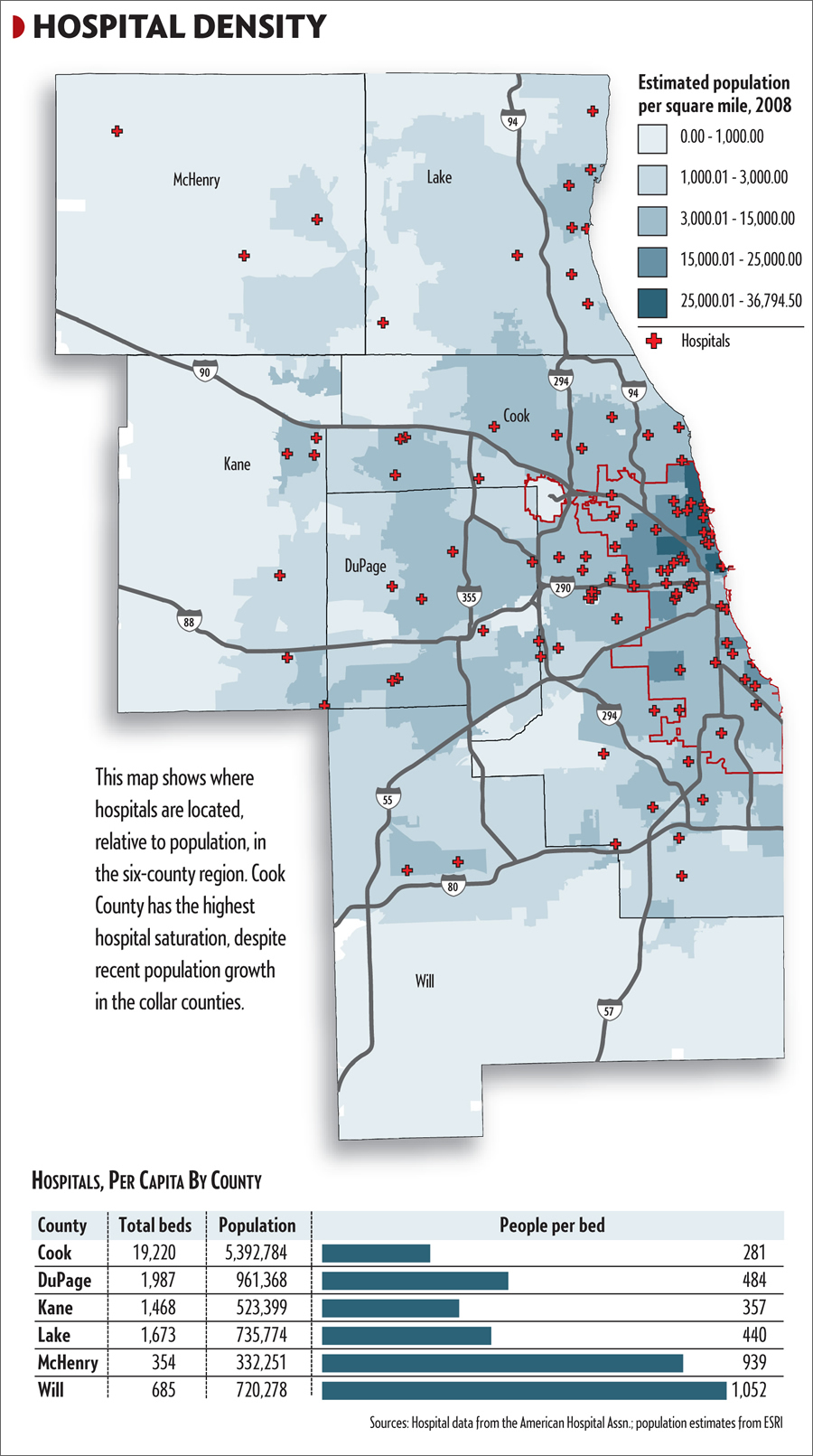 Matthew Carmichael of Crain's Chicago Business made this hospital density map using Esri's ArcGIS Desktop software. |
"We took a population density map and were able to layer over the hospitals' locations. By plotting points on a population density map, we were able to show that the suburbs—especially Will County—are much less served with hospital density than Cook County. It becomes very pronounced the farther you get from the city," Carmichael said.
This information may be of interest to readers living in or thinking about moving to the suburbs. "There has been a huge population explosion in the suburban areas, especially in Will County, and the number of available hospital beds has not caught up yet," Carmichael said. "If I were going to have a heart attack in eastern Will County, I would be a little upset that it is a long way to get to a hospital."
Market Facts also mapped cell phone bill indexes, information of potential interest to cell phone retailers. On the Tech & Telecom page of the print edition, an Esri map of Greater Chicago shows where people spent the most and least on cell phone calls. (Cell phone bills were, on average, higher in the western suburbs.)
The map represents the market potential for households that spent, on average, more than $100 a month on cell phone calls. "What this map tells you quickly are which census tracts have the highest or lowest concentration of households that are spending money for cell phone usage," said Donna Fancher, marketing coordinator for the Commercial and Data team in Product Marketing at Esri. "This information is particularly useful for cell phone retailers. It may help determine where stores should be located and if additional stores are needed in an area. It can also help existing store owners with product selection for their stores."
Carmichael agrees: the maps can highlight some potential new markets for businesses. "Consumer trends and spending are important to all the businesses that want to reach out to those consumers," Carmichael said. "If you are a technology services company, to find where the more technologically driven people are—that would be very helpful."
For more information about Esri Data, visit www.esri.com/data. To learn how you can work with and use data in your publication, contact Brent Roderick at broderick@esri.com.
Fast Facts about Crain's Chicago Business
Published: Weekly
Circulation: 50,000 weekly for the print edition; 170,000 registered Web site users
Web Site: www.chicagobusiness.com
Owned by: Crain Communications, Inc. The family-owned company publishes 36 business, trade, and consumer magazines and newspapers including Advertising Age, Crain's New York Business, Crain's Detroit Business, Crain's Cleveland Business, Crain's Manchester (England) Business, Business Insurance, Modern Health Care, BtoB, Pensions & Investments, Financial Week, and TelevisionWeek.