ArcWatch: Your e-Magazine for GIS News, Views, and Insights
May 2011
Esri's Online Maps Offer Companies a Clear Picture of the Crisis in Japan
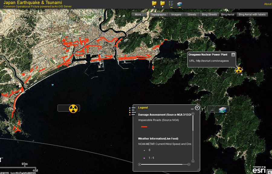
Satellite imagery provides a very quick and accurate sense of what happened on the ground after a catastrophic event, including where damage occurred. This image shows the location of impassable roads in Japan after the recent earthquake and tsunami.
After a magnitude 9.0 earthquake rocked Japan on March 11, 2011, and set off a tsunami, the catastrophe risk modeling firm EQECAT, Inc., headquartered in Oakland, California, quickly went to work gathering information for clients.
Besides collecting economic and scientific data related to the disaster, EQECAT needed digital maps that showed the tsunami flood zones, where aftershocks were located, damaged areas including roads, and the location of population centers in the affected areas.
The maps were created by Esri staff using ArcGIS Online, a platform anyone can use to create and share geographic content and build GIS and mapping applications. Accessible via ArcGIS.com, ArcGIS Online hosts maps, applications, and tools published by the GIS user community that can be shared freely.
Quick Access to Maps and Data
EQECAT knows the power of seeing where natural disasters strike. The consulting firm helps clients in the insurance, financial, and commercial industries better understand the risk of earthquakes, typhoons, and tsunamis so they can better manage their business operations.
Just seven days after the earthquake struck the Japan Trench megathrust fault off Honshu's east coast, EQECAT was in action. The company gathered staff and clients from around the world for a report called a Catastrophe Watch, or CatWatch, that delved into what occurred.
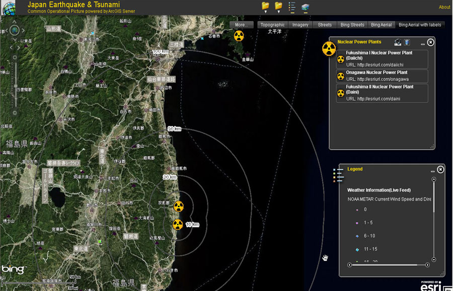
You can learn which population centers may be evacuated by viewing a map with various radiuses around Japan's nuclear power plants.
Broadcast via a webinar, this report on the earthquake detailed postevent effects including economic and insured losses. The CatWatch was attended by primary insurers, reinsurance agencies, brokers, corporations, hedge fund managers, and investment firms that have business dealings in Japan. EQECAT's clients were provided with a comprehensive overview of the event, in part due to the maps created using ArcGIS Online.
Simon Thompson, director of commercial solutions at Esri, and Mark McCoy, Esri's industry solutions manager for insurance, created the maps based on a telephone conversation with Paul Little, EQECAT's head of planning and development, two days before the CatWatch. Working quickly, Thompson and McCoy produced maps displaying data on the tsunami flood zone, data on Japan's highways and major roads, topographic data, and even population information from the Japan Society of Family Sociology.
"Timely delivery of information immediately after an event is one of the ways we create value for our clients," said Little. "Providing maps that give a general overview of an area and providing the ability to drill down to get even more granular information is a huge part of what we feel our clients need so they can begin assessing the financial impact and make decisions on how to deal with a crisis like this."
Knowing EQECAT needed information quickly, Thompson decided to pull together maps and data using ArcGIS Online.
"The power of ArcGIS Online is the fact that all the data and all the template code is available to anyone who needs it," said Thompson. "To create these particular maps, I took a map template shared on ArcGIS Online and edited it to display only what I wanted. I then shared the maps over the Internet with EQECAT staff, who in turn can share them through any browser on a computer or a phone. That's the power of ArcGIS Online and cloud computing."
By clicking the Share button, Thompson provided the maps he created for EQECAT to anyone who wants to view them both on ArcGIS Online and in map viewers such as Esri's free ArcGIS Explorer application.
"This is a prime example of operational GIS," says McCoy. "It's providing data in real time while you are telling me what you want to see. This intelligent map supports effective collaboration by making a vast amount of aggregated knowledge easily understandable to people who need the 30,000-foot level of detail, like CEOs."
Making It Even Easier to "See" an Event
ArcGIS Online hosts a repository of authoritative content from the worldwide GIS community. Esri also provides published disaster mapping applications so organizations can see the information, identify their exposure in the impacted area, and plan effective responses.
The Japan Trends Map is one example. Esri created this heat map from data collected on property damage, hazards, evacuations, power outages, and help and services available. Visualizing this data as hot spots or trends gives an idea of the density of reports coming from a single area. This can assist in allocating resources to those who need the help most or aid the validation of whether incidents reported are corroborated by others, adding increased clarity to a situation. More than just dots on maps, hot spots organize lots of data and provide a better understanding of the data quickly. Reports can also be filtered by date to see daily trends.
Besides Twitter, YouTube, and Flickr postings, Esri's Japan Trends Map supports reports from Ushahidi, a nonprofit technology company that develops a social network to allow people to report incidents via SMS, e-mail, or the web. The information is categorized and analyzed using ArcGIS. By selecting Show Reports, users can view individual Ushahidi reports. Public content from Ushahidi is added to the site through direct access to the Ushahidi Earthquake Tohoku service. This feed aggregates information from the public for use in crisis response.
The Japan Trends Map has been used by many different organizations, including those in the media, to provide detailed information and analytic support to relief efforts. This spatial analysis makes crowdsourced data like Ushahidi reports actionable. "We're able to model the disaster. How many people are affected, and where are they?" Thompson said. "By combining population data with elevation maps, relief organizations can begin to calculate the number of people affected by flooding. How many supplies, like food, water, and temporary shelter, is just one thing that can be estimated to care for those in need."
Many organizations, including the media, have caught on to these ready-made apps showing current events and are embedding these to provide information to their constituents. "I love this kind of content," said Eric Gakstatter, contributing editor for survey and construction for GPSWorld magazine. "I think this puts the event in an entirely new perspective."