Visualizing Freeway Traffic in the San Diego Region with GIS
By Grace C. Chung, San Diego Association of Governments, California
When contemplating transportation improvement projects to a regional freeway system, it's important to first understand how the traffic flows on the freeways. Transportation engineers have long employed standardized and reliable metrics to describe system performance. Such metrics work well when communicating with other transportation engineers but less well when consulting with professionals from other fields or communicating with the general public.
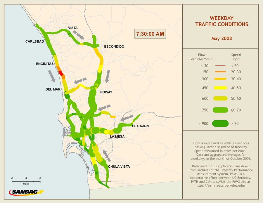 This is a snapshot of SANDAG's traffic conditions animation at one time frame. The animation illustrates the inbound average weekday traffic flow and speed on the San Diego area freeway system in May 2008. |
The San Diego Association of Governments (SANDAG), a regional transportation planning agency, has pioneered a visualization technique using the animation tools in Esri's ArcGIS Desktop and the ArcGIS 3D Analyst extension to create effective, comprehensible depictions of freeway performance. SANDAG uses the animation tools to help planners and the general public visualize a large amount of traffic data at both local and regional scales. GIS animations also help SANDAG transportation planners demonstrate the improvement of the traffic conditions from two different time periods-before and after a construction project-or display the need for future improvements based on model predictions.
Obtaining traffic data in California is fairly easy. The Freeway Performance Measurement System, or PeMS, is a cooperative effort between the University of California, Berkeley, California Partners for Advanced Transit and Highways (PATH) program and the California Department of Transportation (Caltrans). PeMS retrieves the raw, 30-second traffic data from each of reporting Caltrans District Transportation Management Center (TMC). TMC gathers real time traffic data from the loop detectors placed in the freeway roadbed. As vehicles pass over these loop detectors, data on flow, occupancy, and speed across all lanes is acquired and sent to PeMS site at UC Berkeley. The 30-second raw traffic data is filtered, processed; aggregated to 5-minute, lane-by-lane values; and then published on the PeMS Web site.
In the San Diego region, PeMS monitors 19 freeways using over 1,000 vehicle detector stations, compiling flows, occupancies, and speeds at 30-second intervals for on-ramps, high-occupancy vehicle (HOV) lanes, and main freeway lanes. In visualizing the freeway traffic conditions in the region, the challenge is not lack of data; it is how to present the traffic data in an effective way. The conventional techniques of presenting traffic data include x, y scatterplots, bar charts, or maps, which only display static data. These static charts or maps are unable to demonstrate changes in either geographic movements or temporal trends.
SANDAG developed a traffic visualization model using ArcGIS Desktop. Included in this model are the animation tools in the ArcMap application in the ArcGIS Desktopand ArcGlobe application in the ArcGIS 3D Analyst extension. First, each vehicle detector station (VDS) was assigned a point within the project geodatabase. Using the Spatial Join function, each VDS point was linked to the corresponding freeway segment. Monthly average traffic data was downloaded from the PeMS Web site and associated with the corresponding freeway segments.
The first set of animations was built with the animation tools in ArcMap to demonstrate traffic flow and speed. Traffic flow, expressed as vehicles per hour passing through the segment, was symbolized using the multiple attributes and displayed in ArcMap as line segments of graduated widths. The wider the segment, the higher traffic flows passing through the segment. The traffic flow ranges from less than 30 vehicles per five minute period to more than 900 vehicles per five minutes. The color of each segment represents the traffic speed in miles per hour. Traffic speed ranges from less than 20 mph (shown as red) to greater than 70 mph (shown as green). Data represented covers aggregated averages for weekdays during May 2008.
The animation was made to demonstrate the changes in traffic conditions through the day based on the five-minute intervals. Traffic visualizations used by most public Web sites or television media only display one variable: speed. Unlike past attempts at using visualization, SANDAG's traffic visualization model is able to demonstrate changes in two variables, speed and flow, for each detector in five-minute intervals over a 24-hour period. Viewers can visualize how traffic volumes rise to a morning peak, dissipate at midday, and rise again for the afternoon peak. In addition, the animation illustrates where and when bottlenecks occur.
Two animations that show the average weekday traffic flow and speed on the freeway system during May 2008 are available to download and view on SANDAG's public Web site.
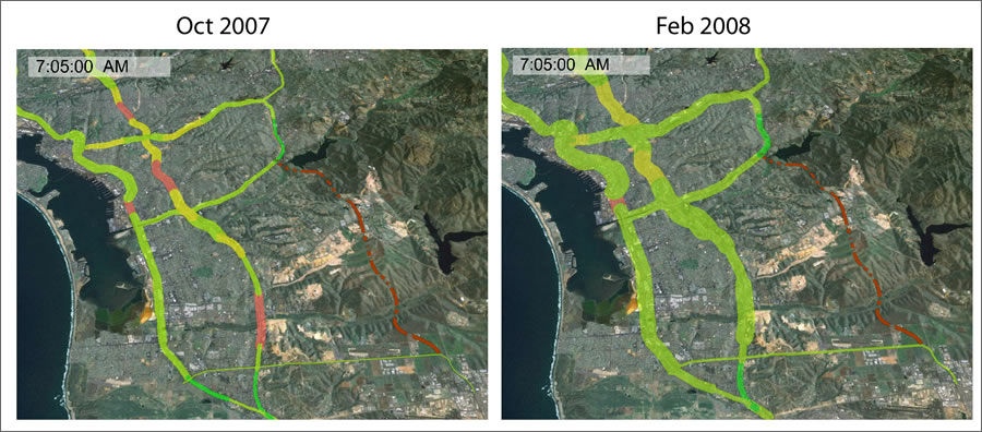 Two animations were created showing changes in north-west bound traffic conditions on the surrounding freeways before and after the opening of the South Bay Expressway (SR-125), shown as the red dashed line. The traffic moved faster on the other freeways after the new expressway opened. |
The second set of animations, created using ArcGlobe, demonstrated how traffic conditions improved from one time period to another: before and after a construction project. The South Bay Expressway (SR-125), a new toll road in San Diego, was opened in November 2007. This new 10-mile north-south toll road connects a major east-west freeway (SR-54) to Otay Mesa near the border with Mexico. This new connection gives the region convenient access to and from Mexico and communities across San Diego.
Two animations were created showing changes in traffic conditions on the surrounding freeways before and after the opening of SR-125. These changes occurred between October 2007 and February 2008. When these two animations play simultaneously side by side, viewers can easily understand the traffic impacts of SR-125 on other important regional freeways and arterials. SANDAG is currently working on animations that will demonstrate the outputs from the transportation and land-use models, which will aid policy and decision makers' understanding of the model scenarios and results.
SANDAG has proved to be a successful tool in managing real-world spatial data capture, analysis, and presentation. SANDAG has utilized the ArcGIS animation tool as a persuasive tool to help GIS analysts, planners, and decision makers visualize and analyze large amounts of temporospatial traffic data for both regional freeway networks and other highway corridors. SANDAG has pioneered innovative approaches to GIS database development, maintenance, analysis, and display for more than 30 years using Esri products. Its GIS is used in a variety of applications, including demography, transportation, land use, environment, public safety, and public facility siting and management.
Grace Chung is a GIS research analyst at San Diego Association of Governments. She is also the project manager of the traffic visualization model at SANDAG. Contact her at cchu@sandag.org or visit www.sandag.org. To learn more about PeMS, visit https://pems.eecs.berkeley.edu.