ArcWatch: Your e-Magazine for GIS News, Views, and Insights
July 2011
The Cost of Working
As Gas Prices Rise, Commuters Find More Disposable Income Eaten Up by Filling Up
The Institute for Spatial Economic Analysis at the University of Redlands conducted this study of how much disposable income Americans spend on gasoline purchases.
When gas prices rise, American consumers tend to compensate by cutting back elsewhere. They'll take a "staycation" at home instead of travelling for a vacation or combine errands into one trip to decrease the amount they drive around town. But what happens when a large chunk of change is spent on just commuting to and from work, an expense that can't be changed as easily?
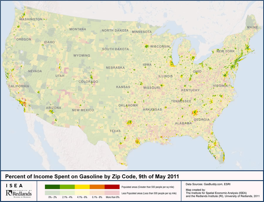
Researchers at the University of Redlands Institute for Spatial Economic Analysis (ISEA) wanted to find out how the recent increase in gas prices was affecting commuters financially. Using Esri data and ArcGIS software, ISEA researchers mapped out by ZIP Code the percentage of disposable income commuters in the United States spend on the drive to and from work. Urban areas that were among the hardest hit: Inland Southern California cities such as Palmdale, Fontana, and Rialto, where the percentage of disposable income spent on gas was greater than 8 percent.
ISEA researchers conducted the study because they felt that US consumers' reliance on oil and the alternatives for this increasingly expensive commodity will become increasingly important topics as the country rebounds from the last recession. "This was an opportunity for us to show how complex information can be easier to understand with simple economic reasoning and the power of a map," said Johannes Moenius, associate professor in the university's school of business and ISEA's director.
The study, conducted in May 2011, found that the average American household spends about 6 percent of its budget on gasoline. Of this, a little more than 4 percent of its disposable income on gasoline is used to commute to work.
"However, for this particular study, we found pockets of the United States where commuters were spending 8 percent or more of their income on fuel just to commute back and forth to work," said Moenius. Areas like the city of Hanover Park in DuPage County, Illinois, and the community of Graham in Pierce County, Washington, are examples of pockets where people are spending more than the national average on their work commute.
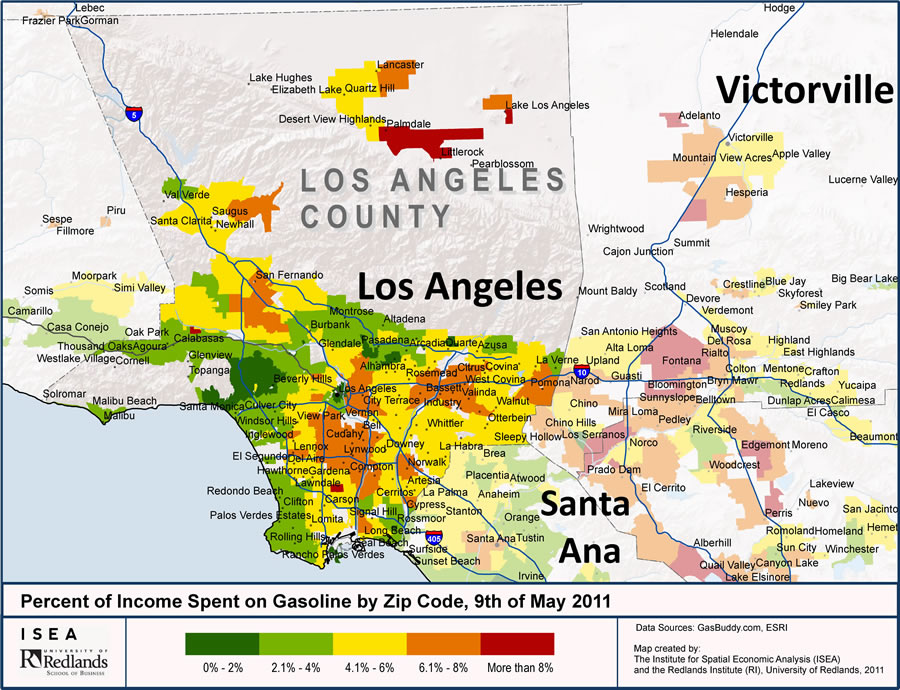
Commuters in Palmdale, Pomona, Compton and several other communities around Los Angeles, California spend much more than the 6 percent national average on gas for their work commute.
ISEA staff combined data on gas prices, commute times, incomes, and other factors, including fuel efficiency; whether a commuter drives alone, carpools, or uses public transportation; and how many people in a household commute to work. View the study's results on an interactive map available through ArcGIS Online, Esri's cloud-based map and data service.
Making Sense of a Sea of Data
The group of researchers who formed ISEA, funded by external sources through the University of Redlands, and based in Redlands, California, has worked on spatial economic analysis issues for several years. Today, business and community leaders turn to ISEA as a resource to understand the socioeconomic environment throughout the United States. Researchers at ISEA present new studies and updated analyses every two weeks on different topics that affect the economy such as unemployment, housing, and logistics. The maps and data for every study are currently available for free to the public on ISEA's website.
To understand the impact of gas prices on commuters, ISEA researchers analyzed data from Esri and other sources found over the web. The data was based on gas prices collected on May 9, 2011, from GasBuddy.com, a collection of 185 websites that gather prices by using a network of volunteer gas price spotters throughout the United States. This crowdsourced data is continually updated and available by metropolitan statistical area and state levels from the GasBuddy organization through its website.
For the mileage driven to work, ISEA used data from the Environmental Protection Agency (EPA) website www.fueleconomy.gov. This website provides accurate miles per gallon (MPG) information on EPA fuel economy ratings for passenger cars and trucks from 1985 to the present.
Researchers combined gas price and mileage information with 2009 Esri data estimates from the US Census Bureau's American Community Survey (ACS) on drive times, modes of transportation, types of employment, household sizes, and household incomes. The ACS collects and produces population and housing information every year instead of every 10 years, presenting a continuous measurement of a small percentage of the population. ACS data was first manipulated and aggregated in a data analysis and software statistical package, Stata, and then matched up with the GasBuddy and EPA fuel economy data. The percentage spent was calculated using this information and mapped in ArcGIS Server by ZIP Code. Using ArcGIS to view all the information such as income level and household data by ZIP provides a good picture of how much disposable income people were spending on gas. Colors on a thematic map represented how much of a household's percentage of disposable income was spent on gasoline for the daily work commute. ISEA used a sliding scale. For populated places, the color red represented amounts greater than 8 percent; orange, 6.1 to 8 percent; yellow, 4.1 to 6 percent; green, 2.1 to 4 percent; and dark green, 0 to 2 percent. Overall, 29,877 ZIP Codes were mapped and analyzed.
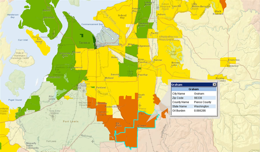
Residents living in the community of Graham in Pierce County, Washington, spend more than the national average of disposable income on gasoline for their work commute.
"We spent hours just looking at the patterns in the data, fascinated with what we found," Moenius said. "It was interesting to see that the high percentage of disposable income being spent on the work commute was concentrated in certain areas. In many places, the color patterns followed economic predictions that the center would be green and the periphery would be red. Some areas including around Los Angeles, Chicago, and Indianapolis had pockets that did not conform to this expectation. We wanted to know what those particular areas had in common."
Oil Burden
The results offer a visual representation of how high gas prices affect commuters. "It is interesting to look at the gasoline needed to drive to work, since this is an inelastic variable," said Moenius. "People have to work to make money. You can give up your vacation drive and economize your errands and other trips you take in the car, but you have to go to work. As gas prices rise, many people may try to turn to alternative sources, such as public transportation. In many areas, however, it is not that easy."
The percentage of disposable household income commuters are spending to drive to and from work—coined an oil burden by ISEA staff—is concentrated in certain areas. While some states seem to be only slightly affected, such as Montana and Wyoming, others, including Mississippi and Louisiana, carry a higher burden. More densely populated areas seem to fare better. In the 33 percent of ZIP Codes with the lowest oil burden, population density is more than four times higher than in the 33 percent of ZIP Codes with the highest oil burden. Researchers also discovered many other interesting aspects to the data from the ZIP Codes with the highest oil burden. Here's how they compare to ZIP Codes with the lowest oil burden:
- The average drive time to work is almost 50 percent higher.
- Carpooling frequency is about one-third higher.
- Use of alternative transportation is more than 50 percent lower.
- The share of population without graduate or postgraduate degrees is more than 20 percent higher.
- Income is more than 25 percent lower.
- Homeownership is about 20 percent higher.
- The share of rural population is roughly double.
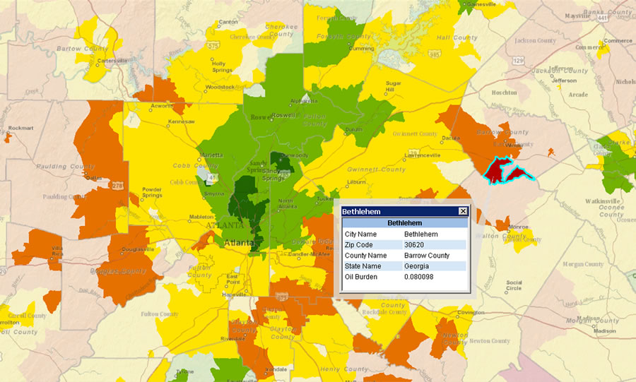
Commuters in Bethlehem, Georgia, spend more than 8 percent of their disposable income on gas to get to and from work. Residents living in and around downtown Atlanta spend 4 percent or less
ISEA researchers point out that, as with any data collected via survey for statistical purposes, the projected values for these datasets are only rough estimates of the true values. "Since 2009, gas prices have risen, and obviously some commute patterns have changed," said Moenius. "So, instead of depending on exact numbers, statistical data like this is best used for looking at patterns and trends in the population."
ISEA staff went a step further to represent data in the most useful way by breaking out populated areas from unpopulated areas, ensuring that count of population was more representative of the density of the population, as opposed to the size of the ZIP Code.
Geography Makes Sense of Analysis
Viewing the data with ArcGIS made complex data easier to understand. Basic thematic mapping brought the information to life—pockets of red can easily be seen, even in regions where a majority of commuters are not feeling a hardship from the rise in gas prices. One interesting example is Atlanta, Georgia. The center of the city is green, while the outskirts are red. This could be because those living in the city center can easily hop on the public transportation system, the Metropolitan Atlanta Rapid Transit Authority (MARTA). Those living in the suburbs don't have such an easy option.
ISEA researchers were stunned when they compared Southern California with the rest of the United States. In the 33 percent of ZIP Codes with the highest oil burden, population density was more than 60 percent higher, while public transportation use was 25 percent lower. Moreover, carpooling in this group was 25 percent higher than in the rest of the country, indicating possible lack of alternative transportation opportunities.
Using geography to discover, view, and analyze information can help people gain a better perspective on how much people are being financially affected by high gas prices and provide better alternatives to help ease the burden. "Suddenly, we go from looking at charts, graphs, and numbers, and we are making it more personal by seeing the actual effects of where people live," said Moenius. "We can see areas that are being affected and can prioritize measures to help those that are being hardest hit first, such as providing more options for transportation. For example, this raises the question of whether public transportation could make a substantial dent in the oil dependency of Southern California, especially in those hardest-hit areas we were able to identify."
Learn more about Esri data including ACS data.