ArcWatch: Your e-Magazine for GIS News, Views, and Insights
July 2011
Mapping the Best Places to Find the Lowest Gas Prices
Location, Location, Location
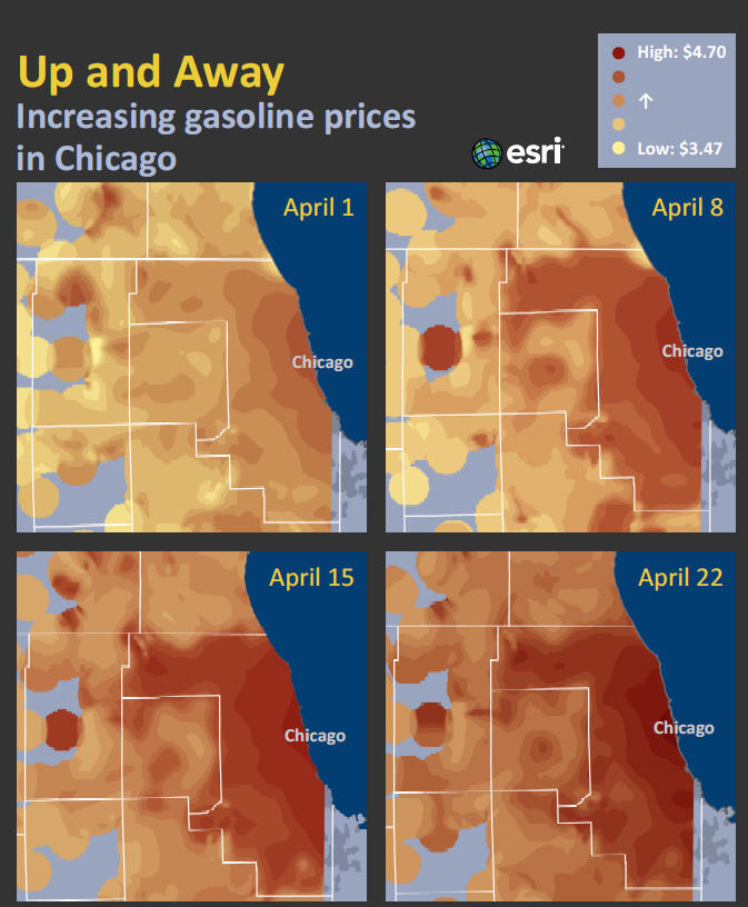
Gas prices on April 22, 2011, were substantially higher than on April 1.
Realtors often advise clients in the market for a new house to buy in a great location. Why? A beautiful view, a safe neighborhood, and an excellent school nearby can add up to a hefty appreciation in value and more money for you when you sell your home. You may not realize it, but location also matters when you are in the market to buy gas for your vehicle. A GIS analysis of gas prices in four major metro areas that Esri conducted for the ABC News show Good Morning America (GMA) found, for example, that driving just one minute from a freeway exit to buy gas can save, on average, 11 percent, or about $7.00 per fill-up.
A drive-time analysis using ArcGIS software confirmed a commonly held view that the average price of gas is lower at stations located farther away—such as a minute or more—from a freeway exit than at stations very close to the exit. The study also found that even though gas prices vary a few cents every day, the overall pattern of prices in a city changes little.
"So if you have to gas up, take a look around," said Jim Herries, a cartography project engineer for Esri and the project lead for the gas price study. "Are prices near your home better than prices near your work? A map of prices helps you understand the price patterns in your area better and also whether to stop now or later to buy gas."
The Investigation Begins
ABC News approached Esri in May 2011 and asked the company to conduct a study of gas prices using geospatial analysis and look for patterns that could yield practical consumer advice for saving money at the pump. The results were reported in GMA Gas Investigation: New Ways to Find the Best Price, which aired the Friday before Memorial Day.
ABC News producers contacted Esri after seeing some of Esri's disaster and current event maps, Herries said. They noticed how Esri was categorizing and analyzing that information to show how a major disaster (e.g., the magnitude 9.0 earthquake in Japan) was developing spatially and how that put the story into a stronger context. "They were aware that with Esri, it is not just points or dots on the map. We can actually analyze the information and help you understand it a little differently," Herries said.
As it analyzed and mapped gas prices for the report, a small team of Esri geographers and cartographers found out just how important a role location plays in how much people pay for gas.

This heat map shows that gas prices in downtown Jacksonville, Florida, tend to be lower than in the suburbs.
ABC News provided Esri with daily gas price data over the period of April 1-30, 2011, from 5,100 gas stations in four areas: Chicago, Illinois; Boston, Massachusetts; Orange County, California; and Jacksonville, Florida. The data was supplied by Oil Price Information Service (OPIS), which on its website calls itself the world's most comprehensive source for petroleum pricing and news information.
The data included latitude, longitude, street address, daily prices, and the brand of gas sold at each of the 5,100 gas stations. "We took the data and put it into ArcGIS Desktop to look at it," Herries said. "As usual, with GIS, we started by showing the data on a map, which always leads to questions that need further analysis."
First, the team created an animation in ArcGIS Desktop 10 to display price patterns over time in each city. "On April 1, the average price in Chicago was $3.50 a gallon, but it varied. It was $4.00 downtown and $3.25 in the suburbs," Herries explained. "We used a classification technique that emphasized the average price that day and where the outliers were, both high and low. And immediately, you look at the map and say, 'Don't buy gas downtown because it is significantly more expensive than gas in midtown or in the suburbs.'"
As the team dug deeper into the data, it discovered other interesting trends. "As you know, gas prices fluctuate," Herries said. "In the month of April, they only increased, day after day after day—30 days of increases. On our map, what was categorized as a high price on April 1 was actually a low price on April 30."
In the search for a pattern, the team then looked at the average price of gas for each day in April in each metro area. For example, once the average price on April 1 in Chicago was calculated, each station was assigned a color based on its price relative to the average price for that day. That process was repeated for each day in April and then turned into an animation.
"As soon as we normalized all that information, a clear pattern emerged," Herries said. "All the variation day to day in price kind of disappeared, and you had a solid urban core pattern with little fingers of high prices reaching out along the freeway to the northwest [of downtown Chicago]." (Watch an animation that shows the gas price patterns and the change in prices over time in Chicago.)

Certain areas in and around Boston show a pattern of higher prices.
ArcGIS Spatial Analyst was then used to create heat maps from the gas station price data. "We realized, 'That heat map looks like weather radar,'" Herries observed. The map resembled Doppler radar images, he said, adding that what emerged were specific geographic patterns (mapped using different colors) that showed the low/average/high gas price spectrum across each of the four metro areas.
"It kind of led to the storyline of, 'This gas price pattern is like a weather system sitting over the top of your city—only it never moves; it never really changes,'" Herries said. "If you need gas, and you are in downtown Chicago, you are going to pay a lot more."
Price patterns based on geography also emerged in Boston, Orange County, and Jacksonville. For example, in Boston, high gas prices were concentrated along I-90 leading into and out of the city. In Orange County, the highest price pockets were in a few beach areas, while in Jacksonville, gas was more expensive in the suburbs and cheaper downtown—the exact opposite of Chicago. (Watch the animation of the gas price patterns in Jacksonville.)
"The bottom line is, you need to know the price patterns in your particular area," said the GMA host as she used the studio's smart screen to display Esri's gas price maps. Another money-saving tip shared with the GMA audience resulted from a price analysis conducted by an Esri geographer. She used ArcGIS Network Analyst to analyze average prices based on one-two-and three-minute drive times from exits of major interstates and highways. (Drive-time analyses take speed limits on the exits and local streets into account.)
"We asked the software to think like a driver: 'I'm here, I need gas, what's around me?'" said Herries. "The difference is that the software can see much farther down the street than you can. As you might expect, we saw significant price decreases after one minute." Gas stations conveniently located near exits and major arteries tend to charge more money for gasoline than those located farther away.
Buying Gas Using the Geographic Perspective
Esri created about 70 maps and animations during the course of the GMA project; the program decided to use four animated heat maps showing the price patterns in Chicago, Boston, Orange County, and Jacksonville. However, viewers could instantly get the geographic perspective from seeing the high gas price "hot spots" symbolized by the dark colors on the screen.
"When you drive and you look down at your gas indicator and you say 'Oh, I should stop for gas,' you are making a spatial decision," Herries pointed out. "You are thinking, 'Should I stop now? How far could I go before I run out of gas? Should I stop when I take the kids to school or when I get to work?'" At that moment in time, most consumers have imperfect information about the local prices, apart from what they can see through the windshield of their vehicle.
Herries said it was interesting to note that the price patterns in the four metro areas did not mimic each other. In some areas, it was less expensive to purchase gas in the suburbs; in others, filling up downtown was a better deal.
The Esri study did not delve into why gas prices were, in some cases, significantly higher in some parts of a metro area compared to other sections of the city.
"Good Morning America asked us to take the consumer's perspective on this topic, so the investigation focused on that," Herries said. "The convenience factor is a large determinant of what a consumer pays, by choice or by circumstance. The maps revealed how convenience drives pricing, both at the neighborhood scale and the city scale."