ArcWatch: GIS News, Views, and Insights
October 2012
Clip the Data Frame to Make Your Map Polished, Professional
When making a map, it sometimes helps to use multiple data frames to show several areas of interest to make the best use of the available space on the page. For example, in figure 1, there are six data frames that show various areas of the United States: the main data frame on the page shows the conterminous states; four smaller data frames show Alaska, the Aleutian Islands, Hawaii, and Puerto Rico; and one data frame shows the mapped areas within the context of a world view, although Hawaii and Puerto Rico are too small to be seen well at this map scale.
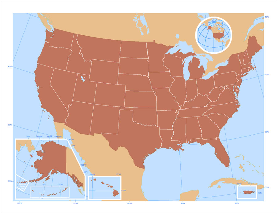
Figure 1. Areas outside the 48 conterminous states are shown in separate data frames on this United States map.
The advantages of using this mapping technique are that (1) you can use the page space more efficiently because you do not have to show the entire extent for all areas mapped within one data frame, and (2) you can map each area appropriately, using the proper coordinate system, map scale, grid or graticule settings, and so on.
When using multiple data frames to map the various areas of interest, it often helps to modify the shape of a data frame to better fit the allowable space on the page. You can use a data frame shape that fits into the available area without obscuring other important features that you also want to show. In ArcMap, this is called "clipping the data frame." For example, in figure 2 below, Alaska is shown in a data frame shaped to fit into the space available at the lower left without overlapping other features, like the east coast of the Gulf of California (see figure 1). The data frame for the Alaska map has been clipped in ArcMap.
ArcMap can use any of the following as shapes to clip the data frame:
- A graphic shape you draw with the Draw toolbar in a focused data frame
- The extent of all the features in a specific layer
- The extent of all the features in a specific layer that is visible in the current map extent
- A selected feature in a specific layer
- A rectangle defined by coordinates that you specify
There are essentially three steps to clip a data frame:
- Create or specify the shape for the data frame.
- Use the options on the Frame tab of the Layer Properties dialog box to clip the data frame.
- Specify the way the data frame boundary and associated grids or graticules will look.
For the Alaska data frame on the US map shown, the data frame was clipped to a graphic shape. Download the map package for this map and follow these steps to learn how this is done in ArcGIS 9.3 and above.
Step 1: In ArcMap, open the archive USA.zip and extract the map package.
Step 2: Make sure that you are in layout view and focus the data frame that you want to clip by double clicking it. You should see a hatched pattern around the edge of the data frame once it is focused, as in figure 2.
Step 3: Use the Polygon tool on the Draw toolbar in data view to create the shape you want for the data frame (figure 2).
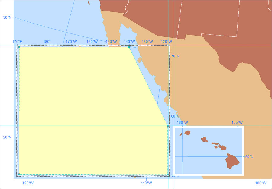
Figure 2. Draw a shape that will be used to clip the data frame.
Step 4: In the table of contents, right-click the data frame you want to clip and click Properties. On the Data Frame tab, under Clip Options, select Clip to shape from the drop-down menu (figure 3).
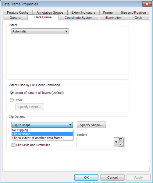
Figure 3. Select the Clip to shape option on the Data Frame tab.
Step 5: Click Specify Shape and select the option to clip to Outline of Selected Graphics(s) (figure 4). The Outline of Selected Graphic(s) button will be disabled if the graphic is not selected.

Figure 4. Specify the layer with the converted graphics as the shape that the data frame will be clipped to.
Step 6: Delete the graphic to see how the data frame has been clipped. Note that Mexico is now visible through the data frame (figure 5).
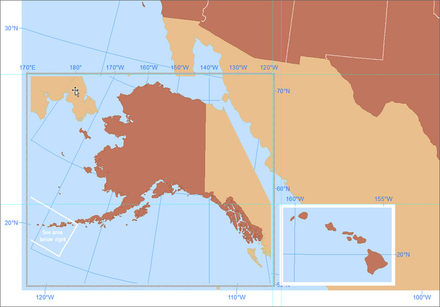
Figure 5. The clipped data frame.
Step 7: Set the background and border frame properties on the Frame tab of the Data Frame Properties dialog box. Right-click the data frame in the table of contents and click Properties. On the Data Frame tab, click the Border drop-down arrow for the border symbol and change the color and width as desired (figure 6). Click the Style Selector button to change the color of the border.

Figure 6. Change the data frame's border symbol on the Data Frame tab of the Data Frame Properties dialog box.
Step 8: If you have a grid or graticule, click the Grid tab and check the box to display a graticule in layout view. Click the Properties button to set properties for the axes, labels, hatching, and intervals.
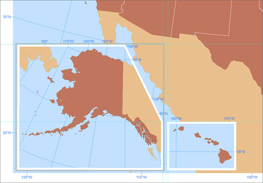
Figure 7. The clipped data frame with the final border symbol.
The final map has the clipped data frame, graticule, and border symbology that match the other data frames on the page (figure 8).

Figure 8. The final map's data frame shows Alaska in the area at the lower left of the page without obscuring the west coast of mainland Mexico.
One caveat to this method is that anything in the clipped data frame that causes rasterization (transparency, raster data, picture marker symbols, etc.) will result in a white fill in the data frame's unclipped rectangular extent. To learn more, read these online help topics:
Thanks go to Esri cartographer Andrew Skinner for his US map, which was used in this tip.