ArcWatch: Your e-Magazine for GIS News, Views, and Insights
November 2011
Tell Your GIS Stories on the Esri Light Gray Canvas Map

Esri released the light gray canvas map this fall to provide a neutral basemap upon which to tell stories geographically.
Painters have long used the neutral-colored canvas as the backdrop upon which to express their themes and tell a story through their artwork.
Now GIS professionals and other web mappers can use a new basemap from Esri that offers a muted canvas-like background that helps to better illustrate the data that tells their stories geographically. Esri recently released the new Light Gray Canvas Map, which gives GIS professionals and other web mappers a neutral, uncluttered canvas on which to use their data to craft stories or impart information on a wide range of topics.
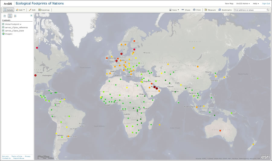
This basemap, which uses a soft, light gray color for land and darker gray for water, was specifically designed to display thematic data in bright colors on top of it so the mapmaker's storyline is vibrant, clear, and unobscured. The map supports any strong colors, creating a visually interesting map graphic that helps readers see the patterns intended.
"People process visual imagery so efficiently, and this basemap helps ensure your map's story is in plain view," said Jim Herries, a cartographic product engineer at the Esri Mapping Center.
The Light Gray Canvas Map, available in ArcGIS Online in the basemap gallery or in ArcGIS Explorer Online, strips away at small scales the streets, buildings, labels, topographic features, and imagery that can vie for readers' attention in other maps.
"The basic idea behind canvas maps is that less is more. You have something clean to work from," said Mamata Akella, cartographic product engineer at the Esri Mapping Center and design lead on the Light Gray Canvas Map project. "Since it's such a subtle background, the other colors just pop. And by using fewer colors and displaying and labeling fewer features, your thematic information comes to the forefront."
On a light gray canvas map, the information the mapmaker is trying to convey is easy to see and understand.
The minimalist Light Gray Canvas Map lends itself well to storytelling because the usual map minutiae play second fiddle and do not distract the eye from the mapmaker's message. View these map samples, including
- Carbon Dioxide Emissions shows the dramatic rise of CO2 emissions around the world between 1960 and 2007. The World Bank provided the data.
- Seattle DOT Parking Map shows locations of parking lots downtown near selected parks.
- Redlands Income—The North/South Divide illustrates the large gap in net worth between residents of north and south Redlands, California.
- Historical Tornadoes shows the location of tornado touchdowns in the United States dating back to the 1950s.
- Land Use in New York City shows the location of commercial, manufacturing, residential, and green space.
- English Coal Exports 1864 traces coal exports from England to various ports around the world. Route widths represent approximate coal tonnages.
- Farmers Markets shows the locations of farmers' markets across the United States.
A New Web Map Design Frontier
Online basemaps are changing, moving toward the minimalist style of information graphics popularized in magazines, newspapers, and other media.
"Today people are using street, topographic, and imagery basemaps less often for their web map applications," said Akella. "We see a more minimalist basemap pattern emerging. It's providing this nice visual starting point on which people are overlaying their thematic information."
The Light Gray Canvas Map will be extremely useful for displaying economic, demographic, behavioral, and health data, Herries said.
"For instance, tracking the exact location of an ambulance requires a detailed street basemap for a web mapping application with GPS-level location data," he noted. "The Light Gray Canvas Map would be better suited to displaying information about how faster ambulance response times might play a role in improving mortality rates from heart attacks."
The aim of using the Light Gray Canvas Map is to avoid making readers struggle to focus on the most important takeaways. "The goal is to make a good-looking map where people don't have to search for the theme—it's automatically apparent to the user," Akella said.
A Canvas Map for the Super Bowl
Last year, Akella created another minimaliststyle basemap in slate gray for FanMap: Super Bowl Edition. This web mapping application, created at the Esri Mapping Center, let Green Bay Packers and Pittsburgh Steelers fans vote for their favorite team to win the Super Bowl by typing in their own ZIP Codes. Each green circle on the map represented the number of votes for the Packers in a single ZIP Code, and each yellow circle represented Steelers votes. The larger the circle size, the greater number of votes were tallied in that ZIP Code. The green and yellow circles stood out very well against the muted gray background. The focus was the general geographic area where the fans were located rather than roads, labels, or terrain streets.
The Light Gray Canvas Map reveals more detail at larger scales. As viewers zoom in, they will begin to see major roads and big parks and then labels on the roads and parks. At the largest scale of 1:9,000, more roads, water bodies, parks, and their labels will come into view, along with building footprints in some cities.
"It's just another basemap option you can try for those times when you need something clean and clear," Herries said. "Your map's theme becomes something that resonates to people who know the area but also will be informative to people who don't know the area."
Herries and Akella agree that mapmakers will find the Light Gray Canvas Map very well suited to telling a visual story of their data that will resonate with readers.
"It's not about the basemap," Akella said.
"It's about you and your theme," Herries added.
To learn more about the canvas map concept, read the blogs Esri Canvas Maps Part 1 and Esri Canvas Maps Part 2 by Akella and her colleague, Esri research cartographer Ken Field.