ArcWatch: Your e-Magazine for GIS News, Views, and Insights
December 2011
A Country Divided
Looking at Income Disparity through a Geographic Lens
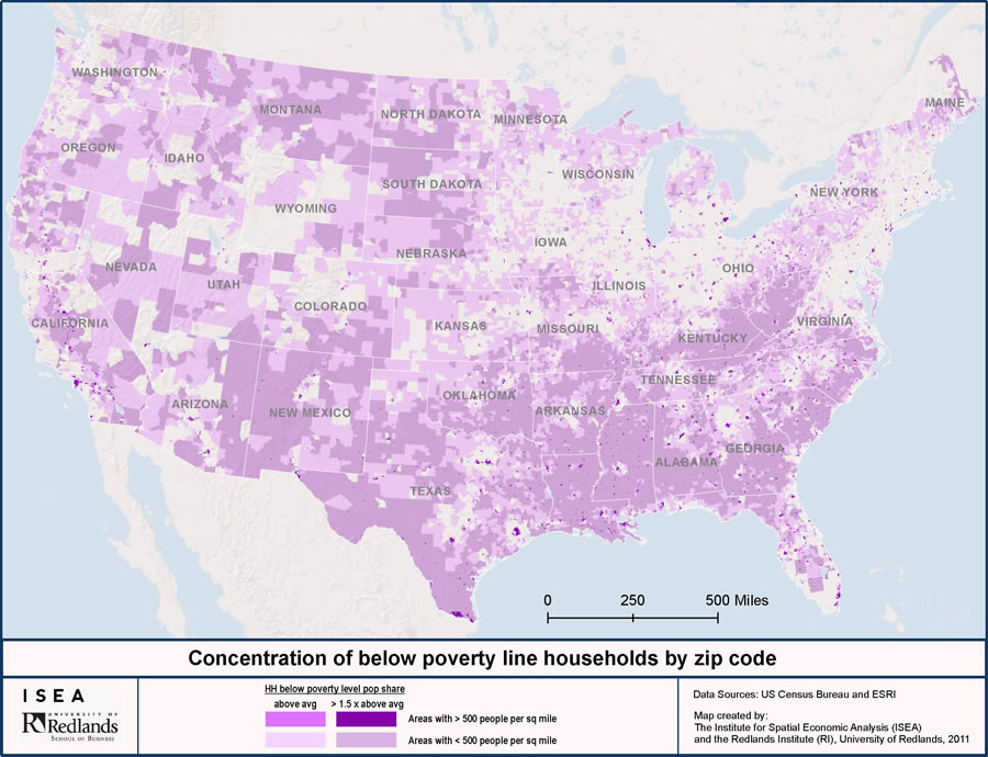
More than 50 percent of ZIP Codes in the United States have an above average percentage of households living at or below the poverty line.
University of Redlands (U of R) researchers used Esri technology and data to analyze income disparity between the rich and poor in the United States. The study's findings—including the fact that people in more than half of the country's ZIP codes experience above-average poverty—can be viewed at a national level on an interactive map, hosted on ArcGIS Online, Esri's cloud-based map and data service. You can pan and zoom to the ZIP Code level. "We were interested in looking closer at income inequality, which has obviously become a hot-button issue for many Americans, as evident through the Occupy Wall Street movement," said Carlo Carrascoso, a faculty fellow with the Banta Center for Business, Ethics and Society at the U of R in Redlands, California.
The rally cry of the Occupy Wall Street protesters, "We are the 99 percent," refers to the difference in wealth and income growth in the United States between the wealthiest 1 percent and the rest of the population. The Occupy Wall Street protest began on September 17, 2011, in Liberty Square in the financial district of New York City and quickly spread to many states, including Oregon, Colorado, and California, and other countries, such as Italy and Spain.
A report released last month by the Congressional Budget Office showed that while the average American household income, after government transfers and federal taxes, rose by 62 percent between 1979 and 2007, income growth for the top (wealthiest) 1 percent of households grew by 275 percent, while the income growth for the bottom (poorest) 20 percent of households grew by only 18 percent. "The growth for the richest households was more than 15 times greater than that of the poorest," said Carrascoso.
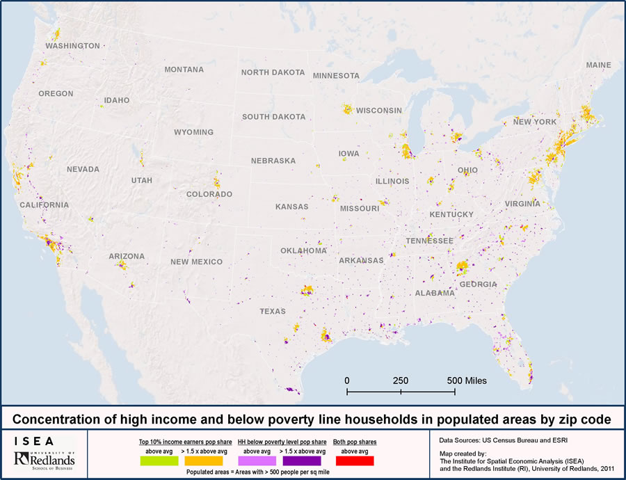
This map shows that households living below the poverty line and those with higher than average incomes seldom live in the same ZIP Code.
Researchers at the university's Institute for Spatial Economic Analysis (ISEA) and the Banta Center for Business, Ethics and Society were interested in understanding more about this income disparity between the rich and poor. Using data on average family size and amount of family income, found in the 2010 Esri data estimates from the US Census Bureau's American Community Survey (ACS), ISEA researchers approximated poverty levels by ZIP Code. "Since we cannot aim for exact precision, we approximated the share of people living below the poverty line," says Johannes Moenius, the director of ISEA.
What they found was unexpected: poverty dominates the United States landscape, especially in less populated areas. More than 50 percent of ZIP Codes in the country have above-average levels of poverty.
The purple zones on the map represent regions where between 13 and 19.5 percent of the households have 2009 income levels below the federal poverty line, defined by the US Department of Health and Human Services (HHS) for a family of four as $22,050. These regions comprise 28 percent of all ZIP Codes.
In deep purple blue regions, the percentage of households with incomes below the poverty line exceeds 19.5 percent. The regions represent 25 percent of all ZIP Codes and include almost all the southern states, New Mexico, North and South Dakota, and urban inner-city areas like those in New York City and Chicago. Within all these regions, more than one in four, or 27 percent, of households live below the poverty line.
The Congressional Budget Office report shows that the distribution of household income has become substantially more unequal in the last study year of 2007 than in 1979. By viewing and analyzing the data on a map, Moenius found that the rich tend to live away from those not as affluent. "Our research revealed that rarely will you find higher than average concentrations of rich (in this study defined as the top 10 percent of income earners by household) and poor (households living below the federal poverty line) in the same ZIP Code."
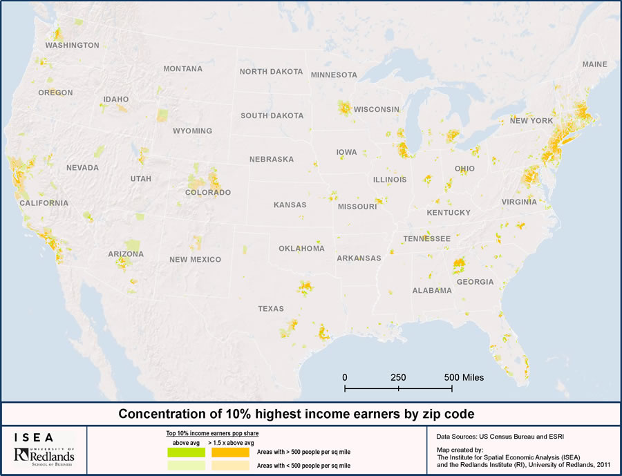
The top 10 percent of income earners tend to be concentrated in urban areas such as San Francisco and Los Angeles, California, Boston, Massachusetts, Washington, D.C., Atlanta, Georgia, and Chicago, Illinois.
Only 0.7 percent of ZIP Codes have a higher than average concentration of both rich and poor. In populated areas, ZIP Codes containing either rich or poor households tend to be contiguous and are next to each other. Higher-income earners tend to be concentrated in large urban metropolitan areas, such as Southern California/Greater Los Angeles and the Washington, D.C./New York City/Boston corridor. Perhaps the most striking feature of the study was the appearance on the map of a "buffer zone" that seemed to separate the rich from the poor. These light gray colored zones appear in suburbia, where middle-income households dominate. Middle-income households were defined for this study as neither the top 10 percent nor those living below the poverty line.
ISEA researchers continue to look at the income disparity problem and other areas of economic analysis that have a strong connection to people and where they live. Visit ISEA to learn more.
Follow the protests on Esri's Occupy Wall Street Social Media map, where events can be visualized by following updates on Twitter, YouTube, and Flickr.