Although an atlas might seem like a relic to some, atlases are still very much alive—both digitally and in print. Indeed, for most cartographers, an atlas is the ultimate mapping product, the showcase of our discipline. Putting one together requires creativity, an aptitude for organizing data effectively, and production management expertise.
An atlas is an intentionally combined collection of maps structured to reach a certain objective. One such structure is the order of the maps. For instance, an atlas might first have various maps of the United States followed by maps of the Americas and then maps of the world. The objective of this atlas might be to inform American children of their local and regional environments but in a global context. Fusing the structure with an objective like this shapes the atlas’s narrative. An atlas might even be considered a story map avant la lettre.
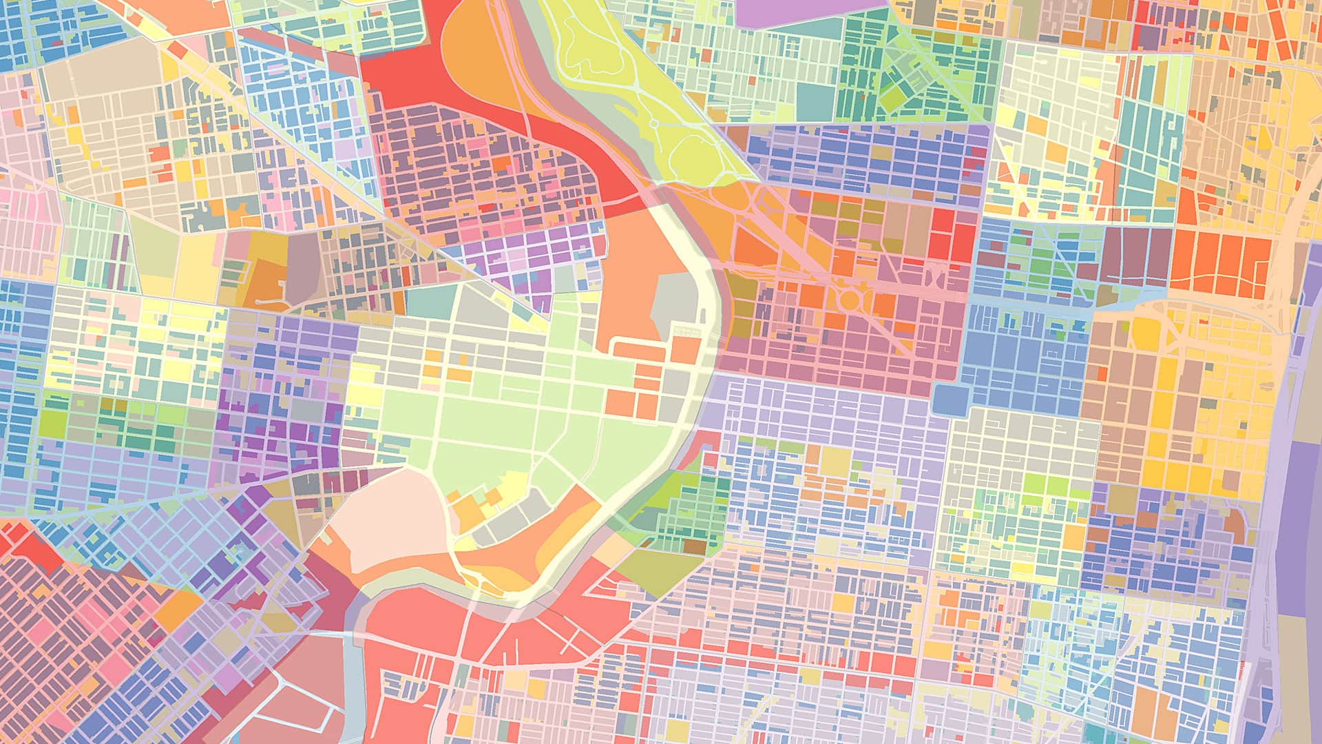
Atlases exist in many forms. There is The Times Atlas of the World, published by the Times (London), which contains reference maps, tables, charts, and now satellite imagery that, together, show not only the earth’s geography but also how humans interact with it. There is the notable National Geographic Atlas of the World as well, which contains maps and infographics that convey subjects such as migration, climate change, advances in communications, economic trends, and more. Other types of atlases are historical, telling the story of a country’s past, for example, or are intended to buttress geography curriculum for schoolchildren. Many atlases are thematic, relating to topics such as geology, the environment, census data, and even wine.
A special category is the national atlas. These are often monumental works made to represent the identity and glory of a country. Finland, for example, published its first national atlas in 1899 while still part of the Russian Empire. The purpose of the atlas was to exhibit the aspiring nation’s essence and accomplishments. Ultimately, this national atlas contributed to Finland’s gaining its independence in 1917.

Like many cartographers, I collect atlases. During my travels, I always try to bring one home. School atlases are especially interesting to me because of the distinctive thematic maps they feature to tell the story of a country’s geography—maps showing the effects of mountain landscapes in Switzerland, for instance, or canals and polders in the Netherlands. The selection of regional and global maps in these atlases can really inform the reader how that specific country looks at the rest of the world.
Although the digital revolution has changed the world of atlases forever, as a collector, I still prefer paper atlases. Why? Well, I can still easily read my physical atlases from 1910. But the first digital atlas I ever purchased—the Atlas of Arizona—is no longer accessible to me. It was issued on a floppy disk, and I no longer have any computers in my house that can read a floppy disk. URLs for online atlases don’t live forever, either. So for my personal collection of atlases, I will stick to paper editions.
That doesn’t mean that digital atlases are in any way futile, though. The big advantage of current-day online atlases is that they can be updated relatively easily. For instance, the census data in an online atlas could be refreshed on a monthly basis (or in any other time frame, depending on how often new data is available). That said, updating an atlas is slightly more complex than just changing the spreadsheet that houses the data. The values might increase or decrease so much so that the map requires a new legend. But the maps included in atlases are designed in such a way that readers can compare different topics in a meaningful way, and map scales and legends are affected by this. By updating some maps and not others, then, this central function of an atlas—comparison—might be destroyed.
It is no surprise that the International Cartographic Association (ICA) has a Commission on Atlases. One of its tasks is to address questions like these—whether to choose a paper or digital format, when to refresh information and when to keep it the same for comparisons’ sake, and how to structure an atlas so it achieves its objectives. The commission also hosts activities on updating the concept of the atlas and putting together a manual for how to plan, design, and produce a digital atlas.
To get in touch with the commission and stay informed about recent developments around atlases, visit atlas.icaci.org. Because, as leaders in the cartographic community, we don’t want these perfect armchair-travel companions to go flat or become stale. Rather, we want them to stay informative and innovative no matter how the process of making maps—and atlases—changes.
Read other articles in The Relevance of Cartography series.