ArcUser Online
The Worldmapper project has successfully produced a series of maps to visualize data concerning a range of issues facing the modern world based on the idea of density-equalizing maps. With this approach, ArcGIS 9.3 plays a crucial role as an interface to convert suitable raster datasets and produce updated cartograms. The data is converted using ArcMap's ArcToolbox, while the cartograms were calculated using a geoprocessing tool available from Esri's ArcScripts site. The final visualization was performed in ArcMap. This article introduces and evaluates further new mapping approaches that move depictions beyond their simple descriptive form. It gives an insight into these new developments, focusing on subnational-level data that has, until now, been neglected. Worldmapper and Its World Population CartogramThe world population cartogram demonstrates the first attempt to include sub-national density data. In the first stage of the Worldmapper project, a wide range of maps depicting various human dimensions of the world have been published on the project's Web site (http://www.worldmapper.org). Since the publication of the first new world population cartogram in 2006, nearly 600 maps have been produced, going far beyond the depiction of the world's population and covering topics such as education, poverty, and pollution. The Worldmapper cartograms show the data for 200 territories, thus making this new view on the world to some extent an arbitrary view: territorial borders are artificial and are subject to change. Furthermore, the assignment of territories in Worldmapper is arbitrary as different thoughts on these territories might exist. Therefore, the world population cartogram was taken as an example to test different ways to calculate these cartograms beyond the territorial borders. [Additional information on the calculations used in and the design of existing Worldmapper cartograms is given in "Worldmapper: The World as You've Never Seen It Before," by Danny Dorling, Anna Barford, and Mark Newman, published in the September 2006 issue of IEEE Transactions on Visualization and Computer Graphics.] Data and Cartogram CalculationData used in this work was derived from the Socioeconomic Data and Applications Center (SEDAC) of Columbia University, New York. The Gridded Population of the World (GPW) database contains the distribution of the world's population on a gridded base (sedac.ciesin.columbia.edu/gpw/), including population data and estimates from 1990 to 2015. This data is available in resolutions of up to 2.5 arc minutes, leading to a population grid of 8,640 x 3,432 pixels. Data from the year 2000 has been used to make results comparable to the original Worldmapper population cartogram.
This raster format data was imported to ArcGIS, converted to polygons, and combined with further metadata (e.g., country labels) to match grid cells for further visualization tasks. The cartogram script uses a 4,096 x 2,048 pixel-sized lattice for its map results. The cartogram itself was calculated using the Cartogram Geoprocessing tool created by Tom Gross of Esri and available from the Esri ArcScripts site (www.esri.com/arcscripts). It uses density-equalizing methodology developed by Mark Newman and Michael Gastner at the University of Michigan. Unlike the Worldmapper cartograms that distort an initial projection of the boundaries of the territories, each population grid is treated as a separate part for the calculation, not taking any territorial information of borders into account. Thus each grid cell marks a border so that distinct shapes of countries are intentionally of no interest in the calculation. Changes in the distortion of the resulting cartogram thus are only possible by adjusting the factor to smooth the original density. In addition, data from the USA has been extracted from the 2.5 arc minutes population grid and is calculated separately in the same way to produce a more detailed view of the resulting grid and its interval variation. ResultsThe resulting cartograms require some final visualization steps to adapt them to appear similarly to the original Worldmapper cartograms. The polygons of the calculated world population cartogram are dissolved according to their affiliation to the Worldmapper territories and colored according to the distinctive Worldmapper color scheme. The gridlines in the USA cartogram are preserved to show the degree of distortion within the grid. A Redrawn World Population CartogramCompared to its predecessor (Figure 1), the redrawn World Population Cartogram (Figure 2) shows considerable differences. For example, in China the sparsely populated Himalayan regions can be distinguished from the densely populated eastern coastal regions. Internal variation within the United States and Mexico can also be recognized. Somewhat harder to identify but still evident are north-south differences in Great Britain and west-east differences in Germany. Hence, our goal to take the varying distributions of population on a subnational level and make them visible on a global view has been achieved. However, subnational variation can be difficult to analyze in more detail because the grid cells are eliminated to sustain the view on the global scale. In addition, more distinctive national shapes are far more distorted than in the original cartogram, which for some users might appear odd when interpreting such maps. Down to Earth: A Population Cartogram of the United States
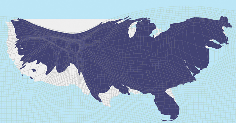
To counter the loss of familiar national boundary shapes, a separate population cartogram is produced for the contiguous United States (Figure 3) and several other countries. The shape of the cartogram has more detail compared to the shape of the USA on the world population cartogram. This is because more grid cells are used in the calculation of the cartogram and no other polygons (e.g., from the European continent) influence the calculation. The different scale also allows the visualization of each grid cell so that subnational variation can be recognized. An "original" map of the USA with its familiar shape is shaded in underneath the grid to aid interpretation. This visualization on a different scale is an improvement that goes far beyond the current capabilities of the Worldmapper project by using gridded base data to allow a different view of population distribution not only worldwide but also within separate regions. By using cartogram techniques, a different view on the regional variations of human geography is created, which can hardly be achieved with traditional mapping techniques. Outlook
The most significant obstacle to the realization of gridded depiction for Worldmapper will be the vast quantity of different topics covered and availability and reliability of data. Reliable gridded social and economic data for the whole world is rarely available and rarely of such good quality as the population data. The estimation of missing national data for some topics has already been a serious matter in the existing Worldmapper cartograms. Such estimations will not meet the demands of gridded datasets, so new ways of data estimation are needed. Current approaches to estimate data commonly use the GPW data, and these have the potential to be adapted to Worldmapper's requirements. Revised gridded cartograms offer great potential to enhance the variety of Worldmapper's visualization capabilities. A different view of the "real" location of the depicted topic can present a better understanding of human action and human patterns on the globe. However, distortions associated with the gridded method are a disadvantage and undermine the purpose of Newman and Gastner's algorithm to preserve the familiar shapes of countries. The potential of the gridded approach and the desire to preserve the familiar shapes must therefore be carefully balanced. Nevertheless, much potential lies in adding more user interactivity and detail to Worldmapper. Grid-based cartograms have the advantage of allowing a user to zoom in to view national and regional details, within a global context. As one of the authors, Danny Dorling, has commented, "Our maps could be made more interactive, certainly, and there are probably many other features that could be added." GIS technology is a key tool to make this happen. A GIS environment not only facilitates data conversion and calculation of cartograms but also allows different geographic scales to be brought together under one map. An easy transfer to popular digital globes can thus be realized, allowing viewers to identify the regional dimension of a subject. Separate regional editions of gridded population cartograms can be generated to visualize the regional variation of population distribution. For additional information, contact Benjamin D. Hennig AcknowledgmentsThe authors thank the Leverhulme Trust for funding the Worldmapper project. The trust played no role in the submission or preparation of this work. ReferencesDorling, Danny (2007), "Worldmapper: The Human Anatomy of a Small Planet," PLoS Medicine 4(1), 13�18. Dorling, Danny, Anna Barford, and Mark Newman (2006), "Worldmapper: The World as You've Never Seen It Before," IEEE Transactions on Visualization and Computer Graphics, 12(5), 757�764, doi:10.1109/TVCG.2006.202. Gastner, M. T., and M. E. J. Newman (2004), "Diffusion-Based Method for Producing Density Equalizing Maps," Proc. Natl. Acad. Sci. USA 101, 7499�7504. Gaffin, S. R. et al. (2004), "Downscaling and Geo-spatial Gridding of Socio-economic Projections from the IPCC Special Report on Emissions Scenarios (SRES)," Global Environmental Change 14(2), 105�123. Hay, S. I., A. Graham, and D. J. Rogers (2006), Global Mapping of Infectious Diseases: Methods, Examples and Emerging Applications, Academic Press, London. Webb, Richard (2006), "Cartography: A Popular Perspective," Nature 439, 800. |