ArcUser
Summer 2012 Edition
Designing Great Web Maps
By Aileen Buckley, Esri Mapping Center Lead
This article as a PDF.
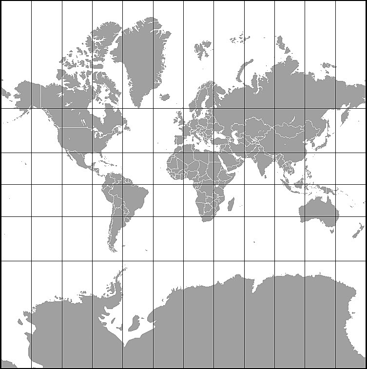

Comparison of the web Mercator (left) and Winkel Tripel projections (right)
Web maps have characteristics that make them different from print maps or other on-screen maps. This article will help you take those differences into account and create more effective web maps.
A web map is a map and related content presented in an online environment with an appropriate interface and optional functionality for queries and reports. For mapmakers using Esri software, a web map is compiled in ArcGIS for Desktop's ArcMap, and the interface, map elements (e.g., legend, scale bar), query elements, and report elements are created using the ArcGIS viewers or ArcGIS APIs, available for JavaScript, Flex, and Silverlight. A web mapping application refers to both the script that is created to define the interface and the elements and functions provided through the interface.
When designing a web map, as with any map you make, the first thing to ask is, "What is the purpose for this map?" The answer will disclose the map's audience and how it will be used by that audience.
Why Web Maps Are Special
Typically, web users have relatively short attention spans and high expectations. They do not focus long on content or tasks before becoming distracted, so not only should a web map display quickly, its functions should respond rapidly and its purpose should be immediately understood. Users also expect what they are viewing to be of immediate and personal use to them. These characteristics challenge web mapmakers to design maps that possess high levels of graphic and information clarity.
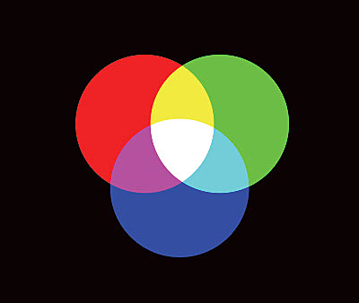
The additive (top) and subtractive (bottom) color systems
Since the web environment is well suited for interaction, more information can be immediately shared using mouse-overs, ToolTips, information boxes, labels, and hyperlinks. It is possible to show less on the map itself (e.g., labels or detailed features) and still convey information. The map can be linked to databases that report attribute information, display images, play sounds when users click related map features, or perform analyses by accessing geoprocessing functionality. Web maps can also be portals for downloading or uploading content.
Web Map Content
Users will likely also have certain expectations for web map content. They expect current data and sometimes continuously updated data (e.g., maps that show monitoring sites). They also expect interactive maps that support zooming at a minimum but also potentially support query, analysis, and customization. For larger-scale maps, users expect detail and realism. They may even expect the data used to make the map to be downloadable and free. As with print maps, data should be complete, consistent, and authoritative.
Making Web Maps
The workflow for making web maps encompasses four primary activities: designing the information to be shown on the map, designing the map, designing the user experience, and promoting the finished web map.
When designing the information to be shown on the map, consider not only how the data is modeled but also its completeness, timeliness, and authority. Determine if there are aspects of the data that must be added when compiling the map. When designing the map, consider how the web interface can be used to communicate the map's message and make it appealing to its intended audience. When designing the user experience, consider how users will interact with the map and its related information. Once the map is finished, promote the map not only to its intended audience but also other potential audiences to maximize its value.
Compiling a Web Map
Before compiling a web map, you have to determine a few things. What size will it be and what geographic extent will it show? Given those parameters, the map scale and resolution can be determined. Next decide which map projection is best. Choose the colors, fonts, and symbols and decide what to show in the map margins. General guidelines will be given for each of these areas. While this is not an exhaustive set of recommendations, it should help you get started.
Size
Although web maps are usually designed for a 17- or 19-inch LCD monitors—because that is what most people have on their desktops—web maps can also be viewed on other devices such as Tablet PCs, smartphones, or iPads. Design for the primary delivery mode. Sometimes a map design will work well on devices other than the primary delivery mode. Sometimes it won't.
The luminosity of an image that is primarily white is taxing to the eye when viewed on-screen.
Geographic extent
Because users can pan and zoom, the geographic extent of the map can be greater than what is shown on the screen initially. Sometimes it is useful—and necessary—to restrict the map extent. Other times, it makes more sense to provide a global view. It will depend on the map's purpose.
Map scale
If readers can zoom in and out, the map scale will be variable. This means that a separate map should be compiled for each map scale to ensure that the zooming experience appears seamless. Learn more about how to do this in ArcMap by reading the Esri Mapping Center blogs "Creating a web map service" and "Working with layers and scale ranges: Tips for organizing the Table of Contents."
Map projection
The map projection you use depends on whether the map will be mashed up with other web maps. For example, if you want your map to overlay with maps on ArcGIS Online, Bing, or Google, you'll use the web Mercator projection.
If you use a different projection, anyone who wants to use your map in a mashup will have to use that same projection. If you do not think anyone will use your map in a mashup, consider alternate projections such as modified Winkel Tripel projection.
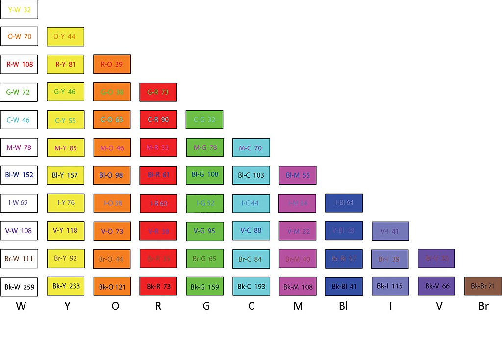
This table shows color contrast metrics for combinations of colors for symbols and their backgrounds. Combinations that have higher values result in better legibility. (from sitepoint.com/anatomy-web-fonts)
Color
Today, computers can display millions of colors, so using web-safe colors is a moot issue. Almost every web map is in color. However, color on the web is different than color in print. This will have an impact on your maps' appearance.
In print, colors are comprised of ink pigments. Using the subtractive color system, these colors are perceived by the viewer as the reflection of light by the pigment on the page. On a computer monitor, colors are made up of colored light. Using the additive color system, colors are created by combining red, green, and blue light in different proportions and intensities. The color white is produced by combining red, green, and blue light at full intensity.
One consequence of using an additive color system is that light colors viewed on a computer monitor are overly luminous and too harsh on the eye for extended viewing. Also, the intensity of the light radiating from a screen displaying pure white can affect the clarity of fine detail in type, point symbols, and line symbols as well as intricate patterns, such as rasters used to show hillshades or elevation tints.
Symbols
To be legible, symbols and text must be large enough to be seen and distinguished from the background. Although the height of a text character varies from font to font, a rule of thumb is that text and symbols should be at least 10 pixels high. That means using fonts 7 points or larger on a PC and 9 points or larger on a Mac.
The ability to distinguish a symbol from its background is called contrast. A table of color contrast metrics is a good guide for color selection that will promote contrast.
Fonts
When possible, use fonts designed for the web. A recent study identified Arial (or Helvetica on Macintosh), Verdana, Georgia, Trebuchet, and Century Gothic (all installed on Windows systems), and Lucinda Grande and Palatino (installed on most systems) as the most popular fonts for web design. Good web fonts have a generous amount of space between characters and within characters (i.e., punch width). A tall x-height also opens up the space within a character. These properties make fonts legible on screen.
With the exception of Georgia and Palatino, these are sans-serif fonts. Serifs are the small lines or decorations added to the ends of the main strokes of the character that theoretically help the letters flow and lead the eye across text during reading. Serif fonts are very popular in print. However, many designers and cartographers believe that sans-serif fonts are more suitable for web map design because serifs compromise the space between characters. This holds true for small blocks of text (e.g., labels on maps, titles, legend text), but for large blocks of text, serif fonts are still easier to read.
Resolution
Computer display resolution is low when compared to print maps. For desktop computers, it is common to design for a resolution of 96 dpi (dots per inch) because all LCD monitors support this resolution. Newer LCDs typically have a native pixel density of 120 dpi and 144 dpi. Choose resolution based on the type of computer your target audience will mostly likely use.
This low resolution, coupled with the color projection issue, will impact the cartographic design of a web map. Because screen displays are pixels, nonorthogonal lines and sharp edges appear jagged. These jagged edges can be softened by adding pixels of intermediate color between the object and the background (antialiasing), which fools the eye into seeing a jagged edge as a smooth one.
Map marginalia
Maps have two basic components: the map itself and information about the map, commonly called marginalia (additional information outside the edge of the map displayed in the margins). Map marginalia includes titles, legends, scale bars, scale text, and north arrows, as well as information about the data used, map projection, author, and publication date. With web maps, it makes sense to include some of these items, but not all.
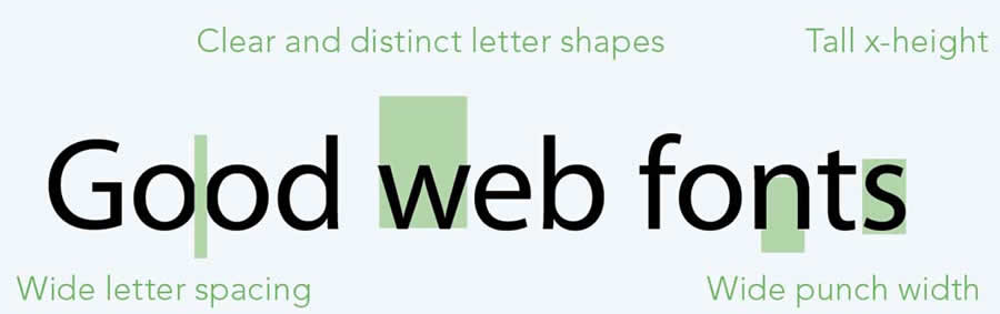
Characteristics of good web fonts (from sitepoint.com/ anatomy-web-fonts)
All maps should have a title. For symbology that may be unclear or confusing, include a legend, especially if the map is for an international audience. Cartographic conventions vary. Whether to include a map scale depends on how much area is shown on the map. If your map covers a large area or is 3D (i.e., is in a perspective rather than planimetric view), scale will vary across the map, and a scale bar or scale text would be inaccurate for all mapped locations. For 3D maps and maps that use a projection other than web Mercator, you may not want to include a north arrow because orientation may vary across the map. Instead, including a graticule (latitude and longitude lines) or other grid is a good alternative that helps address the scale issue as well.
For web maps, it is very useful to include the author and publication date and information on the data. Users of web maps expect data to be current and accurate and sometimes expect to be able to access the data. Knowing who made the map, when it was published, and what data was used to make it helps users assess the validity of the information on or linked to the map.
Conclusion
The web makes it easier for your maps to reach far more people, but knowing how to design maps specifically for the web will help you create maps with immediate and wide appeal that readers will find useful, interesting, and notable.
About the Author
Aileen Buckley is the lead of the Esri Mapping Center, an Esri website dedicated to helping users make professional-quality maps with ArcGIS. She has more than 25 years of experience in cartography and holds a doctorate in geography from Oregon State University. She has written and presented widely on cartography and GIS and is one of the authors of Map Use, Seventh Edition, published by Esri Press.