The Relevance of Cartography
When countries organize a summit, they typically meet to discuss big problems, such as a refugee crisis, climate change, and reducing trade barriers. So what is a Cartographic Summit?
At the 2013 International Cartographic Conference in Dresden, Germany, during a meeting between the leadership of the International Cartographic Association (ICA) and the event’s keynote speaker, Esri president Jack Dangermond, the idea was raised to organize a small, closed gathering among key cartographers and influential professionals who work with maps but who don’t have cartographic backgrounds. The purpose would be to discuss the future of the cartographic discipline. And thus, the Cartographic Summit was born.
A small, closed meeting like this might appear to run counter to the inclusive nature of the ICA. And complaints did ensue about the seeming exclusivity of the event. But sometimes small workshops make a bigger difference than large conferences with hundreds of attendees.
Of course, the inevitable question then arose: Who should be included? We preferred to invite people who had stories to tell and opinions to share. But then we encountered the constraints: agendas, locations, finances, differences of interest, and the like.
Despite all this, however, the summit was held in February 2016 at the Esri campus in Redlands, California, with 50 participants. And we were able to bring together an engaging program.
The central themes of the summit were data, media, and design. Data is a prevalent issue right now because, as the big data paradigm illustrates, it is not lack of data but an abundance of it that causes problems. Media is central to contemporary cartographic discussions because maps are used everywhere. And design is always important because maps have stories to tell and they need to do that well. These three topics are also interdependent.
Heeding the objective of bringing in outside perspectives, the keynote speakers at the Cartographic Summit do not label themselves cartographers and have never had any involvement with the ICA. The three of them—Katy Börner, a professor of information science at Indiana University; Gary Gale, the chief technology officer for startup what3words; and Nigel Holmes, a renowned graphic designer—were asked to view maps from their own standpoints.
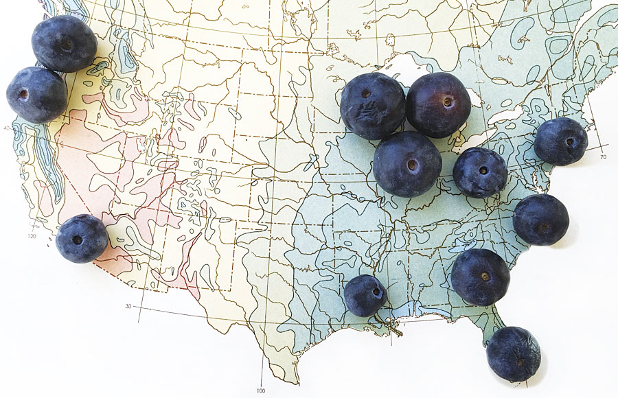
Talking about maps from a data visualization angle, Börner outlined a generic framework for maps that could allow mapmakers to create alternative visualizations for different users based on user questions and a needs-driven workflow. Gale pointed out how crowdsourcing and social media have contributed not only to an abundance of data but also to a whole new interest in maps—both well-designed ones and those that could use a lot of work. To round it out, Holmes stressed the importance of design in making maps appealing and intelligible. As an example, he placed different-sized (and real) blueberries on top of a rainfall map for the United States to demonstrate one way to creatively scale symbology to quantity.

The keynote speakers were also supported by two Lightning Talks: in keeping with the aims of the summit, one talk was from someone outside the ICA community, and the other was from within it to maintain a certain cartographic perspective.
All these presentations were only a small part of the whole event, though. During breakout sessions—which were a core component of the summit—attendees held lively discussions based on keywords they came up with after hearing each presentation. Examples of discussion topics include “analysis” (from the data presentation), “storytelling” (from the media keynote), “clarity” (from Holmes’s talk), and “users” (a common thread in all the speeches). Results from the breakout sessions—where participants were encouraged and felt free to speak up—were reported in joint sessions.
Most of the summit (besides the breakout sessions) was live streamed, and participants live Tweeted it on Twitter—both of which were a first for me, given that I am not very active on social media. This brought a whole new dimension to the event and certainly resulted in some interesting situations.
The audience viewing presentations online, for example, could only see the slides and hear a voice. Some context was lost, and some expressions that were heard by online-only viewers started lives of their own on Twitter. It was also more difficult to share research results that hadn’t been made completely public yet, as there was the chance that they could go viral without having the correct copyright labels in place. I now realize why politicians are always so vague.
On the other hand, news about the Cartographic Summit spread much faster via its hashtag, #cartosummit, than it would have if I had only written about it in this column.
In the end, one question lingered: Can such an exclusive event really change cartography? Not massively, I would imagine, because the scope of the summit did not cover all aspects of cartography. It was also organized as a onetime occasion—though people have already begun asking me when the next one will take place.
What the gathering did do, however, was open up new avenues for thinking about the subjects that were covered. Additionally, it allowed the cartographic community to bring young and bright visualizers into our world—something that is important for us to keep doing. The noncartographic professionals who attended the summit were also able to see that cartography and cartographers are not as dull as they may have seemed before. And I think we all realized that we—and the ICA’s various commissions—need to reach out more to the data, media, and design communities. This is how different groups learn from each other and how we all continue to grow.
For more information on the Cartographic Summit, visit my presidential blog on the ICA website. Video recordings from the summit are available online. And do not forget to look at Twitter posts with the hashtag #cartosummit to view some varying opinions on the gathering.
About the Author
Menno-Jan Kraak is professor of geovisual analytics and cartography at the University of Twente in the Netherlands, where he has been teaching since 1996. He has a degree in cartography from the Faculty of Geographical Sciences at Utrecht University and received his PhD in cartography from Delft Technical University. Kraak has written extensively on cartography and GIS. His book Cartography: Visualization of Spatial Data, written with Ferjan Ormeling, has been translated into five languages. He also wrote Mapping Time: Illustrated by Minard’s Map of Napoleon’s Russian Campaign of 1812, published by Esri Press in 2014. Kraak is a member of the editorial boards of several cartography journals, including the International Journal of Cartography. He currently serves as president of the International Cartographic Association.
Read other articles in “The Relevance of Cartography” series.

